Alteryx Designer Desktop Ideas
Share your Designer Desktop product ideas - we're listening!Submitting an Idea?
Be sure to review our Idea Submission Guidelines for more information!
Submission Guidelines- Community
- :
- Community
- :
- Participate
- :
- Ideas
- :
- Designer Desktop : Nouvelles idées
Featured Ideas
Hello,
After used the new "Image Recognition Tool" a few days, I think you could improve it :
> by adding the dimensional constraints in front of each of the pre-trained models,
> by adding a true tool to divide the training data correctly (in order to have an equivalent number of images for each of the labels)
> at least, allow the tool to use black & white images (I wanted to test it on the MNIST, but the tool tells me that it necessarily needs RGB images) ?
Question : do you in the future allow the user to choose between CPU or GPU usage ?
In any case, thank you again for this new tool, it is certainly perfectible, but very simple to use, and I sincerely think that it will allow a greater number of people to understand the many use cases made possible thanks to image recognition.
Thank you again
Kévin VANCAPPEL (France ;-))
Thank you again.
Kévin VANCAPPEL
While the result window allows sorting and filtering, every time the user switches to another tool within the same run, the configuration is lost. It would be good if there was a 'Retain" button so that the user does not have to keep setting this each time the tool is switched or when the canvas is retriggered.
-
Enhancement
-
UX
The current Export Workflow user experience is extremely frustrating and it sometimes takes me several attempts to export the workflow with all of the correct assets. Some ideas for improving the UX:
- Allow the width of the window to be expanded or maximized. I often have many assets that start with the same folder structure name and I have to scroll to the right for each one to decide whether to check or uncheck it.
Have a display option for "Group asset by Type" (e.g., Input, Output, Macro). I typically only package up my workflows with the embedded macros, not the Inputs or Outputs. (This is especially important during development and testing, when interim yxdb's are saved to facilitate QC and trouble-shooting.) I would like an easy way to "Check all Macros" without having to go through the list one-by-one. I may have over 100 assets; with the current UX, it's really hard to get all the right assets checked.
- Add an option to filter the display to see only the assets that have been checked.
- Add a way to copy the asset list (checked and/or unchecked) to the clipboard. This would allow us to confirm that all of the assets needed are included BEFORE EXPORTING.
- Add an option Select All or Deselect All
-
Enhancement
-
UX
On the SELECT object - add a column "Value if Null". This would work like a COALESCE in SQL. For string fields, an empty string or "" would need to be an available option.
-
New Request
-
UX
When numerous formulae exist within a single formula object, being able to "Expand All / Collapse All" would be most welcomed. :-)
Also - the ability to Disable/Enable a single formula in the formula object - also very nice to have.
-
New Request
-
UX
Debugging could be dramatically simplified if each canvas object had the ability to be disabled/enabled. If disabled, the workflow would still pass through the object, but the object itself would be ignored.
-
New Request
-
UX
It'd be great to have all DCM connections available in the Data connections window.
And when Use Data connection Manager (DCM) is ticked, The screen defaults to DCM Connection list.
-
Enhancement
-
UX
Today, I am able to take an excel file from a folder and drag it onto the canvas, which automatically creates an Input Data tool.
I would like to be able to drag an excel file right from outlook to do the same!
-
Enhancement
-
UX
i investigate a super messy and huge workflow, i have a hard time to trace back the data stream.
it only have around 5 wireless connection, some is easy to find, but some are connect to union..
if have a button to turn all connection back to wire, and better if have option for just solid for temp to show as solid line. it will helps alot.
-
New Request
-
UX
The Interactive Chart configure window cannot be resized. I'm using a single, large monitor, and this window occupies the entire monitor so that I am forced to switch between windows to see other applications. Most of the space used by the configure window is wasted white space. Please update this to allow this window to be resized.
I'm using a 32:9 monitor running at 5120x1440, and the attached screenshot shows the size of the configure window on this monitor - 4986x1286.
-
Enhancement
-
UX
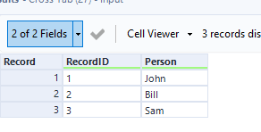
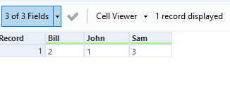
Cross tab automatically alphabetizes the column headers this can be a little awkward when unioning on column position later on. Would be nice to have this as an optional feature through a tick box on the tool.
-
Enhancement
-
UX
When we rename a field in canvas it breaks a lot of formulas or config on tools like select tool or unique tool or summarize tool. If designer can automatically update these new field names in all the further tools if will save us a lot of time.
Thanks,
Sanju
-
New Request
-
UX
Adding a up and down arrow on each column would make it easier and quicker to sort columns then the drop down menu or sort tool
-
Enhancement
-
UX
After multiple years of using Alteryx, The tabbed document feature was left out of 2022.1. This feature allows for a much cleaner canvas for exploring workflow and output data. I view this feature as a basic function of Alteryx, I was surprised to find out that the development team intentionally omitted this function. I really don't want to revert back to older versions but it may be only the way to have a more comfortable feel of Alteryx.
-
New Request
-
UX
At the moment, at least for Postgres and ODBC connections, the DCM only supports a names DSN that must be installed on each machine running Designer or Server. However, the ODBC admin function is admin only within my company, which makes DCM more trouble than it is worth to use.
Connection strings work well in the workflows, have been implemented on the gallery before, and do not require access to the ODBC admin to implement. Could DCM please be improved to support native connection strings?
-
Enhancement
-
UX
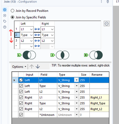
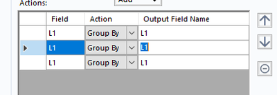
The order of the join fields effects the ordering output
For more complex joins it would be nice to have up and down arrows much like the summarise tool:
Often I need to add filters or other tools early on after the workflow is already been mostly built. If a tool connects to one tool I can drag the filter over the connecting line and add the filter seamlessly. However in large workflows there is often this situation:
The Filter will only connect to one of the lines I'm hovering over. If I could connect to all lines simultaneously and drop in the connection to achieve this (would be awesome):
This is purely aesthetic but it would be great to have a button to auto format tools positions on the canvas. The idea would be similar to a feature many IDE's come with to auto format code so that the indentation is corrected and duplicate return characters are removed.
We currently have the Align and Distribute capabilities which is great. This could be expanded to the entire workflow so that the canvas could look at which tools connect to which and structure their positioning around that. I think it would be a great clean up feature after finishing a workflow.
-
New Request
-
UX
Hello!
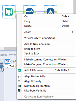
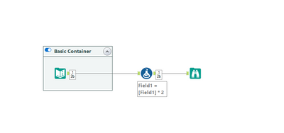
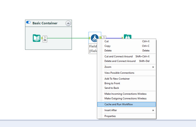
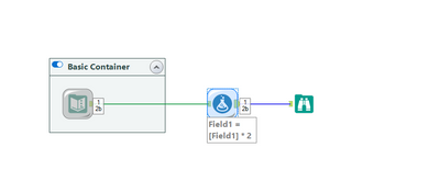
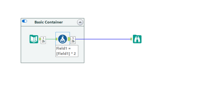
I had found this quirk whilst working on a fairly large workflow, where i had multiple tools cached to keep things quick. I had moved one of the tools on the canvas to a pre-existing container, and it removed the caching on my whole workflow.
Steps to reproduce:
1) setup a super basic workflow (or any workflow):
2) Cache part of the workflow:
3) drag one of the tools (in this case the formula) into the container:
As you can see, the workflow is no longer cached and i have to re-cache it.
This would be a welcome change as that is an unexpected behaviour to me, and so I would imagine others too. A workflow no longer being cached can cost the developer a lot of time (and potential resource, if hitting a Snowflake instance, for example).
Thanks,
TheOC
-
Enhancement
-
UX
Once I've built a workflow I often have to go through the process of removing and combining tools such as selects and formula tools which could be simplified to just one tool. It would be great to have an automated feature which could detect groups of tools which could be simplified and then automatically combined them into one step, improving/simplifying my workflow.
-
New Request
-
UX
It would be helpful if we could open 2 or more workflows at the same time from a gallery connection. Sometimes they are related or part of an overall update process, so opening all of them at the same time would save many clicks and a lot of time.
-
Enhancement
-
UX
- New Idea 376
- Accepting Votes 1 784
- Comments Requested 21
- Under Review 178
- Accepted 47
- Ongoing 7
- Coming Soon 13
- Implemented 550
- Not Planned 107
- Revisit 56
- Partner Dependent 3
- Inactive 674
-
Admin Settings
22 -
AMP Engine
27 -
API
11 -
API SDK
228 -
Category Address
13 -
Category Apps
114 -
Category Behavior Analysis
5 -
Category Calgary
21 -
Category Connectors
252 -
Category Data Investigation
79 -
Category Demographic Analysis
3 -
Category Developer
217 -
Category Documentation
82 -
Category In Database
215 -
Category Input Output
655 -
Category Interface
246 -
Category Join
108 -
Category Machine Learning
3 -
Category Macros
155 -
Category Parse
78 -
Category Predictive
79 -
Category Preparation
402 -
Category Prescriptive
2 -
Category Reporting
204 -
Category Spatial
83 -
Category Text Mining
23 -
Category Time Series
24 -
Category Transform
92 -
Configuration
1 -
Content
2 -
Data Connectors
982 -
Data Products
4 -
Desktop Experience
1 604 -
Documentation
64 -
Engine
134 -
Enhancement
406 -
Event
1 -
Feature Request
218 -
General
307 -
General Suggestion
8 -
Insights Dataset
2 -
Installation
26 -
Licenses and Activation
15 -
Licensing
15 -
Localization
8 -
Location Intelligence
82 -
Machine Learning
13 -
My Alteryx
1 -
New Request
226 -
New Tool
32 -
Permissions
1 -
Runtime
28 -
Scheduler
26 -
SDK
10 -
Setup & Configuration
58 -
Tool Improvement
210 -
User Experience Design
165 -
User Settings
85 -
UX
227 -
XML
7
- « Précédent
- Suivant »
- abacon sur : DateTimeNow and Data Cleansing tools to be conside...
-
TonyaS sur : Alteryx Needs to Test Shared Server Inputs/Timeout...
-
TheOC sur : Date time now input (date/date time output field t...
- EKasminsky sur : Limit Number of Columns for Excel Inputs
- Linas sur : Search feature on join tool
-
MikeA sur : Smarter & Less Intrusive Update Notifications — Re...
- GMG0241 sur : Select Tool - Bulk change type to forced
-
Carlithian sur : Allow a default location when using the File and F...
- jmgross72 sur : Interface Tool to Update Workflow Constants
-
pilsworth-bulie
n-com sur : Select/Unselect all for Manage workflow assets
| Utilisateur | Compte |
|---|---|
| 6 | |
| 5 | |
| 3 | |
| 2 | |
| 2 |


