Alteryx Designer Desktop Ideas
Share your Designer Desktop product ideas - we're listening!Submitting an Idea?
Be sure to review our Idea Submission Guidelines for more information!
Submission Guidelines- Community
- :
- Community
- :
- Participate
- :
- Ideas
- :
- Designer Desktop: Top Ideas
Featured Ideas
Hello,
After used the new "Image Recognition Tool" a few days, I think you could improve it :
> by adding the dimensional constraints in front of each of the pre-trained models,
> by adding a true tool to divide the training data correctly (in order to have an equivalent number of images for each of the labels)
> at least, allow the tool to use black & white images (I wanted to test it on the MNIST, but the tool tells me that it necessarily needs RGB images) ?
Question : do you in the future allow the user to choose between CPU or GPU usage ?
In any case, thank you again for this new tool, it is certainly perfectible, but very simple to use, and I sincerely think that it will allow a greater number of people to understand the many use cases made possible thanks to image recognition.
Thank you again
Kévin VANCAPPEL (France ;-))
Thank you again.
Kévin VANCAPPEL
Currently, there isn't any option in the Salesforce Input tool > Existing Reports to remove the 2000 record limit for queries. Is there any way of removing that cap so that our queries will return the correct number of records?


-
Category Reporting
-
Desktop Experience
Whilst not quite as efficient, the ability to overlay a line graph onto a scatter would enable the user to achieve a similar result as the points for the line can be calculated.
-
Category Reporting
-
Desktop Experience
I would like an separate tool for rendering excel file, or more options in the render tool. Currently you have to manually give the size of the output sheet, and it makes all of the columns on the spreadsheet look odd. Having additional options like "Auto page size" would be tremendous.
-
Category Input Output
-
Category Reporting
-
Data Connectors
-
Desktop Experience
This is a feature request based on my comment submitted here: Email Tool: Format "From" field to accommodate "Di... - Alteryx Community
It would be great to provide an option in the Designer Email Tool to allow us to specify a "Display Name" when sending emails. The "Display Name" is a common part of the email specs listed here: RFC2822 - Section 3.4 (Address Specification)
The email gateway/service that I'm using will send emails, but the "From" line will reflect only the email address.
For example, it will show an email as being from "john.smith@example.com" where I would love for it to show up as from "Smith, John". This would make emails appear like other internal company emails in our company Outlook clients, and in general provides more useful flexibility for the Email tool.
Many other email clients support using Display Name, but it appears that Alteryx currently doesn't.
The format of an email address with Display Name is something like "Smith, John" <john.smith@example.com> (with or without the quotes).
-
Category Reporting
-
Desktop Experience
I am having to render my Alteryx formatted reports to Excel and then upload the report to Google Sheets
It would be very useful (and improve the less well known Alteryx Reporting capabilities) to be able to render straight to a Google Sheet and preserve the formatting.
Thanks
-
Category Reporting
-
Desktop Experience
As pointed out by @Joshman108 in this post, you can lose some/all of your work in the table tool if the metadata is ever not flowing correctly. Losing your metadata can happen for a number of legitimate reasons (copying/pasting, crosstab tool upstream, python tool upstream etc.) There are a number of tools (including the table tool) where losing the matadata can prove catastrophic.
Consider these 2 simple examples:
1) We have the dynamic box checked and apply a rule to field 1:

If our table tool loses its metadata, our row rule is completely erased! I would expect the tool to remember our row rule once metadata is reestablished.
2) We have the dynamic box unchecked, as well as Field4 unchecked. We setup the same rule as before that references field4.

Now when the metadata is lost and restablished, the table tool does a good job of remembering that Field4 is supposed to be unselected, and that I had a rule for Field1; however, the rule has now been changed! I would expect the rule to also remember that I was referencing Field4. Note that if my rule had reference a field that was included in the table, it would have remembered the rule. It's only because my rule referenced Field4 which was not included in the table that my rule got messed up. In my rule, it now references Row# which is completely wrong:

-
Category Reporting
-
Desktop Experience
Hello Product Management,
I'm trying to emulate a graph from the book, Effective Data Visualization by Dr. Stephanie Evergreen. Here's what I have so far:

This was a little bit of work to create and while it isn't what I exactly had hoped for, it does approximate my attempt. Ideally, I would do the following to complete the exercise:
- Have a Y-Axis (none) line on for both Old/New Sites (dual-axis)
- Replace the Y-Axis number with the Label for the departments
- Remove the (line) from the label
As observations, in order to add carriage returns to NOTES, i had to use HTML tags <br>. The settings for points and lines required me to do lots of configuration. Maybe a format painter would help to copy the format from one set of point/lines to the next. Once I completed a chart/insight it would be "nice" to be able to copy and configure the other. If you have an insight and wish to create a chart, you have to reconfigure the new element from scratch.
I do have an error in the creation of the chart that says, "Error parsing configuration." I have no idea what error exists. I submitted a ticket on that issue.
I haven't created this chart via Excel, but the textbook shows you how to create the result in Excel. The graph is easy for me to see and to understand. I like it and think that it could be a valuable way to demonstrate the potential for Alteryx visualizations.
Cheers,
Mark
-
Category Reporting
-
Desktop Experience
-
Feature Request
In Render tool you can use a field to group by and use that field to alter the output file name somewhat similar to the output tool. Unfortunately it is not exactly like the output tool. Usually you have a table tool and or layout or visual layout tool before the Render. In my most recent scenario I have several outputs I use the Table tool for to format, the text tool to generate headings and the visual layout tool to organize these headings and tables into coherent sections on a final output used as a dashboard.
Fine and dandy except a new requirement now divides these data based on client so I tried to find a way to pass the Client code through to the Render tool so it could dynamically alter the output file so each client gets their version without manually creating multiple replicated streams to format. But the Render tool requires a field and if I am passing a table it can't reference columns (fields) within the table and if I build a client code field to pass outside the table I can't seem to find a way to tag it to the table and text going into the layout or in some way pass it into the layout tool in a meaningful way to reach the Render tool for use in dynamic rename of output file.
I wish there was a way to pass a field into the Render tool to modify output file name whether feeding it tables or other data or mixed elements. Maybe a pass through element or something?
-
Category Reporting
-
Desktop Experience
Hello!
Currently, the Visual Layout tool (as opposed to the Layout tool) is in a Beta version and has been since I have been using Alteryx.
I think it's a fantastic tool for (as in the name) visually laying out your reporting tools. I find the original layout tool difficult to use without great attention to detail, and it can cost a lot of time when building report-based workflows.
It would be great to get the Visual Layout tool out of Beta, similar to a lot of the other Laboratory tools (https://help.alteryx.com/20221/designer/laboratory), and increase confidence in using the tool. It is currently hard to suggest using the tool to Alteryx users, as 'BETA' creates apprehension of bugs and unstable functionality.
Thanks,
TheOC
-
Category Reporting
-
Desktop Experience
There is duplicated action in the table tool to force the user decide the decimal places.
In the normal situation, all the data preparation process has been completed prior to the Table tool, we just want to leverage on this tool to format the header or incorporate conditional formatting. However, once the Table tool is connected and we have to re-configure the decimal places for all the numeric columns, the column names will be varied from year to year and it brings additional manual intervention to the workflow.
We recommend to provide flexibility for us to take the original upstream data source without changing the underlying data set.
-
Category Reporting
-
Desktop Experience
Having just participated in weekly challenge 293 there is a requirement to output a table with certain conditional row colours. However the configuration is based on rgb colour codes, whereas the desired output displays the colours using hex codes. 95% of the development time on this challenge was to get matching colour formatting, so being able to insert hex codes would improve this experience.


-
Category Reporting
-
Desktop Experience
When I'm working with a new data or tool set, I'd find it helpful to know which tools other analysts are using.
I'm envisioning an optional, dockable window where a list of tools (and possibly percentage/probability rank) exist to suggest the next tool most users add after the selected tool (or blank canvas).
For example, I open a new workflow and the window shows the following suggestions of tools:

Next, I add a File Input. While the File Input tool is selected, the list updates to show the most utilized tool after a File Input:

If I click back onto the blank canvas though, the suggestion window reverts to:
Ideally, there would be the option of the Community stats and/or your local server/enterprise stats.
-
Category Reporting
-
Desktop Experience
I use the Render tool daily to generate Excel reports with multiple worksheets.The page layout/format is global. Many of my report include 30+ columns of data in multiple tabs, along with a summary tab, with fewer columns.
When formatting the page size, if I don't set "Custom" and some very large number (30-50), Alteryx randomly truncates the headings and any text in the data. If set the page size to such a large number, the "summary" Excel tab (which may only contain 5 columns) is set to the same page format as the larger worksheets. I actually have end-users complain that they have to resize the summary page. A "page format by worksheet" would allow a landscape orientation, with a page size of 8 1/2 X 11 for the "summary" worksheet, and "custom" for the others.
The version of Excel in the "Temp Excel Output" is still 2007. Can we get this updated?
-
Category Reporting
-
Desktop Experience
As a user, I would like to have the ability to define the default table formatting settings for font, border, font size, font style etc within the table tool so that I do not have to redefine each time I create a table.
I understand I could copy the table after doing it once and use for subsequent tables created, however it would nice to do this once and utilize this as the default for future workflows.
These settings could be defined in a report focused section of User Settings, or defined within the tool. For example, if in the tool, features could include a box to (make current settings default, revert back to factory default, etc.) Another beneficial feature would be to create "presets" that could be selected from a drop down that would automatically update the customized settings to match a previously defined combination of formatting specifications.
This could be extended further to formatting rules related to columns and tables as well, saving the time spent on setting up rules previously utilized.
-
Category Reporting
-
Desktop Experience
There is currently no way to export interactive output from the network graph tool. I would like to be able to export a png of the static network graph image, a pdf of the report, and a complete html of the whole (which means including the JSON and vis.js files necessary for creating the report).
-
Category Interface
-
Category Macros
-
Category Reporting
-
Desktop Experience
Service Now dashboards really don't give me as much flexibility as I need, but can't help thinking an Alteryx connector coupled with Qlik Sense dashboards would be fantastic. SNOW seem to be supportive of Tableau - have you guys got plans to get in on the action?
-
Category Connectors
-
Category Reporting
-
Data Connectors
-
Desktop Experience
Please add reply-to field for email tool.
-
Category Reporting
-
Desktop Experience
porWYSIWYG - What you see is what you get...
WYSIWYG implies a user interface that allows the user to view something very similar to the end result while the document is being created.[3] In general, WYSIWYG implies the ability to directly manipulate the layout of a document without having to type or remember names of layout commands.[4]
Looking forward to have such a Reporting layout designer, embed all pictures, tables, graphs, legend, header, footer...
Just like in Qliksense and tableau...


-
Category Reporting
-
Desktop Experience
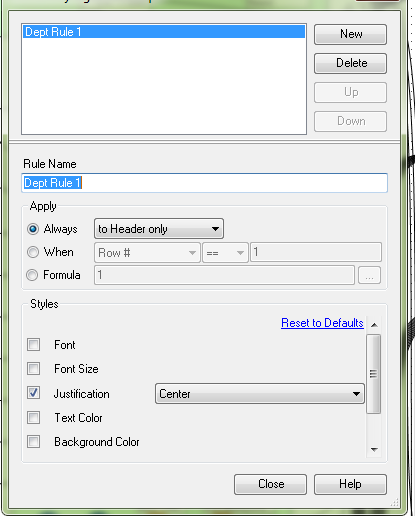
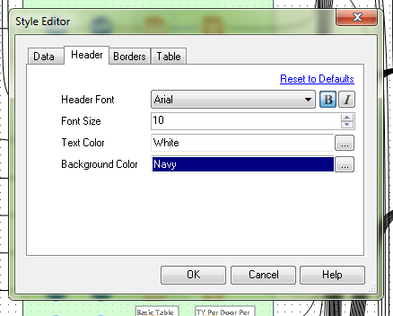
Currently, in order to change the header and data justification to CENTER, one has to select the "Column Rules" button for each column configuration. In a large report (25+ columns), that means selecting each time. It would be more efficient to have the header justification in the Default Table Settings style editor. There is already a setting for font, font size, bold or itallic, text color and background color. I have never created a report for someone where they did not want the headers centered. The workaround is to only feed one column through, then to change the column rules for that column and the Cynamic or Unknown Fields. This works fine, but when I have a report that creates an Excel workbook with 5+ tabs, it gets annoying. It's even more time consuming when I have a report tab, that I need to create sub headings for, so there are multiple report tools for one Excel tab.
-
Category Preparation
-
Category Reporting
-
Desktop Experience
It would be lovely if the Image tool supports GIFs when using the .PCXML and HTML options in the render tool. Understandably, it would use it's .PNG format when using other render options, such as PDF etc.
-
Category Reporting
-
Desktop Experience
- New Idea 229
- Accepting Votes 1,823
- Comments Requested 25
- Under Review 160
- Accepted 59
- Ongoing 5
- Coming Soon 9
- Implemented 481
- Not Planned 119
- Revisit 65
- Partner Dependent 4
- Inactive 674
-
Admin Settings
19 -
AMP Engine
27 -
API
11 -
API SDK
217 -
Category Address
13 -
Category Apps
112 -
Category Behavior Analysis
5 -
Category Calgary
21 -
Category Connectors
241 -
Category Data Investigation
76 -
Category Demographic Analysis
2 -
Category Developer
206 -
Category Documentation
78 -
Category In Database
212 -
Category Input Output
634 -
Category Interface
237 -
Category Join
101 -
Category Machine Learning
3 -
Category Macros
153 -
Category Parse
76 -
Category Predictive
77 -
Category Preparation
386 -
Category Prescriptive
1 -
Category Reporting
198 -
Category Spatial
81 -
Category Text Mining
23 -
Category Time Series
22 -
Category Transform
87 -
Configuration
1 -
Data Connectors
952 -
Data Products
1 -
Desktop Experience
1,505 -
Documentation
64 -
Engine
124 -
Enhancement
292 -
Feature Request
212 -
General
307 -
General Suggestion
4 -
Insights Dataset
2 -
Installation
24 -
Licenses and Activation
15 -
Licensing
11 -
Localization
8 -
Location Intelligence
80 -
Machine Learning
13 -
New Request
181 -
New Tool
32 -
Permissions
1 -
Runtime
28 -
Scheduler
23 -
SDK
10 -
Setup & Configuration
58 -
Tool Improvement
210 -
User Experience Design
165 -
User Settings
75 -
UX
220 -
XML
7
- « Previous
- Next »
-
 Qiu
on:
Features to know the version of Alteryx Designer D...
Qiu
on:
Features to know the version of Alteryx Designer D...
- DataNath on: Update Render to allow Excel Sheet Naming
- aatalai on: Applying a PCA model to new data
- charlieepes on: Multi-Fill Tool
- vijayguru on: YXDB SQL Tool to fetch the required data
- bighead on: <> as operator for inequality
- apathetichell on: Github support
- Fabrice_P on: Hide/Unhide password button
- simonaubert_bd on: ADBC connectivity : faster columnar storage query
- NeoInfiniTech on: Adjustable Delay for Control Containers
| User | Likes Count |
|---|---|
| 61 | |
| 17 | |
| 13 | |
| 10 | |
| 9 |