Alteryx Designer Desktop Ideas
Share your Designer Desktop product ideas - we're listening!Submitting an Idea?
Be sure to review our Idea Submission Guidelines for more information!
Submission Guidelines- Community
- :
- Community
- :
- Participate
- :
- Ideas
- :
- Designer Desktop: New Ideas
Featured Ideas
Hello,
After used the new "Image Recognition Tool" a few days, I think you could improve it :
> by adding the dimensional constraints in front of each of the pre-trained models,
> by adding a true tool to divide the training data correctly (in order to have an equivalent number of images for each of the labels)
> at least, allow the tool to use black & white images (I wanted to test it on the MNIST, but the tool tells me that it necessarily needs RGB images) ?
Question : do you in the future allow the user to choose between CPU or GPU usage ?
In any case, thank you again for this new tool, it is certainly perfectible, but very simple to use, and I sincerely think that it will allow a greater number of people to understand the many use cases made possible thanks to image recognition.
Thank you again
Kévin VANCAPPEL (France ;-))
Thank you again.
Kévin VANCAPPEL
The ability to integrate a HTML page as content in the layout, insight and render process. At the moment I create a range of advanced visualisations in Python and save them as HTML. I would like the ability to open these pages and treat them as specialised content which I can apply reporting workflow to including:
- Layout: arrange in a page layout
- Report Text: add report text as heading or comments
- Render: include in a render process
- Insight: include in an interactive dashboard as a standalone widget
-
Category Reporting
-
Desktop Experience
Migrate old R based charts and create new statistical charts in the interactive chart tool to provide enhanced statistical charting and visual data exploration capabilities.
This includes:
- Error Bars
- Distribution Plots
- 2D Histograms
- Scatterplot Matrix
- Facet & Trellis Plots
- Tree Plots
- Violin Plots
- Heatmaps
- Log Plots
- Parallel Coordinates Plot
This these URLs for more examples:
-
Category Reporting
-
Desktop Experience
-
Enhancement
I would like to see additional basic chart options from plotly in Interactive Charts including:
- Sunburst,
- Gantt,
- Bubble,
- Sankey,
- Treemap &
- Dot plots.
See this link for more examples:
-
Category Reporting
-
Desktop Experience
The ability to create, modify and enhance interactive chart types through custom plotly code in either R or Python. This would allow new style of visualisation to be created and shared with other authors.
-
Category Reporting
-
Desktop Experience
Hello,
I would like to make a suggestion for the Histogram to allow the designer to insert a Tick Mark on the Histogram.
The use case for this is displaying a Histogram of values and then showing where a single value is.
Thank You,
Michael
-
Category Reporting
-
Desktop Experience
Current insight tool can create dashboard but can not display content by user access control, for example: one insight dashboard has whole country's sales number. Would you please add an function to let different region's sales only see their own region data when log into this dashboard ?
Thanks!
-
Category Interface
-
Category Reporting
-
Desktop Experience
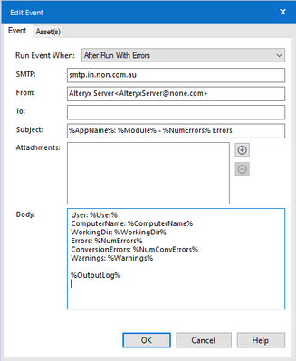
Please enable "Friendly Name" in the e-mail tool.
e.g. None <none@none.com>
When using this configuration, the workflow fails with error:
Error: Email (1): ComposerEmailInterface: Record#1 From Field contains 2 entries
"Fiendly Name" does work when sending a Workflow Event e-mail, but not in the e-mail tool.
-
Category Reporting
-
Desktop Experience
-
Tool Improvement
Could we please change the Interactive Chart tool, to:
- recognize when upstream types have changed and reconfigure (in the case of numerical types marked as string)
- For line charts - sort the values in order of the X value
Sample Flow - derivation of challenge 201:
Issue 1:
- The first interactive chart on this flow has no sorting at all performed by the charting tool - this may be due to the fact that the X & Y axes are in string fields. Generally line charts would attempt to sort both the axes and the values (where the values should order according to the X axis). Please can you add a default sort anyway?
Issue 2:
- If you then change the data types on these fields to be numeric - the charting tool still does not sort them until you reconfigure the tool manually
- REquest: please can you get the tool to remember the data types, so that it can prompt you; or even better just reconfigure?
(image looks identical after retyping the fields)
Issue 3:
- When you do a manual reconfigure of the tool after changing the types - the axes are sorted, but the values are not - so you end up with a chart that crosses back and forth. Generally line charts are ordered in the order of the X Axis for the values
- Request: Please sort values on the line chart automatically in order of the X value?
NOTE: Finally got the outcome needed by forcing the sort before the interactive chart tool
-
Category Reporting
-
Desktop Experience
For charts with a secondary Y axis, it would be helpful to be able to apply dollar signs to one Y axis and percentage signs to the other Y axis.
While the axis labels can say "These are dollars" and "These are percentages", the chart would be quicker to grasp if the units themselves were labeled.
-
Category Reporting
-
Desktop Experience
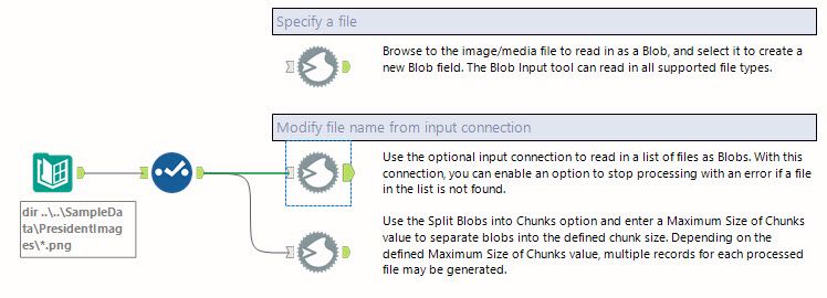
With the new intelligence suite there is a much higher use of blob files and we would like to be able to input them as a regular input instead of having to use non- standard tools like Image, report text or a combination of directory/blob or input/download to pull in images, etc. I would like to see the standard input tool capable of bringing in blob files as well.


-
API SDK
-
Category Developer
-
Category Reporting
-
Category Text Mining
There is an extensive need from customers to be able to create emails but not send them (right away at least). This would be an enhancement to the email tool to allow for checking a box to say "Save in Draft" and if that box was checked the send email functionality would not be called but the email would be created.
-
Category Reporting
-
Desktop Experience
I am relatively new to Alteryx, but to my knowledge it does not seem like you are able to create aggregate data alerts that link two data columns to each other.
My suggestion is the following: Enable Alteryx to create a data alert so if you are creating a warehouse overview (as an example) you can set an alert whenever the quantity of an item is equal to its minimum stock
Alert when: Quantity = Minimum stock
Thus, whenever your quantity is reaching a critical level, you would receive an alert either through Alteryx, in Tableau (which I use to mediate my Alteryx data) or by email.
-
Category Reporting
-
Desktop Experience
As a user, I would like to have the ability to define the default table formatting settings for font, border, font size, font style etc within the table tool so that I do not have to redefine each time I create a table.
I understand I could copy the table after doing it once and use for subsequent tables created, however it would nice to do this once and utilize this as the default for future workflows.
These settings could be defined in a report focused section of User Settings, or defined within the tool. For example, if in the tool, features could include a box to (make current settings default, revert back to factory default, etc.) Another beneficial feature would be to create "presets" that could be selected from a drop down that would automatically update the customized settings to match a previously defined combination of formatting specifications.
This could be extended further to formatting rules related to columns and tables as well, saving the time spent on setting up rules previously utilized.
-
Category Reporting
-
Desktop Experience
Hi,
I am using the Interactive Chart to create a line-chart, but I would like to have values of (X,Y AND Trace Name)
I cannot display it for the différent regions, when we move the mouse over the curve the parameter is applied only for one region.
FI: it works if i modify the xml code by adding the following code to each region:
<value>
<hoverinfo>x+y+name</hoverinfo>
</value>
Is it possible to add it directly in interactive chart ?
Thank you.
-
Category Reporting
-
Desktop Experience
Hello Alteryx Team
I would be great if you could enhance the emailing function to Include sending emails using the Microsoft Exchange Web Service (EWS). And not just SMTP as there are companies that do not Allow sending emails using SMTP but EWS is allowed.
Regards
Markus
-
Category Reporting
-
Desktop Experience
The email tool, such a great tool! And such a minefield. Both of the problems below could and maybe should be remedied on the SMTP side, but that's applying a pretty broad brush for a budding Alteryx community at a big company. Read on!
"NOOOOOOOOOOOOOOOOOOO!"
What I said the first time I ran the email tool without testing it first.
1. Can I get a thumbs up if you ever connected a datasource directly to an email tool thinking "this is how I attach my data to the email" and instead sent hundreds... or millions of emails? Oops. Alteryx, what if you put an expected limit as is done with the append tool. "Warn or Error if sending more than "n" emails." (super cool if it could detect more than "n" emails to the same address, but not holding my breath).
2. make spoofing harder, super useful but... well my company frowns on this kind of thing.
-
Category Reporting
-
Desktop Experience
-
Feature Request
-
Tool Improvement
Figuring out who is using custom macros and/or governing the macroverse is not an easy task currently.
I have started shipping Alteryx logs to Splunk to see what could be learned. One thing that I would love to be able to do is understand which workflows are using a particular macro, or any custom macros for that matter. As it stands right now, I do not believe there is a simple way to do this by parsing the log entries. If, instead of just saying 'Tool Id 420', it said 'Tool Id 420 [Macro Name]' that would be very helpful. And it would be even *better* if the logging could flag out of the box macros vs custom macros. You could have a system level setting to include/exclude macro names.
Thanks for listening.
brian
-
API SDK
-
Category Developer
-
Category Macros
-
Category Reporting
I would like to be able to email attachments to fileshare sites. I can't because the email that Alteryx sends out is missing the required header data that tells the fileshare there is an attachment.
This is what the email should have but it does not.
X-MS-Has-Attach: yes
I worked this issue with Alteryx support probably a year ago and had hoped to see this as an improvement, but it's not there.
There are other ways to get data to fileshare sites, and every single one of them has failed for various reasons. Email would by far be the simplest way if the right header data were included.
-
Category Reporting
-
Desktop Experience
The only thing I have ever found that Excel can do that Alteryx can't is creating a pivot table that allows the user to drill up and down levels of aggregation by collapsing or expanding levels in the data hierarchy. (like this).
Can you add an interactive table to the new interactive charting tool that can provide this level of functionality? It's embarrassing to have to tell Excel users they can't do this in Alteyrx, and likely leads many of them to stick to Excel--and miss out on all the other great things Alteryx can do.
Thank you!
-
Category Reporting
-
Desktop Experience
It would be really usefull if we could invert the sequencial color scale when using pie charts. For example, there are times where the greater the number is, I need it to be more red. Sometimes, I need the oposite behaviour, higher numbers having less red.
-
Category Reporting
-
Desktop Experience
- New Idea 230
- Accepting Votes 1,823
- Comments Requested 25
- Under Review 160
- Accepted 59
- Ongoing 5
- Coming Soon 9
- Implemented 481
- Not Planned 119
- Revisit 65
- Partner Dependent 4
- Inactive 674
-
Admin Settings
19 -
AMP Engine
27 -
API
11 -
API SDK
217 -
Category Address
13 -
Category Apps
112 -
Category Behavior Analysis
5 -
Category Calgary
21 -
Category Connectors
241 -
Category Data Investigation
76 -
Category Demographic Analysis
2 -
Category Developer
206 -
Category Documentation
78 -
Category In Database
212 -
Category Input Output
634 -
Category Interface
237 -
Category Join
101 -
Category Machine Learning
3 -
Category Macros
153 -
Category Parse
76 -
Category Predictive
77 -
Category Preparation
386 -
Category Prescriptive
1 -
Category Reporting
198 -
Category Spatial
81 -
Category Text Mining
23 -
Category Time Series
22 -
Category Transform
87 -
Configuration
1 -
Data Connectors
952 -
Data Products
1 -
Desktop Experience
1,506 -
Documentation
64 -
Engine
124 -
Enhancement
293 -
Feature Request
212 -
General
307 -
General Suggestion
4 -
Insights Dataset
2 -
Installation
24 -
Licenses and Activation
15 -
Licensing
11 -
Localization
8 -
Location Intelligence
80 -
Machine Learning
13 -
New Request
181 -
New Tool
32 -
Permissions
1 -
Runtime
28 -
Scheduler
23 -
SDK
10 -
Setup & Configuration
58 -
Tool Improvement
210 -
User Experience Design
165 -
User Settings
76 -
UX
220 -
XML
7
- « Previous
- Next »
-
Qiu on: Features to know the version of Alteryx Designer D...
- DataNath on: Update Render to allow Excel Sheet Naming
- aatalai on: Applying a PCA model to new data
- charlieepes on: Multi-Fill Tool
- vijayguru on: YXDB SQL Tool to fetch the required data
- bighead on: <> as operator for inequality
- apathetichell on: Github support
- Fabrice_P on: Hide/Unhide password button
- simonaubert_bd on: ADBC connectivity : faster columnar storage query
- NeoInfiniTech on: Adjustable Delay for Control Containers
| User | Likes Count |
|---|---|
| 61 | |
| 17 | |
| 13 | |
| 10 | |
| 9 |


