Alteryx Designer Desktop Ideas
Share your Designer Desktop product ideas - we're listening!Submitting an Idea?
Be sure to review our Idea Submission Guidelines for more information!
Submission Guidelines- Community
- :
- Community
- :
- Participate
- :
- Ideas
- :
- Designer Desktop : Top-Ideen
Featured Ideas
Hello,
After used the new "Image Recognition Tool" a few days, I think you could improve it :
> by adding the dimensional constraints in front of each of the pre-trained models,
> by adding a true tool to divide the training data correctly (in order to have an equivalent number of images for each of the labels)
> at least, allow the tool to use black & white images (I wanted to test it on the MNIST, but the tool tells me that it necessarily needs RGB images) ?
Question : do you in the future allow the user to choose between CPU or GPU usage ?
In any case, thank you again for this new tool, it is certainly perfectible, but very simple to use, and I sincerely think that it will allow a greater number of people to understand the many use cases made possible thanks to image recognition.
Thank you again
Kévin VANCAPPEL (France ;-))
Thank you again.
Kévin VANCAPPEL
-
Category Reporting
-
Desktop Experience
It would be very helpful to be able to export your entire workflow to a poster-sized paper, either in paper or PDF format. When explaining a workflow to others, or getting feedback, the ability to see the entire workflow or lay it out on a table is very helpful
-
Category Reporting
-
Desktop Experience
It would be great if there was a way to convert datatypes within the Table Reporting tool. The specific example that sparked this idea is calculating percentages so they are shown in the report with the decimal place moved over. Today, within the formula tool I need to calculate the percentage and then multiply it by 100 in order for it to display the way I'd like in the report. However, if I need to leverage this percentage for another formula I most likely will have to divide the percentage I calculated first by 100 before I continue my calculation.
It would be nice to not have to multiply by 100 to move the decimal place over 2 spots and instead use the table tool to convert the number into a percentage we're all used to seeing. I'm thinking something similar to excel where you can click percentage, currency, etc to convert your number.
-
Category Reporting
-
Desktop Experience
-
Category Reporting
-
Desktop Experience
I am trying to add additional functionality to my existing workflow.
We have a common workflow pushed to the Alteryx server and there will be multiple people running this workflow.
Every time the workflow is run, the expectation is that an automatic email should be sent to the person who has triggered it(and won't be sent to multiple other people).
Currently, we have it set up using the Email tool but I do not see an option to dynamically update this “To” field to automatically use the email of a person running the workflow on the server.
-
Category Reporting
-
Desktop Experience
I have found a few examples in which the formatting options can be more finely tuned when editing the XML of a workflow but is not allowed by the user interface.
Border widths are just one example. The smallest border width is 1px, whereas if you edit the XML to "0.5" and save, you will get more narrow borders.
-
Category Reporting
-
Desktop Experience
Dear Development Team,
Can we bring back to multiple-column X-axis feature for chart?
The old (depreciated) Charting Tool allows to output 2 dimensions on the X-axis in addition to having an option for "Dynamic/Unknown" column(s). This is not possible with its supposed replacement the Interactive Chart Tool.
A possible use case is Weekly Challenge #91 Challenge #91: Getting into the Weeds - Alteryx Community
If we use the current Interactive Chart Tool, we will need to manually specify 64x layers to cover all bases. Even then the solution will still fail if more "weed types" are added to the datasets.
Considering that bar/column chart is likely the most commonly used and also most basic chart, please can we either bring back the fully supported Charting Tool or add this feature to the current Interactive Chart?
Thank you.
Dawn.
-
Category Reporting
-
Desktop Experience
Recently, I posted one problem regarding on merging a column with same value using the table tool. I do have a hard time to make a solution until @HenrietteH helped on how to do it. What she showed was helped me a lot to do what I want in my module, however it would be more easier if we are going to add this feature on the table tool itself.
Thank you
-
Category Reporting
-
Desktop Experience
Hi,
Would it be possible to simplify some of the workaround processes that are needed for generating Chart Titles when using grouping by adding the potential for using the grouping variable in the Title string so that accurate descriptions can be generated. At the moment it requires the use of a Report Text tool which is not as neat if considering the output that is necessarily generated by grouping.
Only a thought,
Peter
-
Category Reporting
-
Desktop Experience
Hi,
As it is so important to be able to calculate and present time related concepts in modern businesses, it is not possible to have a better output choice? I have seen the reporting chart tool, I have looked at the TS Plot tool and even noticed that the Laboratory Charting tool has disappeared. So can you please provide an output tool that provides some focused functionality on this lacking part?
Kind regards,
Peter
-
Category Reporting
-
Category Time Series
-
Desktop Experience
This error may be encountered and replicated when you are using an image in the reporting "Header" tool where the path contains an "&". Yes this is rare, but possible and sometimes you want to keep the path, but can't update the path name. If you select the image in a path with an "&", then you'll get an error similar to the following:
Error: Report Header (36): The Action "Update Image Tool" has an error: ParseError: Unterminated entity reference, 'D' at line 2 and column 19
while processing "Action_UpdateRawXml"
A discussion began in 2016 on this topic:
Solved: Insert Image in Report Header: ParseError: Untermi... - Alteryx Community
-
Category Reporting
-
Desktop Experience
-
Enhancement
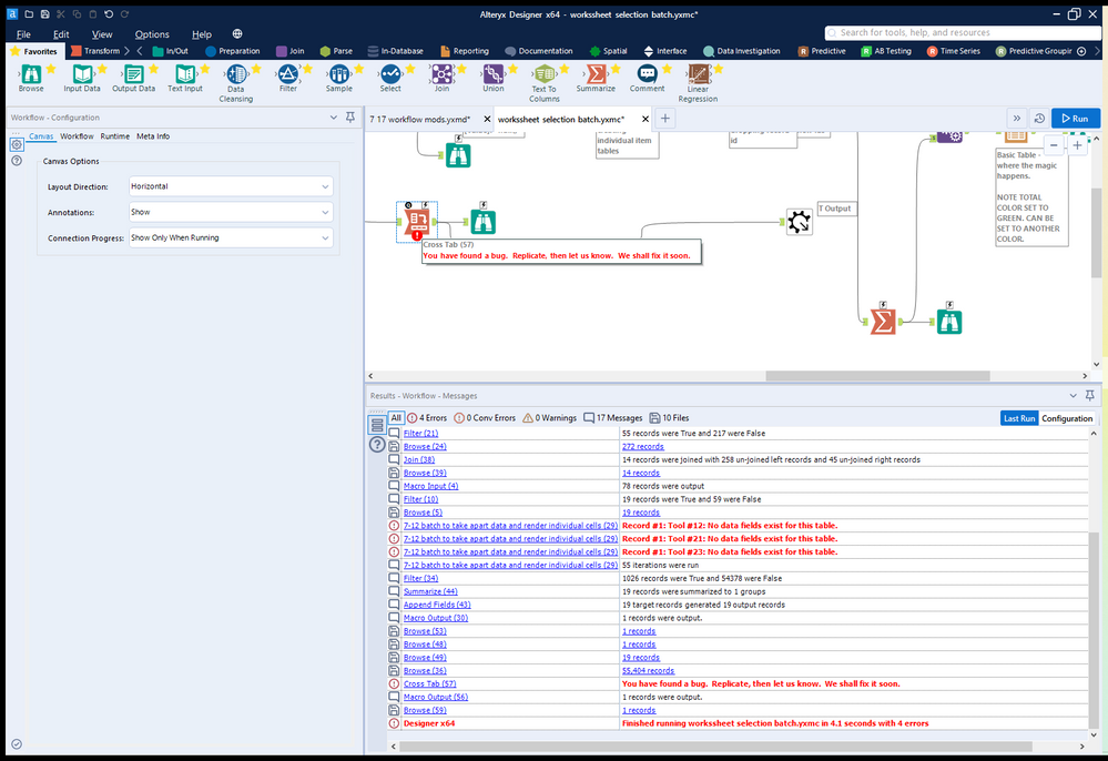
So while first and last make sense concat will crash the system. Here's a screen grab... Designer really doesn't like crosstab reporting tools set (accidentally) to concatenate 3 macros deep in a workflow. Just crashed 3 times before I tracked down the error on my system.
-
Category Reporting
-
Desktop Experience
-
Enhancement
In Interactive Charts, the only way to get user-defined input (other than automatic axis names etc.) into the chart is to add an additional column to the data which has the same content in each row and to use a batch chart.
I have two suggestions to this point:
- I would like to allow access to global Alteryx variables in any Chart text, such as "The path is [Engine.TempFilePath]". This should also work for non-batched charts.
- The current way of referring to columns in batch data is a bit odd and inconsistent to other tools. You have to type in "$" and get a list of available columns. After selecting, the dynamic test appears like static text in the configuration: If you type in "The column name is $column", you see "The column name is column" afterwards. That's quite confusing. My suggestion is to use the same nomenclature as elsewhere in Alteryx: Type in the text in brackets: "The column name is [column]". That way it would be as usual.
-
Category Reporting
-
Desktop Experience
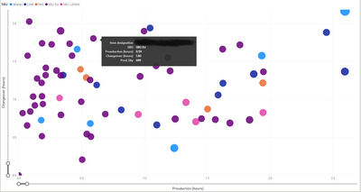
I would like to get a full legend overlay when hovering over the bubble (see example in power BI).
-
Category Reporting
-
Desktop Experience
Currently, there is a setting in the table tool to control the decimal places of all values by column. This is not only unnecessary, but it actually screws up any data that comes in where the ROWS may have different number of decimals. The only way around it is to convert everything into strings, which is annoying. Please just get rid of that column setting! Or enable the same setting inside the row rules.
-
Category Reporting
-
Desktop Experience
Hi Team,
I have a dataset of x,y values that I am plotting with an interactive chart tool. These values will vary widely so I can't use custom display ranges and have to rely on the "Auto" function for display range.
My problem is that the two axis are Auto scaled to different scaling and it is turning all my ellipse shapes into circles. Not a huge setback as you can check the Axis labels to see the scale but for this use case the shape of the data is what I am trying to portray and this makes my reports somewhat misleading.
I'm suggesting adding an option, maybe a tick box, under the interactive chart's "Auto" config that would allow both Axis to be scaled the same amount (That of the highest value).
Cheers,
Stephen
-
Category Reporting
-
Desktop Experience
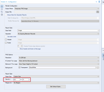
Currently users have the option of outputting to a PNG image but currently can only use Inches to get the size set. I want to be able to output with a pixel size not in inches.
-
Category Reporting
-
Desktop Experience
Alteryx crashed when I attempted to use a custom OTF font in Report Text. I thought it was supported because font options was not greyed out and preview window looked correct and I was able to resize. I clicked 'Apply' and Alteryx popup window appeared saying "only TTF font is supported". Then Alteryx crashed.
Please add OTF font support. Tableau and other packages already support it.
-
Category Reporting
-
Desktop Experience
I get the following message when running a macro with the Render tool inside
" Alteryx ppt testing1 (162) Tool #26: You have found a bug. Replicate, then let us know. We shall fix it soon."
I believe this happens when there is multiple line breaks next to each other and trying to put this into the render tool outputting to powerpoint within a table.I have the formula for updating the line breaks "Replace([Layout],"<br />","<br />")" which works when there aren't very many line breaks but now I have integrated Python to regex out HTML the Render tool has stopped working
-
Category Reporting
-
Desktop Experience
Migrate old R based charts and create new statistical charts in the interactive chart tool to provide enhanced statistical charting and visual data exploration capabilities.
This includes:
- Error Bars
- Distribution Plots
- 2D Histograms
- Scatterplot Matrix
- Facet & Trellis Plots
- Tree Plots
- Violin Plots
- Heatmaps
- Log Plots
- Parallel Coordinates Plot
This these URLs for more examples:
-
Category Reporting
-
Desktop Experience
-
Enhancement
- New Idea 249
- Accepting Votes 1.818
- Comments Requested 25
- Under Review 167
- Accepted 56
- Ongoing 5
- Coming Soon 11
- Implemented 481
- Not Planned 118
- Revisit 65
- Partner Dependent 4
- Inactive 674
-
Admin Settings
19 -
AMP Engine
27 -
API
11 -
API SDK
218 -
Category Address
13 -
Category Apps
112 -
Category Behavior Analysis
5 -
Category Calgary
21 -
Category Connectors
244 -
Category Data Investigation
76 -
Category Demographic Analysis
2 -
Category Developer
208 -
Category Documentation
80 -
Category In Database
214 -
Category Input Output
636 -
Category Interface
238 -
Category Join
102 -
Category Machine Learning
3 -
Category Macros
153 -
Category Parse
76 -
Category Predictive
77 -
Category Preparation
390 -
Category Prescriptive
1 -
Category Reporting
198 -
Category Spatial
81 -
Category Text Mining
23 -
Category Time Series
22 -
Category Transform
87 -
Configuration
1 -
Data Connectors
957 -
Data Products
1 -
Desktop Experience
1.518 -
Documentation
64 -
Engine
125 -
Enhancement
309 -
Feature Request
212 -
General
307 -
General Suggestion
4 -
Insights Dataset
2 -
Installation
24 -
Licenses and Activation
15 -
Licensing
11 -
Localization
8 -
Location Intelligence
80 -
Machine Learning
13 -
New Request
184 -
New Tool
32 -
Permissions
1 -
Runtime
28 -
Scheduler
23 -
SDK
10 -
Setup & Configuration
58 -
Tool Improvement
210 -
User Experience Design
165 -
User Settings
77 -
UX
222 -
XML
7
- « Vorherige
- Nächste »
-
caltang auf: Identify Indent Level
- simonaubert_bd auf: OpenAI connector : ability to choose a non-default...
- nzp1 auf: Easy button to convert Containers to Control Conta...
-
Qiu auf: Features to know the version of Alteryx Designer D...
- DataNath auf: Update Render to allow Excel Sheet Naming
- aatalai auf: Applying a PCA model to new data
- charlieepes auf: Multi-Fill Tool
- seven auf: Turn Off / Ignore Warnings from Parse Tools
- vijayguru auf: YXDB SQL Tool to fetch the required data
- bighead auf: <> as operator for inequality
| Benutzer | Anzahl |
|---|---|
| 212 | |
| 15 | |
| 14 | |
| 10 | |
| 9 |


