Alteryx Designer Desktop Ideas
Share your Designer Desktop product ideas - we're listening!Submitting an Idea?
Be sure to review our Idea Submission Guidelines for more information!
Submission Guidelines- Community
- :
- Community
- :
- Participate
- :
- Ideas
- :
- Designer Desktop: New Ideas
Featured Ideas
Hello,
After used the new "Image Recognition Tool" a few days, I think you could improve it :
> by adding the dimensional constraints in front of each of the pre-trained models,
> by adding a true tool to divide the training data correctly (in order to have an equivalent number of images for each of the labels)
> at least, allow the tool to use black & white images (I wanted to test it on the MNIST, but the tool tells me that it necessarily needs RGB images) ?
Question : do you in the future allow the user to choose between CPU or GPU usage ?
In any case, thank you again for this new tool, it is certainly perfectible, but very simple to use, and I sincerely think that it will allow a greater number of people to understand the many use cases made possible thanks to image recognition.
Thank you again
Kévin VANCAPPEL (France ;-))
Thank you again.
Kévin VANCAPPEL
Could you please add a second/separate opacity setting for polygons? Many times I'd like to have a solid border around a trade area, but with about a 50% opacity setting for the fill.
Thanks!
-
Category Reporting
-
Category Spatial
-
Desktop Experience
-
Location Intelligence
When testing I often need to check single (or a handful of numbers) throughout the workflow. I have to click on each browse to check the numbers. A tool that rendered the output of multiple fields throughout the workflow would allow me to check if I was dropping any rows or miscalculating at a glance.
For instance if at the beginning of a workflow the row count was 15,951 and the cohort size was 328. Also the sum of profit for the cohort was £1,934,402 and the count of sales was 1,584. Remember those? Not if you have to click on the browse tool multiple times all the way through a large workflow to make sure you keep these figures intact. Copying out into excel or popping out the data from browse are the only options, each fiddly when trying to alter things quickly.
A resizable output window such as the explorer window would uber-useful.
Thanks
-
Category Documentation
-
Category Input Output
-
Category Reporting
-
Data Connectors
Just like having an e-mail sender,
I'would love to have an SMS sender as well for automated sending marketing SMS messages...
- probably it can be done with a free SMS API found over the web or
- better It can be provided as a service from Alteryx Gallery... Country by countyr availability to sendin sms'

- Can be used for 2 step verifications
- marketing messages
- campaign enrollment etc.
Best
-
Category Reporting
-
Desktop Experience
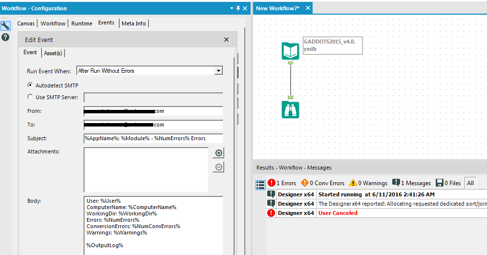
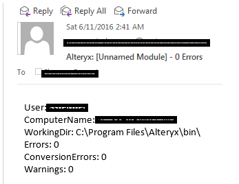
Issue: Even though the Send Email event is configured for the After Run Without Errors setting in the Workflow Configuration it still sends an email when the execution of workflow is cancelled. I think only the Before Run event should be allowed to trigger in this case.
App: Alteryx Designer x64
Version: 10.5.9.15014


-
Category Reporting
-
Desktop Experience
-
Tool Improvement
It would be great to connect the email tool with MS Exchange without SMTP, because in my company the policy is to not use any SMTP (therefore its blocked) .
For this reason I am not able to use the email tool..
-
Category Reporting
-
Desktop Experience
Once you get the hang of it, Alteryx is great at producing reports. Unfortunately, each item has its own XML parameters, like font size, colors, table defaults, etc. As it stands now, if I want to make a change across the course of a complex, multi-page report, I have to update the settings in each table and chart.
I'd love it if I could have a 'Styles' module that I could set, then copy and paste and insert after each table. From that point, I suppose you could make parameters out of style options and build them into a bigger module. For now, though, some kind of reusable style would be invaluable.
-
Category Reporting
-
Desktop Experience
I understand that Server and Designer + Scheduler versions have the option to "cancel workflows running longer than X”.
I'd like to see that functionality in the desktop edition as well.
-
Category Reporting
-
Desktop Experience
-
Engine
-
Runtime
I have been going back and forth between output tool and render tool. The render tool works well when you want formatting. It's also great when you don't want an output created (when rec count=0) while output tool always generates a file regardless if there are records present or not. Output tool works well when you have a lot of fields but then you cannot easily control styling.
My issue is that I have a render tool connected to table tool. In the table tool everything looks neat; there's no wrapped text and no unnecessary white space (auto column width not necessary). However, with the render output, you don't know what to expect. Especially, when you have a lot of fields (30+) data gets truncated and column width is forcibly narrowed due to paper dimensions used in render tool. I skip letter and tabloid formats and now I have to mess with custom paper width (e.g.50) to get my reports looking right and when you have dynamic fields, this is not ideal.
Would it be possible to make the paper size/width automatic in the render tool just like in the table and layout tool? Then this tool also doesn't negate what layout/table tools do so well.
-
Category Reporting
-
Desktop Experience
In the old charting tool, you could change the order of the series by moving them up or down. This feature has been eliminated from the new charting tool. I want sales percent to be the top bar, but despite which 'series' I put it in, inventory percent is the top bar, as the order appears to be alphabetic. It would be nice to have that option added back in.
In the new charting tool, you can adjust the number of decimal places for your series, which is great. Adding '%' as a suffix to the series label would be nice. There is an option to add prefix/suffix to the axis label, but not to the series.
Horizontal axis (x-axis) displays at an angle. Having an alignment option (center; vertical; horizontal; etc.) is preferable.
-
Category Reporting
-
Desktop Experience
In the Report Map tool, I'm locked from changing the 'Background Color' menu, and the color appears to be set to R=253, G=254, B=255, which is basically white.
However, when we use our TomTom basemap, we see that the background is actually blue, despite what's listed in the Background Color window. (This goes beyond the 'Ocean' layer, and appears to cover all space 'under' the continents and ocean.) Since we oftren print large maps of the east coast, this tends to use a lot of blue ink. I've attached a sample image to illustrate this.
My solve to-date has been to edit the underlying TeleAtlas text file and change the default background (117 157 181) to white (255 255 255). Unfortunately, we lose these changes with each data update.
Could Alteryx unlock the Background Color menu, and have it affect the 'base' layer, underneath oceans and continents in TomTom maps? Not sure how it might affect aerial imagery.
-
Category Reporting
-
Category Spatial
-
Desktop Experience
-
Location Intelligence
Would it be possible to add the capability to import or build a CSS for reporting in a future release, I am sure I am not the first to think about having Style Sheets in reports so you do not have to define fonts, colors and all that HTML stuff to each output line.
-
Category Reporting
-
Desktop Experience
Currently, when creating scatter graphs you are unable to order the plots based on a sub-group of the data (ie the legend). It would be nice to have the ability to pick which part of the legend is displayed first, above the other data plots. Could we also have the option to take the 3D element off the scatter graph plots?
Thanks,
Oliver
-
Category Reporting
-
Desktop Experience
There is currently no way to export interactive output from the network graph tool. I would like to be able to export a png of the static network graph image, a pdf of the report, and a complete html of the whole (which means including the JSON and vis.js files necessary for creating the report).
-
Category Interface
-
Category Macros
-
Category Reporting
-
Desktop Experience
It would be nice to tie the labels to the spatial objects being labeled.
-
Category Reporting
-
Desktop Experience
For the Charting tool, specify descending/reverse order for a Bar Chart type, so that it puts the largest value at the top.
-
Category Reporting
-
Desktop Experience
Alteryx crashed when I attempted to use a custom OTF font in Report Text. I thought it was supported because font options was not greyed out and preview window looked correct and I was able to resize. I clicked 'Apply' and Alteryx popup window appeared saying "only TTF font is supported". Then Alteryx crashed.
Please add OTF font support. Tableau and other packages already support it.
-
Category Reporting
-
Desktop Experience
It would be very helpful to have hidden/interactive labels that can be utilized for an Report Map that only appear when the user is hovering over a specific part of the map. For example they only want to see the sales numbers for California, but do want to change the map. It probably makes the most sense to have this available for the HTML Report Maps. This would allow the report map to not look too crowded with labels, but still have the labels available if the user is interested in a particular part of the map. Is this something that can eventually be added to the report map tool?
-
Category Reporting
-
Desktop Experience
Hi,
I've been working on reporting for a while now and figure out that creatitng sub total wasn't part of any tool.
Any chance this could be implemented in next versions or any macro available?
Thanks
Simon
-
Category Reporting
-
Desktop Experience
I would love to see the option to publish the description information from an alteryx workflow into Tableau tde files as the default comment field
-
Category Reporting
-
Desktop Experience
-
Category Reporting
-
Desktop Experience
- New Idea 249
- Accepting Votes 1,818
- Comments Requested 25
- Under Review 167
- Accepted 56
- Ongoing 5
- Coming Soon 11
- Implemented 481
- Not Planned 118
- Revisit 65
- Partner Dependent 4
- Inactive 674
-
Admin Settings
19 -
AMP Engine
27 -
API
11 -
API SDK
218 -
Category Address
13 -
Category Apps
112 -
Category Behavior Analysis
5 -
Category Calgary
21 -
Category Connectors
244 -
Category Data Investigation
76 -
Category Demographic Analysis
2 -
Category Developer
208 -
Category Documentation
80 -
Category In Database
214 -
Category Input Output
636 -
Category Interface
238 -
Category Join
102 -
Category Machine Learning
3 -
Category Macros
153 -
Category Parse
76 -
Category Predictive
77 -
Category Preparation
390 -
Category Prescriptive
1 -
Category Reporting
198 -
Category Spatial
81 -
Category Text Mining
23 -
Category Time Series
22 -
Category Transform
87 -
Configuration
1 -
Data Connectors
957 -
Data Products
1 -
Desktop Experience
1,518 -
Documentation
64 -
Engine
125 -
Enhancement
309 -
Feature Request
212 -
General
307 -
General Suggestion
4 -
Insights Dataset
2 -
Installation
24 -
Licenses and Activation
15 -
Licensing
11 -
Localization
8 -
Location Intelligence
80 -
Machine Learning
13 -
New Request
184 -
New Tool
32 -
Permissions
1 -
Runtime
28 -
Scheduler
23 -
SDK
10 -
Setup & Configuration
58 -
Tool Improvement
210 -
User Experience Design
165 -
User Settings
77 -
UX
222 -
XML
7
- « Previous
- Next »
-
caltang on: Identify Indent Level
- simonaubert_bd on: OpenAI connector : ability to choose a non-default...
- nzp1 on: Easy button to convert Containers to Control Conta...
-
Qiu on: Features to know the version of Alteryx Designer D...
- DataNath on: Update Render to allow Excel Sheet Naming
- aatalai on: Applying a PCA model to new data
- charlieepes on: Multi-Fill Tool
- seven on: Turn Off / Ignore Warnings from Parse Tools
- vijayguru on: YXDB SQL Tool to fetch the required data
- bighead on: <> as operator for inequality
