Alteryx Designer Desktop Ideas
Share your Designer Desktop product ideas - we're listening!Submitting an Idea?
Be sure to review our Idea Submission Guidelines for more information!
Submission Guidelines- Community
- :
- Community
- :
- Participate
- :
- Ideas
- :
- Designer Desktop
Featured Ideas
Hello,
After used the new "Image Recognition Tool" a few days, I think you could improve it :
> by adding the dimensional constraints in front of each of the pre-trained models,
> by adding a true tool to divide the training data correctly (in order to have an equivalent number of images for each of the labels)
> at least, allow the tool to use black & white images (I wanted to test it on the MNIST, but the tool tells me that it necessarily needs RGB images) ?
Question : do you in the future allow the user to choose between CPU or GPU usage ?
In any case, thank you again for this new tool, it is certainly perfectible, but very simple to use, and I sincerely think that it will allow a greater number of people to understand the many use cases made possible thanks to image recognition.
Thank you again
Kévin VANCAPPEL (France ;-))
Thank you again.
Kévin VANCAPPEL
For charts with a secondary Y axis, it would be helpful to be able to apply dollar signs to one Y axis and percentage signs to the other Y axis.
While the axis labels can say "These are dollars" and "These are percentages", the chart would be quicker to grasp if the units themselves were labeled.
-
Category Reporting
-
Desktop Experience
It would be great to be able to display a table to the "Insights" section of the gallery - ideally one that can have formatting (eg row rules and column rules as per basic table tool)
-
Category Reporting
-
Desktop Experience
Hi Alteryx Community and Developers!
Since the autodetect smtp was removed from Alteryx Designer, it's much more harder to send e-mails within the company (too many different e-mail addresses).
In place of autodetect, what do you think about to take the SMTP from field (like cc, bcc, subject, etc.)?
Please keep me posted about it 🙂
Thanks and all the best for the Community!
Kucsi
-
Category Reporting
-
Desktop Experience
Figuring out who is using custom macros and/or governing the macroverse is not an easy task currently.
I have started shipping Alteryx logs to Splunk to see what could be learned. One thing that I would love to be able to do is understand which workflows are using a particular macro, or any custom macros for that matter. As it stands right now, I do not believe there is a simple way to do this by parsing the log entries. If, instead of just saying 'Tool Id 420', it said 'Tool Id 420 [Macro Name]' that would be very helpful. And it would be even *better* if the logging could flag out of the box macros vs custom macros. You could have a system level setting to include/exclude macro names.
Thanks for listening.
brian
-
API SDK
-
Category Developer
-
Category Macros
-
Category Reporting
There should be an in built option in the Email Tool to send only one email instead of sending emails equivalent to the number of records in the attached file.
Currently, it requires to add Unique tool before the Email Tool.
-
Category Reporting
-
Desktop Experience
Alteryx's spatial tools are really powerful and offer a lot of value for analysis. However, when rendering a map for output, there is currently no way to place an image inside of a polygon. This feature would be very useful for customized layers on maps and other spatial-based processes.
My rough suggestion would be to scale a selected image to the size of the polygon's bounding rectangle, and then trim the edges of the image to fit inside the polygon itself.
-
Category Reporting
-
Category Spatial
-
Desktop Experience
-
Location Intelligence
Just like having an e-mail sender,
I'would love to have an SMS sender as well for automated sending marketing SMS messages...
- probably it can be done with a free SMS API found over the web or
- better It can be provided as a service from Alteryx Gallery... Country by countyr availability to sendin sms'

- Can be used for 2 step verifications
- marketing messages
- campaign enrollment etc.
Best
-
Category Reporting
-
Desktop Experience
I get a lot of requests to replicate the Excel Table format into Alteryx output. When I use Reporting-Table tool, I have option to choose border, give color and size. No dotted border format or any other border formats which excel offers.
-
Category Reporting
-
Desktop Experience
In the old charting tool, you could change the order of the series by moving them up or down. This feature has been eliminated from the new charting tool. I want sales percent to be the top bar, but despite which 'series' I put it in, inventory percent is the top bar, as the order appears to be alphabetic. It would be nice to have that option added back in.
In the new charting tool, you can adjust the number of decimal places for your series, which is great. Adding '%' as a suffix to the series label would be nice. There is an option to add prefix/suffix to the axis label, but not to the series.
Horizontal axis (x-axis) displays at an angle. Having an alignment option (center; vertical; horizontal; etc.) is preferable.
-
Category Reporting
-
Desktop Experience
In the Report Map tool, I'm locked from changing the 'Background Color' menu, and the color appears to be set to R=253, G=254, B=255, which is basically white.
However, when we use our TomTom basemap, we see that the background is actually blue, despite what's listed in the Background Color window. (This goes beyond the 'Ocean' layer, and appears to cover all space 'under' the continents and ocean.) Since we oftren print large maps of the east coast, this tends to use a lot of blue ink. I've attached a sample image to illustrate this.
My solve to-date has been to edit the underlying TeleAtlas text file and change the default background (117 157 181) to white (255 255 255). Unfortunately, we lose these changes with each data update.
Could Alteryx unlock the Background Color menu, and have it affect the 'base' layer, underneath oceans and continents in TomTom maps? Not sure how it might affect aerial imagery.
-
Category Reporting
-
Category Spatial
-
Desktop Experience
-
Location Intelligence
I don't believe there is a way to add a pattern/texture to a bar chart created in the Interactive Charting tool. This feature would enhance the accessibility of the charts created natively out of Alteryx.
Example from Plotly: https://plotly.com/python/pattern-hatching-texture/
-
Category Reporting
-
Desktop Experience
14 is a bit large to have as the default text size in the Report Text Tool. Can we make it a "normal" size like 11 or 12? I am always forgetting to change it when setting up automated emails, and have to go back and edit it.
Can either be a setting, or we should just change the default to a normal size.
Text in this post set to 14(4 looked close) for effect.
Thanks!
-
Category Reporting
-
Desktop Experience
Could you please add a second/separate opacity setting for polygons? Many times I'd like to have a solid border around a trade area, but with about a 50% opacity setting for the fill.
Thanks!
-
Category Reporting
-
Category Spatial
-
Desktop Experience
-
Location Intelligence
Hello,
I would like to make 2 suggestions in regards to the Table Tool.
1) The ability to format all of your tables in a workflow at once or the ability to set up a default theme for tables. I may have many table outputs in one report and if I want to change the font in the header I have to go to each table icon and change the configuration one at a time. Generally, I set up the first one then cut and paste it for all of the other tables in my report but if I have to go back and change something it is a real challenge. I am working on a report with 20 table outputs and have to change the header font in each one.... not fun.
2) The ability to change the header justification in the default table settings rather than have to change it in each column. The same report I mentioned has a minimum of 5 fields in each table that is a minimum of 100 adjustments just to have centered field names. A HUGE waste of time. An alternative would be to have centered field headings as the default. I may be wrong but I think the majority of reports have centered field headings.
Thank you for a great product and for listening
Abi
-
Category Reporting
-
Desktop Experience
It would be great to connect the email tool with MS Exchange without SMTP, because in my company the policy is to not use any SMTP (therefore its blocked) .
For this reason I am not able to use the email tool..
-
Category Reporting
-
Desktop Experience
Please add the option to save any of the other report formats to Dropbox (.xlsx, .pdf, .pptx, .html, etc.).
-
Category Reporting
-
Desktop Experience
We are working with an industry leading RPA platform, and they have a very helpful feature built in where the platform keeps track of the ROI from usage of the product.
It feels like this is a very useful capability to have within Alteryx - we can base this on some simple assumptions, and if we make this part of the heads-up monitoring capability for the platform we can then avoid (or answer) all those questions about justifying the cost of the Alteryx licensing.
-
Category Reporting
-
Desktop Experience
Hi All,
It would be so helpful in the table tool in Alteryx if we have feature like rotating table headers from horizontal to Vertical(-90 degree). It helps in formatting like it consumes less space when we have lengthy headers while putting multiple charts in a single slide of PPT.
Thanks in Advance!!
-
Category Reporting
-
Desktop Experience
Hello,
First of all Many thanks to the team for the revamp of the reporting tools. It's so nice to see it's getting a bit more dynamic.
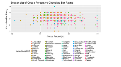
- I'd love to have more options extended to the graph, such as being able to add 3 dimensions to a scatter plot, just like below

- Or being able to have dynamic plot size such as :
- Or again, being able to have a filter in the Interactive Chart (just like the one in the insight tool) would be a great feature to have
- Having Bart chart in differents orientation
Thanks for reading!
-
Category Reporting
-
Desktop Experience
It would be great to be able to output a report to Adobe Illustrator (.ai). This would allow us to refine the presentation, or hand it off to a graphics department to do that for us. It would especially be great for the map reporting tool, as many GIS people finish maps in AI to give a more polished result. This would allow Alteryx to compete better with Esri as far as map creation.
I can only really speak to map creation, but please comment if you have another use case.
-
Category Reporting
-
Desktop Experience
- New Idea 249
- Accepting Votes 1,818
- Comments Requested 25
- Under Review 167
- Accepted 56
- Ongoing 5
- Coming Soon 11
- Implemented 481
- Not Planned 118
- Revisit 65
- Partner Dependent 4
- Inactive 674
-
Admin Settings
19 -
AMP Engine
27 -
API
11 -
API SDK
218 -
Category Address
13 -
Category Apps
112 -
Category Behavior Analysis
5 -
Category Calgary
21 -
Category Connectors
244 -
Category Data Investigation
76 -
Category Demographic Analysis
2 -
Category Developer
208 -
Category Documentation
80 -
Category In Database
214 -
Category Input Output
636 -
Category Interface
238 -
Category Join
102 -
Category Machine Learning
3 -
Category Macros
153 -
Category Parse
76 -
Category Predictive
77 -
Category Preparation
390 -
Category Prescriptive
1 -
Category Reporting
198 -
Category Spatial
81 -
Category Text Mining
23 -
Category Time Series
22 -
Category Transform
87 -
Configuration
1 -
Data Connectors
957 -
Data Products
1 -
Desktop Experience
1,518 -
Documentation
64 -
Engine
125 -
Enhancement
309 -
Feature Request
212 -
General
307 -
General Suggestion
4 -
Insights Dataset
2 -
Installation
24 -
Licenses and Activation
15 -
Licensing
11 -
Localization
8 -
Location Intelligence
80 -
Machine Learning
13 -
New Request
184 -
New Tool
32 -
Permissions
1 -
Runtime
28 -
Scheduler
23 -
SDK
10 -
Setup & Configuration
58 -
Tool Improvement
210 -
User Experience Design
165 -
User Settings
77 -
UX
222 -
XML
7
- « Previous
- Next »
-
caltang on: Identify Indent Level
- simonaubert_bd on: OpenAI connector : ability to choose a non-default...
- nzp1 on: Easy button to convert Containers to Control Conta...
-
Qiu on: Features to know the version of Alteryx Designer D...
- DataNath on: Update Render to allow Excel Sheet Naming
- aatalai on: Applying a PCA model to new data
- charlieepes on: Multi-Fill Tool
- seven on: Turn Off / Ignore Warnings from Parse Tools
- vijayguru on: YXDB SQL Tool to fetch the required data
- bighead on: <> as operator for inequality

