Alteryx Designer Desktop Ideas
Share your Designer Desktop product ideas - we're listening!Submitting an Idea?
Be sure to review our Idea Submission Guidelines for more information!
Submission Guidelines- Community
- :
- Community
- :
- Participate
- :
- Ideas
- :
- Designer Desktop: New Ideas
Featured Ideas
Hello,
After used the new "Image Recognition Tool" a few days, I think you could improve it :
> by adding the dimensional constraints in front of each of the pre-trained models,
> by adding a true tool to divide the training data correctly (in order to have an equivalent number of images for each of the labels)
> at least, allow the tool to use black & white images (I wanted to test it on the MNIST, but the tool tells me that it necessarily needs RGB images) ?
Question : do you in the future allow the user to choose between CPU or GPU usage ?
In any case, thank you again for this new tool, it is certainly perfectible, but very simple to use, and I sincerely think that it will allow a greater number of people to understand the many use cases made possible thanks to image recognition.
Thank you again
Kévin VANCAPPEL (France ;-))
Thank you again.
Kévin VANCAPPEL
Is it possible to have Output like below in Insight?
Ozone | Solar.R | Wind | Temp | Month | Day |
41 | 190 | 7.4 | 67 | 5 | 1 |
36 | 118 | 8 | 72 | 5 | 2 |
12 | 149 | 12.6 | 74 | 5 | 3 |
18 | 313 | 11.5 | 62 | 5 | 4 |
-
Category Reporting
-
Desktop Experience
-
Category Reporting
-
Desktop Experience
Hi,
I'm not finding it anywhere as a current option, but my company uses branded PowerPoint slides using our logo, these slides are in 16.:9 (widescreen) for slide size, but Alteryx won't output to that size even if I choose custom for page size & have Widescreen selected as an option. Could there be an Advanced Options button added that would allow users more output choices, like choosing the 16:9 ratio size output? Without it, I'm having to output the largest map I can create (13 x 9.75 in Report Map tool) and then stretch/shrink to get it to fit the 16:9 slide...for every single map/slide (currently making 40 maps at once).
Is there a work around to accomplish my goal currently? And if not, could the option be added to the Render tool? Thank you!
-
Category Input Output
-
Category Interface
-
Category Preparation
-
Category Reporting
We would like to see more configuration options for renders to PowerPoint PPT. Specifically, we would like to be able to add headers, footers, and repeat column headers in the same way we can with PDF renders.
Refer to this unresolved question:
Powerpoint as an output of macro
-
Category Reporting
-
Desktop Experience
I was discussing these suggestions with our Account Manager last year and was advised that they would be taken into consideration for the planned 2018 Reporting upgrades. When I inquired about the status, I was advised to post here.
- Add “Freeze Panes” option
- RENDER multiple formatted Tables into 1 Excel file, each on its own NAMED tab (If you use the OUTPUT tool, you cannot format the data. If you RENDER you cannot name the tabs or export multiple tabs to one file)
- Changing the column width from “inches” to “number of characters”
-
Category Reporting
-
Desktop Experience
Hi,
I am sure that I can't be the only person that would be interested in an output tool that allows categorical fields on both axes. THis would allow you to visualise the following example and I would suggest that this was either similar to the heatmap with boxes or the colour / size of the entry was determined by a third numerical value - such as 'Confidence' from the table below. THere might be ways to extend the idea as well as having a fourth parameter that puts text in the box or another number but it would be useful and not too hard I am sure.
LHS | RHS | Support | Confidence | Lift | NA |
{Carrots Winter} | {Onion} | 5.01E-02 | 0.707070707 | 1.298568507 | 210 |
{Onion} | {Carrots Winter} | 5.01E-02 | 9.20E-02 | 1.298568507 | 210 |
{Carrots} | {Onion} | 4.39E-02 | 0.713178295 | 1.309785378 | 184 |
{Onion} | {Carrots} | 4.39E-02 | 8.06E-02 | 1.309785378 | 184 |
{Peas} | {Onion} | 3.20E-02 | 0.428115016 | 0.786253301 | 134 |
{Onion} | {Peas} | 3.20E-02 | 5.87E-02 | 0.786253301 | 134 |
{Bean} | {Onion} | 2.20E-02 | 0.372469636 | 0.68405795 | 92 |
{Carrots Nantaise} | {Onion} | 2.08E-02 | 0.483333333 | 0.88766433 | 87 |
Many thanks in advance for considering this,
Peter
-
Category Input Output
-
Category Reporting
-
Data Connectors
-
Desktop Experience
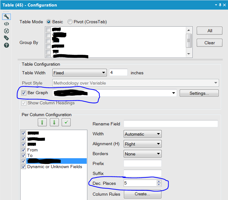
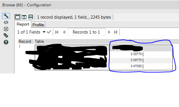
I've added a table tool that also has the bar graph enabled. The data I'm basing the bar graph off of is set to 5 decimal precision, but the bars round to the nearest whole number, making the feature essentially pointless in my scenario. Is there a way to have the bars dynamically adjust to the amount of decimal precision? I'm guessing most folks are exporting their data to a viz tool and not many folks are using the table tool in this context.
-
Category Reporting
-
Desktop Experience
Hello Community & Devs!
This idea consists of a couple of requests that are related to the same topic - table styling using the formula field. As most probably know, the table tool offers column/row specific formatting. Some of the basic formatting offered in the configuration are: fonts, texts colors, and backgrounds. For anything that doesn't fall into these types of formatting rules, there is a "Formula" option that allows the user to define CSS-like statements to format the selected column, row, or cell. Related to this formula, I have two requests:
- I would like a double border to be included as an option. After speaking with a support engineer, they do not believe this is currently available. The double border is used in most financial documents as the "sum line". I see a lot of uses for this, especially in my industry. I would expect a formula like this: "border-top: 1px solid double black;" to give a result like this:
Desired OutputBut it gives a result like this:
Current Alteryx Output
- I would like to see additional documentation on this Style Formula field so users have a reference when attempting to do advanced styling on a table. I don't think it's sufficient to say, "Use of this requires a solid understanding of CSS styles" if all CSS styling options aren't available. Documentation would at least let us know that what we are attempting to do isn't possible.
Thanks for considering my ideas!
-Nick
-
Category Reporting
-
Desktop Experience
Hi,
This feature isn't a must - but would definitely be a nice to have.
Similar to the excel having a tab with key figures like average, count and sum
It would be a really good idea to do something similar within Alteryx just to have a quick glance on key figures/functions (example attached - apologise for the bad paint job but definitely would look good with Alteryx colour scheme)
Thanks
-
Category Data Investigation
-
Category Input Output
-
Category Reporting
-
Category Transform
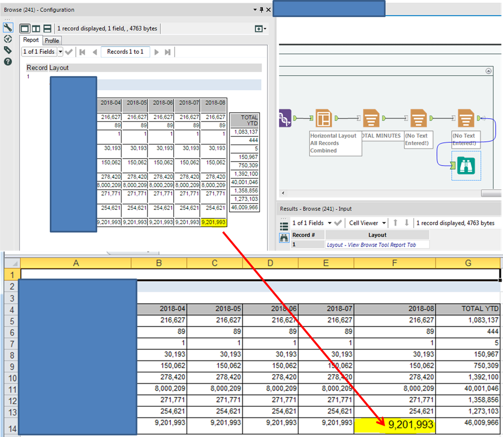
This appears to be a bug with either the Layout Tool or the Render Tool. When I setup two Tables using the Horizontal Layout Tool and export to Excel using the Render tool, the font size of the bottom-right cell of the first table is too large. No amount of changing the font properties within the Alteryx Reporting tools appears to fix this.
-
Category Reporting
-
Desktop Experience
It would be very helpful to be able to export your entire workflow to a poster-sized paper, either in paper or PDF format. When explaining a workflow to others, or getting feedback, the ability to see the entire workflow or lay it out on a table is very helpful
-
Category Reporting
-
Desktop Experience
It would be great if there was a way to convert datatypes within the Table Reporting tool. The specific example that sparked this idea is calculating percentages so they are shown in the report with the decimal place moved over. Today, within the formula tool I need to calculate the percentage and then multiply it by 100 in order for it to display the way I'd like in the report. However, if I need to leverage this percentage for another formula I most likely will have to divide the percentage I calculated first by 100 before I continue my calculation.
It would be nice to not have to multiply by 100 to move the decimal place over 2 spots and instead use the table tool to convert the number into a percentage we're all used to seeing. I'm thinking something similar to excel where you can click percentage, currency, etc to convert your number.
-
Category Reporting
-
Desktop Experience
It would be lovely if the Image tool supports GIFs when using the .PCXML and HTML options in the render tool. Understandably, it would use it's .PNG format when using other render options, such as PDF etc.
-
Category Reporting
-
Desktop Experience
In user settings you can define a "Logging Directory" and if you do the system will send the Output Log (Results view messages) to a file in that folder. The name generated is Alteryx_Log_ + an apparent sequential number, example: Alteryx_Log_1519833221_1.
This makes it impossible to identify which flow it is associated with and which instance of execution simply by looking at the name, you have to parse the content to see the flow name and start/end timestamps. For trouble shooting we want to be able to look at the list of file names and quickly see which file, of possibly hundreds of files, we need to look at to see what went wrong.
-
Category Reporting
-
Desktop Experience
Roughly, in all versions of Alteryx Designer, you can use the Annotations tab and rename a tool. This is awesome for execution in designer, because you can then easily search for certain tool names, better document your workflow, and see the custom tool name in the Workflow Results.
However, when log files are generated, either via email, the AlteryxGallery settings, or an AlteryxEngineCMD command, each tool is recorded using only its default name of "ToolId Toolnumber", which is not particularly descriptive and makes these log files harder to parse in the case of an error.
Having the custom names show in these log files would go a long way towards improving log readability for enterprise systems, and would be an amazing feature add/fix. For users who prefer that the default format be shown, this could be considered as a request to ADD renames in addition to the existing format. EG "Input Data 1" that I have renamed to "Load business Excel File" could be shown in the log as:
00:00:0.003 - ToolId 1 - Load business Excel File: 1 record was read from File Finished in 00:00:0.004
-
Category Reporting
-
Desktop Experience
-
General
Scenario:
Upstream tools end in a Summarize Tool that has set of records with the following fields: EmailAddress, AttachmentUNCPath. So you get a bunch of recipients with various attachments. Each recipient can have different attachments, and this will change each time it's run. In other words, it's fully dynamic.
If the same recipient has multiple attachments, then it would be nice to group the recipient and just separate the attachments with a semi-colon (or whatever) in the same field. Essentially creating one record per recipient, and therefore one email per recipient, and having the Email Tool attach each file. In other words, mbarone@paychex.com gets one email with 5 attachments. And next week maybe only 3 attachments, and so on.
Currently the only way I see to accomplish this is with a batch macro.
Would be infinitely more convenient to just have the Email Tool by default accept multiple attachments in a field as long as they are separated by a semi-colon, much like occurs in the "to" field.
-
Category Reporting
-
Desktop Experience
The chart tool is really nice to create quick graphics efficiently, especially when using a batch macro, but the biggest problem I have with it is the inability to replace the legend icon (the squiggle line) with just a square or circle to represent the color of the line. The squiggly line is confusing and I think the legend would look crisper with a solid square, or circle, or even a customized icon!
Thank You!!!!
-
Category Preparation
-
Category Reporting
-
Desktop Experience
I would like an separate tool for rendering excel file, or more options in the render tool. Currently you have to manually give the size of the output sheet, and it makes all of the columns on the spreadsheet look odd. Having additional options like "Auto page size" would be tremendous.
-
Category Input Output
-
Category Reporting
-
Data Connectors
-
Desktop Experience
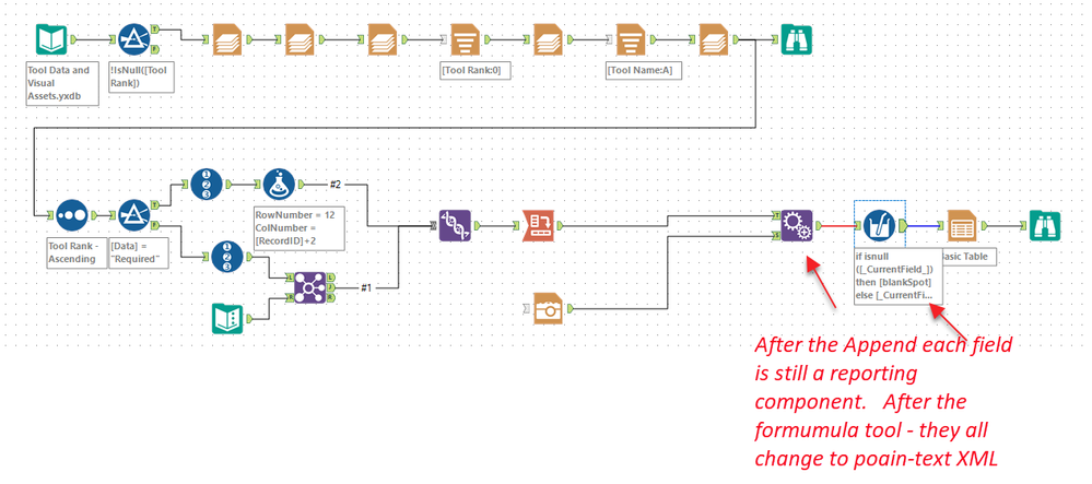
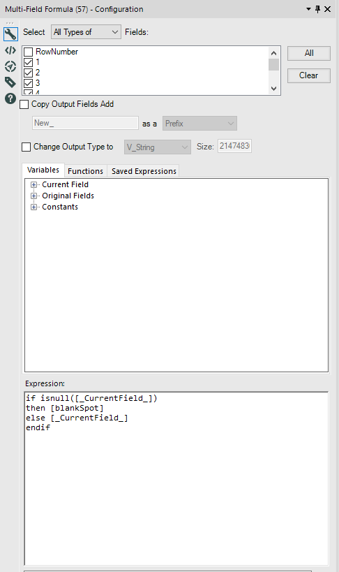
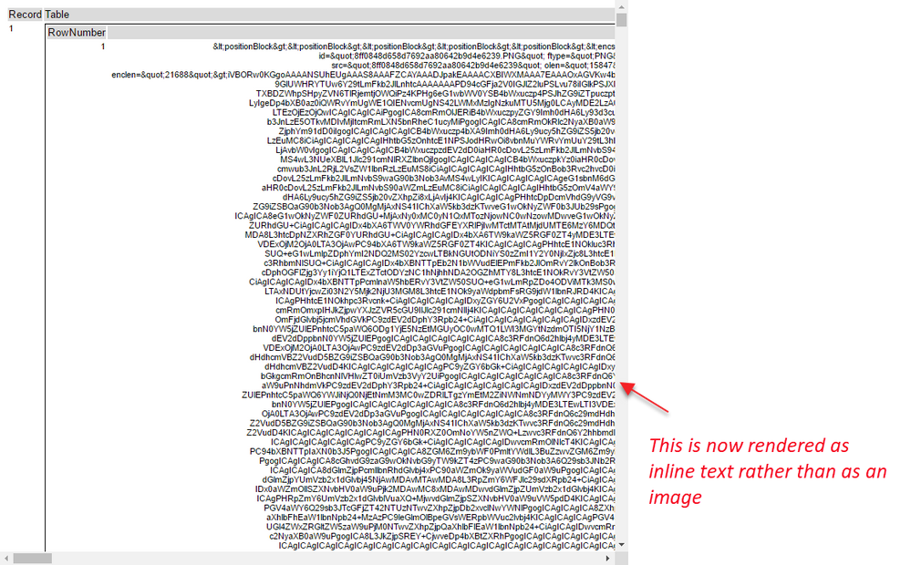
While completing the weekly challenge number 98, @patrick_digan and I noticed some unexpected behaviours while processing images.
Details:
When doing basic functions on fields containing reporting snippets - these fields lose their type and cease to work as reporting snippets. Detail in screenshots below.


-
Category Preparation
-
Category Reporting
-
Desktop Experience
In Table tool column headings using the table and render tools should offer ability to wrap and justify (horizontal and vertical). right now you can justify a column and the heading may or may not stack (wrap) based on table size and the width configuration in the table tool. I wish you could give a it more control like we have in Excel, for example left justified and wrap for a column heading with blanks separating words results in auto stacking the words based on column width, auto or manual width control.
-
Category Reporting
-
Desktop Experience
- New Idea 249
- Accepting Votes 1,818
- Comments Requested 25
- Under Review 167
- Accepted 56
- Ongoing 5
- Coming Soon 11
- Implemented 481
- Not Planned 118
- Revisit 65
- Partner Dependent 4
- Inactive 674
-
Admin Settings
19 -
AMP Engine
27 -
API
11 -
API SDK
218 -
Category Address
13 -
Category Apps
112 -
Category Behavior Analysis
5 -
Category Calgary
21 -
Category Connectors
244 -
Category Data Investigation
76 -
Category Demographic Analysis
2 -
Category Developer
208 -
Category Documentation
80 -
Category In Database
214 -
Category Input Output
636 -
Category Interface
238 -
Category Join
102 -
Category Machine Learning
3 -
Category Macros
153 -
Category Parse
76 -
Category Predictive
77 -
Category Preparation
390 -
Category Prescriptive
1 -
Category Reporting
198 -
Category Spatial
81 -
Category Text Mining
23 -
Category Time Series
22 -
Category Transform
87 -
Configuration
1 -
Data Connectors
957 -
Data Products
1 -
Desktop Experience
1,518 -
Documentation
64 -
Engine
125 -
Enhancement
309 -
Feature Request
212 -
General
307 -
General Suggestion
4 -
Insights Dataset
2 -
Installation
24 -
Licenses and Activation
15 -
Licensing
11 -
Localization
8 -
Location Intelligence
80 -
Machine Learning
13 -
New Request
184 -
New Tool
32 -
Permissions
1 -
Runtime
28 -
Scheduler
23 -
SDK
10 -
Setup & Configuration
58 -
Tool Improvement
210 -
User Experience Design
165 -
User Settings
77 -
UX
222 -
XML
7
- « Previous
- Next »
-
caltang on: Identify Indent Level
- simonaubert_bd on: OpenAI connector : ability to choose a non-default...
- nzp1 on: Easy button to convert Containers to Control Conta...
-
Qiu on: Features to know the version of Alteryx Designer D...
- DataNath on: Update Render to allow Excel Sheet Naming
- aatalai on: Applying a PCA model to new data
- charlieepes on: Multi-Fill Tool
- seven on: Turn Off / Ignore Warnings from Parse Tools
- vijayguru on: YXDB SQL Tool to fetch the required data
- bighead on: <> as operator for inequality
