Alteryx Designer Desktop Ideas
Share your Designer Desktop product ideas - we're listening!Submitting an Idea?
Be sure to review our Idea Submission Guidelines for more information!
Submission Guidelines- Community
- :
- Community
- :
- Participate
- :
- Ideas
- :
- Designer Desktop: Top Ideas
Featured Ideas
Hello,
After used the new "Image Recognition Tool" a few days, I think you could improve it :
> by adding the dimensional constraints in front of each of the pre-trained models,
> by adding a true tool to divide the training data correctly (in order to have an equivalent number of images for each of the labels)
> at least, allow the tool to use black & white images (I wanted to test it on the MNIST, but the tool tells me that it necessarily needs RGB images) ?
Question : do you in the future allow the user to choose between CPU or GPU usage ?
In any case, thank you again for this new tool, it is certainly perfectible, but very simple to use, and I sincerely think that it will allow a greater number of people to understand the many use cases made possible thanks to image recognition.
Thank you again
Kévin VANCAPPEL (France ;-))
Thank you again.
Kévin VANCAPPEL
I don't believe there is a way to add a pattern/texture to a bar chart created in the Interactive Charting tool. This feature would enhance the accessibility of the charts created natively out of Alteryx.
Example from Plotly: https://plotly.com/python/pattern-hatching-texture/
-
Category Reporting
-
Desktop Experience
I love that Alteryx came out with the Visual Layout tool, but have found the Elemental Boundaries to be a bit fickle. I think it would be helpful if items (tables, charts, etc.) could be brought in and moved around like a snippet of paper being moved around on the larger sheet. Additionally, I think it would be helpful if items brought in were the same size as they are output from the tool that is feeding into the visual layout. For example, if a table is set to 4.25 inches and I bring that table into the visual layout tool (with the page setup to be 8.5" x 11" with no margins) then the table would take up half of the width of the visual layout. It gets confusing when I bring something in at a specified size and can then readjust it. It's like having two volume controls on one stereo. If something needs to be adjusted, then I'd rather go back to the took where the columns are being formatted and adjust there.
If the latter is not possible due to other tools, it would be helpful if each item could be treated independently and not push other charts/tables as one is being adjusted or restrict the sizing of those within the same elemental boundary.
Lastly, can this tool be corrected so that images render exactly as they appear on screen?
Thanks!
Doug
-
Category Reporting
-
Desktop Experience
I would like to see additional basic chart options from plotly in Interactive Charts including:
- Sunburst,
- Gantt,
- Bubble,
- Sankey,
- Treemap &
- Dot plots.
See this link for more examples:
-
Category Reporting
-
Desktop Experience
Hello,
I would like to make a suggestion for the Histogram to allow the designer to insert a Tick Mark on the Histogram.
The use case for this is displaying a Histogram of values and then showing where a single value is.
Thank You,
Michael
-
Category Reporting
-
Desktop Experience
It would be very helpful to have hidden/interactive labels that can be utilized for an Report Map that only appear when the user is hovering over a specific part of the map. For example they only want to see the sales numbers for California, but do want to change the map. It probably makes the most sense to have this available for the HTML Report Maps. This would allow the report map to not look too crowded with labels, but still have the labels available if the user is interested in a particular part of the map. Is this something that can eventually be added to the report map tool?
-
Category Reporting
-
Desktop Experience
It would be really usefull if we could invert the sequencial color scale when using pie charts. For example, there are times where the greater the number is, I need it to be more red. Sometimes, I need the oposite behaviour, higher numbers having less red.
-
Category Reporting
-
Desktop Experience
It would be very helpful if it were possible to have each data point display it's value on a line graph in the Interactive Chart tool. While the tool is excellent, this added functionality would go a long way. Since bar and pie charts already have this I'm curious as to why it was never made available for line charts.
-
Category Reporting
-
Desktop Experience
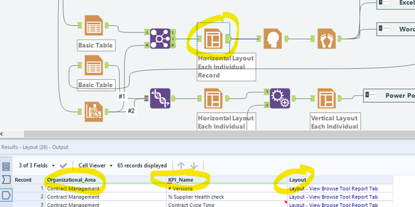
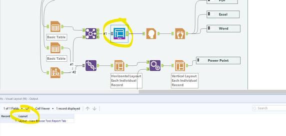
I found a great use for the visual Layout Tool which solved the formatting issues I was running into. Unfortunately it doesn't pass through additional columns from the source. This means that I am unable to use the batch rendering (the "group data into separate reports" functionality in the render tool). See images below.
Image 1: Layout keeps columns in output 🙂
Image 2: Visual Layout drops columns in output
Cheers
-
Category Reporting
-
Desktop Experience
Using Render tool to create an excel document.
(This is for a specific use case)
If you are using the RENDER tool to create one or more EXCEL documents. Ensure that you are NOT explicitly stating the Sheet name in the file name. (Output file or 'Replacing entire Path with Group).
If you explicitly name the sheet, it will throw an inboundPipe error.
Remove the sheet name, and it should work fine.
-
Category Reporting
-
Desktop Experience
Add a new feature to develop your own customized decision tree with Insight. So instead of using a tree generated with the Decision Tree tool a user can generate a tree with custom splits and save the splitting rules as a model to score later a new dataset. This will provide user the ability to enhace a tree with business knowledge.
-
Category Predictive
-
Category Reporting
-
Desktop Experience
It would be nice if we could cancel out of the interactive chart tool without saving the changes we made. It would make it easier than trying to recall how we had it before it was opened, especially when you're making small tweaks to formats & dimensions of things to make them look a little different.
-
Category Reporting
-
Desktop Experience
Hello - does anyone know if it's possible to to place text both above and below a table in the report text tool (in this instance i'm using it to feed an automated email)
I have some text which is the body of the email but also want to add some text with a hyperlink to unsubscribe to the email, below a table but as far as I can tell, there's not a way to input the table in between text, only above/below/left/right
Thanks in advance for the help,
Harry
-
Category Input Output
-
Category Reporting
-
Data Connectors
-
Desktop Experience
Can you look at improving the table tool? something to look at:
- background/alternate color off or none so we don't have any fill color in Excel
- Table header alignment option vertical AND horizontal - different from row alignment.
- make it dynamic for rules - so if _currentfieldname contains 'percent' then back ground color =yellow, if contains 'Rank' then green etc. Split between header & data. I know it could be accomplished with a macro and xml but that's a tedious process and having it in the tool just makes sense.
Thanks!
simon
-
Category Reporting
-
Desktop Experience
There are currently two different types of select tools. The dynamic select tool and the normal select tool. In my opinion there should only be 1 tool and it should be a mix of these two tools.
First the select tool is great because I can select the exact fields that I want, and I can pass new fields through using the "unknown" field. The dynamic select tool is also great because I can write formulas that dynamically select fields. Why not have one tool that does both?
In my mind, it would just look like the select tool, but then on the "unknown" field, I can click on it and configure it. It would basically just open the dynamic select tool interface where I can write formula's etc that select the unknown fields that I am willing to pass through.
For example.. clients add new fields to our data integrations all the time. A lot of the time I dont want these new fields to pass through automatically. But we also do reporting, and reporting could include column headers that are dates (ie sales may 18, sales june 18, etc). As new months appear in our sales data, new columns are added to our reports. I should have the capability to hardcode the fields I want to pass through and then write a formula for the remaining "unknown" fields. In this example I would check mark the fields I know I want, then write a formula that says if the unknown field starts with "sales" then pass it through.
Yes there are workarounds for this type of functionality (such as I could do a dynamic select tool and use the formula function to type in the name of EVERY field that I want to "hardcode"), but that would take a long time if I am trying to pass 10+ fields through.
-
Category Preparation
-
Category Reporting
-
Desktop Experience
Team,
It would be very useful if we could import Excel graphs as images. I've created graphs, tables, and charts using Alteryx tools from raw data (sql queries, etc.), but Excel offers more options. Generating customized emails with Excel graph images in the body instead of Alteryx charts would make this tool all the more powerful.
Idea is to pull in raw data through SQL queries, export data simultaneously to Tableau and Excel, pull back in the Excel graphs that are generated from that data, and create customized emails with links to Tableau workbooks, Excel file attachments, snapshots (graph images), and customized commentary. The Visual Layout tool is very handy for combining different types of data and images for email distribution, and importing Excel graphs as images would make this even better.
-
Category Input Output
-
Category Reporting
-
Data Connectors
-
Desktop Experience
The new insight tool offers some great charting abilities but it does not integrate with other reporting tools. The tool doesn't support pictures,tables or any way to pull text from the data in the workflow in. This really prevents it from being a solution to any of the my reporting needs.
-
Category Reporting
-
Desktop Experience
When the stacked bar chart option is added to the new interactive chart tool it would be fantastic if the functionality can be developed in such a way that waterfall charts can also easily be created. https://community.alteryx.com/t5/Alteryx-Designer-Discussions/Waterfall-Chart-in-Charting-Tool/m-p/1... has a workaround for doing this with the old chart tool but it would be much better if this functionality was a built in option going forward.
-
Category Reporting
-
Desktop Experience
When testing I often need to check single (or a handful of numbers) throughout the workflow. I have to click on each browse to check the numbers. A tool that rendered the output of multiple fields throughout the workflow would allow me to check if I was dropping any rows or miscalculating at a glance.
For instance if at the beginning of a workflow the row count was 15,951 and the cohort size was 328. Also the sum of profit for the cohort was £1,934,402 and the count of sales was 1,584. Remember those? Not if you have to click on the browse tool multiple times all the way through a large workflow to make sure you keep these figures intact. Copying out into excel or popping out the data from browse are the only options, each fiddly when trying to alter things quickly.
A resizable output window such as the explorer window would uber-useful.
Thanks
-
Category Documentation
-
Category Input Output
-
Category Reporting
-
Data Connectors
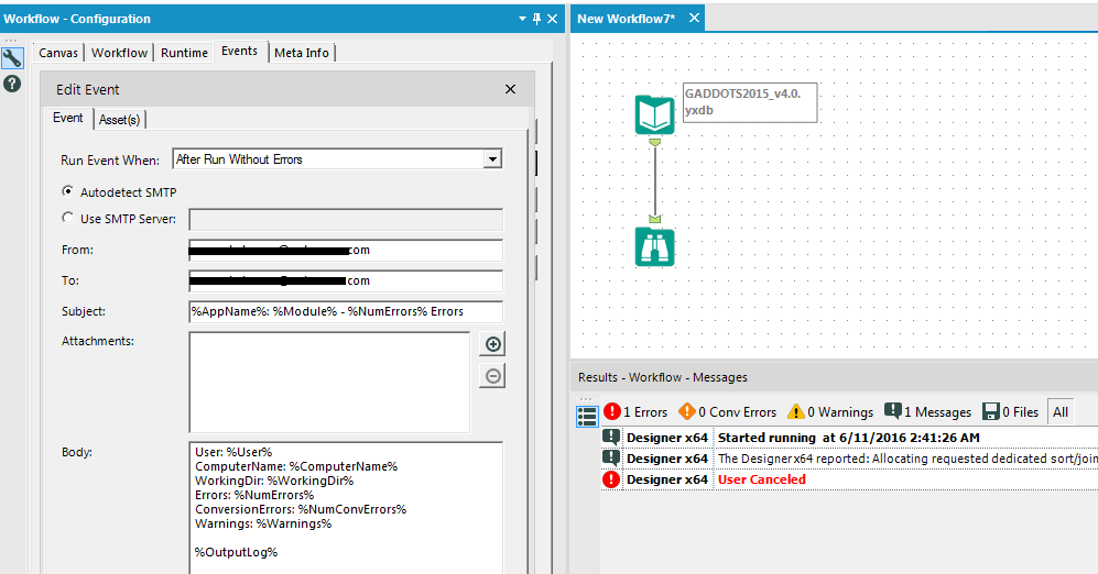
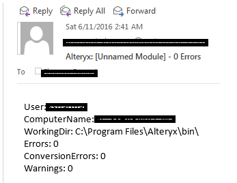
Issue: Even though the Send Email event is configured for the After Run Without Errors setting in the Workflow Configuration it still sends an email when the execution of workflow is cancelled. I think only the Before Run event should be allowed to trigger in this case.
App: Alteryx Designer x64
Version: 10.5.9.15014
-
Category Reporting
-
Desktop Experience
-
Tool Improvement
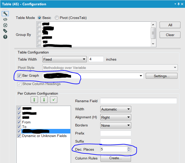
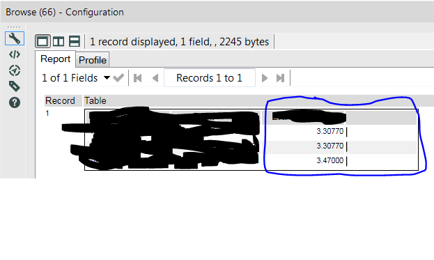
I've added a table tool that also has the bar graph enabled. The data I'm basing the bar graph off of is set to 5 decimal precision, but the bars round to the nearest whole number, making the feature essentially pointless in my scenario. Is there a way to have the bars dynamically adjust to the amount of decimal precision? I'm guessing most folks are exporting their data to a viz tool and not many folks are using the table tool in this context.
-
Category Reporting
-
Desktop Experience
- New Idea 229
- Accepting Votes 1,823
- Comments Requested 25
- Under Review 160
- Accepted 59
- Ongoing 5
- Coming Soon 9
- Implemented 481
- Not Planned 119
- Revisit 65
- Partner Dependent 4
- Inactive 674
-
Admin Settings
19 -
AMP Engine
27 -
API
11 -
API SDK
217 -
Category Address
13 -
Category Apps
112 -
Category Behavior Analysis
5 -
Category Calgary
21 -
Category Connectors
241 -
Category Data Investigation
76 -
Category Demographic Analysis
2 -
Category Developer
206 -
Category Documentation
78 -
Category In Database
212 -
Category Input Output
634 -
Category Interface
237 -
Category Join
101 -
Category Machine Learning
3 -
Category Macros
153 -
Category Parse
76 -
Category Predictive
77 -
Category Preparation
386 -
Category Prescriptive
1 -
Category Reporting
198 -
Category Spatial
81 -
Category Text Mining
23 -
Category Time Series
22 -
Category Transform
87 -
Configuration
1 -
Data Connectors
952 -
Data Products
1 -
Desktop Experience
1,505 -
Documentation
64 -
Engine
124 -
Enhancement
292 -
Feature Request
212 -
General
307 -
General Suggestion
4 -
Insights Dataset
2 -
Installation
24 -
Licenses and Activation
15 -
Licensing
11 -
Localization
8 -
Location Intelligence
80 -
Machine Learning
13 -
New Request
181 -
New Tool
32 -
Permissions
1 -
Runtime
28 -
Scheduler
23 -
SDK
10 -
Setup & Configuration
58 -
Tool Improvement
210 -
User Experience Design
165 -
User Settings
75 -
UX
220 -
XML
7
- « Previous
- Next »
-
Qiu on: Features to know the version of Alteryx Designer D...
- DataNath on: Update Render to allow Excel Sheet Naming
- aatalai on: Applying a PCA model to new data
- charlieepes on: Multi-Fill Tool
- vijayguru on: YXDB SQL Tool to fetch the required data
- bighead on: <> as operator for inequality
- apathetichell on: Github support
- Fabrice_P on: Hide/Unhide password button
- simonaubert_bd on: ADBC connectivity : faster columnar storage query
- NeoInfiniTech on: Adjustable Delay for Control Containers
| User | Likes Count |
|---|---|
| 61 | |
| 17 | |
| 13 | |
| 10 | |
| 9 |
