Alteryx Designer Desktop Ideas
Share your Designer Desktop product ideas - we're listening!Submitting an Idea?
Be sure to review our Idea Submission Guidelines for more information!
Submission Guidelines- Community
- :
- Community
- :
- Participate
- :
- Ideas
- :
- Designer Desktop: New Ideas
Featured Ideas
Hello,
After used the new "Image Recognition Tool" a few days, I think you could improve it :
> by adding the dimensional constraints in front of each of the pre-trained models,
> by adding a true tool to divide the training data correctly (in order to have an equivalent number of images for each of the labels)
> at least, allow the tool to use black & white images (I wanted to test it on the MNIST, but the tool tells me that it necessarily needs RGB images) ?
Question : do you in the future allow the user to choose between CPU or GPU usage ?
In any case, thank you again for this new tool, it is certainly perfectible, but very simple to use, and I sincerely think that it will allow a greater number of people to understand the many use cases made possible thanks to image recognition.
Thank you again
Kévin VANCAPPEL (France ;-))
Thank you again.
Kévin VANCAPPEL
Reporting automation capability is absolutely a great feature that puts Alteryx far ahead its competitors.
Unfortunately, Alteryx reporting tools start to become old fashioned in terms of :
- look & feel
- charts library
- charts configuration
It would be great if Alteryx could redesigned its reporting tools in order to allow the generation of smashing, flashy, modern visualizations mixing nice charts and maps.
Many thanks !
-
Category Reporting
-
Desktop Experience
It would be great to be able to display a table to the "Insights" section of the gallery - ideally one that can have formatting (eg row rules and column rules as per basic table tool)
-
Category Reporting
-
Desktop Experience
Please add reply-to field for email tool.
-
Category Reporting
-
Desktop Experience
This year, Microsoft updated improve their API (GraphAPI) to access Office365 enviroment.
Alteryx have launched on Microsoft District in Public Gallery the Dataverse , Onedrive & Sharepoint Connectors.
Alteryx must develop as soon as possible an connector/email with same authenticator options as connectors Above and improve the emails settings.
It´s important to release and documentation to show wich permissions on Azure it's necssary to send the emails.
References:
https://docs.microsoft.com/pt-br/lifecycle/announcements/exchange-online-basic-auth-deprecated
Azure Permissions:
https://docs.microsoft.com/en-us/graph/api/user-sendmail?view=graph-rest-1.0&tabs=csharp
-
Category Reporting
-
Desktop Experience
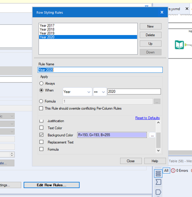
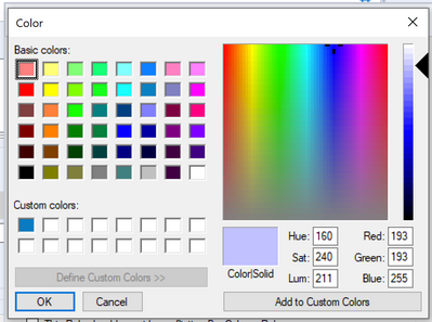
Having just participated in weekly challenge 293 there is a requirement to output a table with certain conditional row colours. However the configuration is based on rgb colour codes, whereas the desired output displays the colours using hex codes. 95% of the development time on this challenge was to get matching colour formatting, so being able to insert hex codes would improve this experience.
-
Category Reporting
-
Desktop Experience
This error may be encountered and replicated when you are using an image in the reporting "Header" tool where the path contains an "&". Yes this is rare, but possible and sometimes you want to keep the path, but can't update the path name. If you select the image in a path with an "&", then you'll get an error similar to the following:
Error: Report Header (36): The Action "Update Image Tool" has an error: ParseError: Unterminated entity reference, 'D' at line 2 and column 19
while processing "Action_UpdateRawXml"
A discussion began in 2016 on this topic:
Solved: Insert Image in Report Header: ParseError: Untermi... - Alteryx Community
-
Category Reporting
-
Desktop Experience
-
Enhancement
I get a lot of requests to replicate the Excel Table format into Alteryx output. When I use Reporting-Table tool, I have option to choose border, give color and size. No dotted border format or any other border formats which excel offers.
-
Category Reporting
-
Desktop Experience
Hey @A11yKyle and Alteryx Accessibility Team! It would be great if we could add alt text (dynamic based on input data would be even better!) and set the tab order of rendered PDFs so we could create reporting outputs that are digitally accessible.
-
Category Reporting
-
Desktop Experience
I don't believe there is a way to add a pattern/texture to a bar chart created in the Interactive Charting tool. This feature would enhance the accessibility of the charts created natively out of Alteryx.
Example from Plotly: https://plotly.com/python/pattern-hatching-texture/
-
Category Reporting
-
Desktop Experience
So while first and last make sense concat will crash the system. Here's a screen grab... Designer really doesn't like crosstab reporting tools set (accidentally) to concatenate 3 macros deep in a workflow. Just crashed 3 times before I tracked down the error on my system.
-
Category Reporting
-
Desktop Experience
-
Enhancement
I am currently working on building self-serve Analytics apps for colleagues and I am using the Email tool for this. However, the credentials have to entered directly into the tool and whenever the password changes this needs to be again changed into the workflow by the workflow developer.
This means that:
A) Workflow developer needs to have access to the mailbox used in the From field
B) Only the developer's email address can be used in the From field
C) The developer needs to connect with mailbox user in person or over video-conference, share control of his own machine and have the user put in their credentials every time the mailbox user's password changes.
These are three major hindrances in using the email tool to its full potential.
Solution:
Provide an option in the Alteryx server to have a database where users can create a record of their credentials (hashed of course) and with each record a token number is generated. The token number can be shared with the developer who will update that in the email tool. Whenever the password changes, the user can directly retrieve his old credentials and change them using the same token number. This method will eliminate the above mentioned three constraints and allow for use of email tool to create complete self-serve apps.
-
Category Reporting
-
Desktop Experience
In Interactive Charts, the only way to get user-defined input (other than automatic axis names etc.) into the chart is to add an additional column to the data which has the same content in each row and to use a batch chart.
I have two suggestions to this point:
- I would like to allow access to global Alteryx variables in any Chart text, such as "The path is [Engine.TempFilePath]". This should also work for non-batched charts.
- The current way of referring to columns in batch data is a bit odd and inconsistent to other tools. You have to type in "$" and get a list of available columns. After selecting, the dynamic test appears like static text in the configuration: If you type in "The column name is $column", you see "The column name is column" afterwards. That's quite confusing. My suggestion is to use the same nomenclature as elsewhere in Alteryx: Type in the text in brackets: "The column name is [column]". That way it would be as usual.
-
Category Reporting
-
Desktop Experience
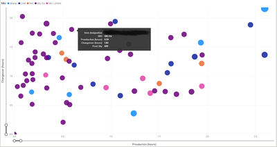
I would like to get a full legend overlay when hovering over the bubble (see example in power BI).
-
Category Reporting
-
Desktop Experience
As pointed out by @Joshman108 in this post, you can lose some/all of your work in the table tool if the metadata is ever not flowing correctly. Losing your metadata can happen for a number of legitimate reasons (copying/pasting, crosstab tool upstream, python tool upstream etc.) There are a number of tools (including the table tool) where losing the matadata can prove catastrophic.
Consider these 2 simple examples:
1) We have the dynamic box checked and apply a rule to field 1:
If our table tool loses its metadata, our row rule is completely erased! I would expect the tool to remember our row rule once metadata is reestablished.
2) We have the dynamic box unchecked, as well as Field4 unchecked. We setup the same rule as before that references field4.
Now when the metadata is lost and restablished, the table tool does a good job of remembering that Field4 is supposed to be unselected, and that I had a rule for Field1; however, the rule has now been changed! I would expect the rule to also remember that I was referencing Field4. Note that if my rule had reference a field that was included in the table, it would have remembered the rule. It's only because my rule referenced Field4 which was not included in the table that my rule got messed up. In my rule, it now references Row# which is completely wrong:
-
Category Reporting
-
Desktop Experience
I love that Alteryx came out with the Visual Layout tool, but have found the Elemental Boundaries to be a bit fickle. I think it would be helpful if items (tables, charts, etc.) could be brought in and moved around like a snippet of paper being moved around on the larger sheet. Additionally, I think it would be helpful if items brought in were the same size as they are output from the tool that is feeding into the visual layout. For example, if a table is set to 4.25 inches and I bring that table into the visual layout tool (with the page setup to be 8.5" x 11" with no margins) then the table would take up half of the width of the visual layout. It gets confusing when I bring something in at a specified size and can then readjust it. It's like having two volume controls on one stereo. If something needs to be adjusted, then I'd rather go back to the took where the columns are being formatted and adjust there.
If the latter is not possible due to other tools, it would be helpful if each item could be treated independently and not push other charts/tables as one is being adjusted or restrict the sizing of those within the same elemental boundary.
Lastly, can this tool be corrected so that images render exactly as they appear on screen?
Thanks!
Doug
-
Category Reporting
-
Desktop Experience
Hi Team,
I have a dataset of x,y values that I am plotting with an interactive chart tool. These values will vary widely so I can't use custom display ranges and have to rely on the "Auto" function for display range.
My problem is that the two axis are Auto scaled to different scaling and it is turning all my ellipse shapes into circles. Not a huge setback as you can check the Axis labels to see the scale but for this use case the shape of the data is what I am trying to portray and this makes my reports somewhat misleading.
I'm suggesting adding an option, maybe a tick box, under the interactive chart's "Auto" config that would allow both Axis to be scaled the same amount (That of the highest value).
Cheers,
Stephen
-
Category Reporting
-
Desktop Experience
when you render out to an excel file, the excel file is created as a new file. You cannot render to an existing excel file.
I'd like to see this functionality. I have a client who has a workbook with multiple formatted sheets and they'd like to render an addiitional sheet of formatted data out from Alteryx into the existing workbook.
-
Category Reporting
-
Desktop Experience
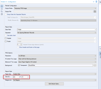
Currently users have the option of outputting to a PNG image but currently can only use Inches to get the size set. I want to be able to output with a pixel size not in inches.
-
Category Reporting
-
Desktop Experience
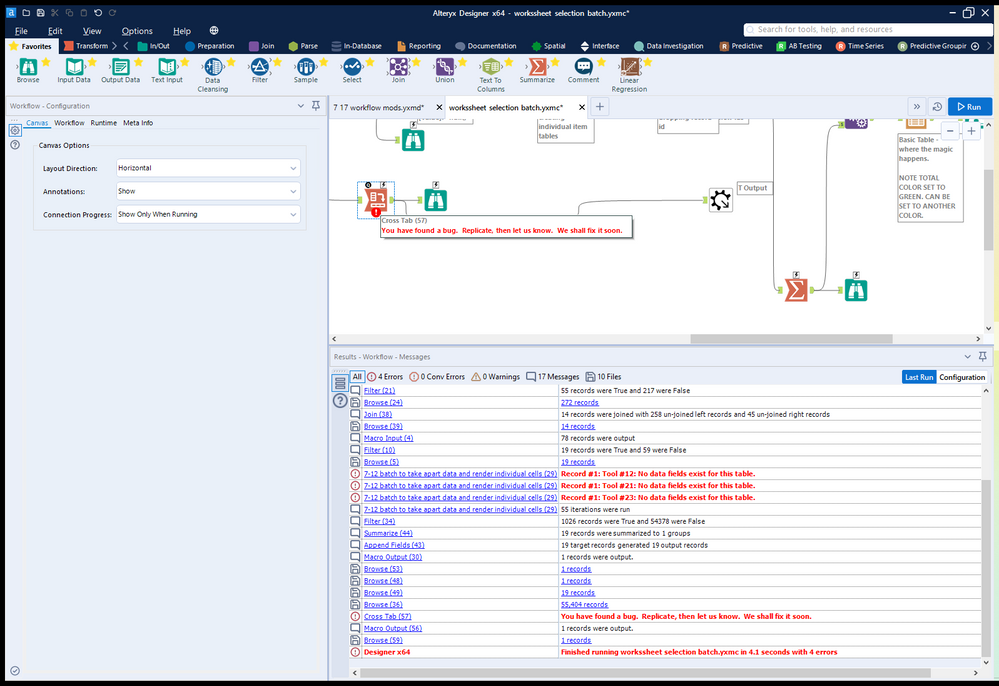
I get the following message when running a macro with the Render tool inside
" Alteryx ppt testing1 (162) Tool #26: You have found a bug. Replicate, then let us know. We shall fix it soon."
I believe this happens when there is multiple line breaks next to each other and trying to put this into the render tool outputting to powerpoint within a table.I have the formula for updating the line breaks "Replace([Layout],"<br />","<br />")" which works when there aren't very many line breaks but now I have integrated Python to regex out HTML the Render tool has stopped working
-
Category Reporting
-
Desktop Experience
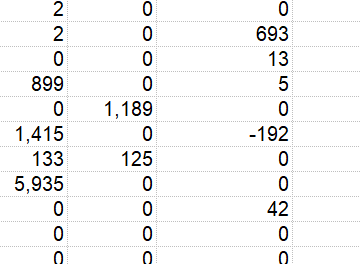
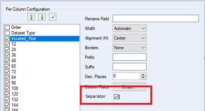
First of, let me say that I really love that the render tool adds commas to your numbers when you output them to excel. You can even control the number of decimals!
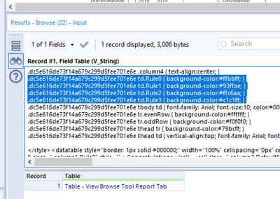
However, there are those times that I wish I could turn the commas off. For example, I have a column that represents years. In this case, I want it to be a number, but I don't want commas. I can see this xml coming out of my table tool:
.de41ddeb2857c4579b858debce63bfbec tbody .column0 { numeric:true; decimal-places:0; }
I would love an additional item like: separator:false that could be set in the table tool to shut off the separator. I've mocked up the table tool here:
In my limited knowledge, I'm guessing Alteryx would need to change/enhance the way their pcxml is structured.
-
Category Reporting
-
Desktop Experience
- New Idea 273
- Accepting Votes 1,818
- Comments Requested 24
- Under Review 174
- Accepted 56
- Ongoing 5
- Coming Soon 11
- Implemented 481
- Not Planned 116
- Revisit 62
- Partner Dependent 4
- Inactive 674
-
Admin Settings
20 -
AMP Engine
27 -
API
11 -
API SDK
218 -
Category Address
13 -
Category Apps
113 -
Category Behavior Analysis
5 -
Category Calgary
21 -
Category Connectors
246 -
Category Data Investigation
77 -
Category Demographic Analysis
2 -
Category Developer
208 -
Category Documentation
80 -
Category In Database
214 -
Category Input Output
640 -
Category Interface
239 -
Category Join
103 -
Category Machine Learning
3 -
Category Macros
153 -
Category Parse
76 -
Category Predictive
77 -
Category Preparation
394 -
Category Prescriptive
1 -
Category Reporting
198 -
Category Spatial
81 -
Category Text Mining
23 -
Category Time Series
22 -
Category Transform
88 -
Configuration
1 -
Content
1 -
Data Connectors
962 -
Data Products
2 -
Desktop Experience
1,533 -
Documentation
64 -
Engine
126 -
Enhancement
326 -
Feature Request
213 -
General
307 -
General Suggestion
6 -
Insights Dataset
2 -
Installation
24 -
Licenses and Activation
15 -
Licensing
12 -
Localization
8 -
Location Intelligence
80 -
Machine Learning
13 -
My Alteryx
1 -
New Request
192 -
New Tool
32 -
Permissions
1 -
Runtime
28 -
Scheduler
23 -
SDK
10 -
Setup & Configuration
58 -
Tool Improvement
210 -
User Experience Design
165 -
User Settings
79 -
UX
222 -
XML
7
- « Previous
- Next »
- TUSHAR050392 on: Read an Open Excel file through Input/Dynamic Inpu...
- AudreyMcPfe on: Overhaul Management of Server Connections
-
AlteryxIdeasTea
m on: Expression Editors: Quality of life update - StarTrader on: Allow for the ability to turn off annotations on a...
-
AkimasaKajitani on: Download tool : load a request from postman/bruno ...
- rpeswar98 on: Alternative approach to Chained Apps : Ability to ...
-
caltang on: Identify Indent Level
- simonaubert_bd on: OpenAI connector : ability to choose a non-default...
- maryjdavies on: Lock & Unlock Workflows with Password
- noel_navarrete on: Append Fields: Option to Suppress Warning when bot...
