Alteryx Designer Desktop Ideas
Share your Designer Desktop product ideas - we're listening!Submitting an Idea?
Be sure to review our Idea Submission Guidelines for more information!
Submission Guidelines- Community
- :
- Community
- :
- Participate
- :
- Ideas
- :
- Designer Desktop: New Ideas
Featured Ideas
Hello,
After used the new "Image Recognition Tool" a few days, I think you could improve it :
> by adding the dimensional constraints in front of each of the pre-trained models,
> by adding a true tool to divide the training data correctly (in order to have an equivalent number of images for each of the labels)
> at least, allow the tool to use black & white images (I wanted to test it on the MNIST, but the tool tells me that it necessarily needs RGB images) ?
Question : do you in the future allow the user to choose between CPU or GPU usage ?
In any case, thank you again for this new tool, it is certainly perfectible, but very simple to use, and I sincerely think that it will allow a greater number of people to understand the many use cases made possible thanks to image recognition.
Thank you again
Kévin VANCAPPEL (France ;-))
Thank you again.
Kévin VANCAPPEL
It would be very helpful if it were possible to have each data point display it's value on a line graph in the Interactive Chart tool. While the tool is excellent, this added functionality would go a long way. Since bar and pie charts already have this I'm curious as to why it was never made available for line charts.
-
Category Reporting
-
Desktop Experience
I understand that the font types available for Interactive Charts is limited to 3 fonts. For tables and other parts of reporting there are more options. This makes it difficult to create a consistent report layout including e..g. one font type. I guess it is not to difficult to add all fonts available in reporting to the interactive chart tool?
-
Category Reporting
-
Desktop Experience
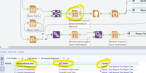
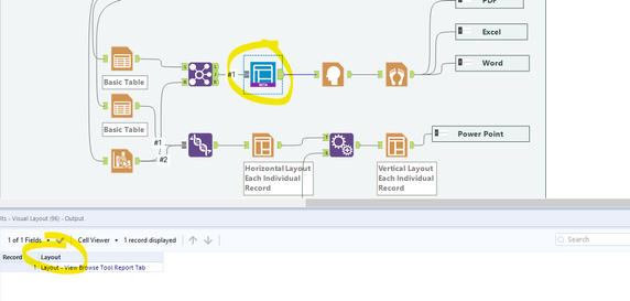
I found a great use for the visual Layout Tool which solved the formatting issues I was running into. Unfortunately it doesn't pass through additional columns from the source. This means that I am unable to use the batch rendering (the "group data into separate reports" functionality in the render tool). See images below.
Image 1: Layout keeps columns in output 🙂
Image 2: Visual Layout drops columns in output
Cheers
-
Category Reporting
-
Desktop Experience
I would like to be able to have the Map Tool to change the Reference Base Map to Tom Tom CA if there is a Country column in the incoming data stream that reads "CAN". Or change the Expand Extent from the default 10(%) to the number that's in a column called "Extent".
Right now I can only do it using the Macro interface tool, but I still have to make my selection after I select which data point(s) I'm using.
I want it to generate specific-format maps based on the input data I provide, so it could run automatically.
I guess, aside from the Spatial Field, Grouping Field, Thematic Field, and Label Fields, I'd love a Configurations Field(s).
-
Category Interface
-
Category Macros
-
Category Reporting
-
Desktop Experience
For example, allowing the letters in front of the column titles to be formatted differently to make them stand out on a report.
-
Category Macros
-
Category Reporting
-
Category Transform
-
Desktop Experience
I am trying to generate the multiple sheets in the same Excel using Render tool. one of the sheet having around 100 columns and other two sheets are having only 20 columns. If am configuring paper size to 50 inches in render tool, its affecting the other sheets too and Report doesn't look good since columns width are getting extended to some extent.
So, it will more helpful if there is an option to configure each sheet paper size or a rule kind of thing.
Please let me know if there are any option to that.
Thanks in advance...
-
Category Reporting
-
Desktop Experience
I would love to see an optional output anker for the render tool.
This would allow us to push a pdf/png into the python module. We could then build twitter/social media 'add ons' using python and fully automize the process.
-
Category Reporting
-
Desktop Experience
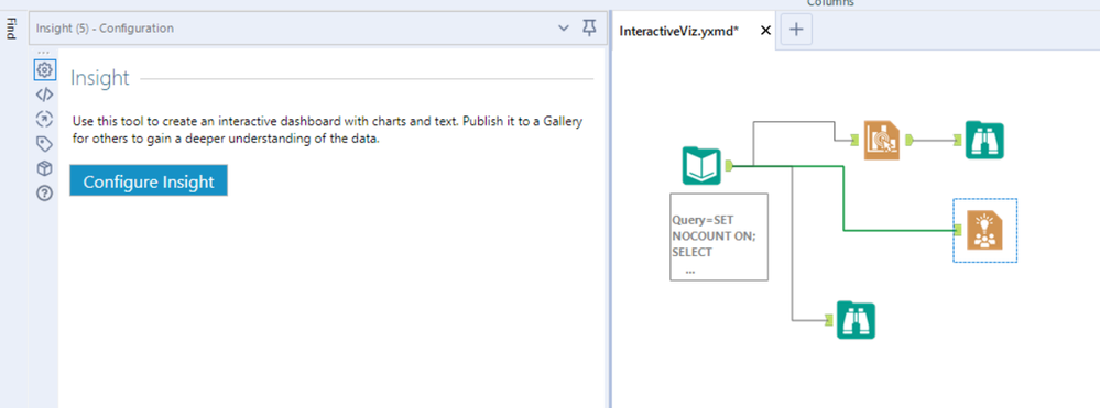
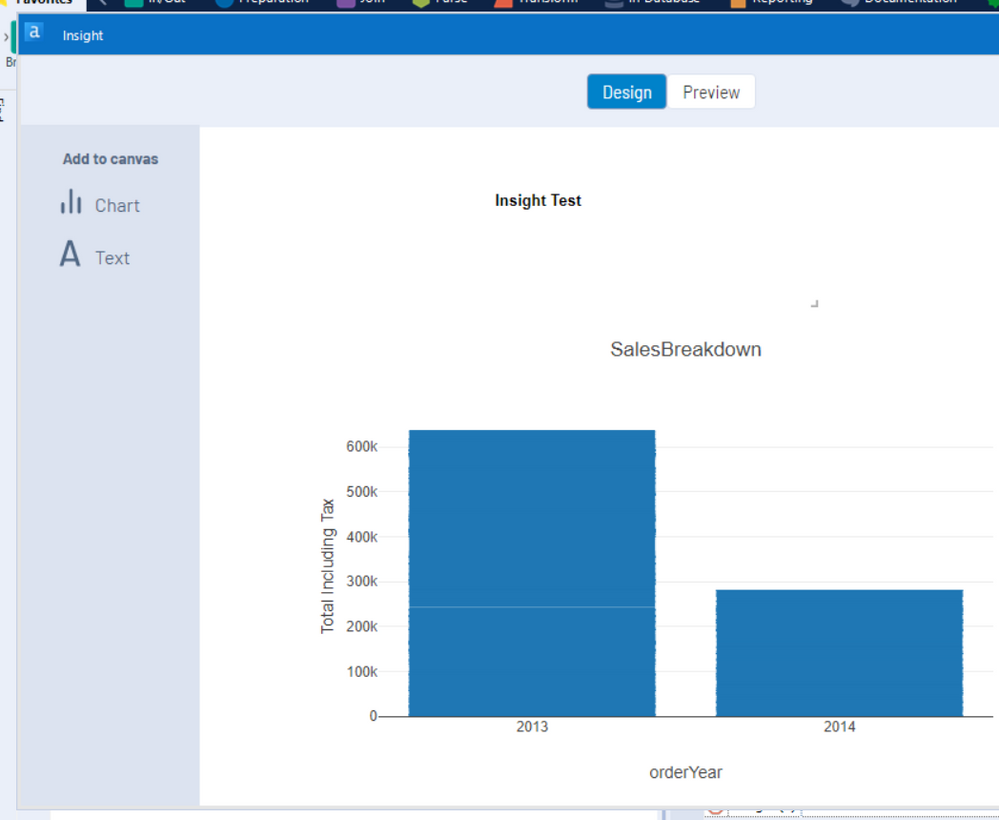
When using Interactive Chart tool; or Insight tool - every time you click on it you are asked to configure, even if you've already configured this previously.
Please could you change this so that it displays the "Configure this tool" screen ONLY if there is no configuration in place.

-
Category Reporting
-
Desktop Experience
Hi to all,
I have seen one or two posts requesting ability to total up rows and/or columns of numbers, however this idea also requests the ability to subtotal data by a field and also produce an overall total.
This could be an extension to existing tools such as 'Summarise' and 'Cross Tab' or could be a stand alone tool. Desired output of using a tool like this would produce something like this:
This would be incredibly useful for building reports within Alteryx as well as analysing the data, and cut down the amount of tools currently required to produce this. I have seen a third party tool which does some of this but this adds the ability to subtotal.
thanks - Roger
-
Category Reporting
-
Category Transform
-
Desktop Experience
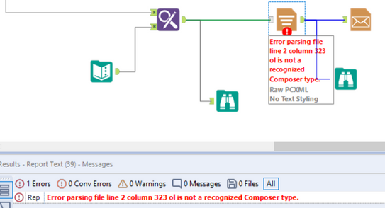
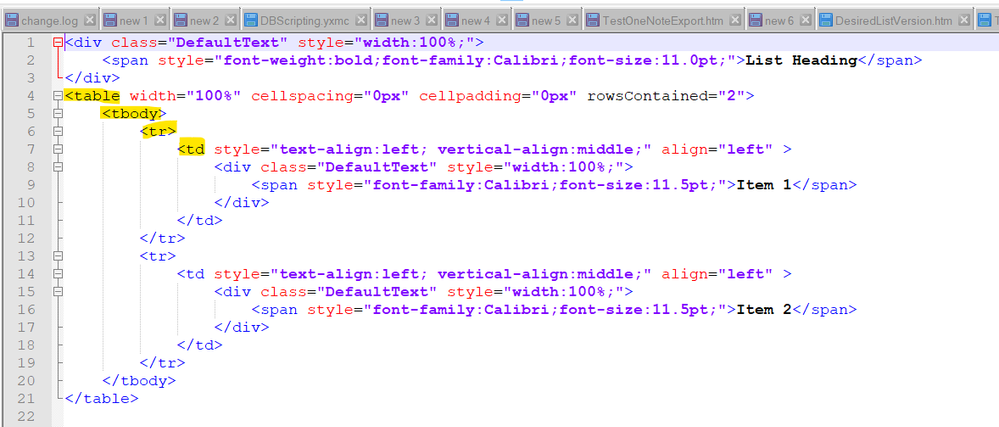
The reporting tools do not currently support HTML structured or unstructured lists https://www.w3schools.com/tags/tag_ul.asp
All vertical combination creates tables which group the lines together. Even if you manually create this - you get an error saying that ul (or ol or il) are not supported in composer
This creates a challenge in 2 ways:
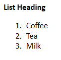
a) When creating lists in reporting outputs - you lose the functionality of structured lists (numbering with letters; numbers etc)
b) additionally - selecting the text in tables behaves differently than selecting data that is created in lists.
Please could you add the ability to create lists in addition to tables in the reporting tools by supporting the ol; ul; and il tags?
NOTE: this could initially be done just by supporting the tags; and then later this could be a summarize option on the summarize tool; and a bullet option in the text tool.

-
Category Reporting
-
Desktop Experience
-
Feature Request
Report text tools currently only give the option to allign left, right or center. Would be great if we could have the option to have a true 'Justify' option also as it makes chunks of text look so much cleaner
-
Category Reporting
-
Desktop Experience
It would be great to have the ability to use a word file as a template and create a pdf as the output which can be emailed to a list of emails through alteryx.
-
Category Reporting
-
Desktop Experience
The #bandofsolvers community has come up with many creative ways to determine if an 'output' action is complete before proceeding with next steps. However, what we really need is an optional output anchor added to (all?) tools in this class.
For example, currently if we need to Output Data to the same file 3 times, we have to put logic in place to make sure that the 3 updates happen in the correct sequence and do not interfere with each other. Or if we need to Render a file and perform additional modifications or file actions on that new file (e.g. ACL using icacls), we have to put checks in place to wait for the render to complete and make sure the file is freed by the write step.
However, if we could have at minimum an optional output anchor pass a Boolean flag indicating the 'output' class tool is complete, that would help tremendously! Even more helpful would be a xml/json object containing the tool configuration. Additionally, data/metadata 'pass-through' could be helpful in some situations as well.
I understand that this simple request could be significant change to the structure of the program, but throwing it out there for the 'Idea' space! 🙂
-
Category Connectors
-
Category Input Output
-
Category Reporting
-
Data Connectors
Add a new feature to develop your own customized decision tree with Insight. So instead of using a tree generated with the Decision Tree tool a user can generate a tree with custom splits and save the splitting rules as a model to score later a new dataset. This will provide user the ability to enhace a tree with business knowledge.
-
Category Predictive
-
Category Reporting
-
Desktop Experience
Hi,
It would be very useful for me If I could consolidate in the same output two different inputs: 1- the whole output flow; 2- The summarize from the output. That would save some time from doing pivot table analysis for instance.
Thanks
-
Category Input Output
-
Category Reporting
-
Data Connectors
-
Desktop Experience
It would be nice if we could cancel out of the interactive chart tool without saving the changes we made. It would make it easier than trying to recall how we had it before it was opened, especially when you're making small tweaks to formats & dimensions of things to make them look a little different.
-
Category Reporting
-
Desktop Experience
I believe that in addition to the already suggested idea of having an option to avoid sending one email per record, the attachments capability should be overhauled. Sending multiple attachments in a single email is a common need, but the only Community idea is a partial address of the issue by requesting an ability to use semi-colon separated paths in a single field as the attachment criterion. This doesn't seem to be an optimal method given the potential usefulness of the tool and ease of use considerations.
I think that a full solution should include:
- The capability to select a (file paths) field of all desired attachments which can then be uploaded into a single email
- The ability to use wildcards or directories in the file input mode (as you find in the Input Tool) in order to upload multiple attachments to a single email)
This would be a transformative solution to a common email need, and I think greatly appreciated!
-
Category Input Output
-
Category Reporting
-
Data Connectors
-
Desktop Experience
Hello,
I would like to make 2 suggestions in regards to the Table Tool.
1) The ability to format all of your tables in a workflow at once or the ability to set up a default theme for tables. I may have many table outputs in one report and if I want to change the font in the header I have to go to each table icon and change the configuration one at a time. Generally, I set up the first one then cut and paste it for all of the other tables in my report but if I have to go back and change something it is a real challenge. I am working on a report with 20 table outputs and have to change the header font in each one.... not fun.
2) The ability to change the header justification in the default table settings rather than have to change it in each column. The same report I mentioned has a minimum of 5 fields in each table that is a minimum of 100 adjustments just to have centered field names. A HUGE waste of time. An alternative would be to have centered field headings as the default. I may be wrong but I think the majority of reports have centered field headings.
Thank you for a great product and for listening
Abi
-
Category Reporting
-
Desktop Experience
Using other data viz tools like Tableau, we often plot yearly timeseries of data onto the same line chart so we can quickly compare year-on-year differences. All data viz tools seem to have complexities but the logical approach is the same. What you do is map all the years data to a relative year, i.e. this year, and then give each year it's own title. See the example below snipped from a Tableau dashboard:
In this example 7 years of data have been plotted on the same chart. Note the x-axis, In Tableau we are able to format the X-Axis labels to only show month and day (Mon-D). This removes the common relative year, i.e 2019.
As expected, Alteryx is awesome at preparing data to do this kind of thing. Using the interactive charting tool you can build really nice charts. However there is currently no way to format the X-Axis label, you must show the relative year too, as shown in the picture below (snipped from the browse tool, outputted from the interactive chart tool):

It was really easy to prepare the 5 year min, max and average lines, which is almost impossible to do in Tableau!
My idea in a nutshell is, please change the interactive chart tool so that the labels on the axis can be formatted to the user's choice, i.e. in this case formatted from datetime to "%B-%d".
Please note, the workflow i'm building in this case, is creating 3 line charts of related data, each by year. The end product is a daily email sent to users.
Thanks, nick
-
Category Reporting
-
Desktop Experience
It is just a bit of annoyance, really. I'd like to see the option of inputting a hexcode of color and/or a screen color picker in the color dialog. At the moment, you have to change R, G, B separately or play around with the cursor to find the right color.
The color dialog is relevant for the documentation purposes but also reporting tools and I'm sure it would make life easier to some people, especially when branding colours are important.
-
Category Interface
-
Category Reporting
-
Desktop Experience
- New Idea 249
- Accepting Votes 1,818
- Comments Requested 25
- Under Review 167
- Accepted 56
- Ongoing 5
- Coming Soon 11
- Implemented 481
- Not Planned 118
- Revisit 65
- Partner Dependent 4
- Inactive 674
-
Admin Settings
19 -
AMP Engine
27 -
API
11 -
API SDK
218 -
Category Address
13 -
Category Apps
112 -
Category Behavior Analysis
5 -
Category Calgary
21 -
Category Connectors
244 -
Category Data Investigation
76 -
Category Demographic Analysis
2 -
Category Developer
208 -
Category Documentation
80 -
Category In Database
214 -
Category Input Output
636 -
Category Interface
238 -
Category Join
102 -
Category Machine Learning
3 -
Category Macros
153 -
Category Parse
76 -
Category Predictive
77 -
Category Preparation
390 -
Category Prescriptive
1 -
Category Reporting
198 -
Category Spatial
81 -
Category Text Mining
23 -
Category Time Series
22 -
Category Transform
87 -
Configuration
1 -
Data Connectors
957 -
Data Products
1 -
Desktop Experience
1,518 -
Documentation
64 -
Engine
125 -
Enhancement
309 -
Feature Request
212 -
General
307 -
General Suggestion
4 -
Insights Dataset
2 -
Installation
24 -
Licenses and Activation
15 -
Licensing
11 -
Localization
8 -
Location Intelligence
80 -
Machine Learning
13 -
New Request
184 -
New Tool
32 -
Permissions
1 -
Runtime
28 -
Scheduler
23 -
SDK
10 -
Setup & Configuration
58 -
Tool Improvement
210 -
User Experience Design
165 -
User Settings
77 -
UX
222 -
XML
7
- « Previous
- Next »
-
caltang on: Identify Indent Level
- simonaubert_bd on: OpenAI connector : ability to choose a non-default...
- nzp1 on: Easy button to convert Containers to Control Conta...
-
Qiu on: Features to know the version of Alteryx Designer D...
- DataNath on: Update Render to allow Excel Sheet Naming
- aatalai on: Applying a PCA model to new data
- charlieepes on: Multi-Fill Tool
- seven on: Turn Off / Ignore Warnings from Parse Tools
- vijayguru on: YXDB SQL Tool to fetch the required data
- bighead on: <> as operator for inequality
