Alteryx Designer Desktop Ideas
Share your Designer Desktop product ideas - we're listening!Submitting an Idea?
Be sure to review our Idea Submission Guidelines for more information!
Submission Guidelines- Community
- :
- Community
- :
- Participate
- :
- Ideas
- :
- Designer Desktop
Featured Ideas
Hello,
After used the new "Image Recognition Tool" a few days, I think you could improve it :
> by adding the dimensional constraints in front of each of the pre-trained models,
> by adding a true tool to divide the training data correctly (in order to have an equivalent number of images for each of the labels)
> at least, allow the tool to use black & white images (I wanted to test it on the MNIST, but the tool tells me that it necessarily needs RGB images) ?
Question : do you in the future allow the user to choose between CPU or GPU usage ?
In any case, thank you again for this new tool, it is certainly perfectible, but very simple to use, and I sincerely think that it will allow a greater number of people to understand the many use cases made possible thanks to image recognition.
Thank you again
Kévin VANCAPPEL (France ;-))
Thank you again.
Kévin VANCAPPEL
It would be good to be able to fix pie chart colours (either automatically of manually), so that when building a report, categories are given the same colour throughout the report across multiple pie charts. Currently, if the number of categories being shown varies, there is no way to manually align the colours (In the Bar Chart type there is a Style Mode for the Series where you can use a formula to assign a colour based on a criteria such as the name, but not for pie charts).
-
Category Reporting
-
Desktop Experience
I am trying to add additional functionality to my existing workflow.
We have a common workflow pushed to the Alteryx server and there will be multiple people running this workflow.
Every time the workflow is run, the expectation is that an automatic email should be sent to the person who has triggered it(and won't be sent to multiple other people).
Currently, we have it set up using the Email tool but I do not see an option to dynamically update this “To” field to automatically use the email of a person running the workflow on the server.
-
Category Reporting
-
Desktop Experience
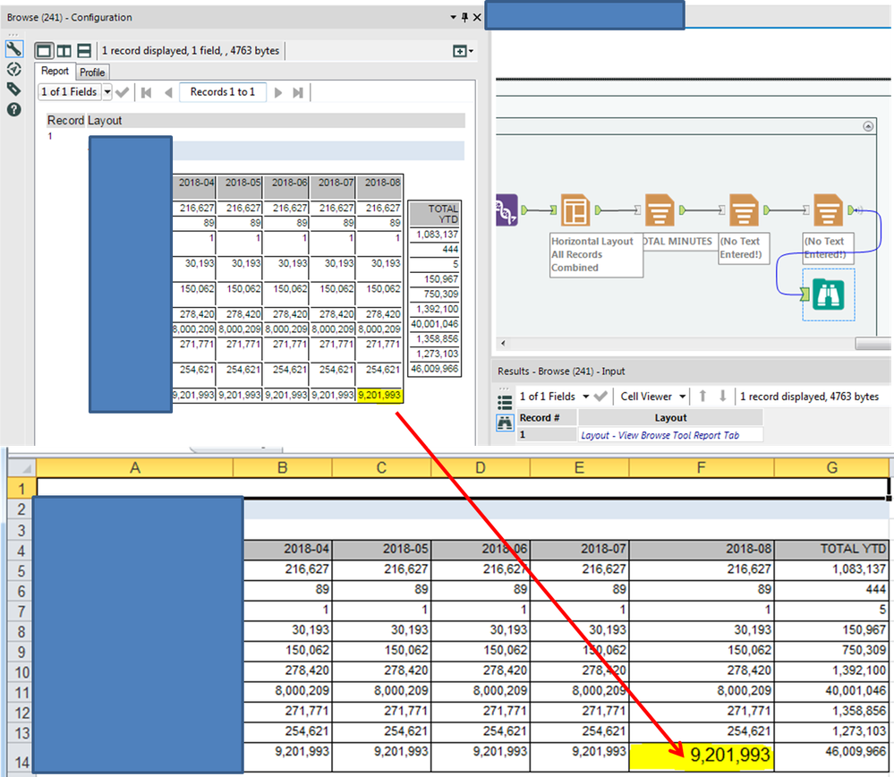
This appears to be a bug with either the Layout Tool or the Render Tool. When I setup two Tables using the Horizontal Layout Tool and export to Excel using the Render tool, the font size of the bottom-right cell of the first table is too large. No amount of changing the font properties within the Alteryx Reporting tools appears to fix this.
-
Category Reporting
-
Desktop Experience
The Render Tool for creating reports like PDFs etc does not function if any of the table data it receives contains an accent or special character,
UTFDataFormatExceptions occur..
It also doesn't work if you want filenames output with accents/non-english characters.
So forget about reporting in proper representations of German/French/Swedish/Irish/Russian/Chinese/Japanese.
This is a bit surprising and needs a note in the render tool documentation also!
Can you fix this feature please!
-
Category Reporting
-
Desktop Experience
-
Localization
There is currently no way to export interactive output from the network graph tool. I would like to be able to export a png of the static network graph image, a pdf of the report, and a complete html of the whole (which means including the JSON and vis.js files necessary for creating the report).
-
Category Interface
-
Category Macros
-
Category Reporting
-
Desktop Experience
Whilst not quite as efficient, the ability to overlay a line graph onto a scatter would enable the user to achieve a similar result as the points for the line can be calculated.
-
Category Reporting
-
Desktop Experience
Reporting automation capability is absolutely a great feature that puts Alteryx far ahead its competitors.
Unfortunately, Alteryx reporting tools start to become old fashioned in terms of :
- look & feel
- charts library
- charts configuration
It would be great if Alteryx could redesigned its reporting tools in order to allow the generation of smashing, flashy, modern visualizations mixing nice charts and maps.
Many thanks !
-
Category Reporting
-
Desktop Experience
I want modification of the Email Tool to support running it at a specific point, defined by developer, within a workflow where currently "The Email tool will always be the last tool to run in a workflow".
We use the tool to send notification of completion of jobs and sometimes attach outputs but we would like to be able to also send notifications at the start or at key points within a workflows processing. Currently the email tool is forced to be the last tool run in a flow, even if you use block until done tool to force order of path execution to hit the email tool first.
If we could add a setting to the configuration to override the current default, of being the last tool run, to allow it to run at will within a flow that would be awesome! And of course we would want the same ability for texting, be it a new feature of the email tool or a new tool all its own.
The Texting option refers to an issue in Andrew Hooper's post seeking enhancement of the email tool for texting, search on "Email tool add HTML output option" or use link...
-
Category Input Output
-
Category Reporting
-
Data Connectors
-
Desktop Experience
I have found a few examples in which the formatting options can be more finely tuned when editing the XML of a workflow but is not allowed by the user interface.
Border widths are just one example. The smallest border width is 1px, whereas if you edit the XML to "0.5" and save, you will get more narrow borders.
-
Category Reporting
-
Desktop Experience
-
Category Reporting
-
Desktop Experience
-
Feature Request

Within the mapping tool, please add an alignment option (left/center/right) within the label options (when wrapping).
-
Category Reporting
-
Category Spatial
-
Desktop Experience
-
Location Intelligence
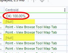
Alteryx currently shows 100% in the profiling of spatial fields in the results window, regardless of if there are rows with missing spatial features. I opened a ticket about this & was told it is expected behavior.
Therefore, I submit the idea that the profiling for spatial fields should give an accurate profile of the field, & if there are nulls in the field, it should identify that column isn't 100% OK and show the % of records that have null values, like the profiling does for every other column in workflows.
Thank you!
-
Category Data Investigation
-
Category Demographic Analysis
-
Category Interface
-
Category Reporting
I don't believe there is a way to add a pattern/texture to a bar chart created in the Interactive Charting tool. This feature would enhance the accessibility of the charts created natively out of Alteryx.
Example from Plotly: https://plotly.com/python/pattern-hatching-texture/
-
Category Reporting
-
Desktop Experience
Since we use Mosaic extensively we would like for the colors used in the Interactive Chart tool to be assigned by a value in order to match Experian's color assignments. For example, if [Mosaic] = “A01” then use RGB 77/72/ 133.
Thanks for the consideration.
-
Category Reporting
-
Desktop Experience
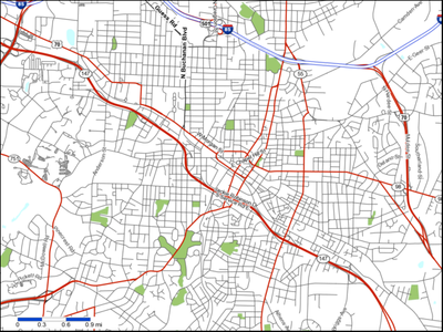
When I put a map snippet into a report, there is no border. Therefore, road segments just terminate into whitespace.
Please add an option to create a border around the map snippet.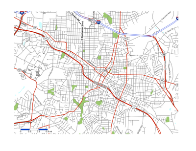
-
Category Reporting
-
Desktop Experience
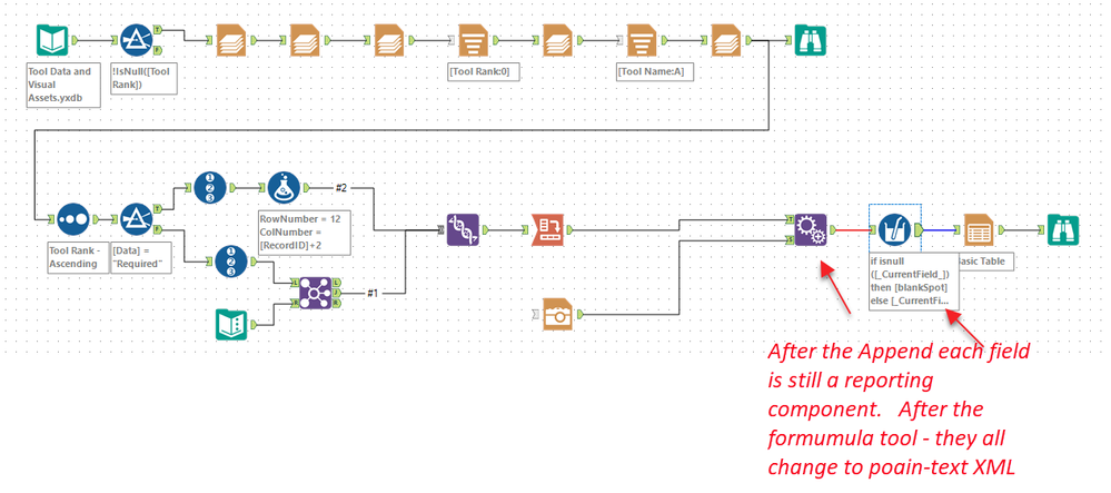
While completing the weekly challenge number 98, @patrick_digan and I noticed some unexpected behaviours while processing images.
Details:
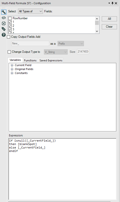
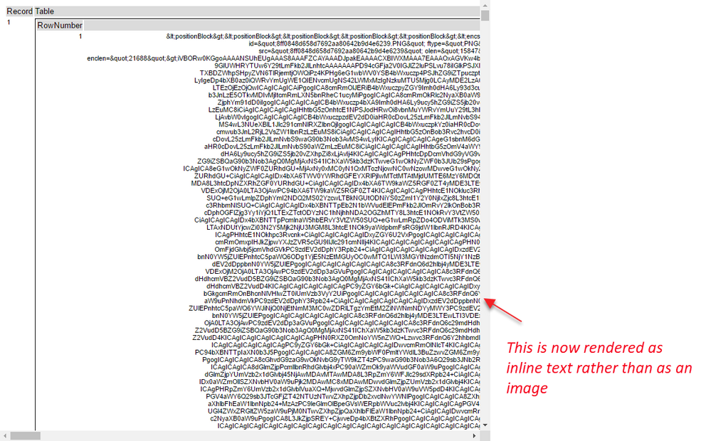
When doing basic functions on fields containing reporting snippets - these fields lose their type and cease to work as reporting snippets. Detail in screenshots below.


-
Category Preparation
-
Category Reporting
-
Desktop Experience
I understand that the font types available for Interactive Charts is limited to 3 fonts. For tables and other parts of reporting there are more options. This makes it difficult to create a consistent report layout including e..g. one font type. I guess it is not to difficult to add all fonts available in reporting to the interactive chart tool?
-
Category Reporting
-
Desktop Experience
Hello all,
When you copy and paste a layout tool to keep the formatting you just spent hours fixing it goes away as soon as you paste it. This is infuriating. Please keep the formatting from resting upon pasting.
Attached are pictures of a copy and pasted layout tool connected to the same incoming data source.
You can clearly see that the order and formatting has been removed. #Infuriating
Nick


-
Category Reporting
-
Desktop Experience
Hi,
Would it be possible to add additional sections to the 'Summarise Tool' such as one for dates so that you might be able to group by Year, Month, Quarter, Week or a combination of all these. There are other extensions that could also be considered such as group with nulls or without that would make this tool far more usable and not dependent on data manipulation prior to it; you might offer to have all nulls grouped and called something else for readability and this shouldn't be very hard at all to implement.
Kind regards,
Peter
-
Category Apps
-
Category Preparation
-
Category Reporting
-
Desktop Experience
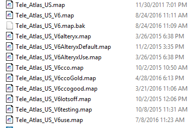
Description: I have configured a number of customized MapServer files rather than having to manually configure each layer in the ReportMap tool.
For reference, these are stored in the <Alteryx Data Install Folder>\AlteryxMap\TomTom_US_2015_Q3, for the TomTom US - Current Vintage reference base map. Below is a picture of the many versions of the .map configuration file I have created.
Rationale: Using these different files is cumbersome and inefficient. To switch out a map file, I have to rename the current .map file to a dummy name. Then I have to rename the desired file to be the name that the existing file was. Additionally, I can only have one .map file in use at any one time and all of the workflows running use the same one.
Idea: Allow user to choose which .map file to use from within the Report Map tool.
-
Category Reporting
-
Desktop Experience
- New Idea 376
- Accepting Votes 1,784
- Comments Requested 21
- Under Review 178
- Accepted 47
- Ongoing 7
- Coming Soon 13
- Implemented 550
- Not Planned 107
- Revisit 56
- Partner Dependent 3
- Inactive 674
-
Admin Settings
22 -
AMP Engine
27 -
API
11 -
API SDK
228 -
Category Address
13 -
Category Apps
114 -
Category Behavior Analysis
5 -
Category Calgary
21 -
Category Connectors
252 -
Category Data Investigation
79 -
Category Demographic Analysis
3 -
Category Developer
217 -
Category Documentation
82 -
Category In Database
215 -
Category Input Output
655 -
Category Interface
246 -
Category Join
108 -
Category Machine Learning
3 -
Category Macros
155 -
Category Parse
78 -
Category Predictive
79 -
Category Preparation
402 -
Category Prescriptive
2 -
Category Reporting
204 -
Category Spatial
83 -
Category Text Mining
23 -
Category Time Series
24 -
Category Transform
92 -
Configuration
1 -
Content
2 -
Data Connectors
982 -
Data Products
4 -
Desktop Experience
1,604 -
Documentation
64 -
Engine
134 -
Enhancement
406 -
Event
1 -
Feature Request
218 -
General
307 -
General Suggestion
8 -
Insights Dataset
2 -
Installation
26 -
Licenses and Activation
15 -
Licensing
15 -
Localization
8 -
Location Intelligence
82 -
Machine Learning
13 -
My Alteryx
1 -
New Request
226 -
New Tool
32 -
Permissions
1 -
Runtime
28 -
Scheduler
26 -
SDK
10 -
Setup & Configuration
58 -
Tool Improvement
210 -
User Experience Design
165 -
User Settings
85 -
UX
227 -
XML
7
- « Previous
- Next »
- abacon on: DateTimeNow and Data Cleansing tools to be conside...
-
TonyaS on: Alteryx Needs to Test Shared Server Inputs/Timeout...
-
TheOC on: Date time now input (date/date time output field t...
- EKasminsky on: Limit Number of Columns for Excel Inputs
- Linas on: Search feature on join tool
-
MikeA on: Smarter & Less Intrusive Update Notifications — Re...
- GMG0241 on: Select Tool - Bulk change type to forced
-
Carlithian on: Allow a default location when using the File and F...
- jmgross72 on: Interface Tool to Update Workflow Constants
-
pilsworth-bulie
n-com on: Select/Unselect all for Manage workflow assets
| User | Likes Count |
|---|---|
| 7 | |
| 5 | |
| 3 | |
| 2 | |
| 2 |
