Alteryx Designer Desktop Ideas
Share your Designer Desktop product ideas - we're listening!Submitting an Idea?
Be sure to review our Idea Submission Guidelines for more information!
Submission Guidelines- Community
- :
- Community
- :
- Participate
- :
- Ideas
- :
- Designer Desktop: Top Ideas
Featured Ideas
Hello,
After used the new "Image Recognition Tool" a few days, I think you could improve it :
> by adding the dimensional constraints in front of each of the pre-trained models,
> by adding a true tool to divide the training data correctly (in order to have an equivalent number of images for each of the labels)
> at least, allow the tool to use black & white images (I wanted to test it on the MNIST, but the tool tells me that it necessarily needs RGB images) ?
Question : do you in the future allow the user to choose between CPU or GPU usage ?
In any case, thank you again for this new tool, it is certainly perfectible, but very simple to use, and I sincerely think that it will allow a greater number of people to understand the many use cases made possible thanks to image recognition.
Thank you again
Kévin VANCAPPEL (France ;-))
Thank you again.
Kévin VANCAPPEL
It would be nice to have Directory tool working for ftp. I would like to have the list of files on a ftp server including sub folders
Alteryx Designer should automatically save my modules on a regular basis so that if I have a failure of some sort, my hard work will not be lost.
Hello all,
It's really frustrating to have an "alteryx field type" in In-Database Select. It doesn't even make sense since we're manipulating only data in SQL database where those types does not exist. What we should see is the SQL field type.
Best regards,
Simon

Hello all,
According to wikipedia https://en.wikipedia.org/wiki/Materialized_view
 In computing, a materialized view is a database object that contains the results of a query. For example, it may be a local copy of data located remotely, or may be a subset of the rows and/or columns of a table or join result, or may be a summary using an aggregate function.

The process of setting up a materialized view is sometimes called materialization.[1] This is a form of caching the results of a query, similar to memoization of the value of a function in functional languages, and it is sometimes described as a form of precomputation.[2][3] As with other forms of precomputation, database users typically use materialized views for performance reasons, i.e. as a form of optimization.
So, I would like to create that in Alteryx, for obvious performance reasons in some use cases.
This is not a duplicate of https://community.alteryx.com/t5/Alteryx-Designer-Desktop-Ideas/In-DB-Create-View/idi-p/157886
Best regards,
Simon
Hello all,
According to wikipedia :
https://en.wikipedia.org/wiki/Embedded_database
An embedded database system is a database management system (DBMS) which is tightly integrated with an application software; it is embedded in the application.
It's often like a single file/dll that you can use inside an application without the user having to connect (or at least to configure it) to it (it's all done inside the application). So, it's widely portable.
Why it does matter ?
As of today, there is not a single example of in database workflow because all the supported databases need the user to:
1/install an odbc driver (most of time, he won't have the rights to do so)
2/configure an odbc connection (sometimes, he doesn't have the rights to)
3/configure a connection on Alteryx (ok, he can)
So it requires IT action, which can be pretty long (in ùany organization, it requires several weeks !!). And even with all of that,the users must be granted privilege to access database and the customer need to develop its own examples and write its own specific documentation.
Well, this is not efficient.
What I suggest is Alteryx to use one of embedded database for training support/one tool examples. SQLlite seems good, maybe a more analytics oriented (like DuckDB ) would be more efficient.
The requirement are, I think, the following :
-OpenSource and free
-Fast
-SQL compliant
-With a bulk load ability
Best regards,
Simon
In order to perform audit-trail logging - it would be valuable to have 2 new capabilities
a) environment variables which show the workflow name; filepath; version; run start date and time; etc. For any worklows we build, we need to have a solid audit trail to be SOX compliant, so having this detail available as a data field to write and manipulate is essential
b) A logging component. What would be great is a component that you can drop on a workflow, not connected to anything, which is able to trap the start; end; runtime; version; etc of a workflow; and commit this to any output data format (CSV or ODBC etc). This logging tool would need to be able to capture the full runtime, so it would need to be the last thing that runs (which means it may need to exist in parallel to the main workflow in some way). This is not currently possible with a complex workflow with outputs, because it's not possible to identify when the entire workflow ended; or the runtime (since output tools don't have an onward connector to pass flow-of-control to catch the final end-time)
Again, both of these are necessary to meet audit requirements for workflows and prodcution-quality ETLs for BI data warehouses.
Note: This idea doesn't strictly fit into any given category as it involves enabling support for something that affects numerous aspects of Alteryx's already existing spatial features.
I live in Australia. As do a large number of your users. Like me, many of those users use Alteryx to process spatial data. There is only one problem; we live on a roving continent. Every year our continent shifts ever so slightly but over time that shift becomes significant. For this reason we have our own continental system of spatial coordinate projections. It's called the Geocentric Datum of Australia or GDA.
Since 2000, the official Australian geodetic datum has been GDA94. However, according to the Intergovernmental Committee on Surveying and Mapping (ICSM), because the coordinates of features on our maps, such as roads, buildings and property boundaries (and so on), are all based on GDA94, they do not change over time. This is why they have since adopted a new datum: GDA2020. This has now become the standard for mapping in Australia, bringing Australia’s national coordinates into line with global satellite positioning systems.
A more detailed explanation of this can be found on the ICSM's website: What is changing and why? | Intergovernmental Committee on Surveying and Mapping (icsm.gov.au).
Of course Alteryx supports the more global WGS84 standard, which like GDA94 is a fixed datum. But there is up to a 1.8 metre discrepancy between GDA94 (and WGS84) and GDA2020. For spatial analysis projects that don't require metre accuracy that's not a problem. But imagine you are building a bridge, plotting the lanes of a road or programming a GPS enabled tractor. That 1.8 metre discrepancy between the real world coordinates and the projection is enough to cause problems.
And it is. Which is why we request that Alteryx include support for GDA2020 in its existing selection of spatial projections.
This will enable spatial datasets configured in GDA2020 to not require conversion and thus risk corruption or error. This includes providing the ability to configure GDA2020 as the spatial projection in the input tool and all spatial tools.
Doing so would go a long way to supporting your ever growing Australian user base and maintaining Alteryx's position as a trusted software for processing spatial data.
Hello there!
Currently the email tool has the following configuration:

It is a fairly easy tool to use - however one part that I would like to be improved is testing the SMTP settings - similar to how it is done on the Alteryx Server. It would be awesome to have a button as part of this page, that would send a test email, and return true/display to the user that the email sent correctly. This would stop the need to setup dummy data and a dummy output to test a connection before rolling the email tool out into a live environment/use-case.
I imagine something along these lines for this functionality:

Clicking test (and passing):

Clicking test (and failing):

Thanks,
TheOC
I will start off with a story. I have built a process to manage batch API requests. It's an iterative process that checks to see where the export is at by calling an API and then returning some status. It will run and wait and run and wait until the export is ready to be downloaded. However sometimes, the jobs don't finish and a status returns something like "failed" or "cancelled". When this is the case, I have my process (which is a little bit batch macro) kicks off an error message, using the nifty error message tool. After some time I noticed that it was a PAIN to go back and figure out which of my requests failed and I decided that I need to add some messaging around where this was failing, so I could do some easy auditing. So I go back into my tool and much to my chagrin, I cannot pass variables into the message section. I would expect it to have worked something like this:
"Record "+[#2]+" is not 'A'"
Can we please get a change to this. It would save a lot of time and energy if we could create a dynamic error message option.
TL;DR Please allow us to use formulas in the "If expression is true, display error message:" settings area.
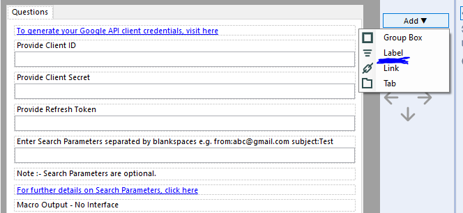
Hi all,
Is it possible to add an option to 'Add an Image' in the settings option of Interface Designer while building Apps or macros?
Currently, we can add Group box, Link, Tab, and Label. It would be really helpful if we can add static images as well!!
This would enable a developer to add an explanatory image just as a link or label is used to communicate to end user.
I am attaching a screenshot for the reference.

Thanks in advance!!
Regards,
Shreyansh Rathod
Hi all,
The Publish to Tableau Server tool is great.. but requires username and password. If you are using AD, there is a chance that your users don't have a password. In that case, you probably have a technical user that you share across the team. This is not an ideal situation and you loose the governance around the data.
Fortunately, there is an easy workaround. You can leverage personal token authentication : https://help.tableau.com/v2019.4/server/en-us/security_personal_access_tokens.htm
The advantage of this method is that it logs in with your user and your data source is uploaded under your name. This is still using the Tableau REST API so the changes to do in the current macro is MINOR.
Changes to do in the current macro :
1- Add a parameter authentication method with choices : Username/Password ; Personal Token
2- If Personal Token is selected, add two parameters : Token_Name and Token_Value
3 - In the TableauServer.Login supporting macro, improve the formula(13) to change the payload based on user selection. If Username/Password, keep it as is. Else use the syntax here : https://help.tableau.com/current/api/rest_api/en-us/REST/rest_api_concepts_auth.htm#make-a-sign-in-r...
This is quite a straight forward change but could help a lot of companies using Alteryx.
Can you please implement that changes to strengthen this tool ?
Thanks a lot,
Not sure what detail needs to be added. This is obviously a widely used RDBMS.
Could we please change the Interactive Chart tool, to:
- recognize when upstream types have changed and reconfigure (in the case of numerical types marked as string)
- For line charts - sort the values in order of the X value
Sample Flow - derivation of challenge 201:

Issue 1:
- The first interactive chart on this flow has no sorting at all performed by the charting tool - this may be due to the fact that the X & Y axes are in string fields. Generally line charts would attempt to sort both the axes and the values (where the values should order according to the X axis). Please can you add a default sort anyway?

Issue 2:
- If you then change the data types on these fields to be numeric - the charting tool still does not sort them until you reconfigure the tool manually
- REquest: please can you get the tool to remember the data types, so that it can prompt you; or even better just reconfigure?
(image looks identical after retyping the fields)

Issue 3:
- When you do a manual reconfigure of the tool after changing the types - the axes are sorted, but the values are not - so you end up with a chart that crosses back and forth. Generally line charts are ordered in the order of the X Axis for the values
- Request: Please sort values on the line chart automatically in order of the X value?

NOTE: Finally got the outcome needed by forcing the sort before the interactive chart tool

I've always wondered why the Data Cleansing tool has the option to convert nulls to blanks, but not convert blanks/empty cells to null.
I'm sure it's debatable given different approaches, but we always look to convert blank/empty data strings to NULL. Currently I have to do an extra cleansing step via a formula tool anytime I want to clean up these blanks.
Would like to see a connector (similar to existing AWS S3 connectors) for Google Cloud storage. I need to download data from the Developer Play console, and they provide a mechanism for accessing the csv data files directly:
https://support.google.com/googleplay/android-developer/answer/6135870
If we had a Input data connector to browse and select CSV files from Google Cloud (either specifically or dynamically), that would make it much easier than running it via a Python script
I am bringing this over from this post.
It would be really cool to have a workflow that you could configure to your server that we could schedule to pull down the new Cass updates and install them. Since they have to be reinstalled every two months, it would help to manage that.
I think that the data updates are set up with an FTP site, Cass could be done essentially the same way. Download it there and then use the command module to run the install? I may be over simplifying the process but it seems like this is something that Alteryx could tackle.
I'm sure there's a reason behind it, but can we please be allowed to run calculations on null values in a formula tool? right now, if we sum three values (1 + 3 + [null]) it produces [null], can the formula tool just ignore the null values? the only way around this is to fill the [null] cells with a value and that adds an additional step to what should be a fairly straight forward process. That value would have to be different for a multiplication formula vs an addition formula in order to not change the answer materially whereas ignoring the value is a more consistent solution.
In order to speed up our workflows (which are very heavily tied to databases and DB queries) it would be valuable to be able to inspect the actual queries which were run against the SQL server so that we can index to optimize these queries directly in SQL Enterprise Manager (or the same on any DB platform - we have the same problem on DB2)
The idea would be to have a simple screen where I can run the workflow with a SQL profiling turned on, and then capture the output of either the entire workflow (grouped by connection so that I can tune one database with only the queries that apply) or a specific component on the canvas.
I appreciate that this is not something that would be required by a fair population of your users - but I'm sure that this will be helpful for any enterprise / corporate customers.
Thank you
Sean
I would love to see Alteryx add an indicator whenever a number being displayed is being truncated. For example, this picture is currently confusing:

The displayed numbers should all be equal according to their displayed value, but in reality a different number is being stored in the background. I would propose something like this:

1) Any number that is being truncated when displayed would have that red triangle in the upper right corner. This already happens when a formula tool result is truncated, but I would like for it to be displayed on all data.
2) Clicking on the cell would show the actual value, not the truncated value. This would be great when debugging.
I understand that numbers are more complex than meets the eye, and I think that changes like this would help alleviate some of the mystery (like why 2 of my numbers above aren't equal).
It is just a bit of annoyance, really. I'd like to see the option of inputting a hexcode of color and/or a screen color picker in the color dialog. At the moment, you have to change R, G, B separately or play around with the cursor to find the right color.
The color dialog is relevant for the documentation purposes but also reporting tools and I'm sure it would make life easier to some people, especially when branding colours are important.

- New Idea 291
- Accepting Votes 1,790
- Comments Requested 22
- Under Review 167
- Accepted 55
- Ongoing 8
- Coming Soon 7
- Implemented 539
- Not Planned 111
- Revisit 59
- Partner Dependent 4
- Inactive 674
-
Admin Settings
20 -
AMP Engine
27 -
API
11 -
API SDK
220 -
Category Address
13 -
Category Apps
113 -
Category Behavior Analysis
5 -
Category Calgary
21 -
Category Connectors
247 -
Category Data Investigation
79 -
Category Demographic Analysis
2 -
Category Developer
209 -
Category Documentation
80 -
Category In Database
215 -
Category Input Output
645 -
Category Interface
240 -
Category Join
103 -
Category Machine Learning
3 -
Category Macros
153 -
Category Parse
76 -
Category Predictive
79 -
Category Preparation
395 -
Category Prescriptive
1 -
Category Reporting
199 -
Category Spatial
81 -
Category Text Mining
23 -
Category Time Series
22 -
Category Transform
89 -
Configuration
1 -
Content
1 -
Data Connectors
968 -
Data Products
3 -
Desktop Experience
1,551 -
Documentation
64 -
Engine
127 -
Enhancement
343 -
Feature Request
213 -
General
307 -
General Suggestion
6 -
Insights Dataset
2 -
Installation
24 -
Licenses and Activation
15 -
Licensing
13 -
Localization
8 -
Location Intelligence
80 -
Machine Learning
13 -
My Alteryx
1 -
New Request
204 -
New Tool
32 -
Permissions
1 -
Runtime
28 -
Scheduler
24 -
SDK
10 -
Setup & Configuration
58 -
Tool Improvement
210 -
User Experience Design
165 -
User Settings
81 -
UX
223 -
XML
7
- « Previous
- Next »
- Shifty on: Copy Tool Configuration
- simonaubert_bd on: A formula to get DCM connection name and type (and...
-
 NicoleJ
on:
Disable mouse wheel interactions for unexpanded dr...
NicoleJ
on:
Disable mouse wheel interactions for unexpanded dr...
- haraldharders on: Improve Text Input tool
- simonaubert_bd on: Unique key detector tool
- TUSHAR050392 on: Read an Open Excel file through Input/Dynamic Inpu...
- jackchoy on: Enhancing Data Cleaning
- NeoInfiniTech on: Extended Concatenate Functionality for Cross Tab T...
- AudreyMcPfe on: Overhaul Management of Server Connections
-
AlteryxIdeasTea
m on: Expression Editors: Quality of life update
| User | Likes Count |
|---|---|
| 5 | |
| 3 | |
| 3 | |
| 3 | |
| 2 |