Alteryx Designer Desktop Ideas
Share your Designer Desktop product ideas - we're listening!Submitting an Idea?
Be sure to review our Idea Submission Guidelines for more information!
Submission Guidelines- Community
- :
- Community
- :
- Participate
- :
- Ideas
- :
- Designer Desktop: New Ideas
Featured Ideas
Hello,
After used the new "Image Recognition Tool" a few days, I think you could improve it :
> by adding the dimensional constraints in front of each of the pre-trained models,
> by adding a true tool to divide the training data correctly (in order to have an equivalent number of images for each of the labels)
> at least, allow the tool to use black & white images (I wanted to test it on the MNIST, but the tool tells me that it necessarily needs RGB images) ?
Question : do you in the future allow the user to choose between CPU or GPU usage ?
In any case, thank you again for this new tool, it is certainly perfectible, but very simple to use, and I sincerely think that it will allow a greater number of people to understand the many use cases made possible thanks to image recognition.
Thank you again
Kévin VANCAPPEL (France ;-))
Thank you again.
Kévin VANCAPPEL
I'd like a simple option to zoom to the full extent of my module, showing all the tools centered on the canvas.
Thank you.
An additional feature would be to have Alteryx be able to auto-arrange or clean up the canvas tools, specifying a mimum distance between tools and reducing connector overlaps.
We need the ability to pre-populate App questions with a default value. This not only gives the user an example of what type of data string the App is looking for, but also may avoid the user from having to do anything if the default folder or file is already correct.
This would also allow for quick App testing since we can just accept the defaults and not have to load up a yxwv file every single time.
ArcPy/Python, ESRI Modelbuilder, PyQGIS can all do this (heck, even MapBasic can do it!) - there's no doubt it's more convenient for the designer and end user.
I have several modules that need to run in sequence. Can a ksh or some other program be used to string the modules together?
So that if I have Step1.yxmd, Step2.yxmd and Step3.yxmd. 2 is dependent on 1, 3 is dependent on 2. I want to tell it the jobs to run and then to wait until that module completes, then run the next.
run Step1.yxmd
Wait
run Step2.yxmd
Wait
run Step3.yxmd
Wait
Or, if I have a group of modules that can run concurrently but subsequent jobs are dependent on all of them to finish, i can let all those jobs run and have the next step wait for those to complete to begin.
run Step1A.yxmd
run Step1B.yxmd
run Step1C.yxmd
run Step1D.yxmd
Wait
run Step2.yxmd
Wait
run Step3.yxmd
Wait
I know this is very simplistic, but hoping it shows the need. Also, we do have the scheduler set up to use, so if there is a way to set dependencies between modules within Scheduler, that might be helpful. Just haven't found anything.
Thanks!
Right now we can create Tableau extract files (.tde), but cannot read them into Alteryx -- this limits the partnership of these two companies.
Please add the functionality to import .tde files,
Best,
Jeremy
Currently, the map input for an application defaults either to a global view of the United States or to a fixed boundary. Usng a chained application, it would be an extremely useful option to be able to specifiy spatial objects (points, lines, polygons) in the first application and then allow the second application to zoom in appropriately to those spatial objects. This could be done by either specifying a custom zoom level and using those spatial objects as a center through a reference layer, or by allowing the zoom's boundary to contain all the spatial objects (similar to the map reporting tools).
I would add:
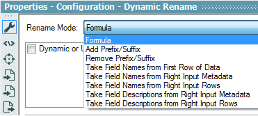
Take Field Metadata from Right Input Metadata
Take Field Metadata from Right Input Rows
These would allow mass changes in data type, size and scale based on either an existing data table's metadata or an external metadata table.
Currently, when a scheduled job is running (and logging is enabled), the log file is locked for use.
Thanks!
It would be very helpful if the renaming is propagated to all the tools in the module using that field name.
I have often thought it would be nice to have a 'predicted run time' for a module calculated.
An adequate prediction might be the complete run time last time the module ran. Then, in combination with a counter of how long a module has been running so far, we’d be well armed to estimate whether to go get a cup of coffee or not.
Alteryx 9 new Macro configuration module, is great
One thing that could be improved :
For Iterative macros, it's very frustrated to set a Maximum of Iterations manually :
when the number is too high it keeps going unnecessarily
when it's too low, we are missing iterations
Ideally this parameters should be calculated automatically by Alteryx
It would just implie to have the possibility to declare the numeric field that must be used for Iteration ... then Alteryx could calculate before launching the job, the Min/Max to set automatically the iteration band.
Is this idea stupid?
Thanks
Arno
I'd love the ability to Input an already-formatted Print Layout area within an Excel document, or a .PDF document in an effort to standardize reports needed on a regular basis.
Our department doesn't create everything that rolls into these reports, but we'd love the ability to incorporate external documents and save our company hours.
Is it possible to format an input tool to only look at the Print Area? If not, that capability would be wonderful.
Thanks!
When developing a module, I generally BROWSE the final data until I'm ultimately ready to generate output. Then I need to add or replace a browse tool with an output tool. Perhaps a general purpose output tool could save time for developers where the output tool functions as a browse tool until the output is actually checked on the tool configuration.
Taking this a step further, if an output is defined and the module is executed one could have a row limit on the read of data into the browse function of an output tool and see the first N records within a browse/output tool.
Sneak Peek.
m
In my environment, creating tables with fields in a particular order is a requirement.
The Select tool (and others) let me manually change sort orders. The Select tool will also allow me to sort on Field Name in Ascending or Descending order.
I can add a sort order prefix to my input data with the Dynamic Rename tool, connect a Select tool and then go into the Select tool properties to sort by Field Name. But this requires that I first run the module so that the Select tool knows what the incoming fields are called, then set up the Select tool properties, and then rerun the module. If I change the prefixes or the list of incoming variables, the Select tool has to be reconfigured.
It would be really nice if there was a Field Sort tool that only had Ascending or Descending as properties that would 'dynamically' do what the Sort on Field Name option in the Select tool does.
Please add Unknow like functionallity in Summarize Tool
Thanks,
Pratik Gujarathi
In the Browse window:
- Can we add a Find function like in excel? (e.g. find record_ID==4 or name =='foobar')
- Can we click the column name so it sorts on that field?
- In 9.0 when I click 'Cell Viewer' in Browse window, 'Show Whitespace' seems to be turn on by default. Can we turn it off like in 8.6?
- When I click the 'Fields' button to toggle fields on/off, it would be great to add a Sort function here too, so fields can be sorted a-z by fieldname (like in the Select tool).
Thanks!
Our team works with a lot of in-house transaction data sets that have been put into a calgary database. It would be much easier to build apps that use the calgary input tool without having to configure html code.
Currently when I open and run an app in designer mode im unable to access any other modules while it runs. It would be nice to be able to work on other modules while an app runs without opening a debug.
- New Idea 291
- Accepting Votes 1,791
- Comments Requested 22
- Under Review 166
- Accepted 55
- Ongoing 8
- Coming Soon 7
- Implemented 539
- Not Planned 111
- Revisit 59
- Partner Dependent 4
- Inactive 674
-
Admin Settings
20 -
AMP Engine
27 -
API
11 -
API SDK
220 -
Category Address
13 -
Category Apps
113 -
Category Behavior Analysis
5 -
Category Calgary
21 -
Category Connectors
247 -
Category Data Investigation
79 -
Category Demographic Analysis
2 -
Category Developer
209 -
Category Documentation
80 -
Category In Database
215 -
Category Input Output
645 -
Category Interface
240 -
Category Join
103 -
Category Machine Learning
3 -
Category Macros
153 -
Category Parse
76 -
Category Predictive
79 -
Category Preparation
395 -
Category Prescriptive
1 -
Category Reporting
199 -
Category Spatial
81 -
Category Text Mining
23 -
Category Time Series
22 -
Category Transform
89 -
Configuration
1 -
Content
1 -
Data Connectors
968 -
Data Products
3 -
Desktop Experience
1,551 -
Documentation
64 -
Engine
127 -
Enhancement
343 -
Feature Request
213 -
General
307 -
General Suggestion
6 -
Insights Dataset
2 -
Installation
24 -
Licenses and Activation
15 -
Licensing
13 -
Localization
8 -
Location Intelligence
80 -
Machine Learning
13 -
My Alteryx
1 -
New Request
204 -
New Tool
32 -
Permissions
1 -
Runtime
28 -
Scheduler
24 -
SDK
10 -
Setup & Configuration
58 -
Tool Improvement
210 -
User Experience Design
165 -
User Settings
81 -
UX
223 -
XML
7
- « Previous
- Next »
- Shifty on: Copy Tool Configuration
- simonaubert_bd on: A formula to get DCM connection name and type (and...
-
 NicoleJ
on:
Disable mouse wheel interactions for unexpanded dr...
NicoleJ
on:
Disable mouse wheel interactions for unexpanded dr...
- haraldharders on: Improve Text Input tool
- simonaubert_bd on: Unique key detector tool
- TUSHAR050392 on: Read an Open Excel file through Input/Dynamic Inpu...
- jackchoy on: Enhancing Data Cleaning
- NeoInfiniTech on: Extended Concatenate Functionality for Cross Tab T...
- AudreyMcPfe on: Overhaul Management of Server Connections
-
AlteryxIdeasTea
m on: Expression Editors: Quality of life update
| User | Likes Count |
|---|---|
| 7 | |
| 6 | |
| 5 | |
| 3 | |
| 3 |