Alteryx Designer Desktop Ideas
Share your Designer Desktop product ideas - we're listening!Submitting an Idea?
Be sure to review our Idea Submission Guidelines for more information!
Submission Guidelines- Community
- :
- Community
- :
- Participate
- :
- Ideas
- :
- Designer Desktop
Featured Ideas
Hello,
After used the new "Image Recognition Tool" a few days, I think you could improve it :
> by adding the dimensional constraints in front of each of the pre-trained models,
> by adding a true tool to divide the training data correctly (in order to have an equivalent number of images for each of the labels)
> at least, allow the tool to use black & white images (I wanted to test it on the MNIST, but the tool tells me that it necessarily needs RGB images) ?
Question : do you in the future allow the user to choose between CPU or GPU usage ?
In any case, thank you again for this new tool, it is certainly perfectible, but very simple to use, and I sincerely think that it will allow a greater number of people to understand the many use cases made possible thanks to image recognition.
Thank you again
Kévin VANCAPPEL (France ;-))
Thank you again.
Kévin VANCAPPEL
1. In series styles, replace current "Label Data Points" Yes/No dropdown options with "No/Top/Bottom/Left Side/Right Side/Alternating Sides" options to allow label text to fall above the line marking the top of the set (current implementation), below the top line, to the left or right or alternating between left and right. Side labels reduce the need for #3 below and alternating side labels partially mitigate the need for #2.
2. If "Label Data Points" is turned on, allow an option to set a minimum threshold to display the labels. In the current implementation the data point labels are placed on top of each other in cases where series with comparatively high volume are mixed with series with very low volume unless there is only one low volume series and it happens to be the last series in the set. With alternating side labels from #1 above this would only be an issue if more than one consecutive low volume series was displayed.
3. Lighten default series colors or change default text color to white. Black label text does not stand out or is unreadable against most of the default colors (dark blue, dark brown, etc.).
-
Category Reporting
-
Desktop Experience
It would be very helpful to be able to export your entire workflow to a poster-sized paper, either in paper or PDF format. When explaining a workflow to others, or getting feedback, the ability to see the entire workflow or lay it out on a table is very helpful
-
Category Reporting
-
Desktop Experience
It would be great if there was a way to convert datatypes within the Table Reporting tool. The specific example that sparked this idea is calculating percentages so they are shown in the report with the decimal place moved over. Today, within the formula tool I need to calculate the percentage and then multiply it by 100 in order for it to display the way I'd like in the report. However, if I need to leverage this percentage for another formula I most likely will have to divide the percentage I calculated first by 100 before I continue my calculation.
It would be nice to not have to multiply by 100 to move the decimal place over 2 spots and instead use the table tool to convert the number into a percentage we're all used to seeing. I'm thinking something similar to excel where you can click percentage, currency, etc to convert your number.
-
Category Reporting
-
Desktop Experience
I would like to suggest adding in additional options to the Output tool for running VBA code after inserts finish.
Similar to how the "7 Post Create SQL Statement" works for "ODBC" or "Oracle" Connections, having this option for excel would be game changing.
Our current processes rely on us calling a .vbs script, or manually formatting our output.
My job of automation would be significantly easier if this was an option.
Getting deliverable ready in an easy to digest format is key.
-
Category Input Output
-
Category Interface
-
Category Reporting
-
Data Connectors
Using Render tool to create an excel document.
(This is for a specific use case)
If you are using the RENDER tool to create one or more EXCEL documents. Ensure that you are NOT explicitly stating the Sheet name in the file name. (Output file or 'Replacing entire Path with Group).
If you explicitly name the sheet, it will throw an inboundPipe error.
Remove the sheet name, and it should work fine.
-
Category Reporting
-
Desktop Experience
Can you look at improving the table tool? something to look at:
- background/alternate color off or none so we don't have any fill color in Excel
- Table header alignment option vertical AND horizontal - different from row alignment.
- make it dynamic for rules - so if _currentfieldname contains 'percent' then back ground color =yellow, if contains 'Rank' then green etc. Split between header & data. I know it could be accomplished with a macro and xml but that's a tedious process and having it in the tool just makes sense.
Thanks!
simon
-
Category Reporting
-
Desktop Experience
When testing I often need to check single (or a handful of numbers) throughout the workflow. I have to click on each browse to check the numbers. A tool that rendered the output of multiple fields throughout the workflow would allow me to check if I was dropping any rows or miscalculating at a glance.
For instance if at the beginning of a workflow the row count was 15,951 and the cohort size was 328. Also the sum of profit for the cohort was £1,934,402 and the count of sales was 1,584. Remember those? Not if you have to click on the browse tool multiple times all the way through a large workflow to make sure you keep these figures intact. Copying out into excel or popping out the data from browse are the only options, each fiddly when trying to alter things quickly.
A resizable output window such as the explorer window would uber-useful.
Thanks
-
Category Documentation
-
Category Input Output
-
Category Reporting
-
Data Connectors
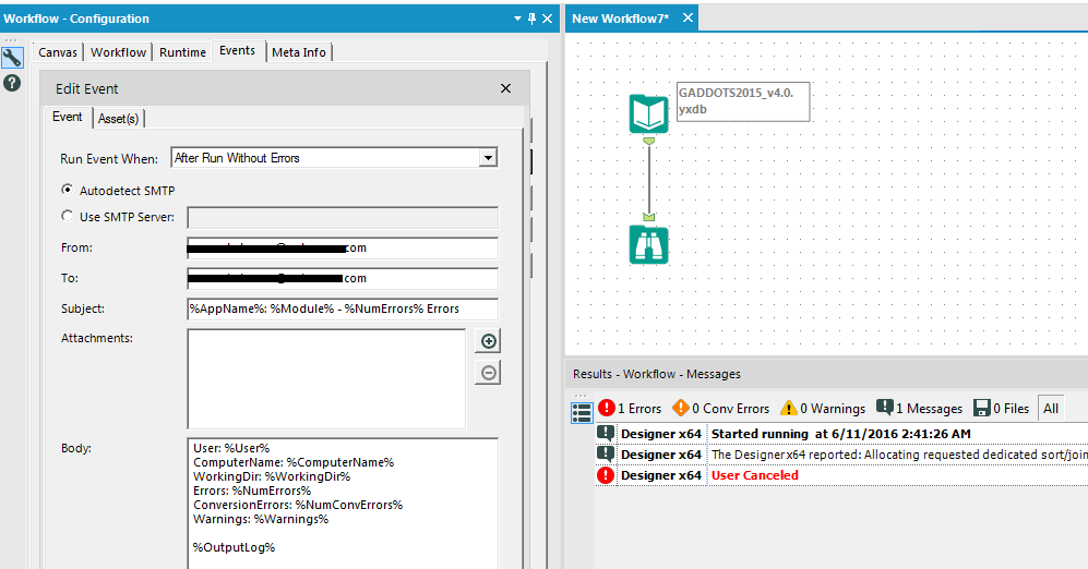
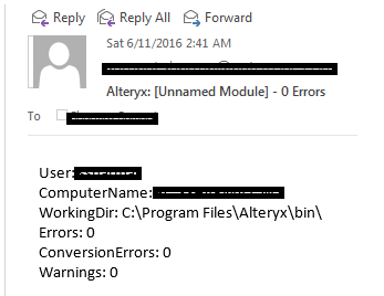
Issue: Even though the Send Email event is configured for the After Run Without Errors setting in the Workflow Configuration it still sends an email when the execution of workflow is cancelled. I think only the Before Run event should be allowed to trigger in this case.
App: Alteryx Designer x64
Version: 10.5.9.15014


-
Category Reporting
-
Desktop Experience
-
Tool Improvement
It would be very helpful to have hidden/interactive labels that can be utilized for an Report Map that only appear when the user is hovering over a specific part of the map. For example they only want to see the sales numbers for California, but do want to change the map. It probably makes the most sense to have this available for the HTML Report Maps. This would allow the report map to not look too crowded with labels, but still have the labels available if the user is interested in a particular part of the map. Is this something that can eventually be added to the report map tool?
-
Category Reporting
-
Desktop Experience
-
Category Reporting
-
Desktop Experience
-
Category Reporting
-
Desktop Experience
Hi, currently using the reporting tools, you need to use the render tool to output it, which makes sense.
However, is there away to render an output when using a connector tool e.g. sharepoint output
-
Category Connectors
-
Category Reporting
-
Data Connectors
-
Enhancement
In the Table tool, is there a way to edit the bar graph's max and min values using a formula based on table values, rather than a fixed value?
For Example, the automatic selection may choose bounds of 0 and 3324539 to include all values. Still, realistically, 100% needs to be a specific value from the table, with batch reports making this amount dynamic.
-
Category Reporting
-
Desktop Experience
-
Enhancement
1. Image Processing Tool functionality should be available in Reporting tools.
2. Image Output Location should allow for a temp file location
3. Image Processing should allow lock of aspect ratio when Cropping (like Scale)
4. Image Processing should allow for fieldname selection for Crop, Scale ...etc to allow for custom calculations. Being able to generate custom values for width and height based upon the values generated in from image profile would be useful
-
Category Reporting
-
Desktop Experience
-
Enhancement
-
New Request
The Table tool does not allow renaming a field so that it breaks at a specific point.
Fields like "H.S. Dropouts Non-Hispanic" and "H.S. Dropouts Whites" need a forced break after Dropouts.
Now we get random breaks like
H.S. Dropouts
Non-Hispanic
H.S. Dropouts White
The Rename Field function in the Basic Table tool would be a great place to allow forced breaks.
Thanks!
-
Category Reporting
-
Enhancement
This error may be encountered and replicated when you are using an image in the reporting "Header" tool where the path contains an "&". Yes this is rare, but possible and sometimes you want to keep the path, but can't update the path name. If you select the image in a path with an "&", then you'll get an error similar to the following:
Error: Report Header (36): The Action "Update Image Tool" has an error: ParseError: Unterminated entity reference, 'D' at line 2 and column 19
while processing "Action_UpdateRawXml"
A discussion began in 2016 on this topic:
Solved: Insert Image in Report Header: ParseError: Untermi... - Alteryx Community
-
Category Reporting
-
Desktop Experience
-
Enhancement
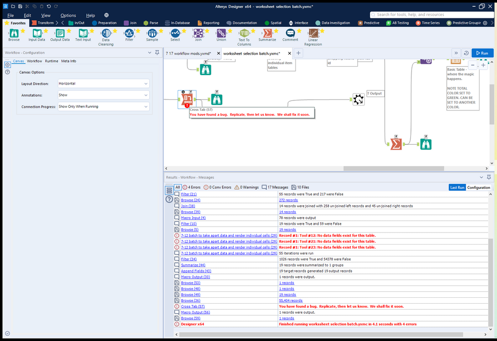
So while first and last make sense concat will crash the system. Here's a screen grab... Designer really doesn't like crosstab reporting tools set (accidentally) to concatenate 3 macros deep in a workflow. Just crashed 3 times before I tracked down the error on my system.
-
Category Reporting
-
Desktop Experience
-
Enhancement
In Interactive Charts, the only way to get user-defined input (other than automatic axis names etc.) into the chart is to add an additional column to the data which has the same content in each row and to use a batch chart.
I have two suggestions to this point:
- I would like to allow access to global Alteryx variables in any Chart text, such as "The path is [Engine.TempFilePath]". This should also work for non-batched charts.
- The current way of referring to columns in batch data is a bit odd and inconsistent to other tools. You have to type in "$" and get a list of available columns. After selecting, the dynamic test appears like static text in the configuration: If you type in "The column name is $column", you see "The column name is column" afterwards. That's quite confusing. My suggestion is to use the same nomenclature as elsewhere in Alteryx: Type in the text in brackets: "The column name is [column]". That way it would be as usual.
-
Category Reporting
-
Desktop Experience
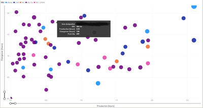
I would like to get a full legend overlay when hovering over the bubble (see example in power BI).
-
Category Reporting
-
Desktop Experience
Hi Team,
I have a dataset of x,y values that I am plotting with an interactive chart tool. These values will vary widely so I can't use custom display ranges and have to rely on the "Auto" function for display range.
My problem is that the two axis are Auto scaled to different scaling and it is turning all my ellipse shapes into circles. Not a huge setback as you can check the Axis labels to see the scale but for this use case the shape of the data is what I am trying to portray and this makes my reports somewhat misleading.
I'm suggesting adding an option, maybe a tick box, under the interactive chart's "Auto" config that would allow both Axis to be scaled the same amount (That of the highest value).
Cheers,
Stephen
-
Category Reporting
-
Desktop Experience
- New Idea 376
- Accepting Votes 1,784
- Comments Requested 21
- Under Review 178
- Accepted 47
- Ongoing 7
- Coming Soon 13
- Implemented 550
- Not Planned 107
- Revisit 56
- Partner Dependent 3
- Inactive 674
-
Admin Settings
22 -
AMP Engine
27 -
API
11 -
API SDK
228 -
Category Address
13 -
Category Apps
114 -
Category Behavior Analysis
5 -
Category Calgary
21 -
Category Connectors
252 -
Category Data Investigation
79 -
Category Demographic Analysis
3 -
Category Developer
217 -
Category Documentation
82 -
Category In Database
215 -
Category Input Output
655 -
Category Interface
246 -
Category Join
108 -
Category Machine Learning
3 -
Category Macros
155 -
Category Parse
78 -
Category Predictive
79 -
Category Preparation
402 -
Category Prescriptive
2 -
Category Reporting
204 -
Category Spatial
83 -
Category Text Mining
23 -
Category Time Series
24 -
Category Transform
92 -
Configuration
1 -
Content
2 -
Data Connectors
982 -
Data Products
4 -
Desktop Experience
1,604 -
Documentation
64 -
Engine
134 -
Enhancement
406 -
Event
1 -
Feature Request
218 -
General
307 -
General Suggestion
8 -
Insights Dataset
2 -
Installation
26 -
Licenses and Activation
15 -
Licensing
15 -
Localization
8 -
Location Intelligence
82 -
Machine Learning
13 -
My Alteryx
1 -
New Request
226 -
New Tool
32 -
Permissions
1 -
Runtime
28 -
Scheduler
26 -
SDK
10 -
Setup & Configuration
58 -
Tool Improvement
210 -
User Experience Design
165 -
User Settings
85 -
UX
227 -
XML
7
- « Previous
- Next »
- abacon on: DateTimeNow and Data Cleansing tools to be conside...
-
TonyaS on: Alteryx Needs to Test Shared Server Inputs/Timeout...
-
TheOC on: Date time now input (date/date time output field t...
- EKasminsky on: Limit Number of Columns for Excel Inputs
- Linas on: Search feature on join tool
-
MikeA on: Smarter & Less Intrusive Update Notifications — Re...
- GMG0241 on: Select Tool - Bulk change type to forced
-
Carlithian on: Allow a default location when using the File and F...
- jmgross72 on: Interface Tool to Update Workflow Constants
-
pilsworth-bulie
n-com on: Select/Unselect all for Manage workflow assets
| User | Likes Count |
|---|---|
| 7 | |
| 5 | |
| 3 | |
| 2 | |
| 2 |

