Alteryx Designer Desktop Ideas
Share your Designer Desktop product ideas - we're listening!Submitting an Idea?
Be sure to review our Idea Submission Guidelines for more information!
Submission Guidelines- Community
- :
- Community
- :
- Participate
- :
- Ideas
- :
- Designer Desktop
Featured Ideas
Hello,
After used the new "Image Recognition Tool" a few days, I think you could improve it :
> by adding the dimensional constraints in front of each of the pre-trained models,
> by adding a true tool to divide the training data correctly (in order to have an equivalent number of images for each of the labels)
> at least, allow the tool to use black & white images (I wanted to test it on the MNIST, but the tool tells me that it necessarily needs RGB images) ?
Question : do you in the future allow the user to choose between CPU or GPU usage ?
In any case, thank you again for this new tool, it is certainly perfectible, but very simple to use, and I sincerely think that it will allow a greater number of people to understand the many use cases made possible thanks to image recognition.
Thank you again
Kévin VANCAPPEL (France ;-))
Thank you again.
Kévin VANCAPPEL
Hello,
I would like to make a suggestion for the Histogram to allow the designer to insert a Tick Mark on the Histogram.
The use case for this is displaying a Histogram of values and then showing where a single value is.
Thank You,
Michael
-
Category Reporting
-
Desktop Experience
As my Alteryx workflows are becoming more complex and involve integrating and conforming more and more data sources it is becoming increasingly important to be able to communicate what the output fields mean and how they were created (ie transformation rules) as output for end user consumption; particular the file target state output.
It would be great if Alteryx could do the following:
1. Produce a simple data dictionary from the Select tool and the Output tool. The Select tool more or less contains everything that is important to the business user; It would be awesome to know of way to export this along with the actual data produced by the output tool (hopefully this is something I've overlooked and is already offered).
Examples:
- using Excel would be to produce the output data set in one sheet and the data dictionary for all of its attributes in the second sheet.
- For an odbc output you could load the data set to the database and have the option to either create a data dictionary as a database table or csv file (you'd also want to offer the ability to append that data to the existing dictionary file or table.
2. This one is more complex; but would be awesome. If the workflow used could be exported into a spreadsheet Source to Target (S2T) format along with supporting metadata / data dictionary for every step of the ETL process. This is necessary when I need to communicate my ETL processes to someone that cannot afford to purchase an alteryx licence but are required to review and approved the ETL process that I have built. I'd be happy to provide examples of how someone would likely want to see that formatted.
-
Category Data Investigation
-
Category Documentation
-
Category In Database
-
Category Reporting
It would be awesome if I could re-display the users selections to them before I continue with the remainder of the workflow in an analytic app. That way, I could collect all of the UI inputs, do my validation on the values provided and then re-display the selections/options/text to the user so they can confirm that they are correct and they wish to continue, or they can stop the processing and make changes via the already-open UI without having to re-enter everything from scratch.
Then, when someone selects something that's potentially harmful or very time consuming, I can confirm their selections and alert them to potential issues.
It would be really usefull if we could invert the sequencial color scale when using pie charts. For example, there are times where the greater the number is, I need it to be more red. Sometimes, I need the oposite behaviour, higher numbers having less red.
-
Category Reporting
-
Desktop Experience
It would be very helpful if it were possible to have each data point display it's value on a line graph in the Interactive Chart tool. While the tool is excellent, this added functionality would go a long way. Since bar and pie charts already have this I'm curious as to why it was never made available for line charts.
-
Category Reporting
-
Desktop Experience
Changing the User Setting "Default Distance Units" doesn't only change the distance units for the Spatial tool. Bizarrely, it also changes page margin specs in the Render tool, and Height and Width specs in tools like Layout.
Separating "Distance" units from "Layout" units would be useful. I may want a map showing kilometers, but when I'm laying it out on an 8.5 x 11 page, I want a half inch margin...
-
Category Reporting
-
Desktop Experience
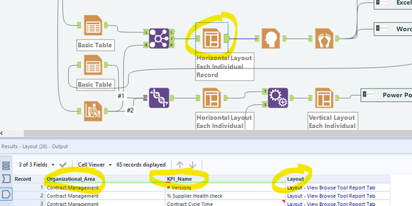
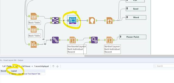
I found a great use for the visual Layout Tool which solved the formatting issues I was running into. Unfortunately it doesn't pass through additional columns from the source. This means that I am unable to use the batch rendering (the "group data into separate reports" functionality in the render tool). See images below.
Image 1: Layout keeps columns in output 🙂
Image 2: Visual Layout drops columns in output
Cheers
-
Category Reporting
-
Desktop Experience
Add a new feature to develop your own customized decision tree with Insight. So instead of using a tree generated with the Decision Tree tool a user can generate a tree with custom splits and save the splitting rules as a model to score later a new dataset. This will provide user the ability to enhace a tree with business knowledge.
-
Category Predictive
-
Category Reporting
-
Desktop Experience
Would it be possible to add the capability to import or build a CSS for reporting in a future release, I am sure I am not the first to think about having Style Sheets in reports so you do not have to define fonts, colors and all that HTML stuff to each output line.
-
Category Reporting
-
Desktop Experience
Currently, when creating scatter graphs you are unable to order the plots based on a sub-group of the data (ie the legend). It would be nice to have the ability to pick which part of the legend is displayed first, above the other data plots. Could we also have the option to take the 3D element off the scatter graph plots?
Thanks,
Oliver
-
Category Reporting
-
Desktop Experience
It would be nice if we could cancel out of the interactive chart tool without saving the changes we made. It would make it easier than trying to recall how we had it before it was opened, especially when you're making small tweaks to formats & dimensions of things to make them look a little different.
-
Category Reporting
-
Desktop Experience
Hi,
I've been working on reporting for a while now and figure out that creatitng sub total wasn't part of any tool.
Any chance this could be implemented in next versions or any macro available?
Thanks
Simon
-
Category Reporting
-
Desktop Experience
Hello - does anyone know if it's possible to to place text both above and below a table in the report text tool (in this instance i'm using it to feed an automated email)
I have some text which is the body of the email but also want to add some text with a hyperlink to unsubscribe to the email, below a table but as far as I can tell, there's not a way to input the table in between text, only above/below/left/right
Thanks in advance for the help,
Harry
-
Category Input Output
-
Category Reporting
-
Data Connectors
-
Desktop Experience
There are currently two different types of select tools. The dynamic select tool and the normal select tool. In my opinion there should only be 1 tool and it should be a mix of these two tools.
First the select tool is great because I can select the exact fields that I want, and I can pass new fields through using the "unknown" field. The dynamic select tool is also great because I can write formulas that dynamically select fields. Why not have one tool that does both?
In my mind, it would just look like the select tool, but then on the "unknown" field, I can click on it and configure it. It would basically just open the dynamic select tool interface where I can write formula's etc that select the unknown fields that I am willing to pass through.
For example.. clients add new fields to our data integrations all the time. A lot of the time I dont want these new fields to pass through automatically. But we also do reporting, and reporting could include column headers that are dates (ie sales may 18, sales june 18, etc). As new months appear in our sales data, new columns are added to our reports. I should have the capability to hardcode the fields I want to pass through and then write a formula for the remaining "unknown" fields. In this example I would check mark the fields I know I want, then write a formula that says if the unknown field starts with "sales" then pass it through.
Yes there are workarounds for this type of functionality (such as I could do a dynamic select tool and use the formula function to type in the name of EVERY field that I want to "hardcode"), but that would take a long time if I am trying to pass 10+ fields through.
-
Category Preparation
-
Category Reporting
-
Desktop Experience
-
Category Reporting
-
Desktop Experience
Adobe Illustrator file type. If this could be added as a Report Render output type, along with BMP, it would make the tool even more useful. Thanks!
-
Category Reporting
-
Desktop Experience
When reports, files, or tables are generated, it would help to be able to view them on an interactive map. Currently I am trying to show where high population growth is located for large areas, ie-entire US, entire State(s), etc., so the user needs to view where these areas are on a map. Ideally, it would be nice to have additional layers seen on the map as well, for example, our current locations, competitor locations, etc.
-
Category Reporting
-
Desktop Experience
-
Category Reporting
-
Desktop Experience
The new insight tool offers some great charting abilities but it does not integrate with other reporting tools. The tool doesn't support pictures,tables or any way to pull text from the data in the workflow in. This really prevents it from being a solution to any of the my reporting needs.
-
Category Reporting
-
Desktop Experience
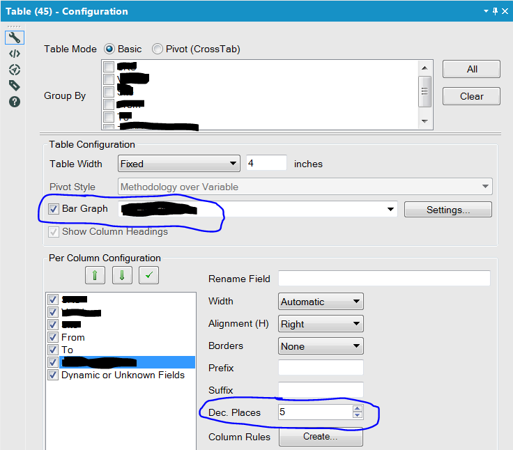
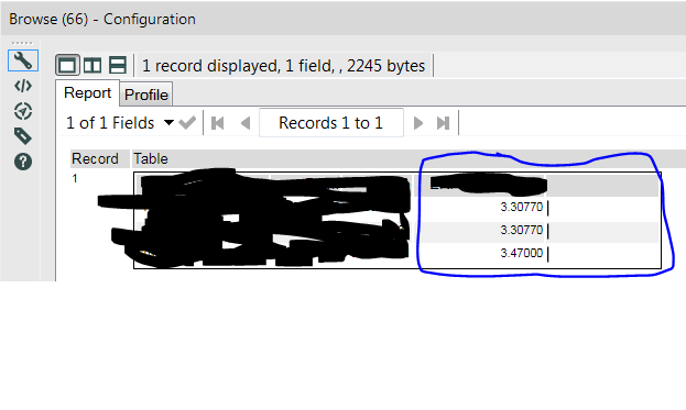
I've added a table tool that also has the bar graph enabled. The data I'm basing the bar graph off of is set to 5 decimal precision, but the bars round to the nearest whole number, making the feature essentially pointless in my scenario. Is there a way to have the bars dynamically adjust to the amount of decimal precision? I'm guessing most folks are exporting their data to a viz tool and not many folks are using the table tool in this context.
-
Category Reporting
-
Desktop Experience
- New Idea 376
- Accepting Votes 1,784
- Comments Requested 21
- Under Review 178
- Accepted 47
- Ongoing 7
- Coming Soon 13
- Implemented 550
- Not Planned 107
- Revisit 56
- Partner Dependent 3
- Inactive 674
-
Admin Settings
22 -
AMP Engine
27 -
API
11 -
API SDK
228 -
Category Address
13 -
Category Apps
114 -
Category Behavior Analysis
5 -
Category Calgary
21 -
Category Connectors
252 -
Category Data Investigation
79 -
Category Demographic Analysis
3 -
Category Developer
217 -
Category Documentation
82 -
Category In Database
215 -
Category Input Output
655 -
Category Interface
246 -
Category Join
108 -
Category Machine Learning
3 -
Category Macros
155 -
Category Parse
78 -
Category Predictive
79 -
Category Preparation
402 -
Category Prescriptive
2 -
Category Reporting
204 -
Category Spatial
83 -
Category Text Mining
23 -
Category Time Series
24 -
Category Transform
92 -
Configuration
1 -
Content
2 -
Data Connectors
982 -
Data Products
4 -
Desktop Experience
1,604 -
Documentation
64 -
Engine
134 -
Enhancement
406 -
Event
1 -
Feature Request
218 -
General
307 -
General Suggestion
8 -
Insights Dataset
2 -
Installation
26 -
Licenses and Activation
15 -
Licensing
15 -
Localization
8 -
Location Intelligence
82 -
Machine Learning
13 -
My Alteryx
1 -
New Request
226 -
New Tool
32 -
Permissions
1 -
Runtime
28 -
Scheduler
26 -
SDK
10 -
Setup & Configuration
58 -
Tool Improvement
210 -
User Experience Design
165 -
User Settings
85 -
UX
227 -
XML
7
- « Previous
- Next »
- abacon on: DateTimeNow and Data Cleansing tools to be conside...
-
TonyaS on: Alteryx Needs to Test Shared Server Inputs/Timeout...
-
TheOC on: Date time now input (date/date time output field t...
- EKasminsky on: Limit Number of Columns for Excel Inputs
- Linas on: Search feature on join tool
-
MikeA on: Smarter & Less Intrusive Update Notifications — Re...
- GMG0241 on: Select Tool - Bulk change type to forced
-
Carlithian on: Allow a default location when using the File and F...
- jmgross72 on: Interface Tool to Update Workflow Constants
-
pilsworth-bulie
n-com on: Select/Unselect all for Manage workflow assets
| User | Likes Count |
|---|---|
| 7 | |
| 5 | |
| 3 | |
| 2 | |
| 2 |


