Alteryx Designer Desktop Ideas
Share your Designer Desktop product ideas - we're listening!Submitting an Idea?
Be sure to review our Idea Submission Guidelines for more information!
Submission Guidelines- Community
- :
- Community
- :
- Participate
- :
- Ideas
- :
- Designer Desktop: Hot Ideas
Featured Ideas
Hello,
After used the new "Image Recognition Tool" a few days, I think you could improve it :
> by adding the dimensional constraints in front of each of the pre-trained models,
> by adding a true tool to divide the training data correctly (in order to have an equivalent number of images for each of the labels)
> at least, allow the tool to use black & white images (I wanted to test it on the MNIST, but the tool tells me that it necessarily needs RGB images) ?
Question : do you in the future allow the user to choose between CPU or GPU usage ?
In any case, thank you again for this new tool, it is certainly perfectible, but very simple to use, and I sincerely think that it will allow a greater number of people to understand the many use cases made possible thanks to image recognition.
Thank you again
Kévin VANCAPPEL (France ;-))
Thank you again.
Kévin VANCAPPEL
I would like to share my idea that would be definitely useful for fast automation of the process with reading and correctly recognizing the text from PDF input. I wrote about that, hoping somebody has already thought about that here.
The idea is the tools "PDF Input" and "Image to Text" from "Text Mining" category to be improved, so as the text from PDF document to be read properly, no matter the text position on each page.
It could be also considered the performance of the combined tools of "PDF Input" and "Image to Text" to be improved as they work slower than the customized tool PDF Input does.
The idea also can be expanded to an entirely new tool that works out all the actions, needed for correctly reading of a PDF document without manual intervention.
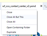
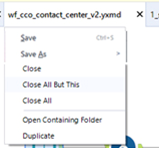
While there are many keyboard shortcuts, we primarily interact with the workflow using the mouse. In order to improve efficiencies and easily create saving habits, we should have the ability to Save our progress by right clicking on the workflow tab. Ideally, it should have Save and Save As.
Current:
New:
On the canvas, underneath the Run button, there are zoom out and zoom in buttons. It would be lovely if between them existed a number box indicating the current zoom level of the canvas. This would operate much like my web browser, which typically shows 100% unless I have zoomed in or out. Bonus points if the button is clickable to reset to the default zoom level.
Currently, when sharing a workflow with a Python-based connector such as Google BigQuery, the credentials for the tool have to be reentered if the workflow is opened on a workstation different from where the workflow was created or by a different user on the same workstation.
There is no need to re-authenticate when publishing a workflow to run by a Server schedule or on the Gallery. This functionality should be extended to sharing the workflow between workstations with the Python registry key enabled.
Hi Team,
As the formula design that able to stack multiple formula in once. There should have more things there.
1. Error Icon for formula have Error
Can you find which row have error in seconds?
We had to count to find which formula had error!!!!
and how about now?
At least, do have an icon or anything significant thing that let us found it in second and WITHOUT COUNT!!!
2. buttons to expand all/ collapse all.
It was normal that we need to review formula in again in future.
So, you need to click one by by to view all the formulas?
I have 5 containers in my workflow that don't all need to be run every time. I could play the game of manually enabling and disabling them depending on the need that day, but that quickly becomes a hassle with larger workflows. It would be much more efficient to have a functionality somewhere that displays all my containers with a checkbox of which ones I want run and the ability to set the run order I specify so I can make sure my 'Data Pull' container always runs first. An option to select/deselect all containers would be nice to, and maybe the ability to rename my containers much like the select tool does for fields.
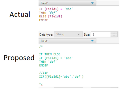
For any tool that uses the IF, THEN, ELSE or IIF statements, let the ELSE statement be optional (like in Python)
For example, notice in the proposed idea there is no ELSE statement, or a third parameter in IIF:
In Interactive Charts, the only way to get user-defined input (other than automatic axis names etc.) into the chart is to add an additional column to the data which has the same content in each row and to use a batch chart.
I have two suggestions to this point:
- I would like to allow access to global Alteryx variables in any Chart text, such as "The path is [Engine.TempFilePath]". This should also work for non-batched charts.
- The current way of referring to columns in batch data is a bit odd and inconsistent to other tools. You have to type in "$" and get a list of available columns. After selecting, the dynamic test appears like static text in the configuration: If you type in "The column name is $column", you see "The column name is column" afterwards. That's quite confusing. My suggestion is to use the same nomenclature as elsewhere in Alteryx: Type in the text in brackets: "The column name is [column]". That way it would be as usual.
I'd like to see the size of the data processing through each tool, in say GB. This would be helpful in understanding the volume of data being written to connected systems and would also be useful when cleansing data to determine if a meaningful impact was made to the data cleanliness.
Please enhance the Join Multiple tool to include an option of:
"left outer join all on input 1".
Such a tool would be massively advantageous when data granularity is defined by one dataset (input 1) and many subsequent tables just need to be joined onto that input.
As-is, I have had to manually perform dozens of join + union sequences which seems both untidy and inefficient.
Such a feature would likely be more useful than existing options of full outer joins / inner joins which currently the tool allows.
I love the new (relatively) ConsumerView Decoder Tool! I used to do it the hard way, and it was fragile.
However, one thing is still missing: the Mosaic fields (MOSAIC HOUSEHOLD and MOSAIC ZIP4) - these are output from the tool as nulls. So, not only do you not get it decoded, you have to join back to the input to get the fields back as they were.
First, at least please pass them through as they were.
But preferably, decode them to the Mosaic Segment/Group names.
I realize (or couldn't find) the source for the Mosaic segment definitions is not currently in a Calgary database, but the tool is in the Calgary group.
The ability to Sort and Filter in the Results window is a huge time saver. Please allow the same functionality when viewing results in a new window.
I was able to add the following lines of R script to get the importance of the variables used in the cluster analysis. This will allow the user to see what variables are important in determining the clusters they have.
The script I added is below. It is pretty basic and could used spruced up by an Alteryx engineer as far as column naming, accounting for contingencies, and making it a reporting function. I think this would be a valuable feature for future versions of this tool.
library(FeatureImpCluster)#load library
FeatureImp_res <- FeatureImpCluster(clus.sol,as.data.table(the.matrix)) #Use FeatureImpCluster to take the cluster model (clus.sol) and data (the.matrix) to get variable imp.
FeatureImp_df <- as.data.frame(FeatureImp_res$featureImp) #turns features from a list to dataframe
FeatureImp_df_rn <- tibble::rownames_to_column(FeatureImp_df, "Variable") #Adds the variable name to the importance scores
write.Alteryx(FeatureImp_df_rn, 3) #outputs dataframe in output #3
The new enhancements to the Input tool, File, Excel file type being able to input a named range is fantastic!
One trick I use often when creating a template Excel file for user input is I give the form sheet a "Code Name" - sadly in Excel this cannot be set when creating the template using code or from Alteryx - it needs to be set manually in the <alt><F11> IDE, select the sheet in browser then set the code name in the properties window. Advantage: the user can change the visible label/name of the sheet to their liking but the code name does not change - therefore, an automated pipeline with a fixed sheet name for import (like a workflow picking up files dropped into a drop folder to ETL new results into a database), could reference the sheet code name and not be prone to workflow failure if the user changes the name of the sheet.
Please consider making the Count Record tool configurable so that users can receive a visual read of results in canvas. This would quickly assist in ensuring a user's ability to verify a workflow is functioning as expected or not. Currently there is no in canvas visual cue tied to the counter. If a user is expecting a certain count result (e.g. zero), the user has to click on the count records function to see if the result meets expectations or not. Users may spend a lot of time checking each stage of a workflow to ensure everything is flowing appropriately. A visual cue of results would reduce that time to check. Outside of runtime errors, there is currently no visual cue to indicate a possible problem or unexpected exception to a filter or other macro.
Two suggestions:
1) Allow users to color code count results in specific count results or ranges. (e.g. if a user is expecting a zero count, allow them to change the color of the counter to red for anything not resulting in zero and green if count is zero). Or allow them to set a color range depending on the count total (e.g. a user may need some visual tolerance indicator with a count under 100 as green, 101-200 as yellow, 201-300 as orange and 300+ as red).
2) Show the actual count in the Count Record macro icon.
Thank you!
Can we have a tool to optimize another tool's configuration based on an output target? For example optimize the fuzzy logic setup to find the optimal tool configuration that yields the best matching score for a given data set.
Would like to be able to connect to the Stibo STEP system/database as a Data Source. Some people have the Stibo server on-premise while others have it hosted in Amazon (AWS).
Not sure what else I could provide at this point for further details.
Hello Alteryx Gurus -
I've got some workflows that run daily, but there are times, depending on the breaks, wherein I don't get any data from one of my data sources. Which is actually fine, nobody did Job X today. But it makes Alteryx puke out and I get an error message emailed to me. Ultimately, I've got to hop into the rather voluminous log entries to determine if this was a data stream not initialized / was empty error, or something else that I actually need to care about.
That being said, in the coding realm, it is relatively simple to look for specific flavors of exceptions and then just eat them without notifying people. So, why not add something to the runtime / events panel for emailing at error time to allow for ignoring data stream not initialized errors? In this way, I could get notified when there is a real error I need to pay attention to, and not get notified when there is no new data, which isn't really that big a deal.
Thank you for attending my TED talk on enhanced error reporting and exception classification capabilities.
Hello
I have searched the community but haven't found any obvious solutions to this.
When using a cross tab I often find that there shouldn't be any aggregated values and if there is it means there is an issue with my data or workflow.
Therefore I think a useful feature would be an option for the cross tab tool to be able to return an error if it trying to aggregate any values.
I have a work around by using a summarize tool to count the non unique records and then a test to see if there are any duplicates but I think this could be a useful addition to the tool.
Thanks
Could you add a presentation mode to Alteryx Designer. When I demonstrate Alteryx Workflow to my colleagues, what Alteryx is doing is great, but it doesn't look great. I'd like to see more clarity and flair when running workflows. In presentation mode, all tools should be dimly grayed out immediately after run, and tools that are 100% complete should be bright and clear.
- New Idea 291
- Accepting Votes 1,790
- Comments Requested 22
- Under Review 167
- Accepted 55
- Ongoing 8
- Coming Soon 7
- Implemented 539
- Not Planned 111
- Revisit 59
- Partner Dependent 4
- Inactive 674
-
Admin Settings
20 -
AMP Engine
27 -
API
11 -
API SDK
220 -
Category Address
13 -
Category Apps
113 -
Category Behavior Analysis
5 -
Category Calgary
21 -
Category Connectors
247 -
Category Data Investigation
79 -
Category Demographic Analysis
2 -
Category Developer
209 -
Category Documentation
80 -
Category In Database
215 -
Category Input Output
645 -
Category Interface
240 -
Category Join
103 -
Category Machine Learning
3 -
Category Macros
153 -
Category Parse
76 -
Category Predictive
79 -
Category Preparation
395 -
Category Prescriptive
1 -
Category Reporting
199 -
Category Spatial
81 -
Category Text Mining
23 -
Category Time Series
22 -
Category Transform
89 -
Configuration
1 -
Content
1 -
Data Connectors
968 -
Data Products
3 -
Desktop Experience
1,551 -
Documentation
64 -
Engine
127 -
Enhancement
343 -
Feature Request
213 -
General
307 -
General Suggestion
6 -
Insights Dataset
2 -
Installation
24 -
Licenses and Activation
15 -
Licensing
13 -
Localization
8 -
Location Intelligence
80 -
Machine Learning
13 -
My Alteryx
1 -
New Request
204 -
New Tool
32 -
Permissions
1 -
Runtime
28 -
Scheduler
24 -
SDK
10 -
Setup & Configuration
58 -
Tool Improvement
210 -
User Experience Design
165 -
User Settings
81 -
UX
223 -
XML
7
- « Previous
- Next »
- Shifty on: Copy Tool Configuration
- simonaubert_bd on: A formula to get DCM connection name and type (and...
-
NicoleJ on: Disable mouse wheel interactions for unexpanded dr...
- haraldharders on: Improve Text Input tool
- simonaubert_bd on: Unique key detector tool
- TUSHAR050392 on: Read an Open Excel file through Input/Dynamic Inpu...
- jackchoy on: Enhancing Data Cleaning
- NeoInfiniTech on: Extended Concatenate Functionality for Cross Tab T...
- AudreyMcPfe on: Overhaul Management of Server Connections
-
AlteryxIdeasTea
m on: Expression Editors: Quality of life update
| User | Likes Count |
|---|---|
| 3 | |
| 3 | |
| 2 | |
| 2 | |
| 2 |


