Alteryx Designer Desktop Ideas
Share your Designer Desktop product ideas - we're listening!Submitting an Idea?
Be sure to review our Idea Submission Guidelines for more information!
Submission Guidelines- Community
- :
- Community
- :
- Participate
- :
- Ideas
- :
- Designer Desktop
Featured Ideas
Hello,
After used the new "Image Recognition Tool" a few days, I think you could improve it :
> by adding the dimensional constraints in front of each of the pre-trained models,
> by adding a true tool to divide the training data correctly (in order to have an equivalent number of images for each of the labels)
> at least, allow the tool to use black & white images (I wanted to test it on the MNIST, but the tool tells me that it necessarily needs RGB images) ?
Question : do you in the future allow the user to choose between CPU or GPU usage ?
In any case, thank you again for this new tool, it is certainly perfectible, but very simple to use, and I sincerely think that it will allow a greater number of people to understand the many use cases made possible thanks to image recognition.
Thank you again
Kévin VANCAPPEL (France ;-))
Thank you again.
Kévin VANCAPPEL
Hello --
Not sure if this is possible right now, but here is my use case. I have a file with sensitive data that is not saved in a share drive, but in a personal home drive so only I have access to it.
At this point, I can run a workflow that requires the file -- but I have access to my home drive -- which other uses would not. I want others to be able to run the workflow -- so, you know, when I win the lottery workflows can go on.
I know I can lock a macro. However, if there is an input file in that macro, the user there is still a dependency on having access to where that file is stored.
What would be nice is if there were an option to embed the entire file within the workflow (macro) which could then be locked. The data could be prepared from within the macro only outputting the desired pieces of information and another user could run the workflow only have access to what comes into the workflow from the output.
The owner of the file has a little auditability as they still have an unencrypted version should then need to see what the source data provided looked like.
Please let me know if you would like to discuss further.
Thanks,
Seth
-
Category Macros
-
Desktop Experience
I would like to share my idea that would be definitely useful for fast automation of the process with reading and correctly recognizing the text from PDF input. I wrote about that, hoping somebody has already thought about that here.
The idea is the tools "PDF Input" and "Image to Text" from "Text Mining" category to be improved, so as the text from PDF document to be read properly, no matter the text position on each page.
It could be also considered the performance of the combined tools of "PDF Input" and "Image to Text" to be improved as they work slower than the customized tool PDF Input does.
The idea also can be expanded to an entirely new tool that works out all the actions, needed for correctly reading of a PDF document without manual intervention.
-
Category Text Mining
-
Desktop Experience
Hi Team,
As the formula design that able to stack multiple formula in once. There should have more things there.
1. Error Icon for formula have Error
Can you find which row have error in seconds?
We had to count to find which formula had error!!!!
and how about now?
At least, do have an icon or anything significant thing that let us found it in second and WITHOUT COUNT!!!
2. buttons to expand all/ collapse all.
It was normal that we need to review formula in again in future.
So, you need to click one by by to view all the formulas?
-
Category Preparation
-
Desktop Experience
-
Enhancement
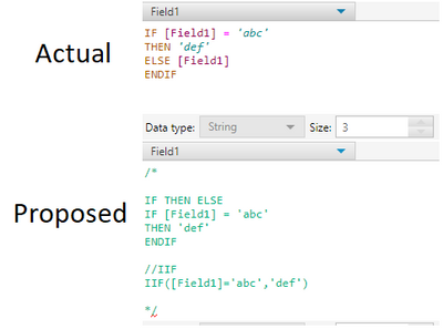
For any tool that uses the IF, THEN, ELSE or IIF statements, let the ELSE statement be optional (like in Python)
For example, notice in the proposed idea there is no ELSE statement, or a third parameter in IIF:
-
Category Preparation
-
Desktop Experience
In Interactive Charts, the only way to get user-defined input (other than automatic axis names etc.) into the chart is to add an additional column to the data which has the same content in each row and to use a batch chart.
I have two suggestions to this point:
- I would like to allow access to global Alteryx variables in any Chart text, such as "The path is [Engine.TempFilePath]". This should also work for non-batched charts.
- The current way of referring to columns in batch data is a bit odd and inconsistent to other tools. You have to type in "$" and get a list of available columns. After selecting, the dynamic test appears like static text in the configuration: If you type in "The column name is $column", you see "The column name is column" afterwards. That's quite confusing. My suggestion is to use the same nomenclature as elsewhere in Alteryx: Type in the text in brackets: "The column name is [column]". That way it would be as usual.
-
Category Reporting
-
Desktop Experience
I'd like to see the size of the data processing through each tool, in say GB. This would be helpful in understanding the volume of data being written to connected systems and would also be useful when cleansing data to determine if a meaningful impact was made to the data cleanliness.
-
Category Apps
-
Desktop Experience
Please enhance the Join Multiple tool to include an option of:
"left outer join all on input 1".
Such a tool would be massively advantageous when data granularity is defined by one dataset (input 1) and many subsequent tables just need to be joined onto that input.
As-is, I have had to manually perform dozens of join + union sequences which seems both untidy and inefficient.
Such a feature would likely be more useful than existing options of full outer joins / inner joins which currently the tool allows.
-
Category Join
-
Desktop Experience
I love the new (relatively) ConsumerView Decoder Tool! I used to do it the hard way, and it was fragile.
However, one thing is still missing: the Mosaic fields (MOSAIC HOUSEHOLD and MOSAIC ZIP4) - these are output from the tool as nulls. So, not only do you not get it decoded, you have to join back to the input to get the fields back as they were.
First, at least please pass them through as they were.
But preferably, decode them to the Mosaic Segment/Group names.
I realize (or couldn't find) the source for the Mosaic segment definitions is not currently in a Calgary database, but the tool is in the Calgary group.
-
Category Calgary
-
Category Demographic Analysis
-
Desktop Experience
I was able to add the following lines of R script to get the importance of the variables used in the cluster analysis. This will allow the user to see what variables are important in determining the clusters they have.
The script I added is below. It is pretty basic and could used spruced up by an Alteryx engineer as far as column naming, accounting for contingencies, and making it a reporting function. I think this would be a valuable feature for future versions of this tool.
library(FeatureImpCluster)#load library
FeatureImp_res <- FeatureImpCluster(clus.sol,as.data.table(the.matrix)) #Use FeatureImpCluster to take the cluster model (clus.sol) and data (the.matrix) to get variable imp.
FeatureImp_df <- as.data.frame(FeatureImp_res$featureImp) #turns features from a list to dataframe
FeatureImp_df_rn <- tibble::rownames_to_column(FeatureImp_df, "Variable") #Adds the variable name to the importance scores
write.Alteryx(FeatureImp_df_rn, 3) #outputs dataframe in output #3
-
Category Predictive
-
Desktop Experience
Hello
I have searched the community but haven't found any obvious solutions to this.
When using a cross tab I often find that there shouldn't be any aggregated values and if there is it means there is an issue with my data or workflow.
Therefore I think a useful feature would be an option for the cross tab tool to be able to return an error if it trying to aggregate any values.
I have a work around by using a summarize tool to count the non unique records and then a test to see if there are any duplicates but I think this could be a useful addition to the tool.
Thanks
-
Category Transform
-
Desktop Experience
-
Enhancement
The macro input tool asks for a template input that is either a text or file input. A perfect template can be hard to come by and so I wonder if the macro input could just ask how many columns are expected and the type and size that this column should be. I feel this would be more intuitive and easier to debug.
-
Category Macros
-
Desktop Experience
In the next product version, can the parameter options for the topic modelling be changed to allow the output of both word relevance summary and interactive chart? It's a bit strange to run the tool twice to get this output.
-
Category Text Mining
-
Desktop Experience
I think this was brought up a few years back but why doesn't the Union config by name option have a field map? It would stop that feeling you get when you browse your workflow after a union tool and find a column which is 5% blank and 95% full sitting next to one with a slightly different name which is 95% blank and 5% full.
-
Category Join
-
Desktop Experience
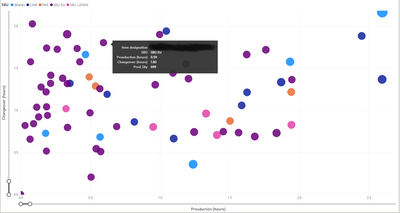
I would like to get a full legend overlay when hovering over the bubble (see example in power BI).
-
Category Reporting
-
Desktop Experience
The new versions of Alteryx the red "change color" has gone to yellow which is almost impossible to see with a big and bright monitor.
PLEASE change it back to the normal red background color!
-
Desktop Experience
-
User Settings
Looking for a way to make multi-selection much easier (rather than single click per item). Could be an improvement on the List Box, or a new tool that allows multi-selection with highlighting desired items. Control/Shift keys for selections similar to Windows, etc.
-
Category Interface
-
Desktop Experience
It would be helpful to be able to toggle the way the Mode calculation handles two or more "ties." Currently if there is a tie between records, the lower is returned. I have a use case where I would rather have the higher value return if there is a tie. I could also see there being a use for an average between the tied records. Ideally I think there would be three options for a tie: use the 1. lowest value 2. highest value 3. average of tied values. I'm not sure if first/last would also be helpful to have as options.
My use case is for product dimensions. We use the mode to normalize the dimensions (height, width, depth) of products. Because we are using the dimensions for space planning, if the lower value is used there may not be enough space for the product on the shelf. We would rather use the higher of the tied values to make sure we aren't creating a plan where the products won't fit.
-
Category Transform
-
Desktop Experience
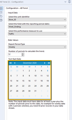
Allow the direct entry of the test start date into the AB Trend tool rather than forcing the use of a calendar widget to select the date. Or at least make the calendar display the date that was set rather then the current month.
It would also be useful to edit the sample workflow for this tool , sample 21_AB_Trend_Controls_Analysis_Sample.yxmd, to add annotations to each tool to describe what the settings are in the example as well as to add more specific detail to the workflow description.
-
Category Predictive
-
Desktop Experience
Today the Autofield tool transforms the fields into byte by default when it considers that the content is suitable while we expect text in it and that it can simply be a field not filled in in the context current but which may be later.
The idea would be to be able to choose which type by default to implement on text or empty fields and not the default byte because a byte field is not recognized on a formula using an IN for example which can produce errors in the following workflows.
-
Category Preparation
-
Desktop Experience
-
Enhancement
Hi Team,
I have a dataset of x,y values that I am plotting with an interactive chart tool. These values will vary widely so I can't use custom display ranges and have to rely on the "Auto" function for display range.
My problem is that the two axis are Auto scaled to different scaling and it is turning all my ellipse shapes into circles. Not a huge setback as you can check the Axis labels to see the scale but for this use case the shape of the data is what I am trying to portray and this makes my reports somewhat misleading.
I'm suggesting adding an option, maybe a tick box, under the interactive chart's "Auto" config that would allow both Axis to be scaled the same amount (That of the highest value).
Cheers,
Stephen
-
Category Reporting
-
Desktop Experience
- New Idea 301
- Accepting Votes 1,790
- Comments Requested 22
- Under Review 169
- Accepted 54
- Ongoing 8
- Coming Soon 7
- Implemented 539
- Not Planned 110
- Revisit 59
- Partner Dependent 4
- Inactive 674
-
Admin Settings
20 -
AMP Engine
27 -
API
11 -
API SDK
222 -
Category Address
13 -
Category Apps
113 -
Category Behavior Analysis
5 -
Category Calgary
21 -
Category Connectors
247 -
Category Data Investigation
79 -
Category Demographic Analysis
2 -
Category Developer
211 -
Category Documentation
80 -
Category In Database
215 -
Category Input Output
646 -
Category Interface
242 -
Category Join
105 -
Category Machine Learning
3 -
Category Macros
154 -
Category Parse
76 -
Category Predictive
79 -
Category Preparation
395 -
Category Prescriptive
1 -
Category Reporting
199 -
Category Spatial
81 -
Category Text Mining
23 -
Category Time Series
22 -
Category Transform
89 -
Configuration
1 -
Content
1 -
Data Connectors
969 -
Data Products
3 -
Desktop Experience
1,558 -
Documentation
64 -
Engine
127 -
Enhancement
348 -
Feature Request
213 -
General
307 -
General Suggestion
6 -
Insights Dataset
2 -
Installation
24 -
Licenses and Activation
15 -
Licensing
13 -
Localization
8 -
Location Intelligence
80 -
Machine Learning
13 -
My Alteryx
1 -
New Request
209 -
New Tool
32 -
Permissions
1 -
Runtime
28 -
Scheduler
24 -
SDK
10 -
Setup & Configuration
58 -
Tool Improvement
210 -
User Experience Design
165 -
User Settings
81 -
UX
223 -
XML
7
- « Previous
- Next »
- asmith19 on: Auto rename fields
- Shifty on: Copy Tool Configuration
- simonaubert_bd on: A formula to get DCM connection name and type (and...
-
NicoleJ on: Disable mouse wheel interactions for unexpanded dr...
- haraldharders on: Improve Text Input tool
- simonaubert_bd on: Unique key detector tool
- TUSHAR050392 on: Read an Open Excel file through Input/Dynamic Inpu...
- jackchoy on: Enhancing Data Cleaning
- NeoInfiniTech on: Extended Concatenate Functionality for Cross Tab T...
- AudreyMcPfe on: Overhaul Management of Server Connections


