Alteryx Designer Desktop Ideas
Share your Designer Desktop product ideas - we're listening!Submitting an Idea?
Be sure to review our Idea Submission Guidelines for more information!
Submission Guidelines- Community
- :
- Community
- :
- Participate
- :
- Ideas
- :
- Designer Desktop
Featured Ideas
Hello,
After used the new "Image Recognition Tool" a few days, I think you could improve it :
> by adding the dimensional constraints in front of each of the pre-trained models,
> by adding a true tool to divide the training data correctly (in order to have an equivalent number of images for each of the labels)
> at least, allow the tool to use black & white images (I wanted to test it on the MNIST, but the tool tells me that it necessarily needs RGB images) ?
Question : do you in the future allow the user to choose between CPU or GPU usage ?
In any case, thank you again for this new tool, it is certainly perfectible, but very simple to use, and I sincerely think that it will allow a greater number of people to understand the many use cases made possible thanks to image recognition.
Thank you again
Kévin VANCAPPEL (France ;-))
Thank you again.
Kévin VANCAPPEL
I was showing Alteryx to someone who was color blind. They did not have the ability to see some of the colors in the tool palette or the formula tool colors. Would be nice to have an option to toggle the colors for color blind people. Color blindness affects approximately 1 in 12 men (8%) and 1 in 200 women in the world.
-
Category Interface
-
Desktop Experience
A question has been coming up from several users at my workplace about allowing a column description to display in the Visual Query Builder instead of or along with the column name.
The column names in our database are based on an older naming convention, and sometimes the names aren't that easy to understand. We do see that (if a column does have a column description in metadata) it shows when hovering over the particular column; however, the consensus is that we'd like to reverse this and have the column description displayed with the column name shown on hover.
It would be a huge increase to efficiency and workflow development if this could be implemented.
Hi,
I was just working on an application that targets a back end database, which is currently manually refreshed. A user on my side requested that we include a "Data Last Refreshed on" text on the application, so that users would see it whenever they ran the app.
I was able to accomplish this by using a Drop Down tool populated using the "External Source" List Values, which is not connected to any Action tool. However, this is a somewhat ugly solution to the problem - it creates one more clickable object for the user that doesn't actually do anything.
I think having a "Label" tool, which functioned similar to a Text Box (multiline support) but did not allow users to enter values, that included the "External Source" option from the List Box/Drop Down, would be a huge help for Application Development. This would let you create a configurable message for your users, be it a Last Refresh, runtime instructions, or even a Last Run Date for the application.
-
Category Apps
-
Category Interface
-
Desktop Experience
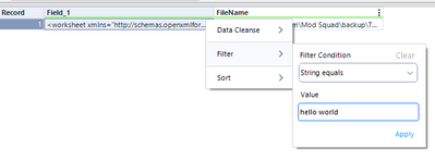
As a change to Designer UI in 2021.2, when in the filter box, I used to be able to use my mouse to click a little X in the corner to clear the filter or sort that had been implemented and it would immediately clear the filter. It's not working as of 2021.2. Now, I must navigate to the last cascade to get to the word Clear and click on it to clear the filter.
This feels like another very tiny move in the wrong direction. These small UI changes cause 2 or 3 additional steps and slow the diagnostic/navigation process in moving around the Results Grid in the Browse Tool or at any point in the flow where the Results Grid is used.
Can the X in the top level of the Filter/Sort box in the Results Grid be restored in 2021.2?
Related to submission:
Small fix for the UI in the Results Grid (or Browse Tool)
Small Keyboard fix for the browse tool's filter
-
Category Interface
-
Desktop Experience
Use case: Person running app to select folder from limited list similar to how the tree tool allows for a user to select one or more files. This selected folder would then be connected via an Action tool to a Directory tool (or by adding a formula tool to a Dynamic Input). The Folder Browse Interface does not have the ability to restrict or provide a starting parent folder. The app below pulls data from SharePoint site, which cannot be easily browsed to. Currently I have the user select a file in the required folder, then use RegEx parse and a Formula tool to pull in all requested files from that folder. It would be a better user interface if the user selected a folder. A test sample of the workflow is attached (final version ends in an Alteryx database this is picked up in a chained app).
-
Category Apps
-
Category Interface
-
Desktop Experience
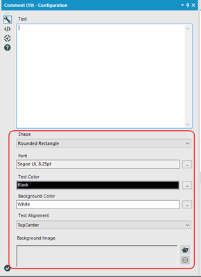
The COMMENT tool has a number of default settings. It would save me a lot of time if the Designer could remember the last settings used.
This is the panel I am referring to:
-
Category Documentation
-
Category Interface
-
Desktop Experience
Loving the fresh new UI, but (there's always a but) I feel like the combination of font usage, (no) smoothing, and kerning in the 2018.4 user interface is very straining on your eyes and makes most of the text pretty hard to read:
On high(er) resolution screens, like laptops, the issues get worse. Working on a ThinkPad P51s, Windows 10, 1920x1080, no weird text and layout upscaling because I'm a sane person.
-
Category Interface
-
Desktop Experience
I have an app that contains 4 check boxes. Each check box is independent, and when checked, two other prompts open up to the user (in this case, text boxes which are also independent of the other check boxes).
I would like to be able to "Check All", so that with one click, ALL four check boxes are checked, and their prompts all open up.
-
Category Interface
-
Desktop Experience
Probably more of a bug. Not sure if this annoyes anyone else, but when a running workflow in a different tab completes, the current windows focus is gone, even you have the pop-up notification disabled. Check the video and see what happens at 0:11 when tab 105 finishes running while I'm typing a super complicated code 😉
-
Category Interface
-
Desktop Experience
There is currently no way to export interactive output from the network graph tool. I would like to be able to export a png of the static network graph image, a pdf of the report, and a complete html of the whole (which means including the JSON and vis.js files necessary for creating the report).
-
Category Interface
-
Category Macros
-
Category Reporting
-
Desktop Experience
Pre-v10, I could set a default tool for each tool palatte. For example, for the Summarize tool pallate, I could make the Summarize tool the default (that already was the default, but you get the point). I could then simply drag the tool palatte icon onto the canvas and the Summarize tool would be there. Now, I have to navigate to the tool pallate and drag my tool on the canvas. Yes, I know I could add it to my favorites, but screen real estate goes quickly after adding just a few favorites to the already defaulted favorites. It would've been nice if this functionality wasn't removed with v10.
-
Category Interface
-
Desktop Experience
This setting is currently in the Options menu under user settings, but I think it would be more intuitive and more consistent with the norm for most software if the check box were directly on the splash screen.
-
Category Interface
-
Desktop Experience
It would be super cool to run a regular workflow in "test mode" or some other such way of running it just one tool at a time, so you can check tool outputs along the way and fix issues as they occur, especially for big workflows. Another advantage would be that if, for whatever reason, a working module stops working (maybe someone changed an underlying file - that NEVER happens to me lol), rather than running the whole thing, fixing something, running the whole thing again, you could just fix what's broken and run it that far before continuing.
Actually, that gives me an even better idea... a stop/start tool. Drop it in the workflow and the module will run up to that point and stop or start from that point. Hmm... time to submit a second idea!
-
Category Data Investigation
-
Category Interface
-
Category Preparation
-
Desktop Experience
Hi,
when I right-click on an Input tool, I can select "Convert To Macro Input" from the context menu. I would like the similar functionality when right-clicking a Browse tool to "Convert To Macro Output".
-
Category Interface
-
Category Macros
-
Desktop Experience
for example, the default filename is
FileA_P10.xlsx the P10 mean the month. and i want to give a freedom to user to amend or change the filename.
hence, i put the interface text box to show the default text built by formula, but it only able to input text only.
from this > "FileA_P10.xlsx"
to this > "FileA_P" + datetimeformat(datetimetoday,"%m") + ".xlsx"
and it is better if it apply for other interface tool.
-
Category Interface
-
Desktop Experience
Please create a way to swap or change the order of the inputs and outputs for tools with two or more inputs and outputs.
For example: When creating a workflow a join tool can end up moving to a location on the canvas that causes flow paths to cross. To fix the overlapping paths with a simple option of change order of input and output with a simple up and down would be much better than deleting the paths and reconnecting and redefining all of the join fields.
-
Category Interface
-
Category Join
-
Desktop Experience
Currently there is no option to edit an existing macro search path from Options-> User Settings -> Macros. Only options are Add / Delete. Ideally we need the Edit option as well.
Existing Category needs to be deleted and created again with the correct path, if search path is changed from one location to another.
-
Category Interface
-
Category Macros
-
Desktop Experience
Very simple. Use the wheel button on the mouse to reconfigure connections between nodes. You click on the origin or end and drop into the new anchor point.
-
Category Connectors
-
Category Interface
-
Data Connectors
-
Desktop Experience
Hi!
Currently, the only visual the user has on which column they have selected in the Results window, is the 3 dots for column options (Data Cleanse/Filter/Sort). It would be incredible if Alteryx would add a border around the entire column that is selected (like you currently do when selecting a whole row) & maybe possibly even bold the header of the selected column.
I think you might be changing the background color from light grey to white, but it's so subtle it's hard to tell. Make it pop!
-
Category Interface
-
Desktop Experience
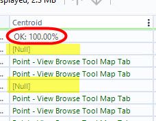
Alteryx currently shows 100% in the profiling of spatial fields in the results window, regardless of if there are rows with missing spatial features. I opened a ticket about this & was told it is expected behavior.
Therefore, I submit the idea that the profiling for spatial fields should give an accurate profile of the field, & if there are nulls in the field, it should identify that column isn't 100% OK and show the % of records that have null values, like the profiling does for every other column in workflows.
Thank you!
-
Category Data Investigation
-
Category Demographic Analysis
-
Category Interface
-
Category Reporting
- New Idea 376
- Accepting Votes 1,784
- Comments Requested 21
- Under Review 178
- Accepted 47
- Ongoing 7
- Coming Soon 13
- Implemented 550
- Not Planned 107
- Revisit 56
- Partner Dependent 3
- Inactive 674
-
Admin Settings
22 -
AMP Engine
27 -
API
11 -
API SDK
228 -
Category Address
13 -
Category Apps
114 -
Category Behavior Analysis
5 -
Category Calgary
21 -
Category Connectors
252 -
Category Data Investigation
79 -
Category Demographic Analysis
3 -
Category Developer
217 -
Category Documentation
82 -
Category In Database
215 -
Category Input Output
655 -
Category Interface
246 -
Category Join
108 -
Category Machine Learning
3 -
Category Macros
155 -
Category Parse
78 -
Category Predictive
79 -
Category Preparation
402 -
Category Prescriptive
2 -
Category Reporting
204 -
Category Spatial
83 -
Category Text Mining
23 -
Category Time Series
24 -
Category Transform
92 -
Configuration
1 -
Content
2 -
Data Connectors
982 -
Data Products
4 -
Desktop Experience
1,604 -
Documentation
64 -
Engine
134 -
Enhancement
406 -
Event
1 -
Feature Request
218 -
General
307 -
General Suggestion
8 -
Insights Dataset
2 -
Installation
26 -
Licenses and Activation
15 -
Licensing
15 -
Localization
8 -
Location Intelligence
82 -
Machine Learning
13 -
My Alteryx
1 -
New Request
226 -
New Tool
32 -
Permissions
1 -
Runtime
28 -
Scheduler
26 -
SDK
10 -
Setup & Configuration
58 -
Tool Improvement
210 -
User Experience Design
165 -
User Settings
85 -
UX
227 -
XML
7
- « Previous
- Next »
- abacon on: DateTimeNow and Data Cleansing tools to be conside...
-
TonyaS on: Alteryx Needs to Test Shared Server Inputs/Timeout...
-
TheOC on: Date time now input (date/date time output field t...
- EKasminsky on: Limit Number of Columns for Excel Inputs
- Linas on: Search feature on join tool
-
MikeA on: Smarter & Less Intrusive Update Notifications — Re...
- GMG0241 on: Select Tool - Bulk change type to forced
-
Carlithian on: Allow a default location when using the File and F...
- jmgross72 on: Interface Tool to Update Workflow Constants
-
pilsworth-bulie
n-com on: Select/Unselect all for Manage workflow assets
| User | Likes Count |
|---|---|
| 7 | |
| 5 | |
| 3 | |
| 2 | |
| 2 |


