Alteryx Designer Desktop Ideas
Share your Designer Desktop product ideas - we're listening!Submitting an Idea?
Be sure to review our Idea Submission Guidelines for more information!
Submission Guidelines- Community
- :
- Community
- :
- Participate
- :
- Ideas
- :
- Designer Desktop: Top Ideas
Featured Ideas
Hello,
After used the new "Image Recognition Tool" a few days, I think you could improve it :
> by adding the dimensional constraints in front of each of the pre-trained models,
> by adding a true tool to divide the training data correctly (in order to have an equivalent number of images for each of the labels)
> at least, allow the tool to use black & white images (I wanted to test it on the MNIST, but the tool tells me that it necessarily needs RGB images) ?
Question : do you in the future allow the user to choose between CPU or GPU usage ?
In any case, thank you again for this new tool, it is certainly perfectible, but very simple to use, and I sincerely think that it will allow a greater number of people to understand the many use cases made possible thanks to image recognition.
Thank you again
Kévin VANCAPPEL (France ;-))
Thank you again.
Kévin VANCAPPEL
Dear Alteryx Gods,
Please hear my plea and add these beloved excel functions into the formula tool, using 3 Alteryx tools to do this simple task is ridiculous.
Thanks!
Under the join ribbon, could there be a new tool added called Minus?
This would behave similar to how SQL Minus works. I think this tool could closely resemble the setup found in the union tool and provide the following functions:
- Ability to manually configure fields
- Automatically configure by name
- Automatically configure by position
- Ability to (de-select extraneous columns)
- Option to either include ALL rows, or just the distinct (similar to the minus and minus all behavior in SQL)
When doing validations in a workflow, this would provide a useful dq measure to use as a sanity check to ensure that for example loan numbers haven't been dropped from one point of the workflow to the next.
Linear Regression Tool errors out with my data set if I sample more than 1 in every 31 cases. The sample size error-out is very consistent, despite the fact that different R error messages filter up with different runs. Support recommended small sample for the predictive tool then submit all data to Score. That's backwards of my need, which is to submit detail data to the predictive tool to create as precise a model as possible then apply that model to predicting a smaller set of future case outcomes.
I used version 2019.4.8.22007. My full data set had 15.46 million rows, and one string field (which is necessary) accounts for the majority of predictors submitted to the model. I ran it from the Desktop version. The PC had 64 GB RAM and I even changed the default Virtual Memory settings in hopes that'd help.
Every time I open a new workflow I start with a heading and subheading.
- Heading: Verdana 8pt bold. Color=black.
- Subheading: Verdana 9pt regular. Color=gray.
The aim is to ensure I know what this workflow is for, the date, who it is for and what was happening around me at the time I created the workflow. This helps bring me back to the premise that kicked this whole thing off and puts me in the frame of mind to understand what was happening at the time I created this workflow.
Occasionally in my workflow I'll have some comments, snippets of code and especially warnings for things to pay attention to when I open or before I run a workflow.
It would be fantastic if the documentation palette can be expanded to more than just three tools to include some of these comment tools, or a customizable set of tools/macros that will allow me to just set it once and reuse them as needed to keep style and formatting consistent so that I can focus on the workflow while keeping everything documented and tidy. Bonus points for including one that allows me to put my logo/signature on the canvas too.
My current workaround to this is putting all my styles in a workflow and having that open to copy and paste the comment and update the content.
We should have a simple mathematical functions under Formula Tool - Math functions to calculate specific Percentile data point. Or it can be a separate tool to derive various other statistical information.
The Python equivalent is Numpy.Percentile() OR quantile().
I have explored Alteryx app, help documentation and community posts without success.
I would like the functionality to configure my own installation media for my companies environment. For example, I want send new users to a link where they can install Alteryx designer that automatically turns on phone home data with our gallery information and installs any company wide macros that are relevant for the users. Then I would like to be able to push any periodic updates to all the designers in our company. For example, if Alteryx comes out with a new version that I want to deploy or if I come out with new macros that I want to deploy I can deploy across all users easily from the server. Obviously the ability to roll back updates would be needed as well.
In the Results - Workflow - Messages and Message Tool would like to add a new message type called Passed.
Changes:
1. In Results - Workflow Messages add new section between Warnings and Messages of Passed with Green Circle Icon
2. In Message Tool, add Message Type of Passed
Rationale:
This would be used for verifying data and indicating that tests have passed. I think one of the great advantages of Alteryx is all of the data verification you can do. For example I can download a report of the totals of all transactions for the year and compare to my daily transactions making sure they sum to the same number. Automated testing!!! The issue is I have to report when the test pass as a warning and I would rather have some green success messages of Passed! I like the visual indicator of success rather than just reporting the negative warnings & errors.
Thanks for considering.
The Join tool is one of the most used in the Community. After delivering some training for new users (Not technical) I see that it's difficult for them understands some some Joins, specially when the relationship between the Sources it's not 1:1.
So I propose to show the Summary visually, extending the Browse current information:
- List of Left Fields Joined / Excluded
- List of Right Fields Joined / Excluded
Also It should be convenient a tool to analyze the potential relationship between the sources, to be used previous to Join...
Thanks!
When I use the rectangular lasso to select some tools and/or control click them, I want to see a count of selected tools please.
Add input of ArcGrid file format.
Hi, I would like the ability to hover over a point/polygon on a Browse tool that displays geospatial data and be provided with some information on the data that isn’t currently offered. Namely, I would like the ability to hover over a point/centroid and have a bubble (a.k.a. tool tip) pop up displaying the exact coordinates of that datum, the row ID and some other unique identifying information (e.g. name, store number, etc). Other geospatial tools provide this functionality. See below:
Google Maps:
Alteryx:
And by the way, I realize Alteryx is not Google Maps, but as a data “consumer” or “interactor”, I think it’s just human nature for people to want them to “feel” the same. Something to strive for, at least.
I would also like the ability to click a datum displayed on the browse tool and have it highlight the row on the Results pane. The clicking functionality works going from the Results pane to the Browse tool, but not the other way.
Thanks! Kurt
When I use Alteryx with Git, I experience a strange bug. I have a workflow with a batch macro inside and the macro questions are mapped to fields. When I save and commit the workflow, the macro questions are not mapped for anyone else who opens that version. Every time that workflow is opened after a commit, we have to map the macro questions. Why does this happen and how can we resolve it? Thank you.
As the titles says, the move up/move down buttons from the select tool or a similar logic are not available yet.
It would come in handy to have this option when creating apps.
I want to create Descriptions for my fields in addition to those Alteryx auto creates, Text to Columns tool for example. I want to load these descriptions automatically into Tableau Hyper files so when I use the Tableau describe field feature, I will see them there. It also sets up the potential to create a data dictionary in the Tableau workbook based on these descriptions. Please give the option to load field descriptions into Tableau hyper files. Thank you.
When models are complex and extensive, it can be difficult to locate specific sections of a workflow despite any effort to organize the tools. I believe that it would be beneficial to have a feature that saves focused views of the model, e.g. zoomed into a specific location or set of tools, with a configuration of expanded or contracted containers.
The intent would not to affect the data flow but rather facilitate the data analyst's movement within the file.
Please see the (simple) example below, where the zone if red could be a saved view, onto which the screen would zoom and shift when selected.
I would like to be able to have the Map Tool to change the Reference Base Map to Tom Tom CA if there is a Country column in the incoming data stream that reads "CAN". Or change the Expand Extent from the default 10(%) to the number that's in a column called "Extent".
Right now I can only do it using the Macro interface tool, but I still have to make my selection after I select which data point(s) I'm using.
I want it to generate specific-format maps based on the input data I provide, so it could run automatically.
I guess, aside from the Spatial Field, Grouping Field, Thematic Field, and Label Fields, I'd love a Configurations Field(s).
I work for a company that is still running v 10.5. It takes some time for us to go through acceptance testing / approval for new versions of software, and therefore we will only upgrade to version 11 in November at the earliest. At the moment there is a warning just above the workflow stating that a newer version of Alteryx designer is available, which decreases the size of the workflow canvas etc. There is a dropdown to to defer this warning for a period of time (90 days/1 year etc), but this appears to make no difference as the warning shows on every startup of Alteryx. It would be great for this warning to be removed/the deferral to actually work as it becomes old pretty quickly when I have to remove this warning on every startup.
Thanks!
I would like to see an included select window for (nearly) all tools. Sometimes almost half of my workflow are select tools because I try to minimize my data and improve naming as much as possible.
Example:
1) Removing unnecessary columns
2) Removing Lat/Long columns
3) Removing not needed columns from distance tool.
Another example would be the typical usage of cross-tab. In 90% of my cross-tab usage, I put a select tool behind it.
I think it would be good to have an included select window in nearly all tools. There are probably tools that don't need them, but I think it would be a good addition to many tools.
I would suggest to add an included select tool for (at least) these tools:
- Input Data
- Cross-tab
- Tile
- Formula
- Multi-Row Formula
- Multi-Field Formula
- Text To Columns
- Cross Tab
- Transpose
- Create Points
- Distance
- Trade Area
- ...
For example, allowing the letters in front of the column titles to be formatted differently to make them stand out on a report.
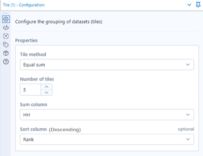
When using the equal sum option in the Tile tool, you have the choice to sort by a column. However, it's not clear from the tool whether the data is being sorted in ascending or descending order.
Confusingly, the data is sorted in descending order, compared to the default of ascending in the Sort tool. This seems counterintuitive, as a user would expect the same defaults across tools (we did! and it caused some consternation when we worked out it wasn't) and also because in most of our use cases, you want the highest tile to be the highest rank, e.g., if you were sorting households by income.
I have two possible suggestions:
1. Update the tool properties so that it reads "Sort column (descending)". (Probably the easiest change!)
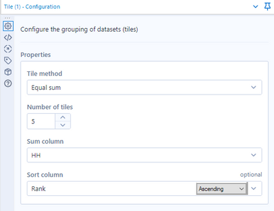
2. Allow the user to specify a direction with another drop down that becomes active when you select a sort field (similar to the sort tool).
I know that the functionality of suggestion 2 is available by adding a Sort tool before the Tile and sorting the data in ascending order. However, having to do that every time seems to defeat the point of being able to sort in the Tile tool.
Thanks for reading!
Jason
Standard Tile configuration:
Option 1 (mock-up):
Option 2 (mock-up):
- New Idea 291
- Accepting Votes 1,790
- Comments Requested 22
- Under Review 167
- Accepted 55
- Ongoing 8
- Coming Soon 7
- Implemented 539
- Not Planned 111
- Revisit 59
- Partner Dependent 4
- Inactive 674
-
Admin Settings
20 -
AMP Engine
27 -
API
11 -
API SDK
220 -
Category Address
13 -
Category Apps
113 -
Category Behavior Analysis
5 -
Category Calgary
21 -
Category Connectors
247 -
Category Data Investigation
79 -
Category Demographic Analysis
2 -
Category Developer
209 -
Category Documentation
80 -
Category In Database
215 -
Category Input Output
645 -
Category Interface
240 -
Category Join
103 -
Category Machine Learning
3 -
Category Macros
153 -
Category Parse
76 -
Category Predictive
79 -
Category Preparation
395 -
Category Prescriptive
1 -
Category Reporting
199 -
Category Spatial
81 -
Category Text Mining
23 -
Category Time Series
22 -
Category Transform
89 -
Configuration
1 -
Content
1 -
Data Connectors
968 -
Data Products
3 -
Desktop Experience
1,551 -
Documentation
64 -
Engine
127 -
Enhancement
343 -
Feature Request
213 -
General
307 -
General Suggestion
6 -
Insights Dataset
2 -
Installation
24 -
Licenses and Activation
15 -
Licensing
13 -
Localization
8 -
Location Intelligence
80 -
Machine Learning
13 -
My Alteryx
1 -
New Request
204 -
New Tool
32 -
Permissions
1 -
Runtime
28 -
Scheduler
24 -
SDK
10 -
Setup & Configuration
58 -
Tool Improvement
210 -
User Experience Design
165 -
User Settings
81 -
UX
223 -
XML
7
- « Previous
- Next »
- Shifty on: Copy Tool Configuration
- simonaubert_bd on: A formula to get DCM connection name and type (and...
-
NicoleJ on: Disable mouse wheel interactions for unexpanded dr...
- haraldharders on: Improve Text Input tool
- simonaubert_bd on: Unique key detector tool
- TUSHAR050392 on: Read an Open Excel file through Input/Dynamic Inpu...
- jackchoy on: Enhancing Data Cleaning
- NeoInfiniTech on: Extended Concatenate Functionality for Cross Tab T...
- AudreyMcPfe on: Overhaul Management of Server Connections
-
AlteryxIdeasTea
m on: Expression Editors: Quality of life update
| User | Likes Count |
|---|---|
| 5 | |
| 3 | |
| 3 | |
| 3 | |
| 2 |
