Alteryx Designer Desktop Ideas
Share your Designer Desktop product ideas - we're listening!Submitting an Idea?
Be sure to review our Idea Submission Guidelines for more information!
Submission Guidelines- Community
- :
- Community
- :
- Participate
- :
- Ideas
- :
- Designer Desktop: Top Ideas
Featured Ideas
Hello,
After used the new "Image Recognition Tool" a few days, I think you could improve it :
> by adding the dimensional constraints in front of each of the pre-trained models,
> by adding a true tool to divide the training data correctly (in order to have an equivalent number of images for each of the labels)
> at least, allow the tool to use black & white images (I wanted to test it on the MNIST, but the tool tells me that it necessarily needs RGB images) ?
Question : do you in the future allow the user to choose between CPU or GPU usage ?
In any case, thank you again for this new tool, it is certainly perfectible, but very simple to use, and I sincerely think that it will allow a greater number of people to understand the many use cases made possible thanks to image recognition.
Thank you again
Kévin VANCAPPEL (France ;-))
Thank you again.
Kévin VANCAPPEL
Configuration window - Add feature to zoom in or out of the configuration window similar to the canvas. There is alot going on in the Configuration window and it would be helpful (especially for those of us with eyesight challenges) to be able to zoom in/out similar to the Canvas.
More and more people are making use of Plotly and Plotly Express to develop really great graphics. However it is extremely difficult to extract either interactive charts (HTML format) or static images (PNG or JPEG).
The main issue for Plotly to save static images is the ability to install and use Orca (application) for R and kaleido (library) for Python. Despite my best efforts I have had no luck getting either approach to work with the respective Alteryx environments
Migrate old R based charts and create new statistical charts in the interactive chart tool to provide enhanced statistical charting and visual data exploration capabilities.
This includes:
- Error Bars
- Distribution Plots
- 2D Histograms
- Scatterplot Matrix
- Facet & Trellis Plots
- Tree Plots
- Violin Plots
- Heatmaps
- Log Plots
- Parallel Coordinates Plot
This these URLs for more examples:
The ability to create, modify and enhance interactive chart types through custom plotly code in either R or Python. This would allow new style of visualisation to be created and shared with other authors.
needs a much simpler way to configure this tool. Its way more obfuscated than it needs to be and the wording on the config is very confusing.
For heavy workflows (e.g. reading massive amount of data, processing it and storing large datasets through in db tools in Cloudera), a random error is sometime generated: 'General error: Unexpected exception has been caught'
This seems due to Kerberos ticket expiration and the related setting may not be modifiable by the Alteryx developer 'especially when GPO). Suggestion is to enhance the indb tools in such a way that they are able to automatically renew the Kerberos ticket like other applications do.
Br, Lookman
Map input allows the user to connect the Q anchor to a file browse in order to navigate for a Reference Layer.
Please allow functionality for the tree input tool to do this as well.
Thanks!
Hello All,
During my trial of assisted modelling, I've enjoyed how well guided the process is, however, I've come across one area for improvement that would help those (including myself) overcome any hurdles when getting started.
When I ran my first model, I was presented with an error stating that certain fields had classes in the validation dataset that were not present in the Training dataset.
Upon investigation (and the Alteryx Community!) I discovered that this was due to a step in the One Hot Encoding tool.
Basically, the Default setting is for all fields to be set to error under the step for dealing with values not present in the training dataset, but there is an option to ignore these scenarios.
My suggestion:
Add an additional step to Assisted Modelling that gives the user the option to Ignore / Error as they see fit.
If this were to be implemented then it would remove the only barrier I could find in Assisted Modelling.
Hope this is useful and happy to provide further context / details if needed.
Issue
Im troubleshooting a workflow with around 4,400 tools, breaking into separate workflows, and leveraging the crew macros to run the workflow sequence. Well- I changed a few file names and have an interesting disaster where I need to go tool by tool to verify everything is properly configured.
Solution
I used tool containers to group and label sections of tools to be organized, but it was becoming difficult to navigate the ocean of tool clusters. So- I used blank comment boxes in the tool containers. If everything works in the container, I made the comment box green. If something is broken, I made it red. From there, I made all of the red comment boxes green to make sure everything was diligently reviewed.
New Cool Idea
Troubleshooting mode- make it easy to flip a lighthouse switch on the tool containers. Colors are great for categories, but this makes it easy to focus or highlight containers with maybe a cool retro looking switch.
Peace, Love, and Workflows....
Salesforce Input tool throws a conversion error if labels are longer than 40 characters:
Could the the size of the field be increased to whatever the the Salesforce maximum is, or at least be configurable from the tool configuration.
Particularly annoying is that the conversion error cannot be ignored (as seen in the Union tool) but will continue to show the result as yellow in the Scheduler. We like to keep a green board!
Using the Download Tool, when doing a PUT operation, the tool adds a header "Transfer-Encoding: chunked". The tool adds this silently in the background.
This caused me a huge headaches, as the PUT was a file transfer to Azure Blob Storage, which was not chunked. At time of writing Azure BS does not support chunked transfer. Effectively, my file transfer was erroring, but it appeared that I had configured the request correctly. I only found the problem by downloading Fiddler and sniffing the HTTPS traffic.
Azure can use SharedKey authorization. This is similar to OAuth1, in that the client (Alteryx) has to encrypt the message and the headers sent, so that the Server can perform the same encryption on receipt, and confirm that the message was not tampered with. Alteryx is effectively "tampering with the message" (benignly) by adding headers. To my mind, the Download tool should not add any headers unless it is clear it is doing so.
If the tool adds any headers automatically, I would suggest that they are declared somewhere. They could either be included in the headers tab, so that they could be over-written, or they could have an "auto-headers" tab to themselves. I think showing them in the Headers tab would be preferable, from the users viewpoint, as the user could immediately see it with other headers, and over-ride it by blanking it if they need to.
It would be great if it was possible to output the top most influential features in producing the score for each individual entity/row when using the predictive and machine learning tools.
Similar to the way they work in DataRobot. Details here and here.
This would enable some simple interpretation of how a model came to an individual prediction and the most important features in that particular row/case.
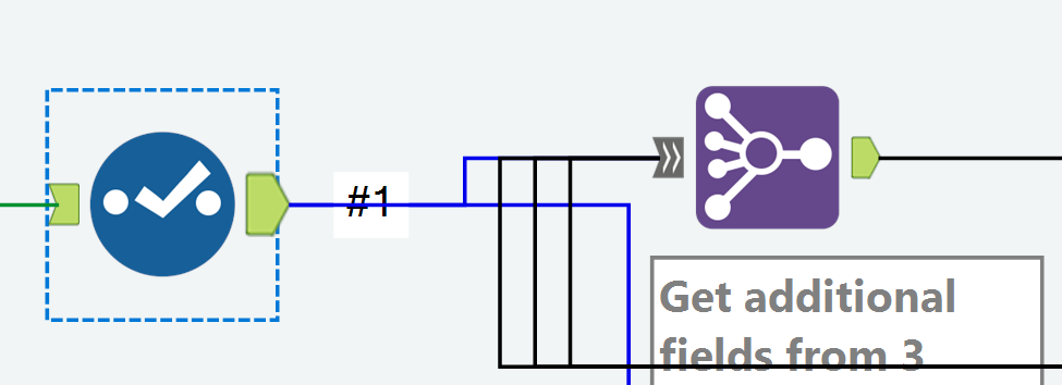
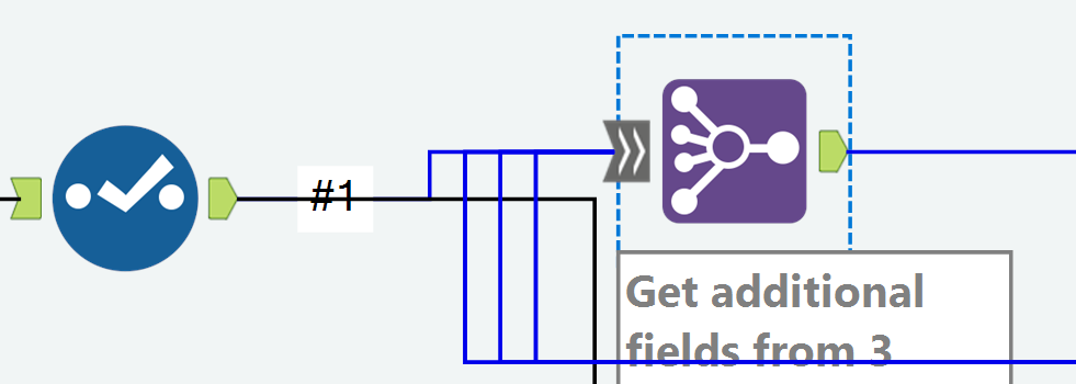
With the Join Multiple tool, a connector line isn't colored correctly all the way to the input anchor.
I'm on version 2019.4
Example: My Join Multiple has 4 inputs
When I click the output anchor on a Select tool that feeds into Input #1 in the Join Multiple, the connector is colored blue for only a portion of the distance to the Join Multiple tool.
Example: When I click the input anchor on the Join Multiple, the connector line isn't blue all the way to the prior Select tool.
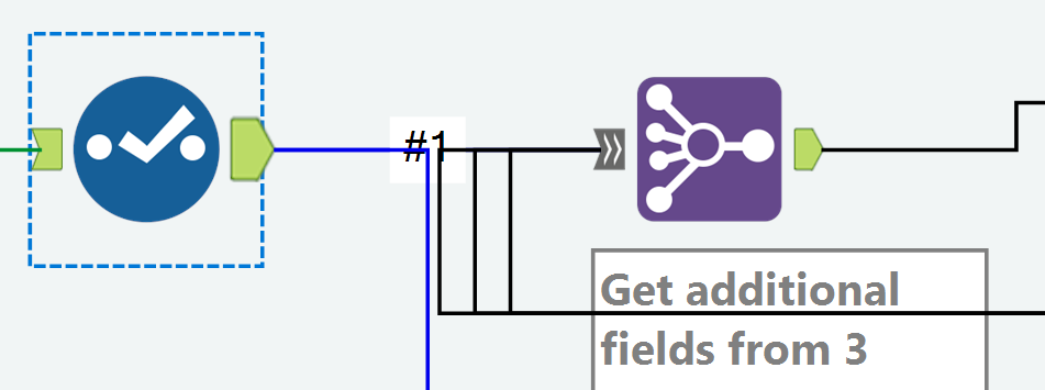
Example of how the incorrect coloring can be confusing:
When the two tools are aligned horizontally, clicking the Select tool makes it look like it's not connected to the Join Multiple.
And clicking the Join Multiple makes it look like it's not connected to the Select.
Chris
Current insight tool can create dashboard but can not display content by user access control, for example: one insight dashboard has whole country's sales number. Would you please add an function to let different region's sales only see their own region data when log into this dashboard ?
Thanks!
I find myself constantly in a situation where I am building a workflow and need to add a browse tool or branch out from the main path to test some ideas or check something and it is very annoying having to run the whole process again, I know that there is the option to cache but it the criteria is very impractical because you can't cache at different points in the workflow easily.
It should be possible to add some tools like browse or output to a file without having to re-run the whole workflow again.
I keep making the same changes to the table tool rules, using the same formulas when I build new reports. For example, Row Rule 1: Font, bold; Background Color, green; Row Rule 2; Font, bold; Background Color, blue; Row Rule 3; Font, bold; Background Color, yellow. Each is based on a formula: IsEmpty([Column Name]). I do this over and over and over again. The only thing that changes is the column name. It would be nice to have the Row Style Rules saved so they can be browsed to" or inserted.
Still waiting for the Default Table Settings to include "CENTER" in the header tab.
Hi Everyone,
If possible I would like to see the Tool Palette Tabs automatically go onto a 2nd or even 3rd row if your screen isn't wide enough to show them all, and/or have the ability to order the Tool Palette Tabs yourself.
Most of the time I use IN/OUT, Preparation, Join & Transform... however I have set up my own Palette Tab for macros that I have made, but I find it a pain to keep scrolling left & right using the small arrow buttons
I could reduce the number of Tabs to fit onto one screen, but whilst learning and looking for tools which maybe useful to a particular task, I have most of them already open and ready.
For example:
With the ability to have this in any order you wish, so you can place your most frequently used Tabs on the top/bottom row, with your own Tab at the beginning... if you wish.
Thanks
Kevin
In the Union Field, we have the option to manually configure fields. This is currently done horizontally, which makes it difficult to see every field (if dealing with lots of columns), if we could have a tick-box, and switch this to vertical, then we could use a view similar to the select field.
Thanks
Sam7
There are currently 7 data types related to numeric values, including byte. Simply and standardize the way Alteryx handles numeric values. Condense the numeric data types to one and provide a way to control the decimal places by indicating how many are needed to the right of the decimal. The current numeric datatypes are confusing and do not behave the same with the formulas functions, like Round.
Adopt the standard numeric functions seen across multiple tools and languages like Excel, SQL, etc; like RoundUp, RoundDown, AbsoluteValue, Integer, etc.
- New Idea 297
- Accepting Votes 1,790
- Comments Requested 22
- Under Review 168
- Accepted 54
- Ongoing 8
- Coming Soon 7
- Implemented 539
- Not Planned 111
- Revisit 59
- Partner Dependent 4
- Inactive 674
-
Admin Settings
20 -
AMP Engine
27 -
API
11 -
API SDK
222 -
Category Address
13 -
Category Apps
113 -
Category Behavior Analysis
5 -
Category Calgary
21 -
Category Connectors
247 -
Category Data Investigation
79 -
Category Demographic Analysis
2 -
Category Developer
211 -
Category Documentation
80 -
Category In Database
215 -
Category Input Output
646 -
Category Interface
241 -
Category Join
104 -
Category Machine Learning
3 -
Category Macros
153 -
Category Parse
76 -
Category Predictive
79 -
Category Preparation
395 -
Category Prescriptive
1 -
Category Reporting
199 -
Category Spatial
81 -
Category Text Mining
23 -
Category Time Series
22 -
Category Transform
89 -
Configuration
1 -
Content
1 -
Data Connectors
969 -
Data Products
3 -
Desktop Experience
1,554 -
Documentation
64 -
Engine
127 -
Enhancement
347 -
Feature Request
213 -
General
307 -
General Suggestion
6 -
Insights Dataset
2 -
Installation
24 -
Licenses and Activation
15 -
Licensing
13 -
Localization
8 -
Location Intelligence
80 -
Machine Learning
13 -
My Alteryx
1 -
New Request
206 -
New Tool
32 -
Permissions
1 -
Runtime
28 -
Scheduler
24 -
SDK
10 -
Setup & Configuration
58 -
Tool Improvement
210 -
User Experience Design
165 -
User Settings
81 -
UX
223 -
XML
7
- « Previous
- Next »
- Shifty on: Copy Tool Configuration
- simonaubert_bd on: A formula to get DCM connection name and type (and...
-
NicoleJ on: Disable mouse wheel interactions for unexpanded dr...
- haraldharders on: Improve Text Input tool
- simonaubert_bd on: Unique key detector tool
- TUSHAR050392 on: Read an Open Excel file through Input/Dynamic Inpu...
- jackchoy on: Enhancing Data Cleaning
- NeoInfiniTech on: Extended Concatenate Functionality for Cross Tab T...
- AudreyMcPfe on: Overhaul Management of Server Connections
-
AlteryxIdeasTea
m on: Expression Editors: Quality of life update
| User | Likes Count |
|---|---|
| 7 | |
| 4 | |
| 3 | |
| 3 | |
| 3 |


