Alteryx Designer Desktop Ideas
Share your Designer Desktop product ideas - we're listening!Submitting an Idea?
Be sure to review our Idea Submission Guidelines for more information!
Submission Guidelines- Community
- :
- Community
- :
- Participate
- :
- Ideas
- :
- Designer Desktop: Hot Ideas
Featured Ideas
Hello,
After used the new "Image Recognition Tool" a few days, I think you could improve it :
> by adding the dimensional constraints in front of each of the pre-trained models,
> by adding a true tool to divide the training data correctly (in order to have an equivalent number of images for each of the labels)
> at least, allow the tool to use black & white images (I wanted to test it on the MNIST, but the tool tells me that it necessarily needs RGB images) ?
Question : do you in the future allow the user to choose between CPU or GPU usage ?
In any case, thank you again for this new tool, it is certainly perfectible, but very simple to use, and I sincerely think that it will allow a greater number of people to understand the many use cases made possible thanks to image recognition.
Thank you again
Kévin VANCAPPEL (France ;-))
Thank you again.
Kévin VANCAPPEL
The ability to create, modify and enhance interactive chart types through custom plotly code in either R or Python. This would allow new style of visualisation to be created and shared with other authors.
-
Category Reporting
-
Desktop Experience
needs a much simpler way to configure this tool. Its way more obfuscated than it needs to be and the wording on the config is very confusing.
-
Category Preparation
-
Desktop Experience
Issue
Im troubleshooting a workflow with around 4,400 tools, breaking into separate workflows, and leveraging the crew macros to run the workflow sequence. Well- I changed a few file names and have an interesting disaster where I need to go tool by tool to verify everything is properly configured.
Solution
I used tool containers to group and label sections of tools to be organized, but it was becoming difficult to navigate the ocean of tool clusters. So- I used blank comment boxes in the tool containers. If everything works in the container, I made the comment box green. If something is broken, I made it red. From there, I made all of the red comment boxes green to make sure everything was diligently reviewed.
New Cool Idea
Troubleshooting mode- make it easy to flip a lighthouse switch on the tool containers. Colors are great for categories, but this makes it easy to focus or highlight containers with maybe a cool retro looking switch.
Peace, Love, and Workflows....
-
Category Documentation
-
Desktop Experience
It would be great if it was possible to output the top most influential features in producing the score for each individual entity/row when using the predictive and machine learning tools.
Similar to the way they work in DataRobot. Details here and here.
This would enable some simple interpretation of how a model came to an individual prediction and the most important features in that particular row/case.
-
Category Predictive
-
Desktop Experience
-
Machine Learning
-
New Tool
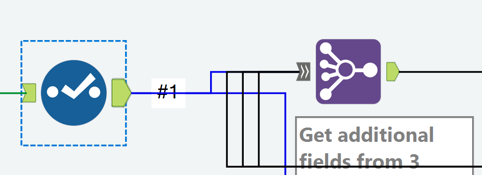
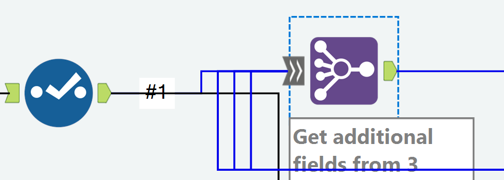
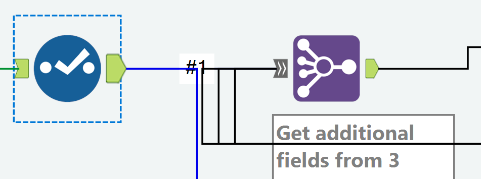
With the Join Multiple tool, a connector line isn't colored correctly all the way to the input anchor.
I'm on version 2019.4
Example: My Join Multiple has 4 inputs
When I click the output anchor on a Select tool that feeds into Input #1 in the Join Multiple, the connector is colored blue for only a portion of the distance to the Join Multiple tool.
Example: When I click the input anchor on the Join Multiple, the connector line isn't blue all the way to the prior Select tool.
Example of how the incorrect coloring can be confusing:
When the two tools are aligned horizontally, clicking the Select tool makes it look like it's not connected to the Join Multiple.
And clicking the Join Multiple makes it look like it's not connected to the Select.
Chris
-
Category Join
-
Desktop Experience
Current insight tool can create dashboard but can not display content by user access control, for example: one insight dashboard has whole country's sales number. Would you please add an function to let different region's sales only see their own region data when log into this dashboard ?
Thanks!
-
Category Interface
-
Category Reporting
-
Desktop Experience
In the Union Field, we have the option to manually configure fields. This is currently done horizontally, which makes it difficult to see every field (if dealing with lots of columns), if we could have a tick-box, and switch this to vertical, then we could use a view similar to the select field.
Thanks
Sam7
-
Category Join
-
Desktop Experience
There are currently 7 data types related to numeric values, including byte. Simply and standardize the way Alteryx handles numeric values. Condense the numeric data types to one and provide a way to control the decimal places by indicating how many are needed to the right of the decimal. The current numeric datatypes are confusing and do not behave the same with the formulas functions, like Round.
Adopt the standard numeric functions seen across multiple tools and languages like Excel, SQL, etc; like RoundUp, RoundDown, AbsoluteValue, Integer, etc.
-
Category Preparation
-
Desktop Experience
-
Category In Database
-
Category Predictive
-
Data Connectors
-
Desktop Experience
I am relatively new to Alteryx, but to my knowledge it does not seem like you are able to create aggregate data alerts that link two data columns to each other.
My suggestion is the following: Enable Alteryx to create a data alert so if you are creating a warehouse overview (as an example) you can set an alert whenever the quantity of an item is equal to its minimum stock
Alert when: Quantity = Minimum stock
Thus, whenever your quantity is reaching a critical level, you would receive an alert either through Alteryx, in Tableau (which I use to mediate my Alteryx data) or by email.
-
Category Reporting
-
Desktop Experience
Hello Alteryx fans and Devs!
For the Summarise tool - would it be useful to have a "Rank" option for the potential Summarise options we can use? Just a thought!
-
Category Transform
-
Desktop Experience
Hi,
I am using the Interactive Chart to create a line-chart, but I would like to have values of (X,Y AND Trace Name)
I cannot display it for the différent regions, when we move the mouse over the curve the parameter is applied only for one region.
FI: it works if i modify the xml code by adding the following code to each region:
<value>
<hoverinfo>x+y+name</hoverinfo>
</value>
Is it possible to add it directly in interactive chart ?
Thank you.
-
Category Reporting
-
Desktop Experience
Hello,
I really apologized if this has been posted before with some other title.
I started with Alteryx month ago and I am really trying to replicate some cool stuff for which we used to write ETL code in Python and loved it.
I saw a lot of posts regarding a Join Tool for left outer join or right outer join. While using Alteryx as a new person even I was confused with the Join tool since I was missing on numbers and ratios then I used Union Tool to union left and inner anchor of the output for the desired output.
I believe there should be a checkbox in the Join Tool for the Union Tool option.
I know its just a matter of dragging one more tool on Canvas but this is regarding with more flexibility and ease of use for every Alteryx user.
Thank you.
Regards,
Owais
-
Category Join
-
Desktop Experience
I frequently have to build nested macros into workflows that will live on the Gallery. Unfortunately, Gallery does not "see" these nested macros when I save to Gallery and manage assets. I have to open the macros, attach the nested macros within through every single nesting layer, save all of them, then return to the main workflow before I can save to the Gallery and have it "see" the nested macros. I usually attach them to the workflow so I don't have to check them on in the Gallery menu anyway. That's why I have to attach the nested macros.
Anyway, when I change all dependencies to relative, these nested macros are not showing that they have relative paths. I cannot get that to work, try as I might. That makes this problematic for version control. How can I attach macros using relative dependencies?
-
Category Macros
-
Desktop Experience
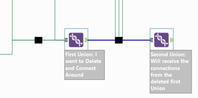
This is an edge case in which I have two back to back Union tools. I want to Delete and Connect Around on the first one. All of the inputs into that Union will flow into the next Union tool. Delete and Connect Around is not available from the context menu for any tool with multiple inputs. See the image for more clarification.
-
Category Join
-
Desktop Experience
When I use the PCA tool, I run it with 2 PCs, then look at the results output to choose my principal components, and re-run it with the actual number of PCs that I need. I use the loadings and variance data quite a lot - it would be great to be able to output the loadings, variance, and also the scaled variables as data to work with in Alteryx, rather than just browse it in the report.
I have modified the PCA tool to do this myself, but I find I need to do this with each upgrade just in case anything has changed in the tool. I'd love it if the report summary data and scaled data was available as an output!
For reference, my amended version is available here:
https://gallery.alteryx.com/#!app/Principal-Components-Analysis-Extra/5eb2f79d0462d70bc0b6c516
-
Category Predictive
-
Desktop Experience
Hi,
Here is an idea I think it would help with documenting any process using the container tool. Currently, with each of the tool, user can use the default annotation or add his or her own annotation to help explaining each step in a process. The annotation on each tool can be set to be hidden (never show) when there are high number of tools are present. This is when the container tool can be used to organized tools. This idea is similar in scope with the two ideas below but I want to push it a little further beyond the current available features described in https://help.alteryx.com/2019.3/ToolContainer.htm
The idea is to have the container tool summarize all the annotations from tools within a container as its own. This way, you will have the full documentation of the combined process within the container, and container of containers. This feature can either be the option to view or to export from the pop up window.
-
Category Documentation
-
Desktop Experience
When using the Select Tool or the Join Tool and adding data from multiple data sources, I would love to see an option to color code a data field to match the data source it was derived from. It would make it much easier to determine you are selecting the correct data field later in a workflow, especially when the multiple data sources have the same data field names.
-
Category Join
-
Desktop Experience
Linear Regression Tool errors out with my data set if I sample more than 1 in every 31 cases. The sample size error-out is very consistent, despite the fact that different R error messages filter up with different runs. Support recommended small sample for the predictive tool then submit all data to Score. That's backwards of my need, which is to submit detail data to the predictive tool to create as precise a model as possible then apply that model to predicting a smaller set of future case outcomes.
I used version 2019.4.8.22007. My full data set had 15.46 million rows, and one string field (which is necessary) accounts for the majority of predictors submitted to the model. I ran it from the Desktop version. The PC had 64 GB RAM and I even changed the default Virtual Memory settings in hopes that'd help.
-
Category Predictive
-
Desktop Experience
The Join tool is one of the most used in the Community. After delivering some training for new users (Not technical) I see that it's difficult for them understands some some Joins, specially when the relationship between the Sources it's not 1:1.
So I propose to show the Summary visually, extending the Browse current information:
- List of Left Fields Joined / Excluded
- List of Right Fields Joined / Excluded
Also It should be convenient a tool to analyze the potential relationship between the sources, to be used previous to Join...
Thanks!
-
Category Join
-
Desktop Experience
- New Idea 294
- Accepting Votes 1,790
- Comments Requested 22
- Under Review 168
- Accepted 54
- Ongoing 8
- Coming Soon 7
- Implemented 539
- Not Planned 111
- Revisit 59
- Partner Dependent 4
- Inactive 674
-
Admin Settings
20 -
AMP Engine
27 -
API
11 -
API SDK
221 -
Category Address
13 -
Category Apps
113 -
Category Behavior Analysis
5 -
Category Calgary
21 -
Category Connectors
247 -
Category Data Investigation
79 -
Category Demographic Analysis
2 -
Category Developer
210 -
Category Documentation
80 -
Category In Database
215 -
Category Input Output
646 -
Category Interface
240 -
Category Join
103 -
Category Machine Learning
3 -
Category Macros
153 -
Category Parse
76 -
Category Predictive
79 -
Category Preparation
395 -
Category Prescriptive
1 -
Category Reporting
199 -
Category Spatial
81 -
Category Text Mining
23 -
Category Time Series
22 -
Category Transform
89 -
Configuration
1 -
Content
1 -
Data Connectors
969 -
Data Products
3 -
Desktop Experience
1,552 -
Documentation
64 -
Engine
127 -
Enhancement
346 -
Feature Request
213 -
General
307 -
General Suggestion
6 -
Insights Dataset
2 -
Installation
24 -
Licenses and Activation
15 -
Licensing
13 -
Localization
8 -
Location Intelligence
80 -
Machine Learning
13 -
My Alteryx
1 -
New Request
204 -
New Tool
32 -
Permissions
1 -
Runtime
28 -
Scheduler
24 -
SDK
10 -
Setup & Configuration
58 -
Tool Improvement
210 -
User Experience Design
165 -
User Settings
81 -
UX
223 -
XML
7
- « Previous
- Next »
- Shifty on: Copy Tool Configuration
- simonaubert_bd on: A formula to get DCM connection name and type (and...
-
NicoleJ on: Disable mouse wheel interactions for unexpanded dr...
- haraldharders on: Improve Text Input tool
- simonaubert_bd on: Unique key detector tool
- TUSHAR050392 on: Read an Open Excel file through Input/Dynamic Inpu...
- jackchoy on: Enhancing Data Cleaning
- NeoInfiniTech on: Extended Concatenate Functionality for Cross Tab T...
- AudreyMcPfe on: Overhaul Management of Server Connections
-
AlteryxIdeasTea
m on: Expression Editors: Quality of life update
| User | Likes Count |
|---|---|
| 7 | |
| 4 | |
| 4 | |
| 3 | |
| 3 |


