Alteryx Designer Desktop Ideas
Share your Designer Desktop product ideas - we're listening!Submitting an Idea?
Be sure to review our Idea Submission Guidelines for more information!
Submission Guidelines- Community
- :
- Community
- :
- Participate
- :
- Ideas
- :
- Designer Desktop: Top Ideas
Featured Ideas
Hello,
After used the new "Image Recognition Tool" a few days, I think you could improve it :
> by adding the dimensional constraints in front of each of the pre-trained models,
> by adding a true tool to divide the training data correctly (in order to have an equivalent number of images for each of the labels)
> at least, allow the tool to use black & white images (I wanted to test it on the MNIST, but the tool tells me that it necessarily needs RGB images) ?
Question : do you in the future allow the user to choose between CPU or GPU usage ?
In any case, thank you again for this new tool, it is certainly perfectible, but very simple to use, and I sincerely think that it will allow a greater number of people to understand the many use cases made possible thanks to image recognition.
Thank you again
Kévin VANCAPPEL (France ;-))
Thank you again.
Kévin VANCAPPEL
I have a process that sends out about 1,500 emails. Every once in a while, it will get stuck at some Percentage and I will have to eventually cancel the workflow, figure out how many emails were sent, and then skip that many emails in order to avoid sending duplicate emails. The process of figuring out how many were sent is currently taking the % of the tool at cancellation minus 50%(since that is where it starts), Multiplying it by 2, and then multiplying that % by the number of lines to get the approximate line of data where it froze up, and then reaching out to individuals to see if they received the email to narrow down exactly where the error occurred.
Example: 60% - 50%= 10% * 2 = 20% * 1249 = 249.8.
This has been pretty accurate in the past, but obviously is not ideal. Is there no way for it to show us how many were sent even if we cancelled the workflow mid processing of the tool?
-
Category Reporting
-
Desktop Experience
-
General
-
Tool Improvement
The older versions of the Publish to Tableau Server Macro had an option to Request an authentication token however the latest version does not. Please return this option to the tool as it is very useful for constructing Rest API call scripts.
Thank you!
~ Eric Marowitz
-
Tool Improvement
Please allow a hover over that would show you the value of a variable in the formula tool. At times I get long formulas and it would be nice to see the values of each variable by just putting your mouse on top of it. Just show the first row like the preview. There is similar functionality in visual studio and it makes coding easier.
-
Feature Request
-
Tool Improvement
To compare a Grid shape before a change and after the change, both shapes should have a reference point where those grids can be created.
The reference point should be changed according to the coordinates system that the designer want to use
-
Tool Improvement

-
General
-
Tool Improvement
Please provide an option to have a the caption of a tool container sent to log/results after all items within it have been processed.
-
Tool Improvement
When using the Transpose tool I'm pivoting out networks names to column headings then I want to populate those fields with an "X". To do this I have to first create a column first with an "X" in it and populated the various Networks columns with that.
How about another drop-down that says something like "I'll key the value I want to populate the fields with" and I can key "X" or "Y", etc.
It's possible I just don't know enough about the tool but I can't see how to do this other than my way.
-
Tool Improvement
When working on the Weekly Challenge #108, I was trying to design a non-macro solution.
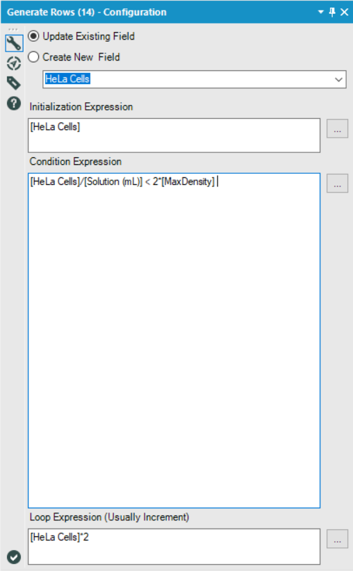
I ended up settling on the Generate Rows tool and was trying to find a way to generate rows until I had reached or exceeded the maximum density, however, I ran into an issue where I'd always have one too few rows, since the final row I was looking for was the one that broke the condition I specified.
In order to get around this, I came up with the following solution:
Essentially, I just set my condition to twice that of the true threshold I was looking for. This worked because I was always doubling the current value in my Loop Expression, and so anything which broke the 'actual' condition I was looking for ([MaxDensity]), would necessarily also break the second condition if doubled again.
However, for many other loop expressions, this sort of solution would not work.
My idea is to include a checkbox which, when selected, would also generate the final row which broke the specified condition.
By adding such a checkbox, it would allow users to continue using the Generate Rows tool as they already do, but reduce the amount of condition engineering that users are required to do in order to get that one extra row they're looking for, and reduce the number of potentially unseen errors in their workflows.
-
Category Preparation
-
Desktop Experience
-
Feature Request
-
Tool Improvement
The CrossValidation tool in Alteryx requires that if a union of models is passed in, then all models to be compared must be induced on the same set of predictors. Why is that necessary -- isn't it only comparing prediction performance for the plots, but doing predictions separately? Tool runs fine when I remove that requirement. Theoretically, model performance can be compared using nested cross-validation to choose a set of predictors in a deeper level, and then to assess the model in an upper level. So I don't immediately see an argument for enforcing this requirement.
This is the code in question:
if (!areIdentical(mvars1, mvars2)){
        errorMsg <- paste("Models", modelNames[i] , "and", modelNames[i + 1],
                          "were created using different predictor variables.")
        stopMsg <- "Please ensure all models were created using the same predictors."
      }
As an aside, why does the CV tool still require Logistic Regression v1.0 instead of v1.1?
And please please please can we get the Model Comparison tool built in to Alteryx, and upgraded to accept v1.1 logistic regression and other things that don't pass `the.formula`. Essential for teaching predictive analytics using Alteryx.
-
Category Predictive
-
Desktop Experience
-
Tool Improvement
Can you devise a way to bring out the dynamic network visualisation on to Powerpoint. Right now, we can only see a static image on a browser
-
Tool Improvement
- New Idea 301
- Accepting Votes 1,790
- Comments Requested 22
- Under Review 168
- Accepted 54
- Ongoing 8
- Coming Soon 7
- Implemented 539
- Not Planned 111
- Revisit 59
- Partner Dependent 4
- Inactive 674
-
Admin Settings
20 -
AMP Engine
27 -
API
11 -
API SDK
222 -
Category Address
13 -
Category Apps
113 -
Category Behavior Analysis
5 -
Category Calgary
21 -
Category Connectors
247 -
Category Data Investigation
79 -
Category Demographic Analysis
2 -
Category Developer
211 -
Category Documentation
80 -
Category In Database
215 -
Category Input Output
646 -
Category Interface
242 -
Category Join
105 -
Category Machine Learning
3 -
Category Macros
154 -
Category Parse
76 -
Category Predictive
79 -
Category Preparation
395 -
Category Prescriptive
1 -
Category Reporting
199 -
Category Spatial
81 -
Category Text Mining
23 -
Category Time Series
22 -
Category Transform
89 -
Configuration
1 -
Content
1 -
Data Connectors
969 -
Data Products
3 -
Desktop Experience
1,558 -
Documentation
64 -
Engine
127 -
Enhancement
348 -
Feature Request
213 -
General
307 -
General Suggestion
6 -
Insights Dataset
2 -
Installation
24 -
Licenses and Activation
15 -
Licensing
13 -
Localization
8 -
Location Intelligence
80 -
Machine Learning
13 -
My Alteryx
1 -
New Request
209 -
New Tool
32 -
Permissions
1 -
Runtime
28 -
Scheduler
24 -
SDK
10 -
Setup & Configuration
58 -
Tool Improvement
210 -
User Experience Design
165 -
User Settings
81 -
UX
223 -
XML
7
- « Previous
- Next »
- nkmcn on: Auto rename fields
- Shifty on: Copy Tool Configuration
- simonaubert_bd on: A formula to get DCM connection name and type (and...
-
NicoleJ on: Disable mouse wheel interactions for unexpanded dr...
- haraldharders on: Improve Text Input tool
- simonaubert_bd on: Unique key detector tool
- TUSHAR050392 on: Read an Open Excel file through Input/Dynamic Inpu...
- jackchoy on: Enhancing Data Cleaning
- NeoInfiniTech on: Extended Concatenate Functionality for Cross Tab T...
- AudreyMcPfe on: Overhaul Management of Server Connections

