Alteryx Designer Desktop Ideas
Share your Designer Desktop product ideas - we're listening!Submitting an Idea?
Be sure to review our Idea Submission Guidelines for more information!
Submission Guidelines- Community
- :
- Community
- :
- Participate
- :
- Ideas
- :
- Designer Desktop
Featured Ideas
Hello,
After used the new "Image Recognition Tool" a few days, I think you could improve it :
> by adding the dimensional constraints in front of each of the pre-trained models,
> by adding a true tool to divide the training data correctly (in order to have an equivalent number of images for each of the labels)
> at least, allow the tool to use black & white images (I wanted to test it on the MNIST, but the tool tells me that it necessarily needs RGB images) ?
Question : do you in the future allow the user to choose between CPU or GPU usage ?
In any case, thank you again for this new tool, it is certainly perfectible, but very simple to use, and I sincerely think that it will allow a greater number of people to understand the many use cases made possible thanks to image recognition.
Thank you again
Kévin VANCAPPEL (France ;-))
Thank you again.
Kévin VANCAPPEL
The new versions of Alteryx the red "change color" has gone to yellow which is almost impossible to see with a big and bright monitor.
PLEASE change it back to the normal red background color!
-
Desktop Experience
-
User Settings
Looking for a way to make multi-selection much easier (rather than single click per item). Could be an improvement on the List Box, or a new tool that allows multi-selection with highlighting desired items. Control/Shift keys for selections similar to Windows, etc.
-
Category Interface
-
Desktop Experience
It would be helpful to be able to toggle the way the Mode calculation handles two or more "ties." Currently if there is a tie between records, the lower is returned. I have a use case where I would rather have the higher value return if there is a tie. I could also see there being a use for an average between the tied records. Ideally I think there would be three options for a tie: use the 1. lowest value 2. highest value 3. average of tied values. I'm not sure if first/last would also be helpful to have as options.
My use case is for product dimensions. We use the mode to normalize the dimensions (height, width, depth) of products. Because we are using the dimensions for space planning, if the lower value is used there may not be enough space for the product on the shelf. We would rather use the higher of the tied values to make sure we aren't creating a plan where the products won't fit.
-
Category Transform
-
Desktop Experience
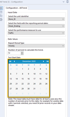
Allow the direct entry of the test start date into the AB Trend tool rather than forcing the use of a calendar widget to select the date. Or at least make the calendar display the date that was set rather then the current month.
It would also be useful to edit the sample workflow for this tool , sample 21_AB_Trend_Controls_Analysis_Sample.yxmd, to add annotations to each tool to describe what the settings are in the example as well as to add more specific detail to the workflow description.
-
Category Predictive
-
Desktop Experience
Today the Autofield tool transforms the fields into byte by default when it considers that the content is suitable while we expect text in it and that it can simply be a field not filled in in the context current but which may be later.
The idea would be to be able to choose which type by default to implement on text or empty fields and not the default byte because a byte field is not recognized on a formula using an IN for example which can produce errors in the following workflows.
-
Category Preparation
-
Desktop Experience
-
Enhancement
Hi Team,
I have a dataset of x,y values that I am plotting with an interactive chart tool. These values will vary widely so I can't use custom display ranges and have to rely on the "Auto" function for display range.
My problem is that the two axis are Auto scaled to different scaling and it is turning all my ellipse shapes into circles. Not a huge setback as you can check the Axis labels to see the scale but for this use case the shape of the data is what I am trying to portray and this makes my reports somewhat misleading.
I'm suggesting adding an option, maybe a tick box, under the interactive chart's "Auto" config that would allow both Axis to be scaled the same amount (That of the highest value).
Cheers,
Stephen
-
Category Reporting
-
Desktop Experience
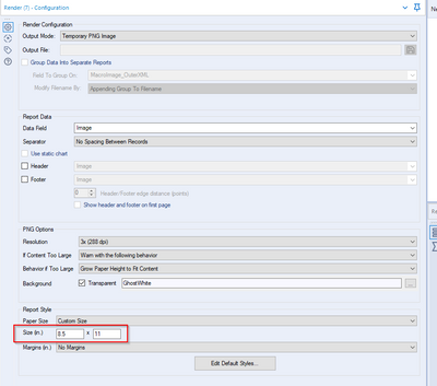
Currently users have the option of outputting to a PNG image but currently can only use Inches to get the size set. I want to be able to output with a pixel size not in inches.
-
Category Reporting
-
Desktop Experience
I would like to be able to connect to an AWS EMR resource.
And an AWS gov cloud endpoint.
-
Desktop Experience
-
User Settings
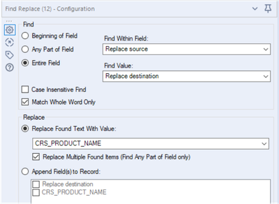
While doing Find replace with the following settings,
The output limits to the number of characters comes with "Replace source". If the number of characters in "Replace Found Text With Value" is more than the source then it will truncate the value to source. I feel it's not correct.
Suggesting, that there should be an option to overwrite the "field size" or keep as it coming from source.
-
Category Join
-
Desktop Experience
A lot of business processes require encryption and decryption, for either data transfer or authentication processes. It would be great if Alteryx could expose some of the C# encryption functions from the System.Security.Cryptography library, as either functions in the Formula tool, or as new tools.
I know that some of these algorithms require byte input, so a new tool might be the sensible option, so that user can pass various data types that are pre-coded to byte arrays before going into the algorithms.
-
Category Preparation
-
Desktop Experience
I get the following message when running a macro with the Render tool inside
" Alteryx ppt testing1 (162) Tool #26: You have found a bug. Replicate, then let us know. We shall fix it soon."
I believe this happens when there is multiple line breaks next to each other and trying to put this into the render tool outputting to powerpoint within a table.I have the formula for updating the line breaks "Replace([Layout],"<br />","<br />")" which works when there aren't very many line breaks but now I have integrated Python to regex out HTML the Render tool has stopped working
-
Category Reporting
-
Desktop Experience
Migrate old R based charts and create new statistical charts in the interactive chart tool to provide enhanced statistical charting and visual data exploration capabilities.
This includes:
- Error Bars
- Distribution Plots
- 2D Histograms
- Scatterplot Matrix
- Facet & Trellis Plots
- Tree Plots
- Violin Plots
- Heatmaps
- Log Plots
- Parallel Coordinates Plot
This these URLs for more examples:
-
Category Reporting
-
Desktop Experience
-
Enhancement
The ability to create, modify and enhance interactive chart types through custom plotly code in either R or Python. This would allow new style of visualisation to be created and shared with other authors.
-
Category Reporting
-
Desktop Experience
needs a much simpler way to configure this tool. Its way more obfuscated than it needs to be and the wording on the config is very confusing.
-
Category Preparation
-
Desktop Experience
Issue
Im troubleshooting a workflow with around 4,400 tools, breaking into separate workflows, and leveraging the crew macros to run the workflow sequence. Well- I changed a few file names and have an interesting disaster where I need to go tool by tool to verify everything is properly configured.
Solution
I used tool containers to group and label sections of tools to be organized, but it was becoming difficult to navigate the ocean of tool clusters. So- I used blank comment boxes in the tool containers. If everything works in the container, I made the comment box green. If something is broken, I made it red. From there, I made all of the red comment boxes green to make sure everything was diligently reviewed.
New Cool Idea
Troubleshooting mode- make it easy to flip a lighthouse switch on the tool containers. Colors are great for categories, but this makes it easy to focus or highlight containers with maybe a cool retro looking switch.
Peace, Love, and Workflows....
-
Category Documentation
-
Desktop Experience
It would be great if it was possible to output the top most influential features in producing the score for each individual entity/row when using the predictive and machine learning tools.
Similar to the way they work in DataRobot. Details here and here.
This would enable some simple interpretation of how a model came to an individual prediction and the most important features in that particular row/case.
-
Category Predictive
-
Desktop Experience
-
Machine Learning
-
New Tool
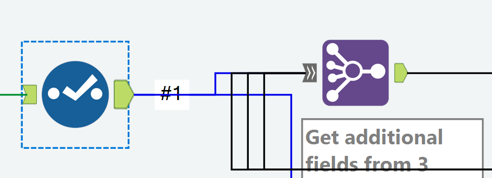
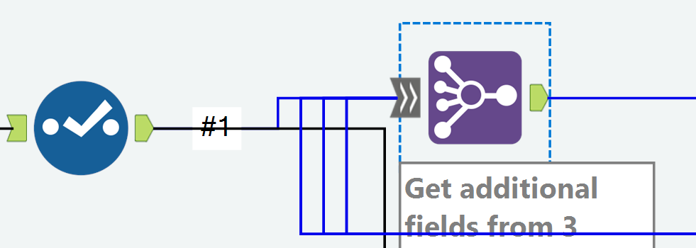
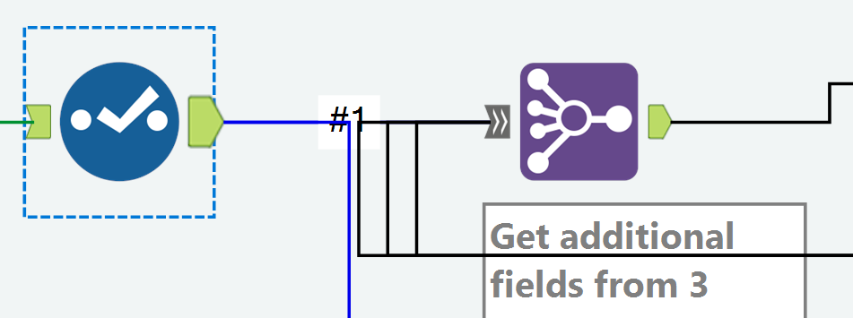
With the Join Multiple tool, a connector line isn't colored correctly all the way to the input anchor.
I'm on version 2019.4
Example: My Join Multiple has 4 inputs
When I click the output anchor on a Select tool that feeds into Input #1 in the Join Multiple, the connector is colored blue for only a portion of the distance to the Join Multiple tool.
Example: When I click the input anchor on the Join Multiple, the connector line isn't blue all the way to the prior Select tool.
Example of how the incorrect coloring can be confusing:
When the two tools are aligned horizontally, clicking the Select tool makes it look like it's not connected to the Join Multiple.
And clicking the Join Multiple makes it look like it's not connected to the Select.
Chris
-
Category Join
-
Desktop Experience
Current insight tool can create dashboard but can not display content by user access control, for example: one insight dashboard has whole country's sales number. Would you please add an function to let different region's sales only see their own region data when log into this dashboard ?
Thanks!
-
Category Interface
-
Category Reporting
-
Desktop Experience
In the Union Field, we have the option to manually configure fields. This is currently done horizontally, which makes it difficult to see every field (if dealing with lots of columns), if we could have a tick-box, and switch this to vertical, then we could use a view similar to the select field.
Thanks
Sam7
-
Category Join
-
Desktop Experience
There are currently 7 data types related to numeric values, including byte. Simply and standardize the way Alteryx handles numeric values. Condense the numeric data types to one and provide a way to control the decimal places by indicating how many are needed to the right of the decimal. The current numeric datatypes are confusing and do not behave the same with the formulas functions, like Round.
Adopt the standard numeric functions seen across multiple tools and languages like Excel, SQL, etc; like RoundUp, RoundDown, AbsoluteValue, Integer, etc.
-
Category Preparation
-
Desktop Experience
- New Idea 376
- Accepting Votes 1.784
- Comments Requested 21
- Under Review 178
- Accepted 47
- Ongoing 7
- Coming Soon 13
- Implemented 550
- Not Planned 107
- Revisit 56
- Partner Dependent 3
- Inactive 674
-
Admin Settings
22 -
AMP Engine
27 -
API
11 -
API SDK
228 -
Category Address
13 -
Category Apps
114 -
Category Behavior Analysis
5 -
Category Calgary
21 -
Category Connectors
252 -
Category Data Investigation
79 -
Category Demographic Analysis
3 -
Category Developer
217 -
Category Documentation
82 -
Category In Database
215 -
Category Input Output
655 -
Category Interface
246 -
Category Join
108 -
Category Machine Learning
3 -
Category Macros
155 -
Category Parse
78 -
Category Predictive
79 -
Category Preparation
402 -
Category Prescriptive
2 -
Category Reporting
204 -
Category Spatial
83 -
Category Text Mining
23 -
Category Time Series
24 -
Category Transform
92 -
Configuration
1 -
Content
2 -
Data Connectors
982 -
Data Products
4 -
Desktop Experience
1.604 -
Documentation
64 -
Engine
134 -
Enhancement
406 -
Event
1 -
Feature Request
218 -
General
307 -
General Suggestion
8 -
Insights Dataset
2 -
Installation
26 -
Licenses and Activation
15 -
Licensing
15 -
Localization
8 -
Location Intelligence
82 -
Machine Learning
13 -
My Alteryx
1 -
New Request
226 -
New Tool
32 -
Permissions
1 -
Runtime
28 -
Scheduler
26 -
SDK
10 -
Setup & Configuration
58 -
Tool Improvement
210 -
User Experience Design
165 -
User Settings
85 -
UX
227 -
XML
7
- « Anterior
- Siguiente »
- abacon en: DateTimeNow and Data Cleansing tools to be conside...
-
TonyaS en: Alteryx Needs to Test Shared Server Inputs/Timeout...
-
TheOC en: Date time now input (date/date time output field t...
- EKasminsky en: Limit Number of Columns for Excel Inputs
- Linas en: Search feature on join tool
-
MikeA en: Smarter & Less Intrusive Update Notifications — Re...
- GMG0241 en: Select Tool - Bulk change type to forced
-
Carlithian en: Allow a default location when using the File and F...
- jmgross72 en: Interface Tool to Update Workflow Constants
-
pilsworth-bulie
n-com en: Select/Unselect all for Manage workflow assets
| Usuario | Cantidad |
|---|---|
| 6 | |
| 5 | |
| 3 | |
| 2 | |
| 2 |

