Alteryx Designer Desktop Ideas
Share your Designer Desktop product ideas - we're listening!Submitting an Idea?
Be sure to review our Idea Submission Guidelines for more information!
Submission Guidelines- Community
- :
- Community
- :
- Participate
- :
- Ideas
- :
- Designer Desktop
Featured Ideas
Hello,
After used the new "Image Recognition Tool" a few days, I think you could improve it :
> by adding the dimensional constraints in front of each of the pre-trained models,
> by adding a true tool to divide the training data correctly (in order to have an equivalent number of images for each of the labels)
> at least, allow the tool to use black & white images (I wanted to test it on the MNIST, but the tool tells me that it necessarily needs RGB images) ?
Question : do you in the future allow the user to choose between CPU or GPU usage ?
In any case, thank you again for this new tool, it is certainly perfectible, but very simple to use, and I sincerely think that it will allow a greater number of people to understand the many use cases made possible thanks to image recognition.
Thank you again
Kévin VANCAPPEL (France ;-))
Thank you again.
Kévin VANCAPPEL
When in the flow of designing a workflow, I often accidentally click on the help ? Icon on the side bar of the configuration window, thereby launching a browser window, taking me out if Alteryx and interrupting my flow. Would love to have some UX indication, perhaps a different color, that clicking on this icon will redirect the user out of Alteryx.
-
User Experience Design
Some of my workflows requires about 2 hours to run. Would like a stopwatch feature on the workflow UI or application after I begin running it. Would like to get an email when completed, as well. Thx
-
General
-
User Experience Design
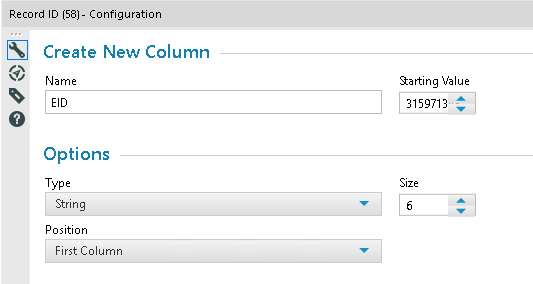
user is not able to see the complete value
only 7 digits are showing up
-
User Experience Design
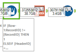
When using horizontal layout the status messages can overlap those of other tools meaning % progress can't be read:
Status labels would be better placed above the tools, not to the right.
-
General
-
User Experience Design
The new 10.6 leaves all this empty space to the right of the "Connect" field and "Options"/"Preview" fields. This means I have to drag out my tab way farther than I used to in order to see the same amount of information... Can you go back to having these fields stretch all the way to the right of the frame? When you have huge workflows, every little bit of space really matters.

Look at all that empty space!
-
User Experience Design
- New Idea 376
- Accepting Votes 1,784
- Comments Requested 21
- Under Review 178
- Accepted 47
- Ongoing 7
- Coming Soon 13
- Implemented 550
- Not Planned 107
- Revisit 56
- Partner Dependent 3
- Inactive 674
-
Admin Settings
22 -
AMP Engine
27 -
API
11 -
API SDK
228 -
Category Address
13 -
Category Apps
114 -
Category Behavior Analysis
5 -
Category Calgary
21 -
Category Connectors
252 -
Category Data Investigation
79 -
Category Demographic Analysis
3 -
Category Developer
217 -
Category Documentation
82 -
Category In Database
215 -
Category Input Output
655 -
Category Interface
246 -
Category Join
108 -
Category Machine Learning
3 -
Category Macros
155 -
Category Parse
78 -
Category Predictive
79 -
Category Preparation
402 -
Category Prescriptive
2 -
Category Reporting
204 -
Category Spatial
83 -
Category Text Mining
23 -
Category Time Series
24 -
Category Transform
92 -
Configuration
1 -
Content
2 -
Data Connectors
982 -
Data Products
4 -
Desktop Experience
1,604 -
Documentation
64 -
Engine
134 -
Enhancement
406 -
Event
1 -
Feature Request
218 -
General
307 -
General Suggestion
8 -
Insights Dataset
2 -
Installation
26 -
Licenses and Activation
15 -
Licensing
15 -
Localization
8 -
Location Intelligence
82 -
Machine Learning
13 -
My Alteryx
1 -
New Request
226 -
New Tool
32 -
Permissions
1 -
Runtime
28 -
Scheduler
26 -
SDK
10 -
Setup & Configuration
58 -
Tool Improvement
210 -
User Experience Design
165 -
User Settings
85 -
UX
227 -
XML
7
- « 前へ
- 次へ »
- abacon 場所: DateTimeNow and Data Cleansing tools to be conside...
-
TonyaS 場所: Alteryx Needs to Test Shared Server Inputs/Timeout...
-
TheOC 場所: Date time now input (date/date time output field t...
- EKasminsky 場所: Limit Number of Columns for Excel Inputs
- Linas 場所: Search feature on join tool
-
MikeA 場所: Smarter & Less Intrusive Update Notifications — Re...
- GMG0241 場所: Select Tool - Bulk change type to forced
-
Carlithian 場所: Allow a default location when using the File and F...
- jmgross72 場所: Interface Tool to Update Workflow Constants
-
pilsworth-bulie
n-com 場所: Select/Unselect all for Manage workflow assets

