Alteryx Designer Desktop Ideas
Share your Designer Desktop product ideas - we're listening!Submitting an Idea?
Be sure to review our Idea Submission Guidelines for more information!
Submission Guidelines- Community
- :
- Community
- :
- Participate
- :
- Ideas
- :
- Designer Desktop : Nouvelles idées
Featured Ideas
Hello,
After used the new "Image Recognition Tool" a few days, I think you could improve it :
> by adding the dimensional constraints in front of each of the pre-trained models,
> by adding a true tool to divide the training data correctly (in order to have an equivalent number of images for each of the labels)
> at least, allow the tool to use black & white images (I wanted to test it on the MNIST, but the tool tells me that it necessarily needs RGB images) ?
Question : do you in the future allow the user to choose between CPU or GPU usage ?
In any case, thank you again for this new tool, it is certainly perfectible, but very simple to use, and I sincerely think that it will allow a greater number of people to understand the many use cases made possible thanks to image recognition.
Thank you again
Kévin VANCAPPEL (France ;-))
Thank you again.
Kévin VANCAPPEL
Alteryx can enhance the interactive dashboard capabilities by adding more visualization options, such as heat maps, treemaps, and network diagrams. This will allow users to create more informative and engaging dashboards, and enable them to better communicate insights to stakeholders. For example, Alteryx can add support for heat maps and treemaps, allowing users to visualize data density and distribution, or network diagrams, allowing users to visualize relationships between data points.
Alteryx should take a look at the BI platform so they can integrate the Dashboard Capability and remove the dependency of Visualization tool and become one stop solution
-
Enhancement
-
UX
Alteryx can add more advanced machine learning capabilities, such as deep learning and neural networks, to its existing set of predictive modeling tools. This will allow users to perform more complex and accurate analyses, and enable them to tackle more sophisticated machine learning problems. For example, Alteryx can add support for deep learning frameworks like TensorFlow and Keras, which will allow users to use pre-trained models or create their own models for image and natural language processing.
-
Enhancement
-
UX
Alteryx can improve the data connectivity options by adding more built-in connectors to various data sources such as big data platforms, cloud-based services, and IoT devices. This will enable users to easily access and import data from a wider range of sources, without the need for complex coding or manual data preparation. For example, Alteryx can add connectors to popular big data platforms like Hadoop and Spark, or cloud-based services like AWS and Azure, which will allow users to easily import data from these platforms into Alteryx for analysis.
-
Enhancement
-
UX
I think the undo/redo capabilities in Alteryx could be greatly improved. Here is an idea that I think would be beneficial...
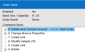
I'd like to see which exact tools are affected by my undo/redo actions. An idea was suggested a couple years ago to move your location on the canvas, but that was not added to the roadmap. Instead, is it possible to add the tool ID to the undo menu so that it is obvious which tool each line is detailing?
This is the current debug menu that shows your previous actions:
When a tool is created, the ID can be displayed in this menu, but this is not shown when a change is made to an existing tool. My suggestion is that the menu would say:
4. Change Sort (3) Properties
This same change should be made in the Edit dropdown menu.
-
Enhancement
-
UX
Hello All,
I am not sure whether my idea makes sense or not.
In today's advanced analytics world, we used RPA for various automation, process simplification, etc. There are CO-BOTs that are designed to run the Alteryx flow as well. Through RPA we are able to log in to the system and tools like Cognos, Oracle, TM1, and so on.
So, I am thinking, if Alteryx developed RPA as a tool in the Alteryx Designer like other tools such as Join, Transform, ML, Computer Vision, Interface, etc.
I believe the implementation of RPA in Alteryx will prove an Asset, and make Alteryx.com more powerful.
Thanks,
Mayank
-
Enhancement
-
New Request
-
Scheduler
It looks like as of 2022.3, workflow tabs get shortened to a specific width. This is fine however now the asterisk that lets me know if my workflow has changed doesn't display in the tab anymore. I would have to look at the top of the screen to see this. I know this isn't a huge deal, but it would be nice to still be able to see the asterisk in the tab so that I can still know which workflows have been saved even if I am currently looking at a different open workflow. One solution may be to move the asterisk to the front of the workflow name.
Also, would users want a setting to allow them to keep full workflow names versus shortening them?
Thanks!
-
Enhancement
-
UX
I'd love to have a shortcut (like Ctrl+I) that opens the Insert Macro feature, saving the time of right-clicking, and scrolling down on the menu (Note: Once you spent a "little time" using Designer, this menu can be a very long one, and the mouse wheel doesn't work on it).
-
Enhancement
-
UX
In Alteryx Designer I like to use Containers with very specific color, transparency and border settings something I've asked can be built into defaults somehow in another Product suggestion which I cannot find. What's very useful to me is defining processes into the Tool categories, i.e. ingestion = In/Out = Green, Preparation tools = Prep Category = Blue, this standardised across all workflows is good practice when managing an estate of workflows.
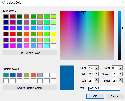
In Tableau when editing 'Colors' there is a box you can enter the #0065a8 code for a color you wish to use, perhaps from Brand guidelines or in my case the same # as the Tool Category Colors themselves. I have to go into Tableau, pick screen color, create a custom colour then regenerate on Alteryx side.
Can we add "pick a screen color' and / or 'HTML: #0065a8' like you can do in Tableau?
-
Enhancement
-
UX
It would be great if I could see my save history in the debug menu. Currently it looks like this:
I'm not asking to be able to undo saves, I just want to be able to see where the workflow was saved within this menu so that I can easily see what actions have been taken since my last save.
-
Enhancement
-
UX
Currently, you have two choices for Auto Configure while working on workflows:
- Auto Configure switched on: After every change, the configurations (= columns) of tools are re-evaluated for the entire workflow (at least, this is how it feels like).
- Auto Configure switched off: Configuration of tools is only re-evaluated when pressing F5 (or when using the clipboard).
Pros and Cons of both:
- Auto Configure switched on:
- Configuration in each tool is always accurate so that working on tools is straight forward.
- Editing workflows gets annoyingly slow for complex workflows, especially when data sources from network locations or macros are used. Sometimes I have to wait a minute between two mouse clicks.
- Auto Configure switched off:
- Editing workflows is faster (at least in theory).
- I have to press F5 all the time (because I nearly always change output configuration of tools when working on workflows). Even after pressing F5, Alteryx does not always succeed in calculating the correct configuration of a tool.
- Working with clipboard, loading, saving workflows is still slow.
I would love to have something in between all, kind of an intelligent Auto Configure with following features:
- F5 still starts full configuration evaluation.
- Configuration of input tools is frozen (unless F5 pressed) so that no network access is started during editing the workflow.
- Check for update of macro files is switched off (unless F5 pressed).
- After changing a tool configuration, either a flag is set that this tool was changed but no re-assessment of the workflow configuration is run (approach 1), or only downstream configuration is updated (approach 2). Whether approach 1 or 2 is started could be decided on various criteria: Number of downstream tools (or other measure of complexity), how many "change flags" according to approach 1 are already set, etc.
- If approach 1 was chosen: If you edit a tool which is downstream to another one for which the change flag is set, re-evaluate only the portion of the workflow between the previously changed upstream tool and the tool supposed to be edited.
- Using Clipboard should not invoke full re-configuration.
- Before saving a file, full re-configuration needs to be run (as already now).
This idea will add quite some complexity into the logic of Auto Configure but should have quite some potential to speed up editing workflows because network access and number of re-evaluated tools in each editing step will be reduced.
-
Enhancement
-
UX
Hello!
I like to annotate my workflows when finished, and it can be a bit of a pain to add more and more comment tools by searching for them, or going through the current right-click menu:
What would be nice is the option to right click anywhere on the canvas, and have the option of 'add comment', similar to how we have the option for 'add container' when selecting tools on the canvas.
Cheers!
-
Enhancement
-
UX
Hi
I think its super frustrating not beeing able to search for dates, or date ranges in the result window.
Lets say I have a dataset with 2 dates, date picked up and date delivered.
Then I need to search broad in the result window, for a given date. With search in both coloumns.
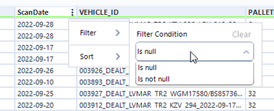
Could we please have a simple specific date search, and maybe a from-to date? Like in the filter?
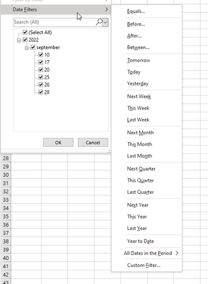
Or go all the way and look at excel date filter?
Kind regards
-
Enhancement
-
UX
I can be picky about how my workflows are laid out. Oftentimes, the connector between tools has a "mind of its own" as to what direction it goes and how it crosses other objects. I'd like to see the ability to control the connector lines with "elbows" that can be positioned in custom locations and directions, like an MS Visio diagram. Alternatively, add a simple "pin" tool could be added to the canvas and it's only function is to take in and send out a connector line by defining the input and output location. The input and output locations could be defined angularly/radial in degrees, for example. Image attached below of existing workflow with a "troublesome" connector and the concept of "elbows" and "pins" added as an alternate control mechanism. Both would be great! :)
-
Enhancement
-
UX
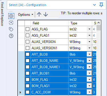
If the tables in the config window has lots of rows, it is quite complicated to find those of interest.
Please add a filter or search option (e.g. by the field name) to display only the relevant rows.
It would also be helpful to select or deselect multiple selected rows with one click.
Find an example from the "Select-Tool":
-
Enhancement
-
UX
Overview might be enhanced for example by adding to the side of the panel displaying a list of tools in the highlighted area or summarize how many tools are in the selected area.
-
Enhancement
-
UX
When we use search option it might be helpful to see also tool category where we can find searching tool.
-
Enhancement
-
UX
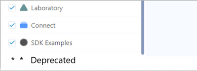
Instead of 'Show Dprecated Tools' functionality more helpful and intuitive would be always display deprecated tools inside new tool category.
-
Enhancement
-
UX
Hello Team,
I am working on the different Alteryx Models for my monthly and weekly reporting and reconciliations. Several times during recon and validation, I forgot to close the output file and run the Model, few of my Models take around 9-10mins to complete a 1 run, in that case, after10mins the Model kicks off the message - "Error: Output Data: Unable to delete Excel file", this wasted the whole running time.
I suggest two Idea options -
The first Idea is, it would be great if you provide the functionality to overwrite the output file manually, for example - if the user forgets to close the output file and run the Model, at the end when Alteryx Model generates the output, It will ask a user to whether you need to overwrite the existing file or not. In that way, we save the running time and effort of the user. It's a very general mistake any user doing while working on the Models - forget to close the output file.
The Second Idea is, It would be helpful for users if Alteryx Model provide a message in the first place when the run kicked off - that output file is opened please close it. It will save enough time from the user prospect
Thanks,
Mayank
-
Enhancement
-
New Request
-
UX
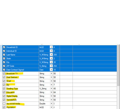
I think adding a highlight color option to the fields in the select tool would be a helpful field organization feature. Many times I am appending data/joining data, and I would like to visually separate the original fields from the appended ones, and then sort on the highlight colors chosen--and maintain these colors through the workflows. For example my raw data customer fields would be highlighted in blue: ID, First Name, Last Name, Address and my appended ones in, say, yellow: (marketing fields such as Dwelling Type, Household Composition, etc). Then it would allow to easily sort and visualize by append through the workflows.
-
Enhancement
-
UX
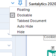
I set up my canvas how I want it, but I will sometimes undock or auto-hide the canvas windows (Results, Configuration, etc.). My suggestion is to add a Locked Dock as a selection that will allow for resizing, but not undocking.
-
Enhancement
-
UX
- New Idea 301
- Accepting Votes 1 790
- Comments Requested 22
- Under Review 169
- Accepted 54
- Ongoing 8
- Coming Soon 7
- Implemented 539
- Not Planned 110
- Revisit 59
- Partner Dependent 4
- Inactive 674
-
Admin Settings
20 -
AMP Engine
27 -
API
11 -
API SDK
222 -
Category Address
13 -
Category Apps
113 -
Category Behavior Analysis
5 -
Category Calgary
21 -
Category Connectors
247 -
Category Data Investigation
79 -
Category Demographic Analysis
2 -
Category Developer
211 -
Category Documentation
80 -
Category In Database
215 -
Category Input Output
646 -
Category Interface
242 -
Category Join
105 -
Category Machine Learning
3 -
Category Macros
154 -
Category Parse
76 -
Category Predictive
79 -
Category Preparation
395 -
Category Prescriptive
1 -
Category Reporting
199 -
Category Spatial
81 -
Category Text Mining
23 -
Category Time Series
22 -
Category Transform
89 -
Configuration
1 -
Content
1 -
Data Connectors
969 -
Data Products
3 -
Desktop Experience
1 558 -
Documentation
64 -
Engine
127 -
Enhancement
348 -
Feature Request
213 -
General
307 -
General Suggestion
6 -
Insights Dataset
2 -
Installation
24 -
Licenses and Activation
15 -
Licensing
13 -
Localization
8 -
Location Intelligence
80 -
Machine Learning
13 -
My Alteryx
1 -
New Request
209 -
New Tool
32 -
Permissions
1 -
Runtime
28 -
Scheduler
24 -
SDK
10 -
Setup & Configuration
58 -
Tool Improvement
210 -
User Experience Design
165 -
User Settings
81 -
UX
223 -
XML
7
- « Précédent
- Suivant »
- asmith19 sur : Auto rename fields
- Shifty sur : Copy Tool Configuration
- simonaubert_bd sur : A formula to get DCM connection name and type (and...
-
NicoleJ sur : Disable mouse wheel interactions for unexpanded dr...
- haraldharders sur : Improve Text Input tool
- simonaubert_bd sur : Unique key detector tool
- TUSHAR050392 sur : Read an Open Excel file through Input/Dynamic Inpu...
- jackchoy sur : Enhancing Data Cleaning
- NeoInfiniTech sur : Extended Concatenate Functionality for Cross Tab T...
- AudreyMcPfe sur : Overhaul Management of Server Connections
| Utilisateur | Compte |
|---|---|
| 68 | |
| 14 | |
| 14 | |
| 6 | |
| 4 |


