By Megan Dibble and David Kim (@dimkavid)
In Part 1 of this series, we explored best practices for problem formulation and data setup in Auto Insights. This article will delve into best practices for configuring Missions and using Magic Documents.
Read on to learn strategies that will help you become an Auto Insights power user!
Missions
If you’re new to Missions, check out this article, which covers what questions to ask and how to create valuable Missions in Auto Insights. In this section, we will cover some best practices and tips for creating and interpreting Missions.
Using Mission Templates
We can start by understanding how and when to leverage the Mission templates! Mission templates allow for a quick understanding of your dataset by generating an initial iteration of a potential Mission. There are a few different options available to start, each with a variation of insights depending on your needs:
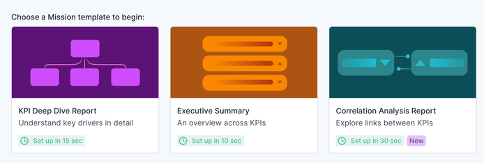
KPI Deep Dive
This template should be leveraged when there is ONE key metric that you want to understand at a deeper level. You will need to “configure” this template by assigning the key metric, and Auto Insights will take it from there. It will start off with a high-level overview of that metric and then create additional pages with breakdowns from segments that are statistically significant to the metric.
Executive Summary
This template should be leveraged when you are not sure which metric(s) you want to understand and/or there are multiple you want to see at a high level. Auto Insights will look at all of the possible measures in your selected dataset and present the top handful of significant measures in the latest period to display.
Correlational Analysis Report
This template should be leveraged when you want to understand the relationship between TWO metrics at once. You will need to “configure” this template by assigning both the key metrics, and Auto Insights will generate a correlation analysis across the two. Oftentimes, it will be best to choose two metrics within the same dataset, as they will have the same segments to analyze across, but you can analyze metrics from separate datasets. When doing so, it is important to have some common segments across the two datasets so that Auto Insights can connect the potential drivers and share more stories.
Make Your Own
When you know exactly what you want to explore in your dataset, it's easiest to create your own Mission so that you can directly configure the metric(s), filters, segments, and time frames. This is particularly useful for analyzing specific time frames as all the other Mission templates will default to the latest default time period that is specified in Admin Portal > ‘Confirm Fields.’
Confirming Settings
When you are ready to create a Mission, it’s a good idea to double-check your dataset setup. For example, you can redefine a column by changing a numeric ID column to a segment instead of a measure. You can see this in action in the Uploading Data section of this article.
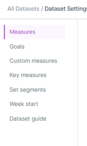
Outside of ensuring all columns are coming through as the right data type, you can access the dataset settings in the ‘Datasets’ tab of Auto Insights. Simply select the 3 dots to the right of the dataset you wish to edit and go to the ‘Edit Settings’ option, where you will be taken to a new menu of options to configure for your use case. Here, you’ll be able to do things like add units and formatting, upload forecast data, hide unnecessary measures, or even create custom ratios, which we will dive further into below!
Tying Out With Existing Reporting
Once you have a Mission set up to answer your business question, your next step should be to check the quality of the data and the accuracy of the setup by comparing the metrics to the output of your existing reporting method or source data. If you cannot get the values to align, then understanding how Auto Insights treats your data is critical for troubleshooting. If you're looking at it at the weekly level, make sure to check the week start configuration of the dataset to ensure that the right dates are being included for how your use case considers a week.
Calculated Measures
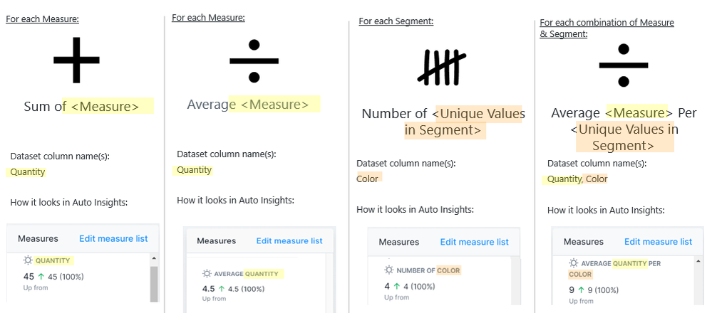
4 types of measures will be calculated on your dataset based on the data type of each column ingested:
For Measures (or numeric value columns), it will calculate:
For Segment columns, it will calculate:
- Number of unique values in that column
For each combination of a Measure (numeric) and Segment column, it will calculate:
- Average Measure value per number of unique values in the Segment
Below are what these measures will look like in Auto Insights based on the column names (Quantity & Color):
Here is some more detail on how each of these values are calculated:
- Sum: the addition of all values in a measure column
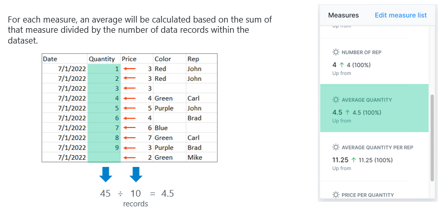
- Average: the sum of the measure divided by the number of data records in the dataset. Rows with no value for the measure will be included and treated as a value of 0.
- Number of: the number of non-null unique values in a segment column
- Average Measure per Segment: the sum of a measure where the segment is not null divided by the number of non-null unique values.
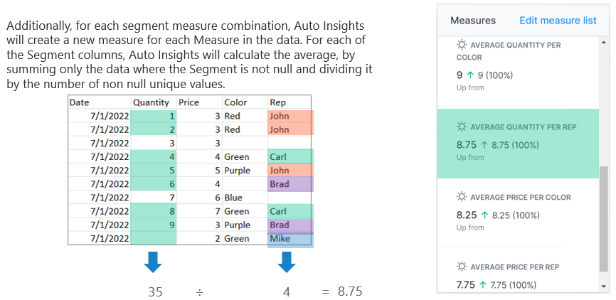
Knowing how these values are calculated will help you reconcile the Auto Insights output with your current reporting, as well as help you identify how to structure your dataset to get the best-desired output or insights.
If you want to change these default calculations, head to the Datasets page and click Edit Settings for the appropriate dataset.

On the right side of the page, you can select the calculation you want to make available in Missions for each measure. One common use case for making edits here is if you have a percentage value metric. You can uncheck “Sum” and change the unit to “Percentage” so that Auto Insights will not add up percentage values, saving you and your other Auto Insights users from confusion.
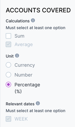
Edited calculations for a percentage measure
Edit Dataset Settings
Within the Dataset Settings page, there are several options to help you customize your dataset for your Missions.
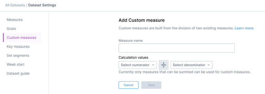
The custom measures page allows you to create new ratio measures in Auto Insights from your dataset. This option gives you more flexibility than importing pre-calculated ratios because the values will change dynamically with the time period in your Mission.
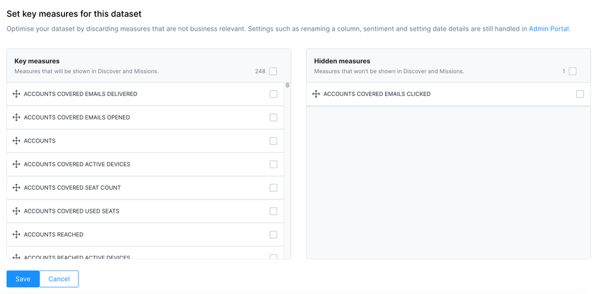
You can hide measures in your dataset on the key measures page so that they will not show on the Missions page. This can be helpful when sharing your Mission with other users—hiding measures you do not use can help eliminate confusion and errors.
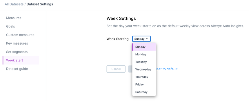
Finally, the week start page allows you to change the start day of the week across Auto Insights. This is a good setting to double-check if you are trying to tie out numbers in Auto Insights to other reports.
Interpreting the Insights
Once you’ve got your Mission configured and you’re confident in the data setup, you’re ready to interpret the insights and make data-driven decisions. So, what can you expect Auto Insights to generate for you?
What Caused This?
The first way Auto Insights helps you understand your data is through the ‘What Caused This?’ analysis that it provides. ‘What Caused This?’ looks at the contribution of each of the Segment columns and analyzes each of the unique values within those columns, how they contribute to the overall Measure, and the change in Measure.

It identifies each of the largest possible data values within the top 6 segments (less if there are less than 6 segments) to highlight INDIVIDUALLY as potential likely causes for the overall metric. The causes highlighted are independent of each other.
There might be instances where your dataset has connected/hierarchical segment columns that map into each other, showing certain redundancy in insights in the ‘What Caused This?’ but AAI does not understand those relationships and only highlights unique values. As a data and business expert, it is up to you to apply your own context. And if it is proving to be a distraction for you or viewers, you can always edit the segment relevancy either in dataset settings or in the Mission page itself to select the necessary columns for each measure and reduce that redundancy.
Data Stories
One of the ways Auto Insights can help you see more trends in your data is through data stories. To see data stories, you must compare by a segment in your Mission. For example, here’s a Mission that looks at revenue compared by country:

At the bottom of the Mission, stories are generated automatically, and the stories Auto Insights chooses depend on your dataset. They are displayed when themes in your data are present—for example when there are notable significant increases or decreases in your measure for certain segments.
In the above example, Auto Insights highlights large increases, large decreases, the top values, the 80/20 principle, and new, lost, or returning values.


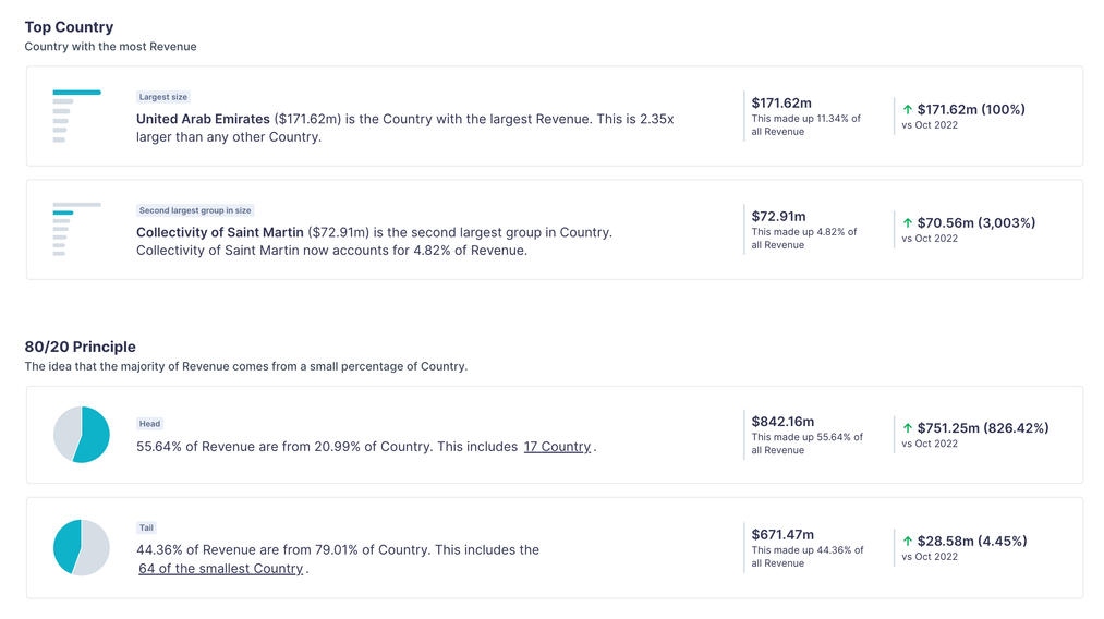

You can double-click on any of the stories to dive deeper into an insight and filter the data further. It’s important to return to the previous page with all the stories to un-filter your data when you’ve completed your analysis.
If your Mission was set up to view Revenue with no segment breakdown, there would not be data stories at the bottom of the page. Instead, it would show ‘What Caused This,’ allowing you to see at a high level the impact of the most significant segment values to your measure (Revenue). The goal at that level view is to find a segment of interest to include as a breakdown so we can get to those insights and data stories. The strength of Auto Insights lies in leveraging the breakdowns, drill downs, and filtering to better understand your data—the dynamic capabilities open up more interactive analysis for you and your stakeholders.
Charts
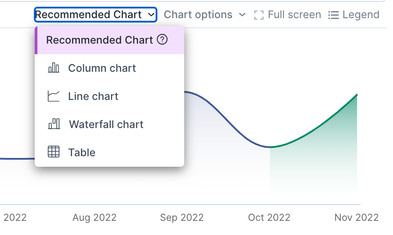
Auto Insights selects a recommended chart for your Mission based on your data. But did you know that you can change it? Hover over the Recommended Chart options on the top right and select another way to present your data.
Query Bar Configuration
Everything starts at the query bar! It is the communication of the slice of data you focus on and where the insights are generated. For each query bar configuration, you MUST select:
- 1 measure (if you want to view 2 measures, you can add a second query bar!)
- The focus time period (no need if you don’t have timestamps in your data).
From here, you can also select:
- Up to 500 values to filter on and/or 1 segment column to break down by
- Whether you want to look at changes or totals
- If you want to look at changes, you will need to add a comparison time period
By default, only 1 query bar will be presented, and time periods will default to the time scale defined in the Admin Portal – typically displaying the latest full period of data.
Some key tips when it comes to configuring your data view:
- If you are filtering on specific values, avoid adding that values column name in the breakdown option. This will only display the specific value(s) you are already filtering on, so the breakdown grouping does not provide valuable insights.
- If you have a considerable amount of null or blank values in certain segments and the 'Unknown’ value is consistently highlighted as a key insight when you look at a breakdown, you can reverse filter those blanks out of your view. In the filter drop-down, select the column with the ‘Unknown’ value. Select all and then deselect ‘Unknown’. This will only include the data records where there is a known value and remove those unhelpful insights from your view.
Mission Tips
Missions are useful in being able to tell a story so that meaningful conversations and actions can take place. But it is a starting point! The goal of a Mission is not to display every single slice of the data imaginable. It is recommended to start high level with your KPI of interest and then progressively get more granular with each page – ideally only going 1 or 2 levels deeper.
Example:
- Level 1 --> Select the KPIs and time periods
- Level 2 --> Include breakdown views on select segment columns
- Level 3 --> Add filter on some of the key values that are highlighted in the breakdown view (removing the breakdown)
- Level 4 --> Add a new breakdown segment on top of the filter
From here, if users need to go deeper or more specific, they can explore on their own in Search or make a copy of the Mission to edit further.
Other tips when it comes to Missions:
- In the Mission overview, you can select multiple (or all pages) on the left-hand side, and as long the pages come from the same dataset, you can change the filters for multiple pages at once.
- This is useful if you are creating a similar Mission for different stakeholder groups, and the only difference is the value you are filtered on.
- Each page of a Mission can come from different datasets, and there is no limit to how many different pages or datasets can be included in a Mission.
- You can change the way each page (visualization and insights) is displayed
- You can change multiple pages at once, similar to the filtering
- When sharing your Mission, it is important that the users have access to the Mission AND the datasets inside your Mission
- Subscriptions are great ways to communicate these insights but should only be leveraged once a data refresh method has been determined.
- The data refresh method could be (1) setting a schedule on your direct database connection, (2) scheduling a workflow run on the Server, or (3) having an assigned task to manually run a workflow or upload a new CSV at a regular interval.
- If the data refresh is not ready yet, but you still want to share with others, leveraging the ‘Share’ or ‘Send via Email’ option is a great way to collaborate and share insights on an ad hoc basis.
Magic Documents
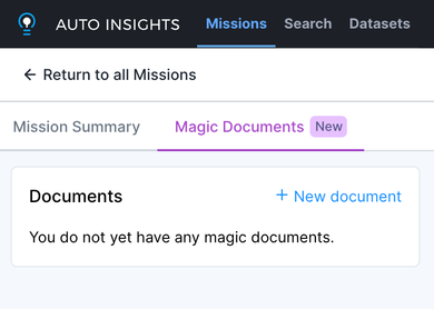
The Magic Documents feature leverages AI to create compelling stories using Auto Insights in presentations, emails, or messages. You can access it from the left panel in a Mission.
Here are a few tips when it comes to creating Magic Documents:
- You can configure the document objective, tone, and more, but only after you generate it for the first time
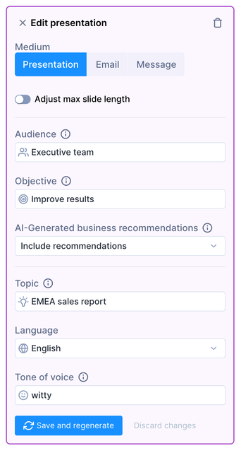
- When editing the objective, treat it like you are interacting with ChatGPT. You can add as much detail as you want to create a document that best suits your needs. Here’s an example:
Identify variances and specify the change and top 3 values of change in each significant segment as sub-bullets, including recommendations underneath
- You can customize the output document as everything is free text—make as many edits as you would like!
Check out this article to see an example of Magic Documents in action.
Conclusion
Auto Insights Missions and Magic Documents are powerful tools to identify trends and drill down on root causes for changes in your dataset. Knowing more about the setup and best practices will help your business get the most out of these features.
Now that you know the ins and outs of Auto Insights from our best practices series, take the next step and earn your micro-credential today!