Weekly Challenges
Solve the challenge, share your solution and summit the ranks of our Community!Also available in | Français | Português | Español | 日本語
IDEAS WANTED
Want to get involved? We're always looking for ideas and content for Weekly Challenges.
SUBMIT YOUR IDEA- Community
- :
- Community
- :
- Learn
- :
- Academy
- :
- Challenges & Quests
- :
- Weekly Challenges
- :
- Challenge #229: Trend Analysis
Challenge #229: Trend Analysis
- Subscribe to RSS Feed
- Mark Topic as New
- Mark Topic as Read
- Float this Topic for Current User
- Bookmark
- Subscribe
- Mute
- Printer Friendly Page
- Mark as New
- Bookmark
- Subscribe
- Mute
- Subscribe to RSS Feed
- Permalink
- Notify Moderator
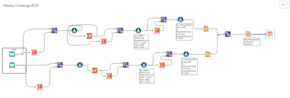
An interesting exercise - playing with charts and layouts. The macro could use some polishing 🙂
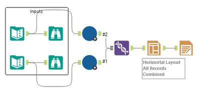
And the macro

- Mark as New
- Bookmark
- Subscribe
- Mute
- Subscribe to RSS Feed
- Permalink
- Notify Moderator
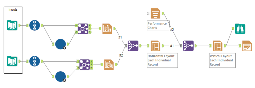
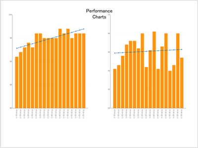
Busy week. Just got to this and it's quick and dirty. Pretty straightforward if you just follow the directions in the article. As far as the charts go, I've made many compromises in my life, but I draw the line at truncated y-axes 🙂
- Mark as New
- Bookmark
- Subscribe
- Mute
- Subscribe to RSS Feed
- Permalink
- Notify Moderator
- Mark as New
- Bookmark
- Subscribe
- Mute
- Subscribe to RSS Feed
- Permalink
- Notify Moderator
- Mark as New
- Bookmark
- Subscribe
- Mute
- Subscribe to RSS Feed
- Permalink
- Notify Moderator
- Mark as New
- Bookmark
- Subscribe
- Mute
- Subscribe to RSS Feed
- Permalink
- Notify Moderator
Hi @mithily ,
This may or may not pertain to what your response was aimed at, but two tools that are very useful are the Browse and Field Summary tools. Adding a Browse will let you see information about each field in the configuration pane when clicked on in the results pane, including uniqueness, stats (such as sum and avg, etc. The Field Summary tool in the Data Investigation tools will more comprehensively summarize the data set, showing each field as a record with metrics based on whether it is a numeric or string field. Check them out! Hope this helps!
- Mark as New
- Bookmark
- Subscribe
- Mute
- Subscribe to RSS Feed
- Permalink
- Notify Moderator
- Mark as New
- Bookmark
- Subscribe
- Mute
- Subscribe to RSS Feed
- Permalink
- Notify Moderator
- Mark as New
- Bookmark
- Subscribe
- Mute
- Subscribe to RSS Feed
- Permalink
- Notify Moderator
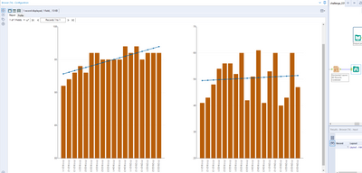
The formula wasn't the challenge for me. It took me a while to realize why my graphs don't look exactly the same as the ones in the example. I started my y-axis at zero...used the reverse of the color palette below as well.
- Mark as New
- Bookmark
- Subscribe
- Mute
- Subscribe to RSS Feed
- Permalink
- Notify Moderator
I really enjoyed using the charting tool. Changing the axes range could be misleading, so I kept them the same.
-
Advanced
298 -
Apps
27 -
Basic
153 -
Calgary
1 -
Core
152 -
Data Analysis
186 -
Data Cleansing
6 -
Data Investigation
7 -
Data Parsing
14 -
Data Preparation
231 -
Developer
35 -
Difficult
84 -
Expert
16 -
Foundation
13 -
Interface
39 -
Intermediate
266 -
Join
211 -
Macros
60 -
Parse
141 -
Predictive
20 -
Predictive Analysis
14 -
Preparation
272 -
Reporting
55 -
Reporting and Visualization
17 -
Spatial
60 -
Spatial Analysis
53 -
Time Series
1 -
Transform
225
- « Previous
- Next »
