Excellence Awards 2016: Shelley Browning - Most Time Saved
- Subscribe to RSS Feed
- Mark as New
- Mark as Read
- Printer Friendly Page
Author: Shelley Browning, Data Analyst
Company: Intermountain Healthcare
Awards Category: Most Time Saved
Describe the problem you needed to solve
Intermountain Healthcare is a not-for-profit health system based in Salt Lake City, Utah, with 22 hospitals, a broad range of clinics and services, about 1,400 employed primary care and secondary care physicians at more than 185 clinics in the Intermountain Medical Group, and health insurance plans from SelectHealth. The entire system has over 30,000 employees. This project was proposed and completed by members of the Enterprise HR Employee Analytics team who provide analytic services to the various entities within the organization.
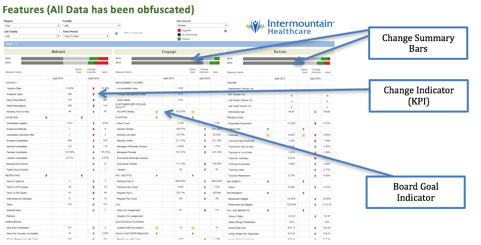
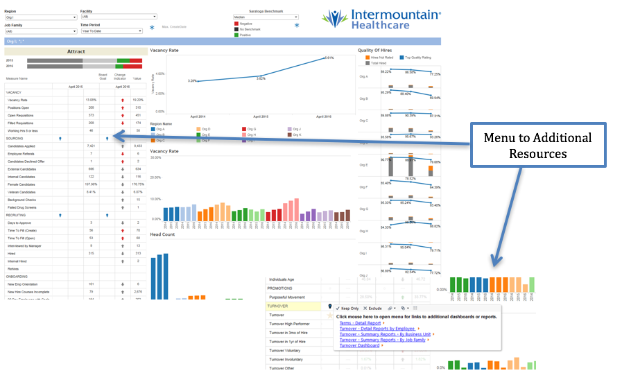
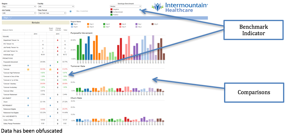
The initial goal was to create a data product utilizing data visualization software. The Workforce Optimization Dashboard and Scorecard is to be used throughout the organization by employees with direct reports. The dashboard provides a view of over 100 human resource metrics on activities related to attracting, engaging, and retaining employees at all levels of the organization. Some of the features in the dashboard include: drilldown to various levels of the organization, key performance indicators (KPI) to show change, options for various time periods, benchmark comparison with third party data, and links to additional resources such as detail reports. Prior to completion of this project, the data was available to limited users in at least 14 different reports and dashboards making it difficult and time consuming to get a complete view of workforce metrics.
During initial design and prototyping it was discovered that in order to meet the design requirements and maintain performance within the final visualization it would be necessary for all the data to be in a single data set. The data for human resources is stored in 17 different tables in an Oracle data warehouse. The benchmark data is provided by a third party. At the time of development the visualization software did not support UNION or UNION ALL in the custom SQL function. During development the iterative process of writing SQL, creating an extract file, and creating and modifying calculations in the visualization was very laborious. Much iteration was necessary to determine the correct format of data for the visualization.
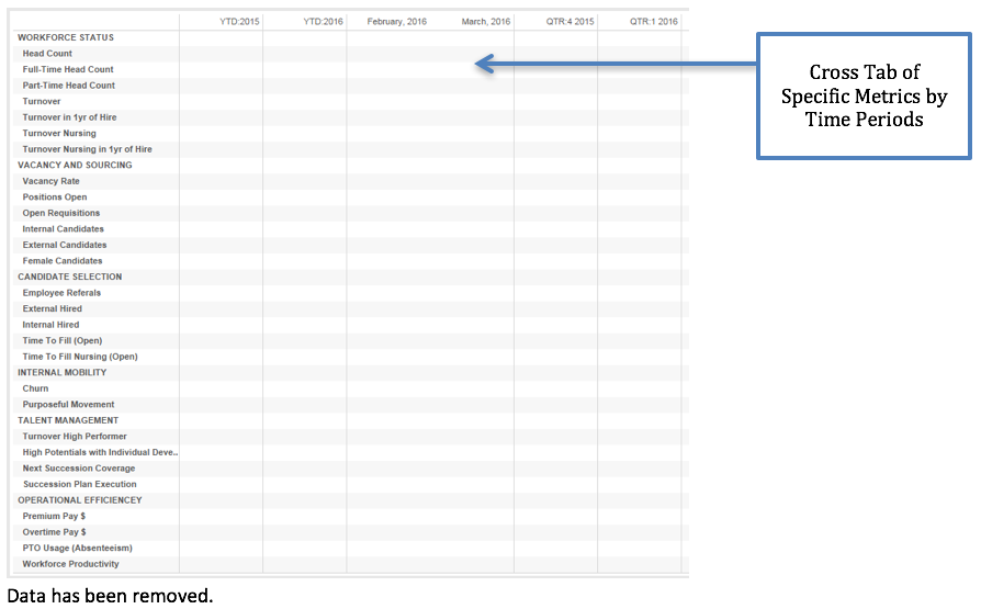
Other challenges occurred, such as when it was discovered that the visualization software does not support dynamic field formatting. The data values are reported in formats of percent, currency, decimal and numeric all within the same data column. While the dashboard was in final review it was determined that a summary of the KPI indicators would be another useful visualization on the dashboard. The KPI indicators, red and green arrows, were using table calculations. It is not possible to create additional calculations based on the results of table calculations in the visualization software. The business users also requested another cross tabular view of the same data showing multiple time periods.
Describe the working solution
Alteryx was instrumental in the designing and development of the visualization for the workforce dashboard. Without Alteryx the time to complete this project would have easily doubled. By using Alteryx, a single analyst was able to iterate through design and development of both the data set and the dashboard.
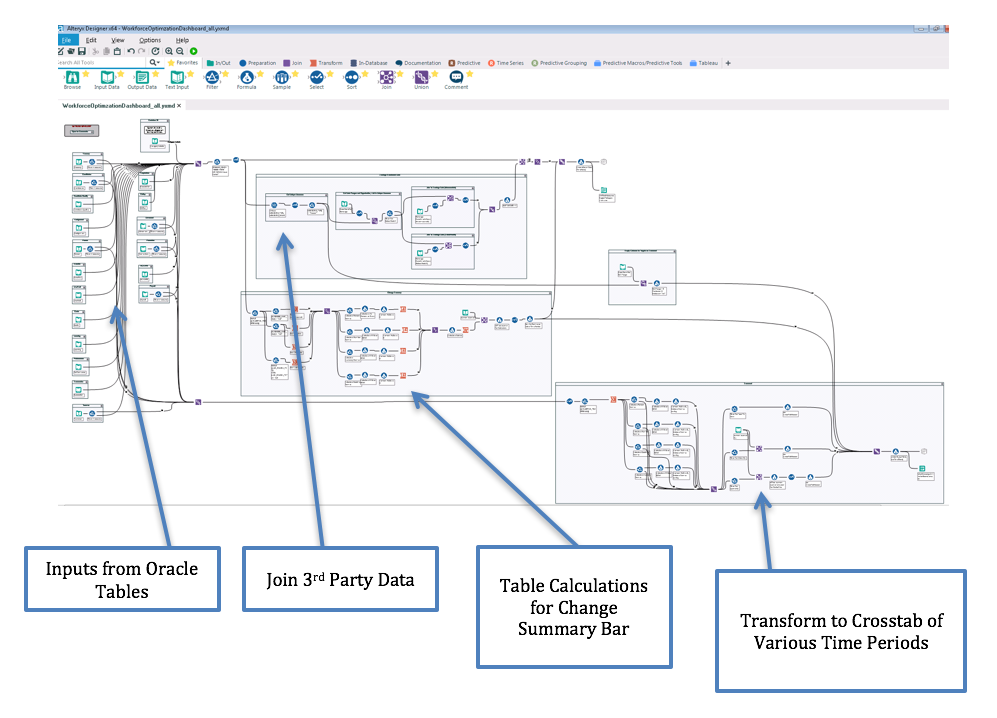
The final dashboard includes both tabular and graphic visualizations all displayed from the same data set. The Alteryx workflow uses 19 individual Input Data tools to retrieve data from the 17 tables in Oracle and unions this data into the single data set. Excel spreadsheets are the source for joining the third party benchmark data to the existing data. The extract is output from Alteryx directly to a Tableau Server. By utilizing a single set of data, filtering and rendering in visualization are very performant on 11 million rows of data. (Development included testing data sets of over 100 million rows with acceptable but slower performance. The project was scaled back until such a time as Alteryx Server is available for use.)
Describe the benefits you have achieved
The initial reason for using Alteryx was the ability to perform a UNION ALL on the 19 input queries. By selecting the option to cache queries, output directly to tde files, and work iteratively to determine the best format for the data in order to meet design requirements and provide for the best performance for filtering and rendering in the visualization, months of development time was saved. The 19 data inputs contain over 7000 lines of SQL code combined. Storing this code in Alteryx provides for improved reproducibility and documentation. During the later stages of the project it was fairly straight forward to use the various tools in Alteryx to transform the data to support the additional request for a cross tab view and also to recreate the table calculations to mimic the calculations the visualization. Without Alteryx it would have taken a significant amount of time to recreate these calculations in SQL and re-write the initial input queries.
Our customers are now able to view their Workforce Optimization metrics in a single location. They can now visualize a scenario in which their premium pay has been increasing the last few pay periods and see that this may be attributed to higher turnover rates with longer times to fill for open positions, all within a single visualization. With just a few clicks our leaders can compare their workforce optimization metrics with other hospitals in our organization or against national benchmarks. Reporting this combination of metrics had not been attempted prior to this time and would not have been possible at this cost without the use of Alteryx.
Costs saving are estimated at $25,000 to-date with additional savings expected in future development and enhancements.
You must be a registered user to add a comment. If you've already registered, sign in. Otherwise, register and sign in.
