Data Science
Machine learning & data science for beginners and experts alike.- Community
- :
- Community
- :
- Learn
- :
- Blogs
- :
- Data Science
- :
- Why use SVM?
- Subscribe to RSS Feed
- Mark as New
- Mark as Read
- Bookmark
- Subscribe
- Printer Friendly Page
- Notify Moderator
Support Vector Machine has become an extremely popular algorithm. In this post I try to give a simple explanation for how it works and give a few examples using the the Python Scikits libraries. All code is available on Github. I'll have another post on the details of using Scikits and Sklearn.
What is SVM?
SVM is a supervised machine learning algorithm which can be used for classification or regression problems. It uses a technique called the kernel trick to transform your data and then based on these transformations it finds an optimal boundary between the possible outputs. Simply put, it does some extremely complex data transformations, then figures out how to seperate your data based on the labels or outputs you've defined.
So what makes it so great?
Well SVM it capable of doing both classification and regression. In this post I'll focus on using SVM for classification. In particular I'll be focusing on non-linear SVM, or SVM using a non-linear kernel. Non-linear SVM means that the boundary that the algorithm calculates doesn't have to be a straight line. The benefit is that you can capture much more complex relationships between your datapoints without having to perform difficult transformations on your own. The downside is that the training time is much longer as it's much more computationally intensive.
Cows and Wolves
So what is the kernel trick?
The kernel trick takes the data you give it and transforms it. In goes some great features which you think are going to make a great classifier, and out comes some data that you don't recognize anymore. It is sort of like unraveling a strand of DNA. You start with this harmelss looking vector of data and after putting it through the kernel trick, it's unraveled and compounded itself until it's now a much larger set of data that can't be understood by looking at a spreadsheet. But here lies the magic, in expanding the dataset there are now more obvious boundaries between your classes and the SVM algorithm is able to compute a much more optimal hyperplane.
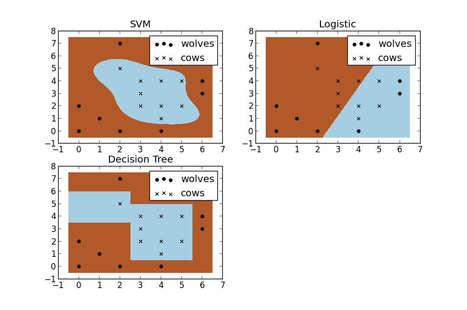
For a second, pretend you're a farmer and you have a problem--you need to setup a fence to protect your cows from packs of wovles. But where do you build your fence? Well if you're a really data driven farmer one way you could do it would be to build a classifier based on the position of the cows and wolves in your pasture. Racehorsing a few different types of classifiers, we see that SVM does a great job at seperating your cows from the packs of wolves. I thought these plots also do a nice job of illustrating the benefits of using a non-linear classifiers. You can see the the logistic and decision tree models both only make use of straight lines.
Want to recreate the analysis?
Want to create these plots for yourself? You can run the code in your terminal or in an IDE of your choice, but, big surprise, I'd recommend Rodeo. It has a great pop-out plot feature that comes in handy for this type of analysis. It also ships with Python already included for Windows machines. Besides that, it's now lightning fast thanks to the hard work of TakenPilot.
Once you've downloaded Rodeo, you'll need to save the raw cows_and_wolves.txt file from my github. Make sure you've set your working directory to where you saved the file.
Alright, now just copy and paste the code below into Rodeo, and run it, either by line or the entire script. Don't forget, you can pop out your plots tab, move around your windows, or resize them.
# Data driven farmer goes to the Rodeo

import numpy as np
import pylab as pl
from sklearn import svm
from sklearn import linear_model
from sklearn import tree
import pandas as pd


def plot_results_with_hyperplane(clf, clf_name, df, plt_nmbr😞
 x_min, x_max = df.x.min() - .5, df.x.max() + .5
 y_min, y_max = df.y.min() - .5, df.y.max() + .5

 # step between points. i.e. [0, 0.02, 0.04, ...]
 step = .02
 # to plot the boundary, we're going to create a matrix of every possible point
 # then label each point as a wolf or cow using our classifier
 xx, yy = np.meshgrid(np.arange(x_min, x_max, step), np.arange(y_min, y_max, step))
 Z = clf.predict(np.c_[xx.ravel(), yy.ravel()])
 # this gets our predictions back into a matrix
 Z = Z.reshape(xx.shape)

 # create a subplot (we're going to have more than 1 plot on a given image)
 pl.subplot(2, 2, plt_nmbr)
 # plot the boundaries
 pl.pcolormesh(xx, yy, Z, cmap=pl.cm.Paired)

 # plot the wolves and cows
 for animal in df.animal.unique():
 pl.scatter(df[df.animal==animal].x,
 df[df.animal==animal].y,
 marker=animal,
 label="cows" if animal=="x" else "wolves",
 color='black')
 pl.title(clf_name)
 pl.legend(loc="best")


data = open("cows_and_wolves.txt").read()
data = [row.split('\t') for row in data.strip().split('\n')]

animals = []
for y, row in enumerate(data😞
 for x, item in enumerate(row😞
 # x's are cows, o's are wolves
 if item in ['o', 'x']:
 animals.append([x, y, item])

df = pd.DataFrame(animals, columns=["x", "y", "animal"])
df['animal_type'] = df.animal.apply(lambda x: 0 if x=="x" else 1)

# train using the x and y position coordiantes
train_cols = ["x", "y"]

clfs = {
 "SVM": svm.SVC(),
 "Logistic" : linear_model.LogisticRegression(),
 "Decision Tree": tree.DecisionTreeClassifier(),
}

plt_nmbr = 1
for clf_name, clf in clfs.iteritems():
 clf.fit(df[train_cols], df.animal_type)
 plot_results_with_hyperplane(clf, clf_name, df, plt_nmbr)
 plt_nmbr += 1
pl.show()
Let SVM do the hard work
In the event that the relationship between a dependent variable and independent variable is non-linear, it's not going to be nearly as accurate as SVM. Taking transformations between variables (log(x), (x^2)) becomes much less important since it's going to be accounted for in the algorithm. If you're still having troubles picturing this, see if you can follow along with this example.
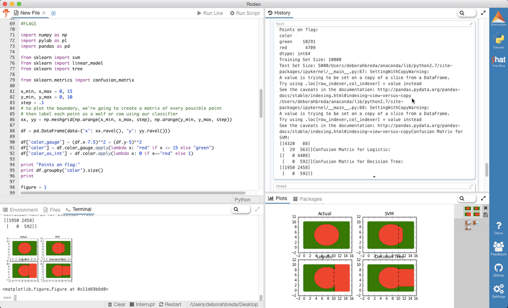
Let's say we have a dataset that consists of green and red points. When plotted with their coordinates, the points make the shape of a red circle with a green outline (and look an awful lot like Bangladesh's flag).
What would happen if somehow we lost 1/3 of our data. What if we couldn't recover it and we wanted to find a way to approximate what that missing 1/3 looked like.
So how do we figure out what the missing 1/3 looks like? One approach might be to build a model using the 80% of the data we do have as a training set. But what type of model do we use? Let's try out the following:
- Logistic model
- Decision Tree
- SVM
I trained each model and then used each to make predictions on the missing 1/3 of our data. Let's take a look at what our predicted shapes look like...
Follow along
Here's the code to compare your logistic model, decision tree and SVM.
import numpy as np
import pylab as pl
import pandas as pd

from sklearn import svm
from sklearn import linear_model
from sklearn import tree

from sklearn.metrics import confusion_matrix

x_min, x_max = 0, 15
y_min, y_max = 0, 10
step = .1
# to plot the boundary, we're going to create a matrix of every possible point
# then label each point as a wolf or cow using our classifier
xx, yy = np.meshgrid(np.arange(x_min, x_max, step), np.arange(y_min, y_max, step))

df = pd.DataFrame(data={'x': xx.ravel(), 'y': yy.ravel()})

df['color_gauge'] = (df.x-7.5)**2 + (df.y-5)**2
df['color'] = df.color_gauge.apply(lambda x: "red" if x <= 15 else "green")
df['color_as_int'] = df.color.apply(lambda x: 0 if x=="red" else 1)

print "Points on flag:"
print df.groupby('color').size()
print

figure = 1

# plot a figure for the entire dataset
for color in df.color.unique():
    idx = df.color==color
    pl.subplot(2, 2, figure)
    pl.scatter(df[idx].x, df[idx].y, color=color)
    pl.title('Actual')


train_idx = df.x < 10

train = df[train_idx]
test = df[-train_idx]


print "Training Set Size: %d" % len(train)
print "Test Set Size: %d" % len(test)

# train using the x and y position coordiantes
cols = ["x", "y"]

clfs = {
    "SVM": svm.SVC(degree=0.5),
    "Logistic" : linear_model.LogisticRegression(),
    "Decision Tree": tree.DecisionTreeClassifier()
}


# racehorse different classifiers and plot the results
for clf_name, clf in clfs.iteritems():
    figure += 1

    # train the classifier
    clf.fit(train[cols], train.color_as_int)

    # get the predicted values from the test set
    test['predicted_color_as_int'] = clf.predict(test[cols])
    test['pred_color'] = test.predicted_color_as_int.apply(lambda x: "red" if x==0 else "green")

    # create a new subplot on the plot
    pl.subplot(2, 2, figure)
    # plot each predicted color
    for color in test.pred_color.unique():
        # plot only rows where pred_color is equal to color
        idx = test.pred_color==color
        pl.scatter(test[idx].x, test[idx].y, color=color)

    # plot the training set as well
    for color in train.color.unique():
        idx = train.color==color
        pl.scatter(train[idx].x, train[idx].y, color=color)

    # add a dotted line to show the boundary between the training and test set
    # (everything to the right of the line is in the test set)
    #this plots a vertical line
    train_line_y = np.linspace(y_min, y_max) #evenly spaced array from 0 to 10
    train_line_x = np.repeat(10, len(train_line_y)) #repeat 10 (threshold for traininset) n times
    # add a black, dotted line to the subplot
    pl.plot(train_line_x, train_line_y, 'k--', color="black")

    pl.title(clf_name)

    print "Confusion Matrix for %s:" % clf_name
    print confusion_matrix(test.color, test.pred_color)
pl.show()

Results
From the plots, it's pretty clear that SVM is the winner. But why? Well if you look at the predicted shapes of the decision tree and GLM models, what do you notice? Straight boundaries. Our input model did not include any transformations to account for the non-linear relationship between x, y, and the color. Given a specific set of transformations we definitely could have made GLM and the DT perform better, but why waste time? With no complex transformations or scaling, SVM only misclassified 117/5000 points (98% accuracy as opposed to DT-51% and GLM-12%! Of those all misclassified points were red--hence the slight bulge.
When not to use it
So why not use SVM for everything? Well unfortunately the magic of SVM is also the biggest drawback. The complex data transformations and resulting boundary plane are very difficult to interpret. This is why it's often called a black box. GLM and decision trees on the contrary are exactly the opposite. It's very easy to understand exactly what and why DT and GLM are doing at the expense of performance.
More Resources
Want to know more about SVM? Here's a few good resources I've come across:
- Beginner SVM Tutorial: Just the basics with a little bit of spoon feeding from Zoya Gavrilov at MIT
- Beginner How SVM algorithm works: Video by Thales Sehn Körting
- Intermediate A Gentle Introduction to Support Vector Machiens in Biomedicine Slides from NYU & Vanderbilt
- Advanced Tutorial on Support Vector Machines for Pattern Recognition from Christopher Burges at Bell Labs
You must be a registered user to add a comment. If you've already registered, sign in. Otherwise, register and sign in.


