Let’s ponder for a moment, what are the movies or TV shows we like best? The ones with strong characters, good dialogue, great music, and... a gripping mystery. There is always a quest for something, isn’t there? That is when you resonate with the story. And what happens when there are too many plotlines and a story that’s hard to understand? Often, you give up on it and move to the next one, right?
What does this have to do with data, you ask? You’re telling stories every day - through data! When you present a chart or a graph on a PowerPoint slide or your dashboard, you’re basically telling your audience a story – the story of the increase in prices of raw materials this year, the story of the decrease in productivity of your employees this quarter, or the story of a drastic increase in your company’s revenue. There’s good news, bad news, and almost always news that needs some corrective action. And the only way your audience will take that action is if they see the data, understand it, believe in it, and most importantly, feel the story.
Storytelling with visualization has literally been saving lives since as early as the 1800s when a story created by physician John Snow convinced other physicians in London that Cholera was spreading through water. He drew black bars in the location of each death due to cholera.
 Source: National Geographic
It was clear from his chart that the deaths were more in number in areas around the pumps.

Source: National Geographic
The pump was then closed, after which a steady decline was observed in cholera cases!
The impact of good data stories on your CFO
There are a lot of numbers that corporates come across every day. Giving context and a story to the numbers is what makes them valuable. To make decisions to improve a company's financial performance, it is extremely important that proper analysis is done on available data and that the numbers are presented effectively to identify all the pain points. Let us see the benefits of good storytelling for CFOs.
Stories help focus on what’s important
Telling a data story requires asking yourself, “What am I trying to answer with this chart?” before presenting your data. Once you have it, you can talk about the change in points and arrive at the answer to the question.
It’s a simple 3-step formula: Setup(before), Conflict(change), and Resolution(after). When you make sure that your data answers one major question rather than many different questions or automatically gives you the ability to ask more effective questions, you have the attention of your CFO exactly where you need it.
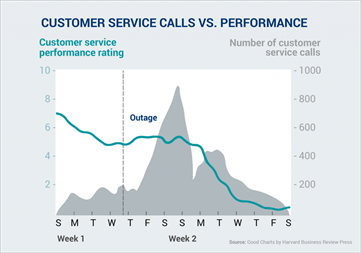
For instance, this graph down here does not have a good story. At first glance, you can’t decide what to focus on. Multiple axes and different plotlines leave your audience having to work hard to figure out what you’re trying to imply.
Source: YouTube
Perhaps the graph should’ve thrown light on just one thing: the decline in ratings. These are precisely the kind of mistakes you avoid when you follow good storytelling techniques. Having all the necessary metrics in an easy-to-read way on your CFO’s daily dashboard will make processes smoother every day, either sent automatically or they can subscribe to updates.
Stories help convert data into actionable insights
By telling stories to your CFO, you turn important metrics into actionable insights. You will have an analysis of your key performance indicators in a way that not only aligns with your key business goals but also transforms the numbers into narratives that drive action.
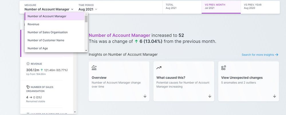
Alteryx Auto Insights does exactly that. It enables you to select the KPIs or Measures that resonate most with your purpose and uses visual cues to build such stories around your data automatically.
Source: Auto Insights
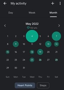
Below are snippets from a Google Fit app showing my history of daily walks.
 Source: Google Fit app on personal phone
The weekly analytics gives a certain amount of insight, but the bubble chart on the monthly analytics is rather eye-catching. It helps me understand the consistencies in the data (or lack of it), and the image is more memorable after. The next time I strike my evening walk off my calendar, perhaps I stop and think back.
Source: Google Fit app on personal phone
Stories help enhance processes with graphs
As discussed, stories always come with a definite path: a well-defined start, middle, and finish. Recently, I was facilitating a CFO Roundtable event, and nearly all the CFOs alluded to the fact that they now have many dashboards but either do not know what they mean or are telling them.
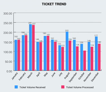
In the following situation, a bar chart shows the number of IT tickets received and processed each month. While this may be comprehensible, it doesn’t necessarily spark a realization in the reader’s mind.
Source: YouTube
However, the below alternative tells a story regarding “why” the change in numbers takes place and calls for corrective action.
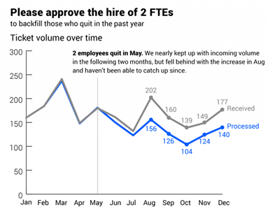
Source: YouTube
Now let’s look at an example with Alteryx Auto Insights. Here we can see there is an increase in the Exclusive Amount:
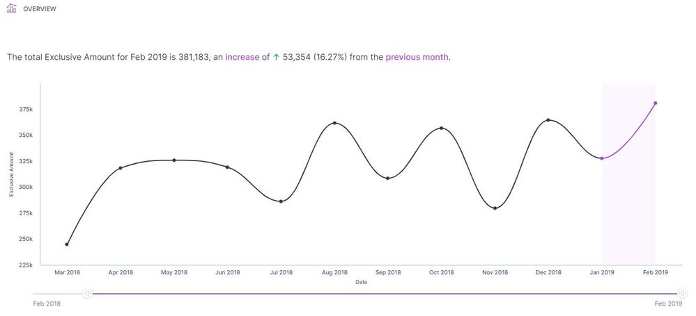
Source: Auto Insights
And, we can automatically start to see what has caused this trend, as well as understand why such a trend exists:
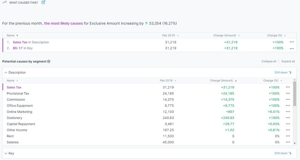
Source: Auto Insights
And with this, we can drill down further to understand the reasons further, which starts to paint a picture and a story for the CFO:
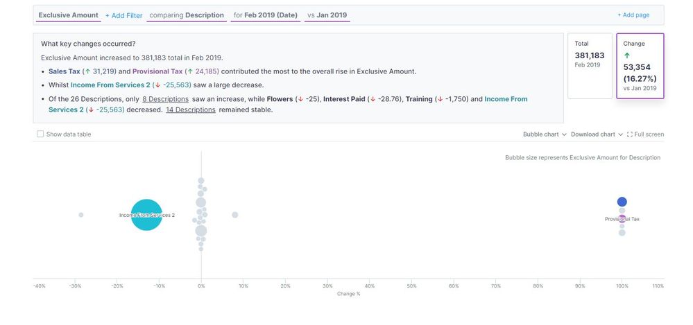
Source: Auto Insights
As a result of speaking to CFOs recently at a Roundtable event, they stated that stories they require or are important for them are typically so time-consuming to create (maybe not the visualization, but the commentary and data storytelling that an analyst has to write themselves to support it). This commentary changes every time the data updates; therefore, CFOs often get these types of information every quarter and, if they're lucky, monthly. But Alteryx Auto Insights automates this data storytelling. You can schedule new Insights to go out to your CFO weekly - so they can keep a pulse on the business - without an analyst having to lift a finger.
Stories help improve communication and participation
Maintaining a good engagement rate with clients and other stakeholders consistently is a challenge most organizations face. Your audience may not always know the ins and outs of the process your dashboard talks about. For instance, your CFO may not be aware of the functionality of the machinery in your manufacturing unit, but there may be a problem with it that you need to explain to them. You would then have to stand in the shoes of the Office of Finance and work out an effective way to present it by focusing on the KPIs and Measures that resonate with their point of view.
Using relevant frameworks and visuals in the plot is vital for effective communication. When information is made easy to understand and relate to, through good storytelling, it is more likely to keep anybody – from experts to even absolute novices – engaged. And when is more engagement, there is more room for brainstorming and overall process improvement.
Stories help bring a visual appeal
In the age of smartphones, we hardly have the patience or the attention span to sit through something we don’t fully comprehend. It is important to make your data visually appealing to keep your audience’s eyes glued to the screen.
Visualization also helps you retain information, which means that your CFO will ponder over your findings long after walking out of that conference room.
Bottomline
The vast amount of data generated every minute is useless until it is well-interpreted. Every organization has a lot of data in its hands, and putting it to good use is possible with effective storytelling. Experts are among the best storytellers in the world - and you should be too.
Empower your CFO to make the best decisions for your organization by giving them the best visual representation of your numbers. Get started on your improving your stories today with Alteryx Auto Insights!
Related Content
Data Storytelling with Auto Insights
Auto Insights: What Makes a Good Use Case?
Converting Business Questions into Answers with Auto Insights