Time for some role-playing! You are now a sales leader. (Stick with me here.)
You want to answer your question, “how is my revenue performing over time, and what’s driving it?” You know you have revenue data and Alteryx Auto Insights (AAI). But how exactly do you get the metrics and charts you need?
Let’s look at the steps you need to formulate a query in Auto Insights to be your most successful sales leader self. I will outline turning your question into the Auto Insights query structure. And don’t worry—this process can be used for all sorts of business questions, not just ones about revenue.
1. Determine your measure
In the Search tab of Auto Insights, you will find the empty query bar:

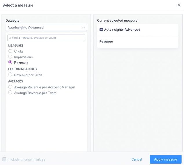
The first prompt reads “select a measure.” A measure is a data column that can be aggregated (i.e., summed, averaged, etc.) It is the numerical data that you want to analyze over time in Auto Insights.
Back to your question—“how is my revenue performing over time, and what’s driving it?” Revenue is what we want to track over time, and it is a numeric column. Great! We can select Revenue and click “Apply measure” to continue building our query.
Auto Insights will make an assumption about the period you want to look at—below, it defaults to month-on-month analysis, comparing our latest month to the prior month and figuring out what is driving the change. But, what if we want to look at a view that is not month-on-month?
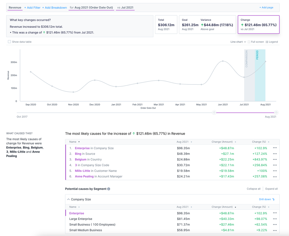
Question built so far: How is my revenue performing monthly, and what’s driving it?
2. Select a time period
Depending on the granularity of your data, your periods could be from days to years. For this example, let’s say we want to do our analysis at the monthly level. So the question becomes, “how is revenue performing month by month?”
We also need to set a focus period—how many months do we want to compare? Let’s go with the past six months.
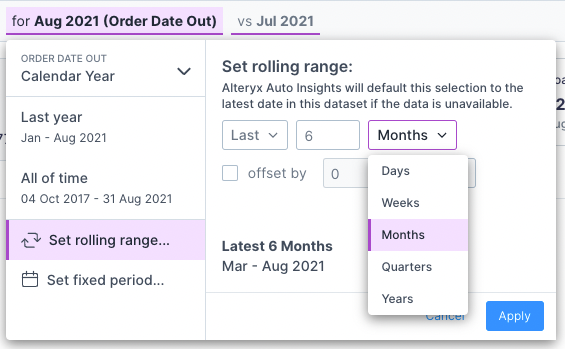
Now that we know we want a monthly analysis for the past six months, it’s time to adjust our query in Auto Insights. Click on the piece of the query (note: this will default to a date value before you change it—in the screenshot below, it defaulted to August 2021).

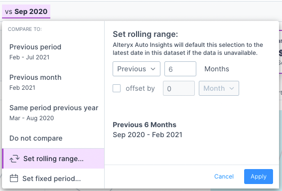
Using the drop-down selections and the text box, you can set your rolling range to the last six months.
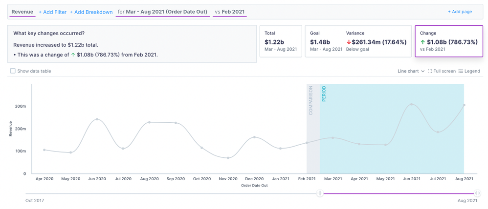
After selecting the last six months, your chart will look like the one below… not quite what we want. It defaults to comparing the six months to the month before. We can change that by clicking on the “vs. ___” section.
To compare against the previous six-month period, we can set the rolling range to “Previous” 6 Months.
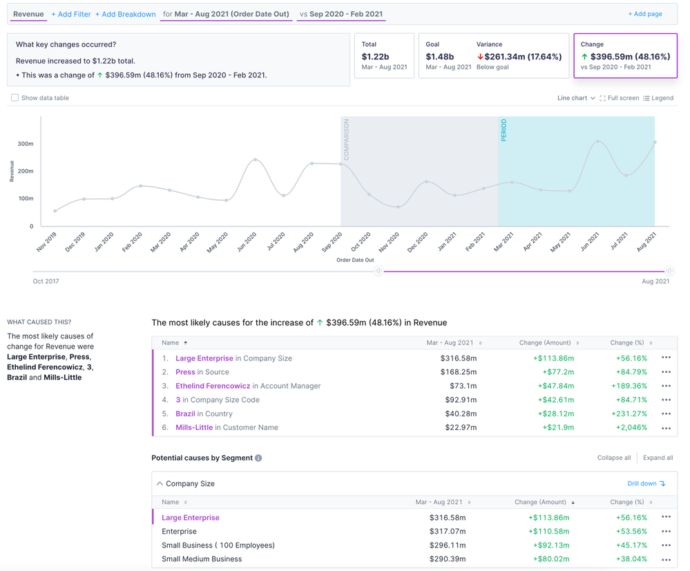
Now the chart and the metrics make more sense—the change in the top right corner represents the change in monthly revenue between the latest six months and the previous six months.
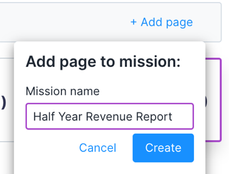
Let’s add this result to a new mission. First, you click on the add page button at the top right of the screen. Then click “Create new mission.”

Now we can give the mission an informational title and click “Create.” This will save our analysis so we can refer back to it for future reporting needs.
Question built so far: How is my revenue performing for the past six months, and what’s driving it?
3. Filter your measure
You have an excellent analysis built so far, but then you realize—you are the sales leader for North America, but this dataset contains global data. Here is where filtering comes in!

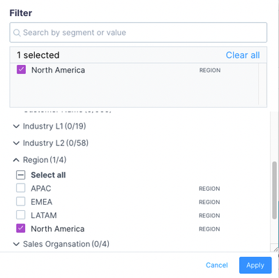
When you click on “Add Filter” in the , you can select dimensions to filter on. We select North America and then hit apply.
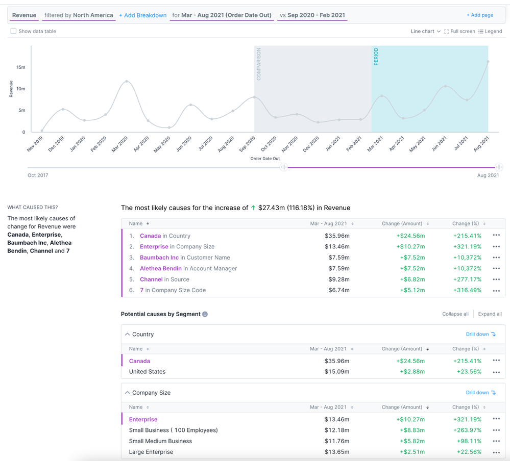
Here is what your search results will look like. As you can see below, the “What Caused This” section has changed—now that we are looking at just North America, the number one potential cause for the increase in revenue is the country (whereas before, it was company size).
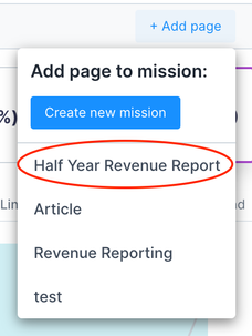
You can now add this page to the mission you created earlier in order to save this filtered view.
Question built so far: How is my revenue performing month on month for the past six months in North America, and what’s driving it?
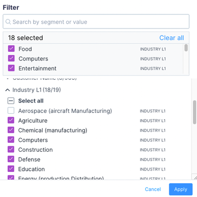
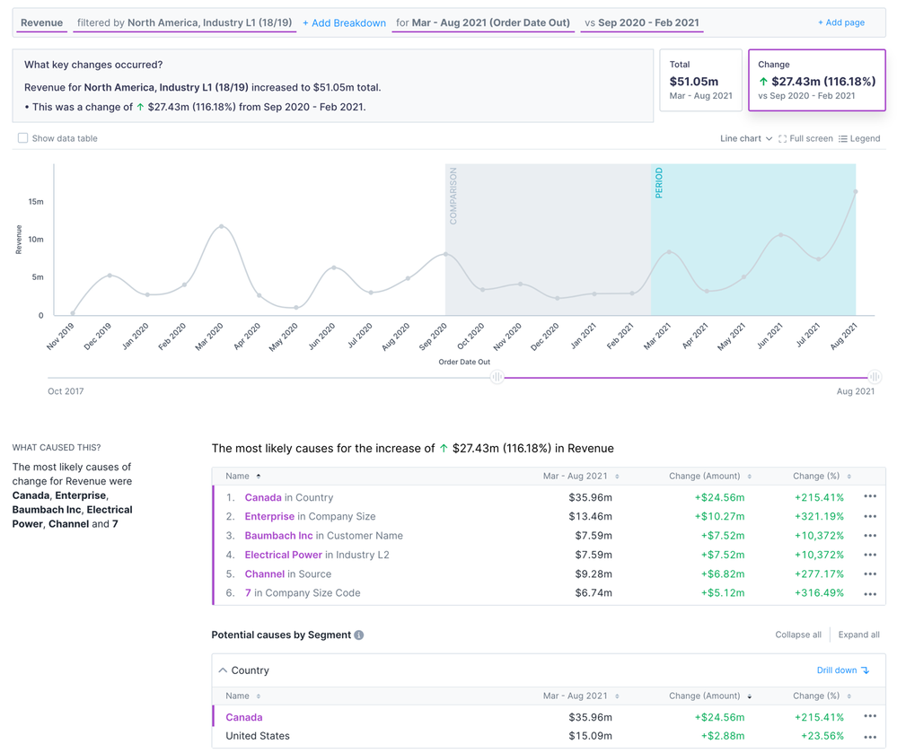
This is a simple example, but you can build up a filter to be as complex as needed. For example, you can check the “select all” option under a column and then deselect an option to exclude that from the dataset. Below is a screenshot of a filter where we excluded the Aerospace industry from the analysis. You can also filter multiple fields to see only the North American region for all industries except Aerospace.
4. Identify segments to compare
Now for the final component to the query—adding the segment breakdown. Perhaps you look at your revenue trend and think, I would like to see what industries are driving this revenue increase. This can be done quickly! Click on the “Add Breakdown” portion of the query and select Industry L1.

The default visual looks like the one below, which is suitable for identifying the biggest drivers of change in the last month. However, we need to change the chart type to get that month over month for the last six months' view.
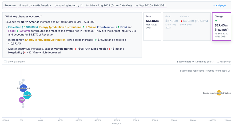
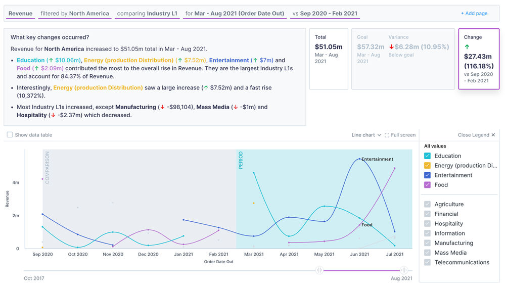
We can change the chart to a line chart and limit the x-axis to see the last 12 months. Now we have an answer to our final question. Additionally, you can turn on the legend in the top right corner of the chart to get the look below.
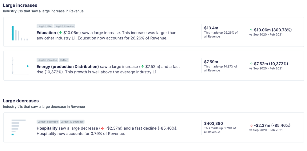
To add to the “what is driving this?” part of the question, you can scroll down in this view to see additional insights about drivers of change for revenue. And to get more detail, you can drill into each insight by clicking it.
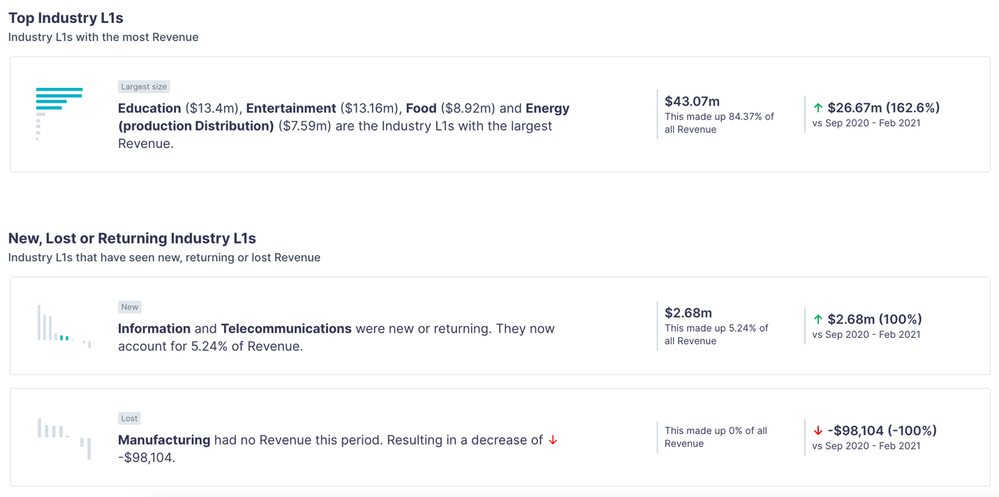
Question answered: How is my revenue in North America performing month on month for the past six months – and which industry is driving it?
Conclusion
Now that you have spent all this time creating your analysis, you should add the final page to your mission! You can refresh the data and use the same query to get an updated analysis when a new month comes around.
Congrats on being an incredible sales leader 
For more training on Alteryx Auto Insights, check out these interactive lessons. And if you aren’t sure where to start, refer to this blog post on what makes a good Auto Insights use case.