At Alteryx, we know you need to see into your data at every step of the way to better understand your data including the ability to effectively communicate those insights you worked so hard to develop. With our Visualytics you can bring every insight to life so people of all levels in the organization can understand your entire analysis. With our latest release, 2018.3, you can now try our extended Visualytics features with our Interactive Chart and Insight Tool within the Reporting Suite. Today, we will focus on the Insight Tool but this Interactive Chart tool post will provide you with helpful hints.
What can I do with the Insight Tool?
With the new Insight tool you can build and combine multiple interactive charts so your stakeholders can investigate and focus on what is important to them. The Insight Tool leverages our new chart capabilities, so you can easily customize your charts, adding a drill down to each so when you drill down into one chart it reflects across all other charts. The resulting dashboard can then be output to your organization’s Alteryx Gallery to share your insights with everyone.
Create the same popular chart types that are available in the Interactive Chart Tool:
- Area
- Bar
- Box & Whisker
- Candlestick
- Heatmap
- Line
- Scatter
- Pie
How do I use the Insight Tool?
The Insight Tool is a simple to use feature that lets you build interactive dashboards by combining multiple charts and text together so anyone can understand the full picture of your analysis and drill down on what’s important to them.
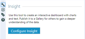
1. From the reporting suite of tools, simply drop the Insight tool  into your workflow
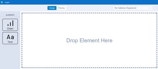
2. Configure your Insight by dragging and dropping either a chart or text onto the Insight Tool canvas. Configure each chart you want to share by choosing the type, add layers, drill downs, and customizing fonts, colors and much more. If you have a preconfigured chart that you saved to your templates, you can import to reuse the same format. The steps below will build out insights with drilldowns.
3. Add drilldowns that will enable each individual chart to change across the dashboard.
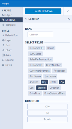
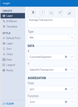
4. Add Layer by giving it a name, choosing which type of chart and the data you want to visualize. This includes any drilldown fields you created in the above step which will show up at the bottom of the list. If you want more than one layer to add dimensions to your charts, simply click add layer within the interactive chart tool. Please note that you can add different chart types (ex. line and bar graph)
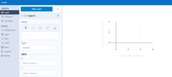
5. Within the layer tab, you can also perform some calculations such as sum, count, min, max or mean to your data.
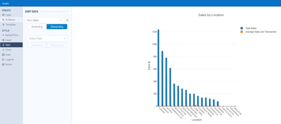
6. Ensure your data looks the way you want by using the sort function. For example, on a bar chart you can sort by ascending so it’s easier for your stakeholders to quickly digest the information.
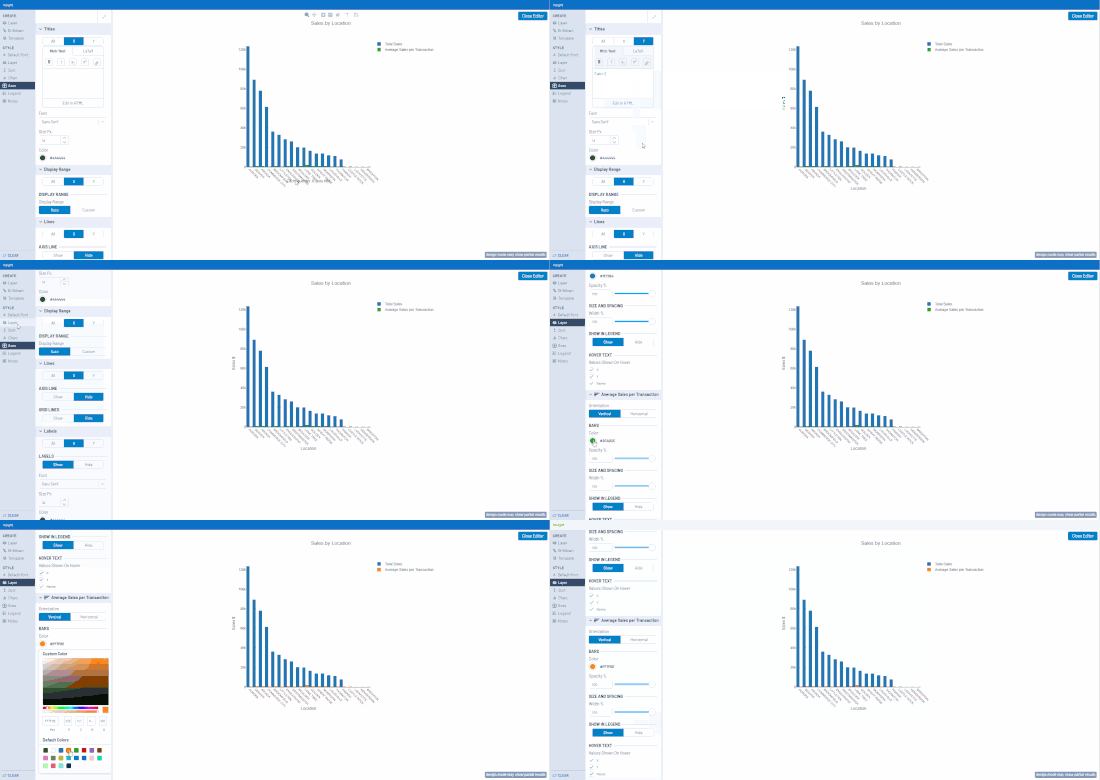
7. Customize the look and feel of your chart by adding labels, changing colors, fonts, size, gridlines and more to create the chart you need. Edit the titles inline by simply clicking and typing the text you wish to create.
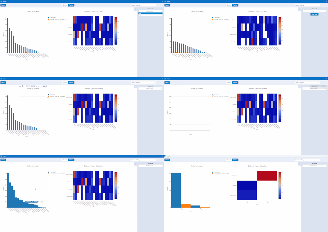
8. The Insight tool has two modes, design and preview. Design mode allows you to add new charts and text, position and size. Preview allows you to verify the behavior (hover/highlighting, drilldown, filter) before sharing.

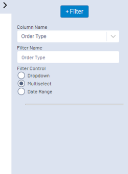
9. Add filters on the right side while in Design mode to enable the consumers of your analysis to focus on what’s important to them.
10. Use the Preview mode to check everything is working as expected and share your Insights to Gallery in the upper-right corner to bring your insights to life for everyone across your organization.
Watch the video below to see it in action, download our trial or upgrade to 2018.3 to take our new Visualytics Insight experience for a spin!