As someone who recently purchased their first home, mortgage data (along with DIY YouTube videos) has become a bit of an obsession. Maybe it's just general curiosity, or maybe I am just obsessed with validating my mortgage deal – either way, I wanted to understand mortgage values and demographics historically.
Luckily, I found some HMDA (Home Mortgage Disclosure Act) data for New York. The data can be found on the CFPB website. The structure of the data is as follows:
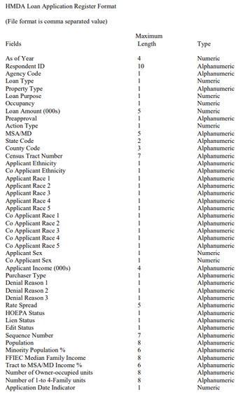
Already I noticed that there was a slight issue. Auto Insights works best with granualar transactional (time series) data, but the dataset here only classified each record with the year. Luckily, because there were datasets available from 2007–2017, instead of giving up on this dataset, I decided to expand the scope of it. I expanded my dataset by downloading all the years 2007-2017 and accepting that I could only look at it year over year (YOY) without any more granularity. Not ideal, but for these purposes, it’ll do.
After downloading the data and uploading them into Alteryx Designer, it was time to prep and transform my dataset for optimal performance in AAI.
Basic Data Tweaks
- I converted the ‘As of Year’ or my date column into the correct ‘YYYY-MM-DD' format, transforming each ‘As of Year’ into January 1 (ex: 2016-01-01).
- I renamed ‘Loan Amount’ to ‘Applied Amount’ and created another column, ‘Approved Amount,’ which was the same as ‘Applied Amount’ only if the application was approved.
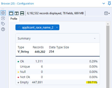
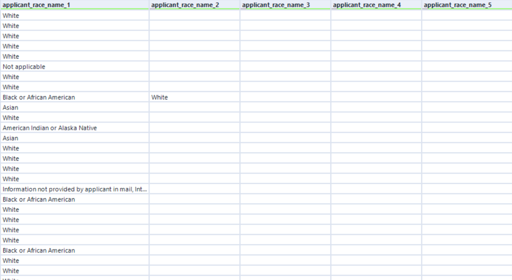
- I only selected the columns that I was interested in to reduce the size of the dataset and also to reduce some of the noise, so the analysis is clearer in Auto Insights. What I mean by that is that the Race 2-5 columns for applicant and co-applicant were filled with blanks. Less than 0.3% of records even had an applicant race 2 value, and it got progressively less and less with each number. And less than that for the co-applicant race. So to keep the data rich and not have too many nulls, I decided to remove them.
- I also noticed that our key measure, loan amount, was labeled in thousands. So to make it easier to read at first glance and not have to check the label for units, I just multiplied the value by 1000 (300 became 300*1000 = 300,000). There is no need to have to shorthand your measures because Auto Insights will automatically take care of that – instead of showing $161,350,000,000, it will show $161.35b.

Converting Measures Into Segment Buckets
The final data transformation I did was to convert some of the measures into bucketed segments. You might wonder why I did that since additional measures are a good thing to incorporate into Auto Insights. While that is true, the way that Auto Insights does its automatic summation, there are times when converting a measure into a segment before uploading makes sense. Let me explain using two examples: minority population % and applicant income.
Minority population % showed the percentage of minorities in the census tract area for each applicant – it was pre-calculated for each census tract number. Now I do think that it is potentially interesting to see how the minority population influences mortgages - taking the SUM of each applicant’s area’s minority pop % doesn’t give us a useful data point. It’s just a sum of different percentages, and it doesn’t describe the total minority population of the dataset – it would just show a really high number in Auto Insights.
❝
So, it's helpful to be cognizant of pre-calculated measures in each record. They might make sense within the context of each row (record), but aggregated, they will not have the same impact and cause more confusion.
❞
When this is the case, it's best to convert those measures into segments to be able to break down and see the impact. And 99.9% of the time, you want to make sure to handle this transformation outside of the Auto Insights platform. What I mean by that is, sure, you can just change it from Measure to Segment in the 'Confirm Fields’ of the data import process in Auto Insights, but doing so makes it harder to view the insights as we see with the “Converted to Segment (as-is)” example.
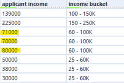
Converting a Measure to a Segment is not enough on its own, but it's most useful when you convert a Measure into Segmented Buckets. Auto Insights identifies and counts each unique value in a Segment. For these measure/numeric fields that are continuous, there can be small differences in these values, but in reality, they do not represent true unique segments. Someone with $70,000 in income is not materially different from someone with $71,000. And a minority population of 4.322% is not that different from one with 4.323%. The way to prevent this is to categorize each numeric value into a bucket. So, with the help of some nested if functions, I created some MECE (Mutually Exclusive, Collectively Exhausted) structure to categorize these individual values into a more comprehendible number of ranges that is easier to digest and break down.
Left as Measure
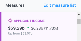
Taking the sum of all the applicant incomes gives us a large metric that doesn’t explain to us anything relevant in the data.
Converted to Segment (as-is)
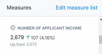
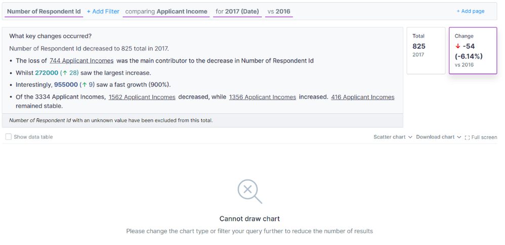
When we convert it to a segment, we can see that there are 2.6K+ of distinct incomes in the data. It is slightly more helpful than the Measure version but when we drill down into it, we still see too much noise and Auto Insights cannot create visualizations when there are too many distinct values.
Converted to Segment (bucket)
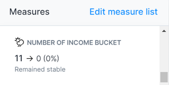
And just like Goldilocks, the bucketed segments is just right. Because we created the number of buckets, the created measure of “Number of Income Bucket” doesn’t add value (we may want to remove it), but when we drill down, we can see how many mortgage applications are coming from the different income ranges which is a valuable insight.
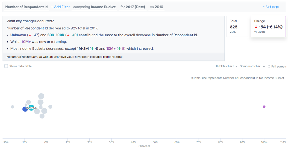
If I hadn’t created these buckets and instead just converted the measure to segment, then for applicant income, the top insight is the loss of 744 incomes as the main contributing factor to the decrease in applications. But with the income buckets, the income bucket that most contributed to the decrease in mortgage applications was the $60-100K applicants—a much more insightful and actionable takeaway.
Another benefit of doing this bucketed segment approach, especially for numeric fields, is the “rough” ability to do multi-measure analysis. Auto Insights is a tool designed for single-measure KPIs. And while my focus has been on loan amounts applied for, I, of course, wanted to understand the relationship of applicant income on loan amount – aka correlation - since it is such a core component of the mortgage process., And while Auto Insights is not designed for this type of multi-measure correlation analysis, that doesn’t mean you can’t drill down. By converting one of the measures (applicant income in this case) into a segment, I could utilize Search to select my measure, loan amount, and compare it by applicant income and get some level of insight from the two data points.

Auto Insights is a single-measure tool. When starting a ‘Search’ or even in ‘Discover,’ you select A single Measure. Once you select the single measure, then you have the ability to filter on as many segment combinations and or compare by an additional segment.

With this dataset setup, Auto Insights can easily and automatically capture the average loan amount per applicant income bucket. Then I can compare it between buckets to get an understanding of the average loan amount applied for each individual income bucket.
Analysis
After all that, the data was ready for upload. Looking at the applied amount, the sharp decline since 2007 and the mortgage crisis were evident in the trend analysis. And since then, it has remained relatively stable with a slight rise and fall from 2013-2014. In 2017, there were $156.75B of mortgage applications. A decrease of $4.6B or 2.85% compared to 2016. And ‘What caused this?’ was able to concisely describe the drivers of this decline.
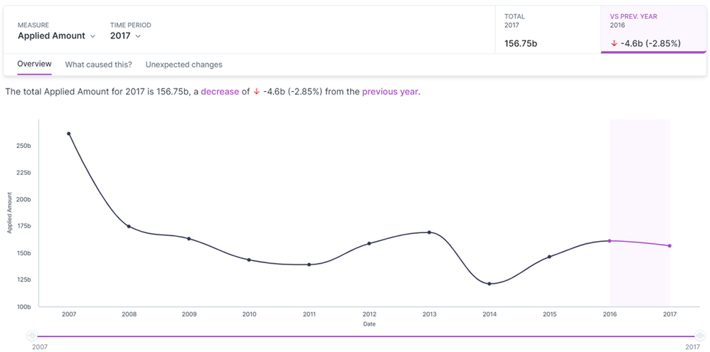

While application trends are interesting, I knew I wanted to better understand the decisioning of each application, so I went to ‘Search’ and started playing with the data. I was able to see originated loans by adding them to the filter section of the query bar. And with just that slight change in my question, I was able to see some distinct differences compared to ‘Discover.’
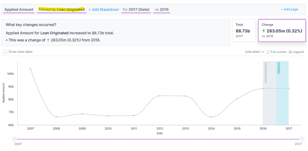
Overall, the trend line is slightly different from before, and most notably, instead of a decline in 2017, we see a slight increase in loan amounts for originated loans. With one simple filter, our perception of the data can easily change. And I wanted to see what else I could decipher. The ‘loan purpose’ segment informs us of the purpose of the loan and whether the money was loaned out for a mortgage, as a part of refinancing, or for home improvements. I was curious about the impact that it might have on the dataset, so I was able to add it as a breakdown in our query bar. I adjusted the view from a bubble chart into a stacked column and selected 100% stacked to see the proportion of the loan amount.
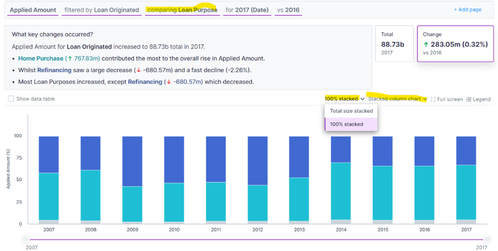
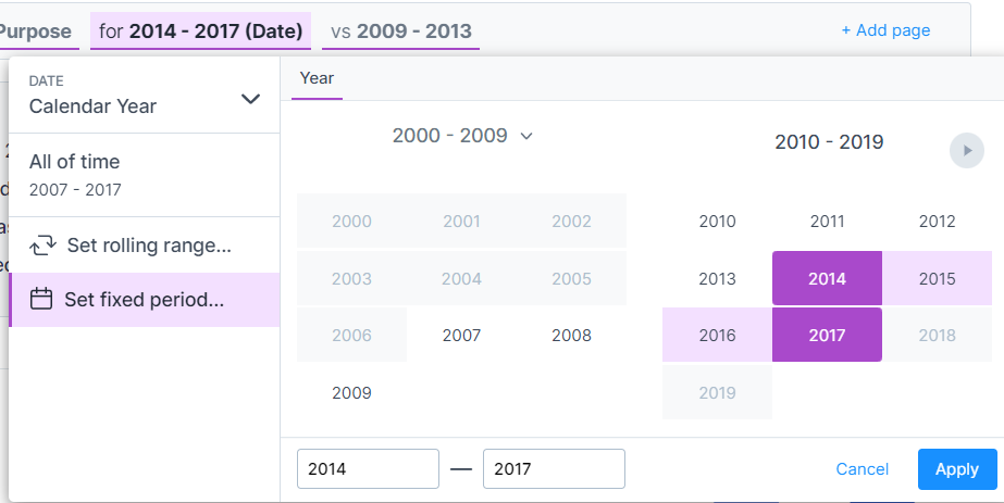
With another slight addition to the query bar here and changing the visualization options, I was able to get a totally different understanding of the data. From this, we can see how the proportion of refinancing amounts to mortgage loan amounts. Between 2009 and 2013, that proportion stood out the most and was nearly 1:1. Without much context, I might assume that it has more to do with mortgages declining as a result of the global mortgage crisis, but it could be a result of an increase in refinancing loans as people might have had to dip into their equity to stay afloat. . By switching the time period of focus from 2014-2017 and comparing it to the 2009-2013 period, we were able to confirm the findings to see that it was both a decrease in home purchase mortgages and an increase in refinances during the 2009-2013 period.

Another key area I wanted to explore was a drill down by the income buckets that we transformed earlier. By changing the breakdown to ‘Income Bucket,’ I could start to see the impact and behavioral changes that income levels played in originated loan amounts.
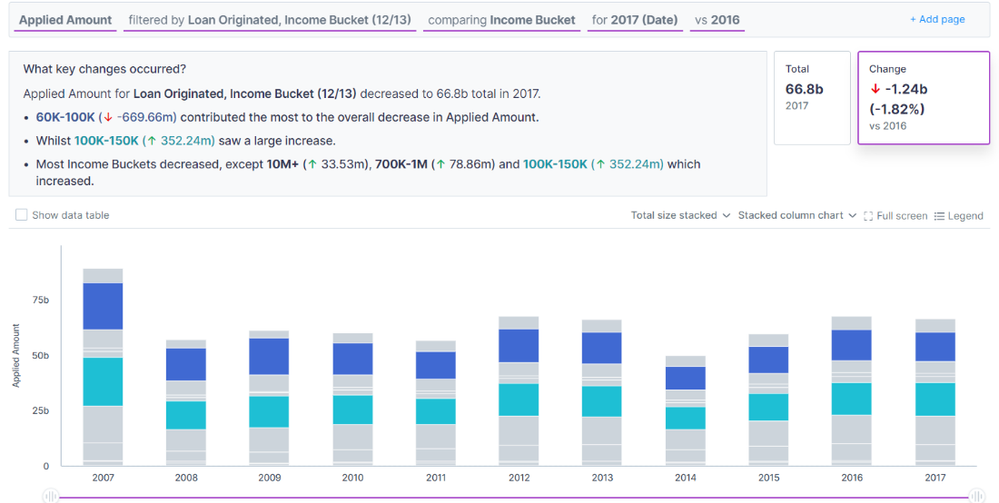


As a whole, originated loan amount decreased from 2017 compared to 2016 by ~$1.24B. And half of that decrease comes from the $60-100K bucket --> “60K-100K (↓ -669.66m) contributed the most to the overall decrease.” That is not as surprising as we see from the 80/20 Story that almost 62% of all originated loan dollars come from these three buckets: $60-100K, $100-150K, and $150-250K. Still, even in the midst of the general decline in 2017, $100-150K actually saw a large increase! And also accounts for the most originated loan amounts compared to other buckets.
But in 2022, with the recent inflation prints, I couldn’t help but wonder if dollars were the best way to track this. So I realized it might not make the most sense to look at “Applied Amount’. Instead, I utilized one of the automatically calculated measures that Auto Insights provides. For each segment, Auto Insights will count the number of distinct values within the segment. So if you have a unique identifier column, like Respondent ID, you can easily use this Measure to get a count of your dataset. So that is what I did and changed my Measure configuration to “Number of Respondent ID” in order to view the number of originated loans.
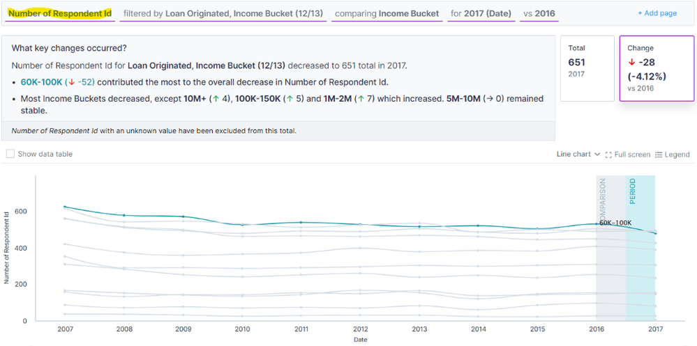
You might notice there is no longer a stacked column chart view. When utilizing these calculated number of unique segment value measures, some charting functionality is limited compared to the sum of “true” or numeric measures.
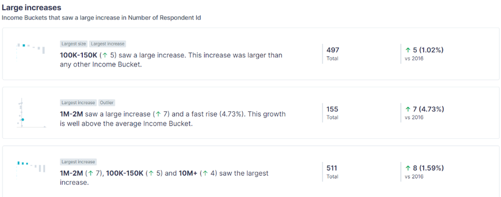
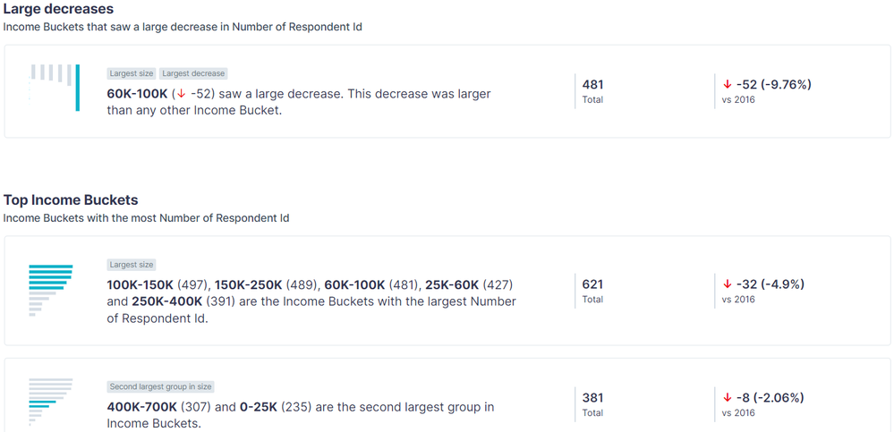

With this change in our query bar, we start to get a different view and different insights stories! It was interesting to see the change in approved mortgages in the $60-100K income bucket. Historically, we can see from the graph that it was always the top income bucket when it came to approved mortgages. But as we see from the key changes call out, “60K-100K (↓ -52) contributed the most to the overall decrease” in originated loans - which we would have suspected based on our previous Search. What was surprising was to see the $100-150K bucket overcome and be the top bucket in terms of originated loans. Yes, we knew that they were responsible for the most originated amount. Still, higher incomes tend to have higher loans, so to actually see more loans be originated in this group compared to any other was very interesting and got me to consider two things: (1) lenders are being more risk averse and requiring more income (2) income is up across the board either due to improved quality of life and income or inflation.
The last question I wanted clarity on was regarding demographics, specifically race. So staying in the number of respondent ID measure, I broke it down comparing by ‘Applicant Race.’ Initially, the data showed that there were race values of “Not Applicable” and “Information Not Provided,” which doesn’t add any value to understanding. I wanted to exclude those from the analysis, so a quick way to accomplish that was by checking the ‘Show data table’ box above the chart, selecting all rows in the table, and deselecting
Considerations
When you start to filter out and deselect some of the data points, it's important to consider how much of the dataset you will be removing. By removing too much data, you may be skewing the data points and the insights generated. For example: if there are 100 data points and 50 of them are marked ‘unknown’ race, and of the remaining 50, 35 are ‘Asian.’ When you filter out the ‘unknown’ data points, suddenly, your understanding is that 70% of the population is ‘Asian’ (35 ÷ 50). And when you don’t filter out the ‘unknowns,’ you get 35% (35 ÷ 100). Two very different insights.
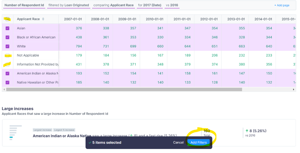
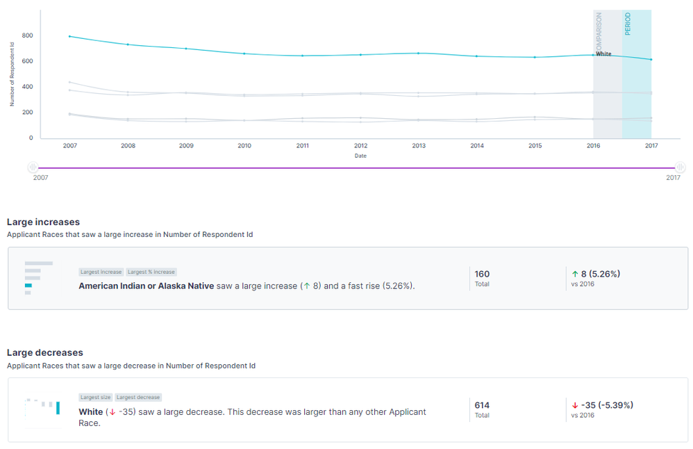
From there, by clicking ‘Add Filters’ in the bottom pop-up, we were able to filter only the selected values for the insights. While historical trends showed the overwhelming number of originated loans were those that were “White” followed by “African American” and “Asian,” we can actually see in our , “White” originated loans decreased the largest and the largest increase was in “American Indian or Alaskan Native.”
With data this rich with multiple segments to explore, I can keep going for days on ways to frame questions and utilize the query bar to uncover new insights, but hopefully, by now, you understand the fundamentals. Auto Insights isn’t typically meant for one-time or annual analysis like this example. Ideally, we would be able to productionize a more granular dataset that refreshes on a more frequent basis. That way, with the Search pages and Missions we created, we can see how the insights change as new data flows in and we can action of those insights in real time. So, this is far from a perfect use case, but still understanding how it functions and the calculations and insights available allowed me to utilize the platform and get a deeper understanding of my New York HDMA Mortgage data. I shared how I had to sacrifice time granularity and make some adjustments to my dataset to fit the proper time series structure. We learned how to transform measures into segments for additional drill-downs and utilize search and query bar/chart configurations.
Hopefully, this gets your mind racing with ideas of what you can accomplish in Auto Insights. If you have any ideas or questions, please put them in the comments! I would love to hear how you chose to utilize Auto Insights!