There's a lot of talk about ggplot these days (we even wrote a Python version of it) and for good reason: it's a great plotting package that's easy to use. Despite this, I sometimes find myself wanting something even quicker than ggplot. When that's the case, I turn to base R plots. They're not as pretty and the syntax is a little unpleasant but they're very fast, work on just about anything, and are often used by the pros. In those regards, it's actually really similar to UNIX tools such as grep, sed, and awk.
So sit back, relax, and get ready to have some fun with R base plots!
The Data
We're using the iris dataset. It's a tried and true classic and while it's not the most exciting data in the world, it's built into R (so you don't need to download anything) and easy to understand.
head(iris)
Sepal.Length Sepal.Width Petal.Length Petal.Width Species
 1 5.1 3.5 1.4 0.2 setosa
 2 4.9 3.0 1.4 0.2 setosa
 3 4.7 3.2 1.3 0.2 setosa
 4 4.6 3.1 1.5 0.2 setosa
 5 5.0 3.6 1.4 0.2 setosa
 6 5.4 3.9 1.7 0.4 setosa
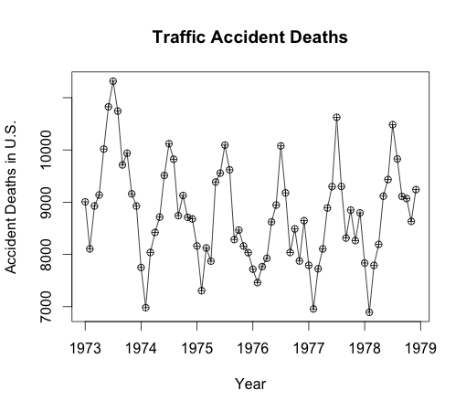
The other dataset we'll be using is the USAccDeaths dataset which contains numbers on the accidental deaths in the U.S. from 1973 to 1978. It's also built into R and is a good example of a time series dataset. This will let us show off some of R's handy built-in features for working with time series data.
USAccDeaths
 Jan Feb Mar Apr May Jun Jul Aug Sep Oct Nov Dec
1973 9007 8106 8928 9137 10017 10826 11317 10744 9713 9938 9161 8927
1974 7750 6981 8038 8422 8714 9512 10120 9823 8743 9129 8710 8680
1975 8162 7306 8124 7870 9387 9556 10093 9620 8285 8466 8160 8034
1976 7717 7461 7767 7925 8623 8945 10078 9179 8037 8488 7874 8647
1977 7792 6957 7726 8106 8890 9299 10625 9302 8314 8850 8265 8796
1978 7836 6892 7791 8192 9115 9434 10484 9827 9110 9070 8633 9240
Just plot it
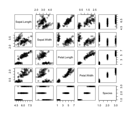
Ok first things first: the command to make plots is, you guessed it, plot. More good news: just about every data structure in R is plotable. That's not to say it'll look pretty or even make sense, but you can always try and find out.
plot(iris)

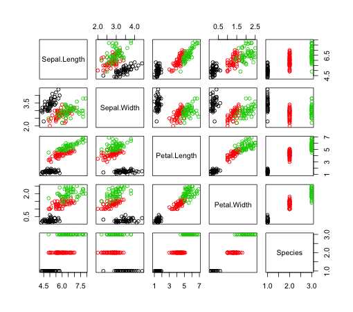
You can add colors to your points by passing a value to the col parameter.
plot(iris, col=iris$Species)

Less $
If you get tired of calling the iris data frame with the $ every time, you can "attach" data which will imply that everything from there forward is referencing the dataset you attach. Just don't forget to detach when you're done.
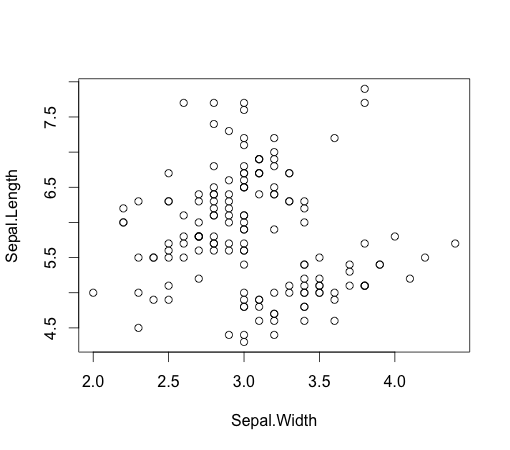
So as an example, let's say we want to plot specific values on the x and y axis. Instead of having to prefix our variables with iris$, we'll use attach.
attach(iris)
plot(x=Sepal.Width, y=Sepal.Length)
detach(iris)

Time Series
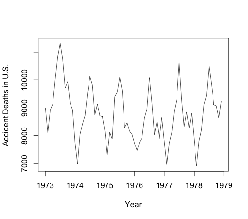
Time series plotting is really easy with R. Since R natively has a time series type, plots work right out of the box. In the example below, I'm going to pass the plot function the USAccDeaths dataset.
You can see that we can also assign labels to our x and y axis by using xlab and ylab.
plot(USAccDeaths, xlab="Year", ylab="Accident Deaths in U.S.")

Adding points is also super easy. There are functions called points and lines which, you guessed it again, layer points and lines on your existing plots.
plot(USAccDeaths, xlab="Year", ylab="Accident Deaths in U.S.", main="Traffic Accident Deaths")
points(USAccDeaths, pch=10)

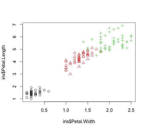
You might have noticed there's a really weird circle with a cross in the middle of it on the points of our graph. You can assign different styles of points using the pch argument. Point styles can even be assigned to different categories (or "levels" in R) of a variable.

plot(x=iris$Petal.Width, y=iris$Petal.Length, pch=as.numeric(iris$Species),
 col=as.numeric(iris$Species))

Histograms
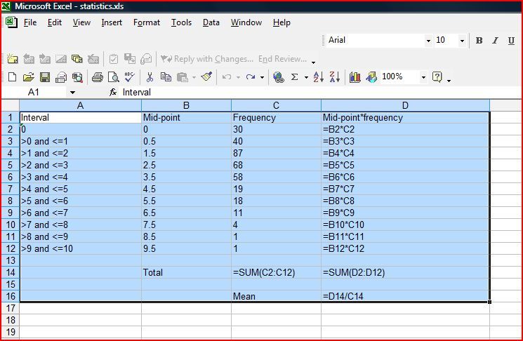
One of my very favorite things about R: histograms! When I made the switch from Excel to R, I had heard tales of mad sorcery where I could replace catalogs of frequency tables with one line of R code.

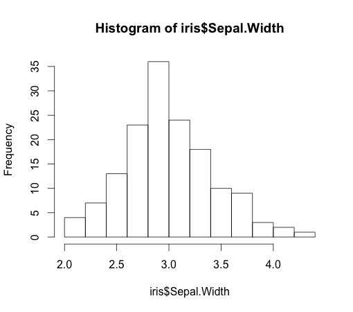
Histograms are great. They're a super easy way to get a quick feel for what your dataset looks like. So while it's one of the first things I learned in R, it's also one of the things I use the most.
hist(iris$Sepal.Width)

Density Plots and Legends
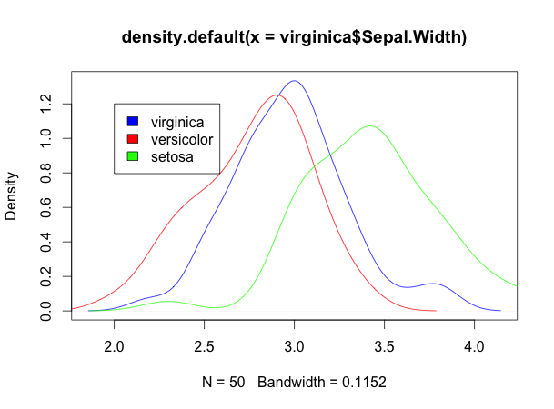
To display distributions of different variables on the same plot, I recommend using density plots. density creates an estimate of the pdf (probability density function) of your variable. This basically gives you a nice, continuous line representing the distribution of your data. We'll use the lines function to add individual distributions with different colors to our plot.
virginica <- subset(iris, Species=="virginica")
versicolor <- subset(iris, Species=="versicolor")
setosa <- subset(iris, Species=="setosa")
# plot distributions for each species
plot(density(virginica$Sepal.Width), col="blue")
lines(density(versicolor$Sepal.Width), col="red")
lines(density(setosa$Sepal.Width), col="green")
legend(2, 1.2, c("virginica", "versicolor", "setosa"), c("blue", "red", "green"))

Final Thoughts
So there you have it: the basics about base plots in R. That's all I'll cover today, but if you're interested in learning more here are some other resources:

