In my last article, I explored the idea of Answers vs. Insights and showed how the rich details delivered by Alteryx Auto Insights provide a much deeper understanding than traditional data visualization. My example showed a series of screenshots that included a wide array of descriptive data points. While that served to bolster the argument I was making, it also brought to light another challenge when analyzing data: focusing on what matters. Or, to put it another way: when it comes to data, value is far more important than volume.
With so much data available, it can be hard to distill out what is delivering information worthy of attention. And to make matters worse, it's rarely consistent. What was valuable to know this month may be different than last. This again is a challenge with traditional dashboards as they are designed to show specific things. While the type of data they depict is generally deemed important, it’s the data flowing into it that contains the actual value. As events happen in the organization over time, the value of any particular data point changes to reflect its level of causal effect or residual outcome. A simple example of this was shown in the last article, where Indonesia surfaced as a key contributor to revenue because of a single transaction.
And this, of course, intersects the issues we noted with formulating questions; it’s not just a matter of what is the right question to ask. It’s a matter of what is the right question to ask right now? It’s the fluid nature of this that makes Auto Insights’ generated content so compelling; it’s inherently dynamic and adapts to all these changes without you needing to do anything.
Let’s jump back into that example to help illustrate this.
Take a look at this sample of the data we are working with. Fourteen columns of sales transactions indicating the who, what, when, where and how much we sold over the past few years.

What data is valuable?
The answer is relative to what you want to know – and that, as we know, changes. But you can’t build a dashboard to handle all the permutations, and we only have 14 columns! So instead, you start by designing something that includes what you think is most important. A typical sales manager might naturally gravitate to seeing revenue over time, and probably the Regions and Countries would be used as this represents a common organizational structure. Maybe Strategic Priority too?
The Regional Sales Dashboard might look something like this…
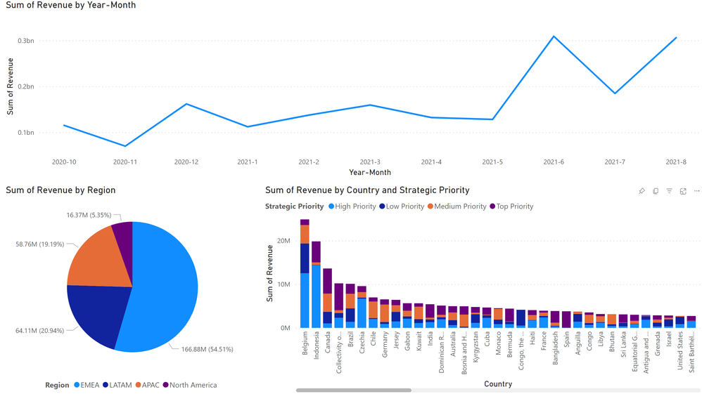
(Side note: I’m a novice at Power BI, and this dashboard took me 15 minutes to build with obviously no polish. A true BI developer could have done it much quicker, but you have to factor in the time for design meetings, waiting in the development queue, testing, deployment, etc. For reference, this dataset is ready in Auto Insights in just over 1 minute.)
You can see from the line chart that the sales went up significantly last month. Most of that seems to have come from the EMEA region, and you can see the countries with the biggest sales. Maybe that info on Strategic Priority is useful. But does any of this tell you what the most important contributors to that overall increase from across all the data were? Honestly, not really.
If we had similar charts for all the data, would that be any better? Marginally, if at all. The reason is that any given chart in a dashboard can only display a few data elements at a time. Putting lots of charts on the screen only creates a lot of mini data silos, as each chart is fundamentally independent of the others. Sure, you can link them to filter things consistently, but the views are still discrete. And therein lies the problem.
In order to understand what has value, i.e., what matters, you have to assimilate ALL of the data together to understand the relative impacts of the many changes occurring. And again, it has to effectively be done for every potential question!
Yes, that’s precisely what Auto Insights does. It looks at everything and then surfaces what actually matters.
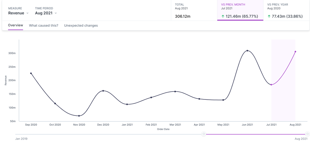
The Discovery view in Auto Insights is where this is most apparent. From the same high-level trend perspective, it surfaces the most important contributing factors…

And it will then show the most important items within each of the most important segments.
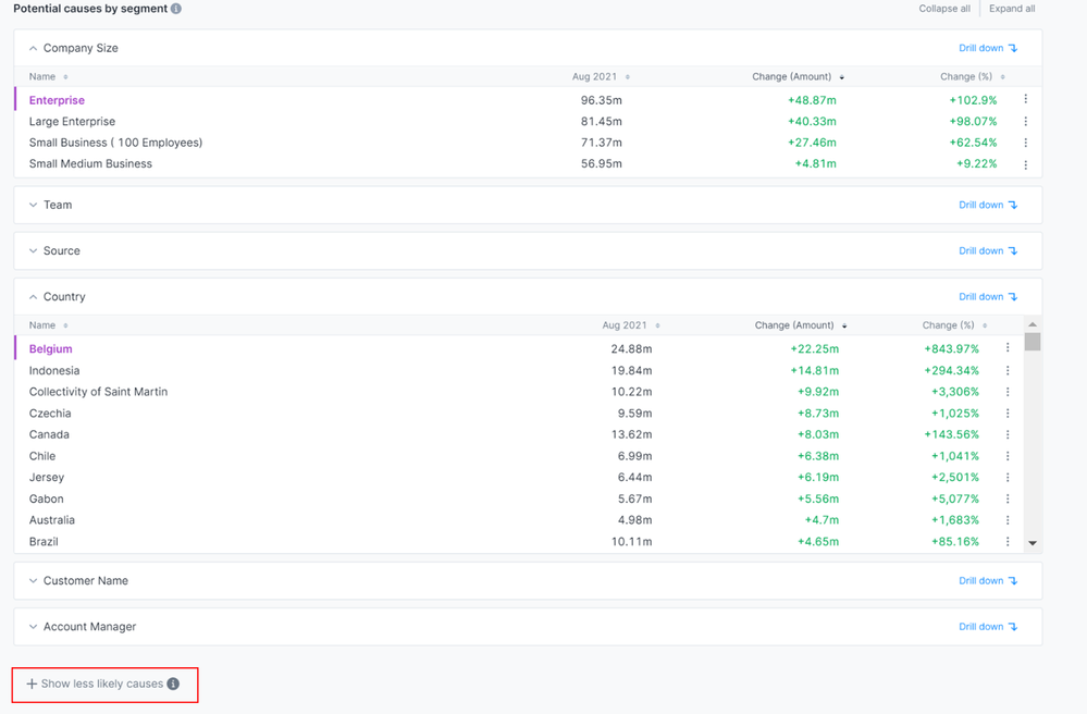
And you see Indonesia (which we identified last time) is already bubbling up in Countries. But you might be asking. “this is only 6 of our columns—what about the others?” They are still here, but Auto Insights determined they were less important factors from an analytic perspective, so it hid them.

Notice Region and Strategic Priority, which were things we wanted on the dashboard, fell into this category. Auto Insights found that the changes at that level were not meaningful in understanding the causes of the revenue increase. It’s not telling you things that don’t matter!
As you interact with the data in Auto Insights, this manifests in other ways too. The variety of details I showed in the previous article adjusted; Auto Insights will only reveal things that are consequential. For example, changing the comparison focus from Country to Sales Organization, there is much less important info, so the display is significantly reduced, only showing the Large Increases details.
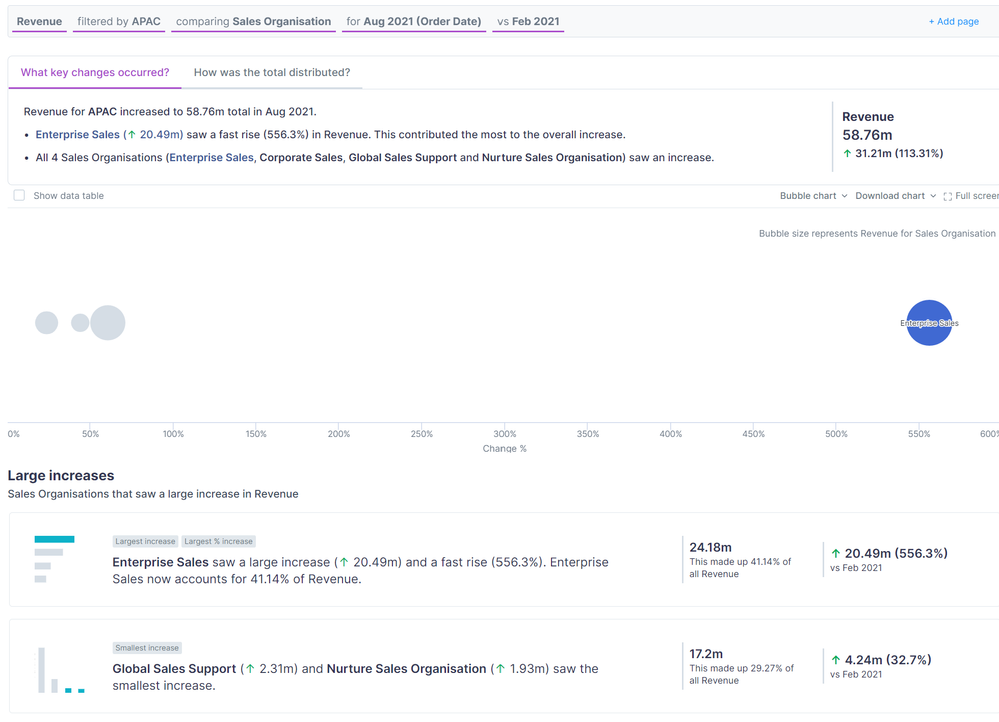
Similarly, the new Mission templates (aka Magic Missions) do a fantastic job cutting through the noise and highlighting the most salient points of data across those important segments identified in Discovery:
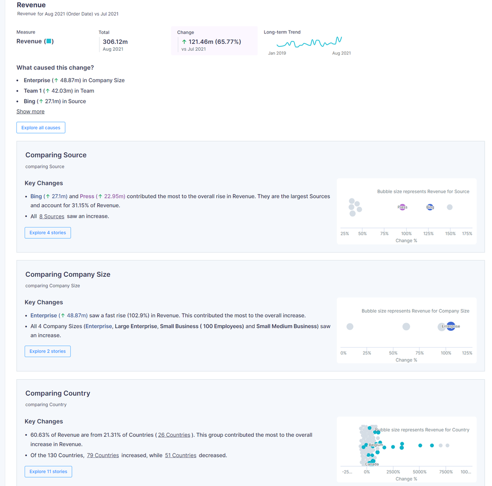
Note this image excludes 3 more segments to save space.
In all of these examples, you are given specific starting points for your analysis that have been identified as significant. No more wading through things that aren’t. And it bears repeating that everything you see is generated instantly as you explore your data; there is absolutely no construction required to get these displays dramatically accelerating the time to insight. For those of us who have worked in data analytics for years, it can be rather mesmerizing to see data in the UI for the first time.
It’s fascinating to consider that one of the more powerful capabilities of Auto Insights is its ability to not tell you something. But think about how much time you spend consuming information that, in the end, proves meaningless to your ultimate decision; it’s a large volume of data that has minimal value. Auto Insights’ ability to automatically eliminate the things that don’t matter: priceless!