Tool Mastery | Histogram
- Subscribe to RSS Feed
- Mark as New
- Mark as Read
- Bookmark
- Subscribe
- Printer Friendly Page
- Notify Moderator
- edited

Thisarticle is part of the Tool Mastery Series, a compilation of Knowledge Base contributions to introduce diverse working examples for Designer Tools. Here we’ll delve into use of theHistogram Tool on our way to mastering the Alteryx Designer:
The humble histogramis something many people are first exposed to in grade school. Histograms are a type of bar graph that display the distribution of continuousnumerical data. Histograms are sometimes confused with bar charts, which are plots of categorical variables.
To create a histogram, the data is first split into "bins"or "breaks"(i.e., a series of intervals covering the range of data values). These breaks are adjacent, non-overlapping, consecutive, and most often (but not necessarily) of equal size. After the bins are determined, frequencyfor each bin (the count of times a value in the data set falls within each bin) is calculated, and then a rectangle is created for each bin, with its height proportional to the frequency.
The histogram’s simplicity is part of what makes it so powerful as a data investigation and visualization tool. Histograms allow us to visualize the distribution values of a variable. By organizing the data into larger breaks, Histograms depict a smoother probability density than plotting the frequency of individual data values, which will generally create a more accurate depiction of the distribution of the variable of interest. They are easily understood and can help illuminate patterns in the data that impact how the data should be treated.
The configuration of the Alteryx Histogram Tool is very simple. All you need to do is select which field you would like to create a histogram for, and select the number of breaks (i.e. bins) to create. If you leave it set to auto, R will calculate break points with an algorithm based on Sturges formula. If you are interested in learning more about how R calculates histogram break points, there is a thorough blog post you can readhere.Bad break points can create unhelpful or misleading histograms, so it is best practice in data investigation to experiment with different breaks.
If you choose to select the Plot a smoothed density curve… option, one additional setting is displayed, allowing you to set the bandwidth of the smoother. As noted in the configuration window, a smaller number means a narrower smoother and a larger number means a wider smoother.
The Plot a smoothed density curve option plots a smoothedempirical densitycurve and converts frequency to density.
In the second tab of the tool’s configuration window, you can specify your plot size, font size and graph resolution. This is particularly helpful if your histogram is going to end up in a report.
Now that you know how to configure the tool, lets talk a little bit about description and interpretation. As I mentioned, it is a good idea to spend a little bit of time playing with different bin widths and seeing how it impacts the overall shape of the histogram. While you are going through this process, keep an eye on what the overall distribution of your data looks like. Words used to describe patterns in a histogram include symmetric, skewed left, and skewed right, to describe skewness, and unimodal, bimodal, and multimodalto describe mode(s).
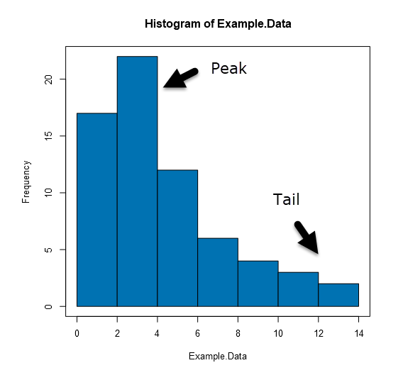
Symmetric and left or right skewed describe the relative position of the distribution’s peak. Symmetric describes when the peak is in the center of the data, and the distribution is the same to the left or right of the peak. Skewed left or right describes when the peak is off center, toward one of the limits, and a “tail” stretches away from it. Left or right is assigned based on which side the tail is on.

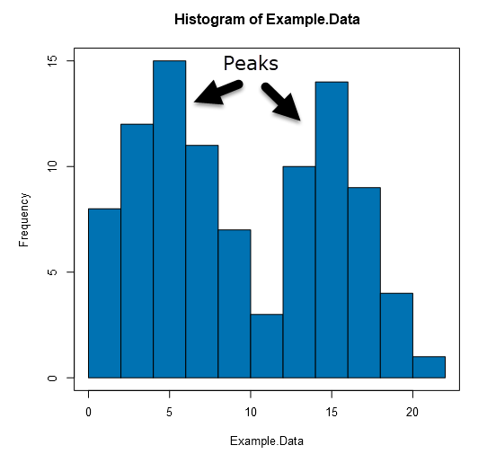
Unimodal, bimodal and multimodal describe the number of peaks that occur in the data’s distribution. Unimodal means a single peak, bimodal two, and multimodal more than two.

Interpretation is an art, and only you know what your data represents, how it was collected, and how it needs to be handled. The Histogram Tool, like all the tools included in the Data Investigation Toolbox, are here to help you with that process.
By now, you should have expert-level proficiency with the Histogram Tool! If you can think of a use case we left out, feel free to use the comments section below! Consider yourself a Tool Master already? Let us know atcommunity@alteryx.comif you’d like your creative tool uses to be featured in the Tool Mastery Series.
Stay tuned with our latest posts every#ToolTuesdayby following@alteryxon Twitter! If you want to master all the Designer tools, considersubscribingfor email notifications.
- Mark as Read
- Mark as New
- Bookmark
- Permalink
- Notify Moderator
How to get a proper histogram with exact values on x-axis the bar starts at certain point on x-axis as data is there from that point
However, I am not able to see what is the exact point
For example data starts just before 2000 year but i do not know exactly which year histogram is starting
Please reply
- Mark as Read
- Mark as New
- Bookmark
- Permalink
- Notify Moderator
Hi @Ravishankar,
Can you please post your workflow with sample data to a new Designer Discussion thread, and tag me in the post? I will be better able to help you if I can see the format of the data you are working with. In the post, can you also please describe what phenomena you are attempting to visualize (e.g., the distribution of records by year)?
Thank you!
- Mark as Read
- Mark as New
- Bookmark
- Permalink
- Notify Moderator
I am not able to post there: I get the below message again and again:
Correct the highlighted errors and try again.
- There was an error while attempting to post your message. Try again in a few minutes.
However I do not see anything highlighted to correct, so i am posting here again with the histogram picture
The data used has only 1 column YearofRegistration(ranging from 1000 to 9999) here i dont have option to attach the data
Below is the histogram.
Please reply which year the the data is starting and ending, so that it is useful for analysis.
- Mark as Read
- Mark as New
- Bookmark
- Permalink
- Notify Moderator
Hi @Ravishankar,
The Histogram is starting at 1000, the minimum value in the field you have selected, and displaying the frequency of records which each value, ranging from 1000 to 9999. It looks like the first large bar that appears on your chart may be a bin for all values between 1500-2000, and the second a bin containing values from 2000-2500.
The Histogram Tool takes your selected field, and calculates the frequency of each value in that selected field, and then displays the frequency in bins. It is part of the Data Investigation Toolbar and allows you to investigate the distribution of different fields. If this display is not helpful, you could try adjusting the bins or "breaks" of your data by modifying the "The number of breaks to use" argument. You could also try using the Reporting Tools (Specifically the Charting Tool or the Interactive Chart Tool, introduced in 2018.3) to develop the plot you are looking for.
- Mark as Read
- Mark as New
- Bookmark
- Permalink
- Notify Moderator
Oh OK, Thank you for quick reply, histogram is not very accurate so will use Qlikview
I will try the Charting tool thanks again.
- Mark as Read
- Mark as New
- Bookmark
- Permalink
- Notify Moderator
Hello All,
I am creating reporting a PDF report which consists of 4 tables and 1 Graph. There are 9 similar PDF has to be generated for different Regions. SO i am creating tables using Region as group by column in table. SO render is generating automatically 9 files based on Region group by.
Ho wdo I add graph in the same report , what is the option to do group by in Chart? Can someone guide?


