Alteryx Designer Desktop Discussions
Find answers, ask questions, and share expertise about Alteryx Designer Desktop and Intelligence Suite.- Community
- :
- Community
- :
- Participate
- :
- Discussions
- :
- Designer Desktop
- :
- Scattered plot- Alteryx advanced question help
Scattered plot- Alteryx advanced question help
- Subscribe to RSS Feed
- Mark Topic as New
- Mark Topic as Read
- Float this Topic for Current User
- Bookmark
- Subscribe
- Mute
- Printer Friendly Page
- Mark as New
- Bookmark
- Subscribe
- Mute
- Subscribe to RSS Feed
- Permalink
- Notify Moderator
I had a question on the Alteryx advanced exam where I needed to look at a graph and select what options were selected in the scatterplot tools configuration. However I'm having difficulty understanding what each tool is doing. Can someone help me understand these tools better or point me to the right direction?
Smooth line- This one I'm not to sure about. Attached I created a Alteryx scattered plot graph, and I can see a dotted line, is that all it is?
Marginal boxpoints- This one is a easy one as you can see the box points outside of the graph
Log x axis- Not totally sure how you can see this by just looking at the graph
Log y axis- Not totally sure how you can see this by just looking at the graph
Below are the definitions but something visual showing the differences would help me understand this better. I tried this by creating my own scatterplot Alteryx graph in the attached but the only one that I can be truly sure about is the Marginal boxpoints.
Log X axis: If selected, a natural log transformation is applied to the X values. Doing this is often useful for exploring certain types of non-linear relationships. Log Y axis: If selected, a natural log transformation is applied to the Y values
Smooth line: Displays a non-linear line between the X and Y fields that is created using a loess (non-parametric local regression) model.* Included by default
Solved! Go to Solution.
- Labels:
-
Predictive Analysis
- Mark as New
- Bookmark
- Subscribe
- Mute
- Subscribe to RSS Feed
- Permalink
- Notify Moderator
Hi @cerchiara
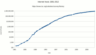
If you look at this graph from the wikipedia page on logarithmic scales:
You can see that each increment on the Y axis is 10x bigger than the one before. So equal distances on a log scale are actually displaying 10x the distance in value. They can be really useful when looking at exponential growth (if you remember the Covid growth charts from a few years ago).
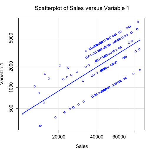
Another clue is that with log gridlines, they aren't always equally spaced, as you can see in the below example:
But generally look at the grid lines and values to identify if it's logged or not
The smooth line is not straight, unlike the least-squares (regression) line, so that should help visually identify it
Hope that helps,
Ollie
- Mark as New
- Bookmark
- Subscribe
- Mute
- Subscribe to RSS Feed
- Permalink
- Notify Moderator
Thanks @OllieClarke , this makes sense. But it didn't seem clear on the exam. If you take the sales vs variable 1 graph and enabled and disabled the log x and log y options are the values of the x and y axis supposed to be changing? Or is it just the scattered points that are? On the alteryx file I attached if I enable and disable log x for example it just looks like the scattered points move from off the line to the line.
- Mark as New
- Bookmark
- Subscribe
- Mute
- Subscribe to RSS Feed
- Permalink
- Notify Moderator
Hey @cerchiara
So the data and values don’t change. It’s just the way they look that does.
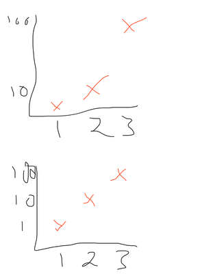
if I’ve got x values of 1,2,3
and y values of 1,10,100
if i graph them normally they look very spread out, with a connecting line that curves sharply upward.
if I log the y axis, then they are equally spaced with a straight connecting line.
the values are still the same though
(please excuse my terrible drawing)
We’re just changing what a visually equal distance means
- Mark as New
- Bookmark
- Subscribe
- Mute
- Subscribe to RSS Feed
- Permalink
- Notify Moderator
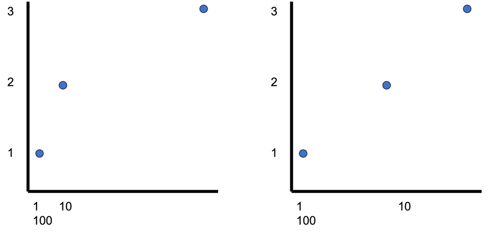
My drawing skills would look about the same ha! This helps a lot though thanks! I assume for the Log X then its similar but opposite then?
- Mark as New
- Bookmark
- Subscribe
- Mute
- Subscribe to RSS Feed
- Permalink
- Notify Moderator
-
Academy
6 -
ADAPT
2 -
Adobe
204 -
Advent of Code
3 -
Alias Manager
78 -
Alteryx Copilot
27 -
Alteryx Designer
7 -
Alteryx Editions
96 -
Alteryx Practice
20 -
Amazon S3
149 -
AMP Engine
252 -
Announcement
1 -
API
1,210 -
App Builder
116 -
Apps
1,360 -
Assets | Wealth Management
1 -
Basic Creator
15 -
Batch Macro
1,559 -
Behavior Analysis
246 -
Best Practices
2,696 -
Bug
720 -
Bugs & Issues
1 -
Calgary
67 -
CASS
53 -
Chained App
268 -
Common Use Cases
3,825 -
Community
26 -
Computer Vision
86 -
Connectors
1,426 -
Conversation Starter
3 -
COVID-19
1 -
Custom Formula Function
1 -
Custom Tools
1,939 -
Data
1 -
Data Challenge
10 -
Data Investigation
3,489 -
Data Science
3 -
Database Connection
2,221 -
Datasets
5,223 -
Date Time
3,229 -
Demographic Analysis
186 -
Designer Cloud
743 -
Developer
4,376 -
Developer Tools
3,534 -
Documentation
528 -
Download
1,038 -
Dynamic Processing
2,941 -
Email
929 -
Engine
145 -
Enterprise (Edition)
1 -
Error Message
2,262 -
Events
198 -
Expression
1,868 -
Financial Services
1 -
Full Creator
2 -
Fun
2 -
Fuzzy Match
714 -
Gallery
666 -
GenAI Tools
3 -
General
2 -
Google Analytics
155 -
Help
4,711 -
In Database
966 -
Input
4,296 -
Installation
361 -
Interface Tools
1,902 -
Iterative Macro
1,095 -
Join
1,960 -
Licensing
252 -
Location Optimizer
60 -
Machine Learning
260 -
Macros
2,866 -
Marketo
12 -
Marketplace
23 -
MongoDB
82 -
Off-Topic
5 -
Optimization
751 -
Output
5,259 -
Parse
2,328 -
Power BI
228 -
Predictive Analysis
937 -
Preparation
5,171 -
Prescriptive Analytics
206 -
Professional (Edition)
4 -
Publish
257 -
Python
855 -
Qlik
39 -
Question
1 -
Questions
2 -
R Tool
476 -
Regex
2,339 -
Reporting
2,434 -
Resource
1 -
Run Command
576 -
Salesforce
277 -
Scheduler
411 -
Search Feedback
3 -
Server
631 -
Settings
936 -
Setup & Configuration
3 -
Sharepoint
628 -
Spatial Analysis
599 -
Starter (Edition)
1 -
Tableau
512 -
Tax & Audit
1 -
Text Mining
468 -
Thursday Thought
4 -
Time Series
432 -
Tips and Tricks
4,187 -
Topic of Interest
1,126 -
Transformation
3,732 -
Twitter
23 -
Udacity
84 -
Updates
1 -
Viewer
3 -
Workflow
9,983
- « Previous
- Next »


