Alteryx Designer Desktop Discussions
Find answers, ask questions, and share expertise about Alteryx Designer Desktop and Intelligence Suite.- Community
- :
- Community
- :
- Participate
- :
- Discussions
- :
- Designer Desktop
- :
- Lift Curve
Lift Curve
- Subscribe to RSS Feed
- Mark Topic as New
- Mark Topic as Read
- Float this Topic for Current User
- Bookmark
- Subscribe
- Mute
- Printer Friendly Page
- Mark as New
- Bookmark
- Subscribe
- Mute
- Subscribe to RSS Feed
- Permalink
- Notify Moderator
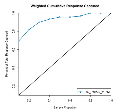
Here is the lift chart output, the chart starts at (0.1,0.1) not at the origin of (0,0) is there a reason to that?

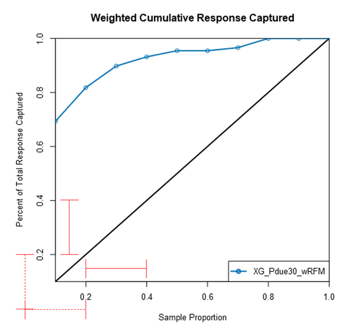
Here are some scaling on both X and Y axis...
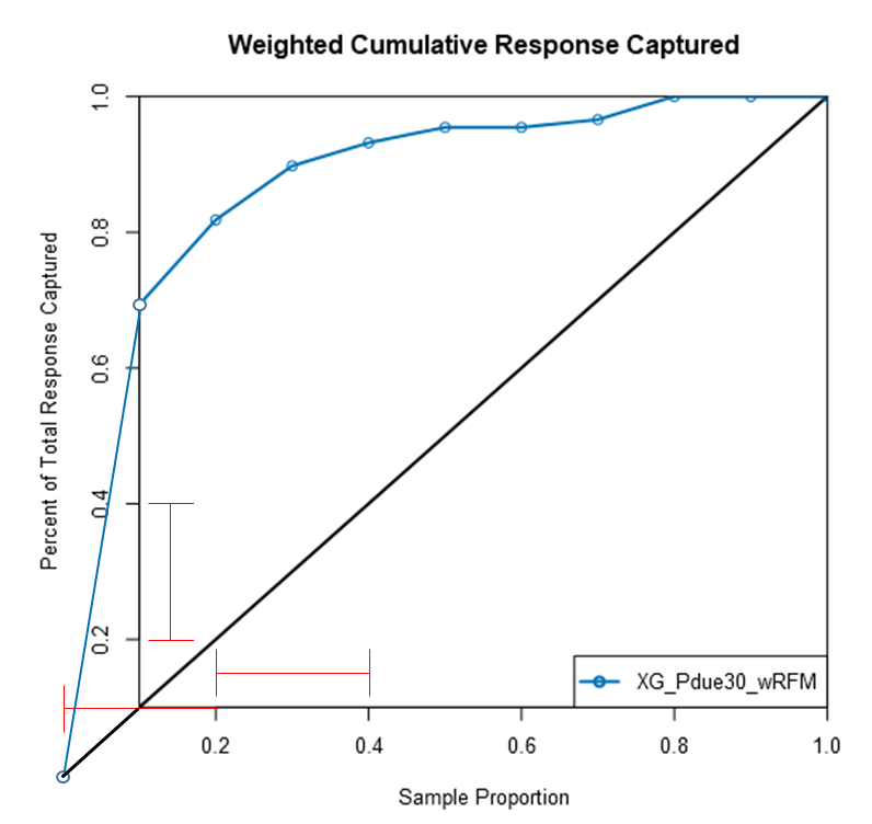
If we put eh point to the origin and redraw the cumulative response, is this a more accurate graph?
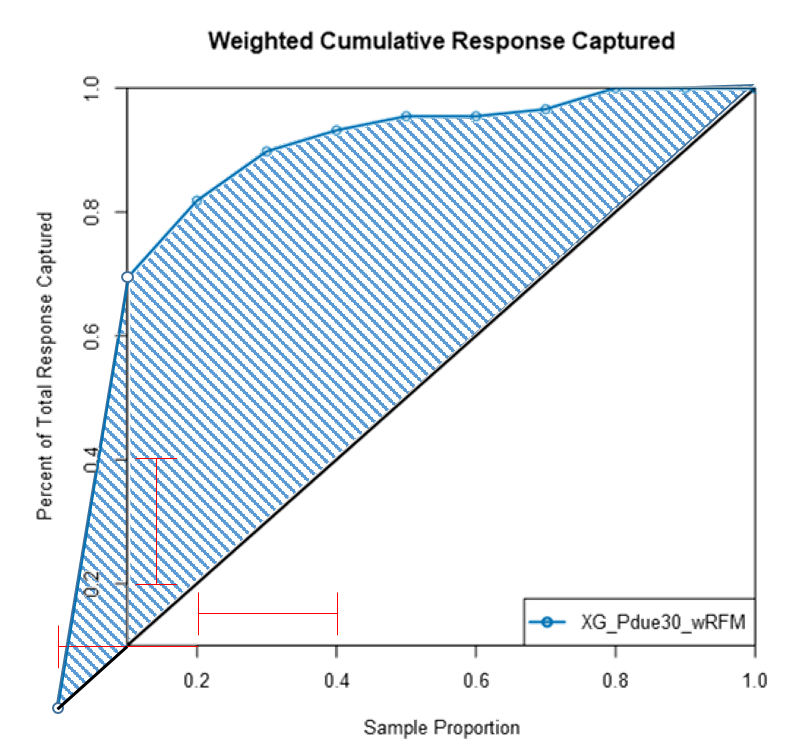
The area under the curve (AUC or ROC metric) does it include the drawn area as well or not?
Best
Solved! Go to Solution.
- Labels:
-
Predictive Analysis
-
Reporting
- Mark as New
- Bookmark
- Subscribe
- Mute
- Subscribe to RSS Feed
- Permalink
- Notify Moderator
This question is old and I am not with Alteryx support, but I was doing something related. I thought I would comment.
I believe the AUC reported does indeed include the area between 0 and 0.1 even though it is not shown.
I checked this using the gains chart that is also provide in the output. So say Alteryx gives you a gains chart like this:
| Decile | Cum_Pct |
| 0 | g0 |
| 10 | g1 |
| 20 | g2 |
| 30 | g3 |
| 40 | g4 |
| 50 | g5 |
| 60 | g6 |
| 70 | g7 |
| 80 | g8 |
| 90 | g9 |
| 100 | g10 |
g0-g10 are numbers between 0 and 1.
The x-coordinates of the points in the curve are Decile / 100. The y-coordinates of points in the curve are g0 - g10 (though point (0,g0) is omitted as you pointed out.
Using the trapezoidal rule, the AUC including the area that's 'falling off the picture' is like this:
AUC ~= sum(i= 1 to i=10) {((Decile[i] - Decile[i-1])/100)*(g[i] + g[i-1])/2}
It may look a little funky, but this calculation is easy to do in Excel. Doing that in my own example, I can match the AUC Alteryx is outputting to 3 decimal places. So I think it's the case that they're including the 'falling of the chart' area. Why they didn't start the chart at 0 for the picture, I don't know. I speculate that the incremental option would logically start at 0.1 and they decided to start both versions of the chart at the same place.
Best,
Jose
- Mark as New
- Bookmark
- Subscribe
- Mute
- Subscribe to RSS Feed
- Permalink
- Notify Moderator
Oh noticed one other thing. You mentioned ROC in your question and this is not an ROC curve. The AUC reported by the Lift tool is the AUC under the Gains curve. I think there are other Alteryx tools that calculate AUC for the ROC curve but I haven't used them.
-
Academy
6 -
ADAPT
2 -
Adobe
204 -
Advent of Code
3 -
Alias Manager
78 -
Alteryx Copilot
27 -
Alteryx Designer
7 -
Alteryx Editions
96 -
Alteryx Practice
20 -
Amazon S3
149 -
AMP Engine
252 -
Announcement
1 -
API
1,210 -
App Builder
116 -
Apps
1,360 -
Assets | Wealth Management
1 -
Basic Creator
15 -
Batch Macro
1,559 -
Behavior Analysis
246 -
Best Practices
2,696 -
Bug
720 -
Bugs & Issues
1 -
Calgary
67 -
CASS
53 -
Chained App
268 -
Common Use Cases
3,825 -
Community
26 -
Computer Vision
87 -
Connectors
1,426 -
Conversation Starter
3 -
COVID-19
1 -
Custom Formula Function
1 -
Custom Tools
1,939 -
Data
1 -
Data Challenge
10 -
Data Investigation
3,489 -
Data Science
3 -
Database Connection
2,221 -
Datasets
5,223 -
Date Time
3,229 -
Demographic Analysis
186 -
Designer Cloud
743 -
Developer
4,377 -
Developer Tools
3,534 -
Documentation
528 -
Download
1,038 -
Dynamic Processing
2,941 -
Email
929 -
Engine
145 -
Enterprise (Edition)
1 -
Error Message
2,262 -
Events
198 -
Expression
1,868 -
Financial Services
1 -
Full Creator
2 -
Fun
2 -
Fuzzy Match
714 -
Gallery
666 -
GenAI Tools
3 -
General
2 -
Google Analytics
155 -
Help
4,711 -
In Database
966 -
Input
4,297 -
Installation
361 -
Interface Tools
1,902 -
Iterative Macro
1,095 -
Join
1,960 -
Licensing
252 -
Location Optimizer
60 -
Machine Learning
260 -
Macros
2,866 -
Marketo
12 -
Marketplace
23 -
MongoDB
82 -
Off-Topic
5 -
Optimization
751 -
Output
5,260 -
Parse
2,328 -
Power BI
228 -
Predictive Analysis
937 -
Preparation
5,171 -
Prescriptive Analytics
206 -
Professional (Edition)
4 -
Publish
257 -
Python
855 -
Qlik
39 -
Question
1 -
Questions
2 -
R Tool
476 -
Regex
2,339 -
Reporting
2,434 -
Resource
1 -
Run Command
576 -
Salesforce
277 -
Scheduler
411 -
Search Feedback
3 -
Server
631 -
Settings
936 -
Setup & Configuration
3 -
Sharepoint
628 -
Spatial Analysis
599 -
Starter (Edition)
1 -
Tableau
512 -
Tax & Audit
1 -
Text Mining
468 -
Thursday Thought
4 -
Time Series
432 -
Tips and Tricks
4,188 -
Topic of Interest
1,126 -
Transformation
3,733 -
Twitter
23 -
Udacity
84 -
Updates
1 -
Viewer
3 -
Workflow
9,983
- « Previous
- Next »


