Alteryx Designer Desktop Discussions

Find answers, ask questions, and share expertise about Alteryx Designer Desktop and Intelligence Suite.
SOLVED

Larger Number below smaller number on bar chart

clarrock
8 - Asteroid

Hi,


My bar chart shows the lower value higher,,,i want to make the bars transparent cause i want to place values close to my lines

How do i seq it in correct way?
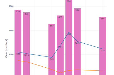
 

clarrock_0-1656846158401.png


DateVehicleNameValue
23-06-22BusEUR1055
23-06-22BusUSD876
24-06-22BusEUR1023
24-06-22BusUSD855
27-06-22BusEUR943
27-06-22BusUSD693
28-06-22BusEUR1191
28-06-22BusUSD620
29-06-22BusEUR1465
29-06-22BusUSD676
30-06-22BusEUR1275
30-06-22BusUSD685
03-07-22BusEUR1117
03-07-22BusUSD666


7 REPLIES 7
DataNath
17 - Castor

@clarrock at the moment it’s showing the right order because your data set is in date order and you haven’t split it on the currency and so for each day it’s showing the total or both currencies. If you want to split these out you can go to batch > on > columns to group by > group by currency. If you want the graph to purely be in order of value rather than date, you can just add a sort tool before your interactive chart tool and sort on value (ascending if you want smallest to largest, descending for largest to smallest). Off the top of my head I can’t remember if it is there/where, but transparency would likely be in the ‘layer’ tab for your bar chart.

clarrock
8 - Asteroid

@DataNath thanks for your response, i have tried the sort option but i want to keep the dates since with the sort it actually messes up the line graph. Is there a way to have a line graph for currencies (both) with the x axis being the "Date" and the y axis being the "Value" but the values being placed on the lines without creating a bar chart and making it transparent?

DataNath
17 - Castor

I think I remember seeing that only bar and pie charts constantly show the values so I think you do need to keep this for the work around. In the bar chart layer though you should be able to change the opacity to 0% which will hide it. May be worth suggesting it as an idea for the devs to add - if nobody has already - and if enough people show support they may look to add it as a feature.

clarrock
8 - Asteroid

@DataNath So i guess theres no solution cause if i keep opacity to 0% it will still show the order incorrectly. and if i sort it my line graph would be incorrect.


Is there a way i can have the bar chart for both the currencies say eur sep and usd separate like a dual bar chart and then a line graph for the mid points of the bars? Would that be possible in Alteryx? Or is there an alternative way that you suggest i shd present this data graphically?

DataNath
17 - Castor

@clarrock you could use a Summarize tool to group on date and get the average for each day, then join it back to the original dataset and then set up multiple layers to have the average as a line chart. To split the labels you’d need to batch the bar chart layer and group it on currency and before the interactive chart tool you’d need to sort by date ascending and then by value either ascending or descending depending on what you want. I personally use Tableau for reporting/BI and so I’d always just prep my data in Alteryx and then use a separate tool for building charts etc but I think if you’re stuck with just Alteryx then using the above and maybe playing around with various settings to fine tune it may be the best.

clarrock
8 - Asteroid

@DataNath I'm not able to get the output, new to the interactive chart tool..could you share a workflow perhaps?

DataNath
17 - Castor

Sorry for the late response @clarrock - haven't been on my laptop until now. How does this look? May just need some tweaking to get the sizing etc right.


DataNath_0-1656924018371.png


Labels