Get Inspire insights from former attendees in our AMA discussion thread on Inspire Buzz. ACEs and other community members are on call all week to answer!
Search
Close
Free Trial
Turn on suggestions
Auto-suggest helps you quickly narrow down your search results by suggesting possible matches as you type.
Showing results for
Weekly Challenges
Solve the challenge, share your solution and summit the ranks of our Community!Also available in | Français | Português | Español | 日本語
IDEAS WANTED
Want to get involved? We're always looking for ideas and content for Weekly Challenges.
SUBMIT YOUR IDEA- Community
- :
- Community
- :
- Learn
- :
- Academy
- :
- Challenges & Quests
- :
- Weekly Challenges
- :
- Re: Challenge #320: Women Representation in Politi...
Challenge #320: Women Representation in Politics
Options
- Subscribe to RSS Feed
- Mark Topic as New
- Mark Topic as Read
- Float this Topic for Current User
- Bookmark
- Subscribe
- Mute
- Printer Friendly Page
Jeremy
8 - Asteroid
05-24-2022
09:29 AM
- Mark as New
- Bookmark
- Subscribe
- Mute
- Subscribe to RSS Feed
- Permalink
- Notify Moderator
Not sure this is a good use for a pie chart. It fails to highlight that most countries are below 50%.
17 - Castor
05-24-2022
09:34 AM
- Mark as New
- Bookmark
- Subscribe
- Mute
- Subscribe to RSS Feed
- Permalink
- Notify Moderator
Toons
12 - Quasar
05-24-2022
10:25 AM
- Mark as New
- Bookmark
- Subscribe
- Mute
- Subscribe to RSS Feed
- Permalink
- Notify Moderator
TonyAndriani
9 - Comet
05-24-2022
11:37 AM
- Mark as New
- Bookmark
- Subscribe
- Mute
- Subscribe to RSS Feed
- Permalink
- Notify Moderator
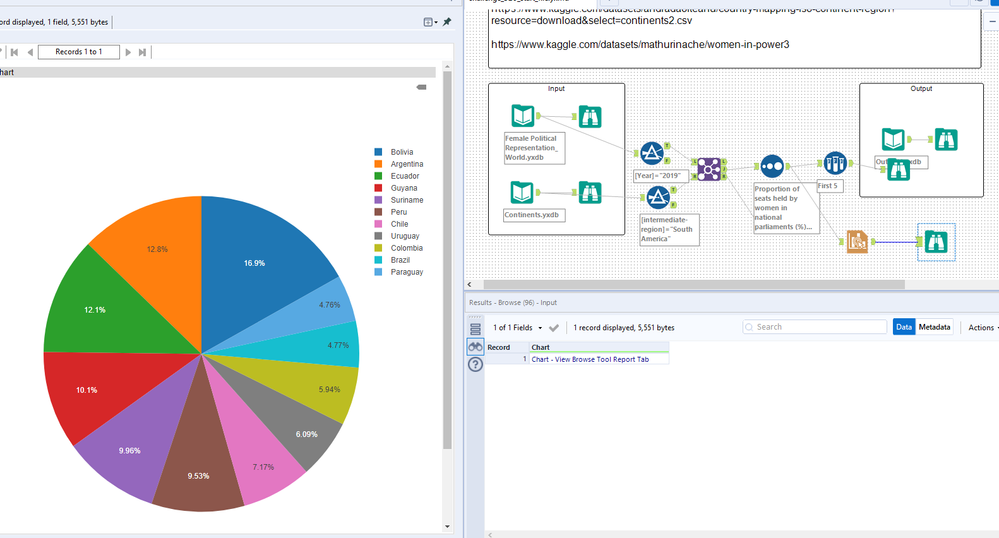
Followed the example and used a pie chart, although I agree with @IraWatt and @Jeremy that a pie chart isn't the best choice here. Banning them is a bit strong, but I find pie charts are most useful when you are comparing a small number of values (probably no more than five and that's pushing it).
Spoiler
I looked at the other solutions after I did this and it looks like there aren't a lot of variations. I was debating filtering the World data before doing a join, but the numbers were small enough that it was probably faster to just process all the data than to add the overhead of including another process step. As for using Find Replace instead of Join, with these data sizes and the AMP engine, it really doesn't matter.


KarenYL
8 - Asteroid
05-24-2022
11:41 AM
- Mark as New
- Bookmark
- Subscribe
- Mute
- Subscribe to RSS Feed
- Permalink
- Notify Moderator
ahsanaali
11 - Bolide
05-24-2022
11:45 AM
- Mark as New
- Bookmark
- Subscribe
- Mute
- Subscribe to RSS Feed
- Permalink
- Notify Moderator
jeevan067
5 - Atom
05-24-2022
11:53 AM
- Mark as New
- Bookmark
- Subscribe
- Mute
- Subscribe to RSS Feed
- Permalink
- Notify Moderator
Spoiler
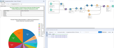
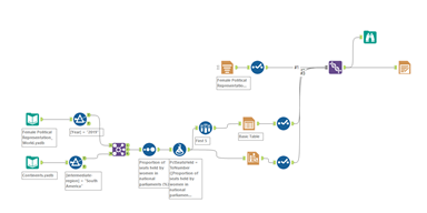
Solution:


rkwyant
6 - Meteoroid
05-24-2022
12:18 PM
- Mark as New
- Bookmark
- Subscribe
- Mute
- Subscribe to RSS Feed
- Permalink
- Notify Moderator
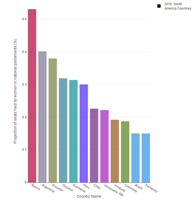
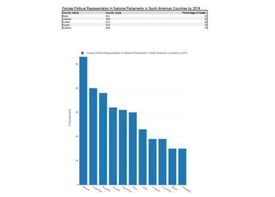
My first go at one of these weekly challenges so let me know if I did this whole posting a solution thing correctly. I went with a bar chart:
13 - Pulsar
05-24-2022
02:16 PM
- Mark as New
- Bookmark
- Subscribe
- Mute
- Subscribe to RSS Feed
- Permalink
- Notify Moderator
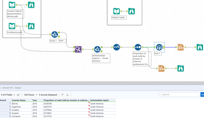
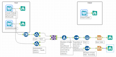
My solution:
GabrielDiniz
7 - Meteor
05-24-2022
02:53 PM
- Mark as New
- Bookmark
- Subscribe
- Mute
- Subscribe to RSS Feed
- Permalink
- Notify Moderator
Labels
-
Advanced
274 -
Apps
24 -
Basic
128 -
Calgary
1 -
Core
112 -
Data Analysis
170 -
Data Cleansing
4 -
Data Investigation
7 -
Data Parsing
9 -
Data Preparation
195 -
Developer
35 -
Difficult
70 -
Expert
14 -
Foundation
13 -
Interface
39 -
Intermediate
237 -
Join
206 -
Macros
53 -
Parse
138 -
Predictive
20 -
Predictive Analysis
12 -
Preparation
271 -
Reporting
53 -
Reporting and Visualization
17 -
Spatial
60 -
Spatial Analysis
49 -
Time Series
1 -
Transform
214
- « Previous
- Next »

