Search
Close
Free Trial
Turn on suggestions
Auto-suggest helps you quickly narrow down your search results by suggesting possible matches as you type.
Showing results for
Weekly Challenges
Solve the challenge, share your solution and summit the ranks of our Community!Also available in | Français | Português | Español | 日本語
IDEAS WANTED
Want to get involved? We're always looking for ideas and content for Weekly Challenges.
SUBMIT YOUR IDEA- Community
- :
- Community
- :
- Learn
- :
- Academy
- :
- Challenges & Quests
- :
- Weekly Challenges
- :
- Re: Challenge #201: Wage Ain't Nothin' but a Numbe...
Challenge #201: Wage Ain't Nothin' but a Number
Options
- Subscribe to RSS Feed
- Mark Topic as New
- Mark Topic as Read
- Float this Topic for Current User
- Bookmark
- Subscribe
- Mute
- Printer Friendly Page
dsmdavid
11 - Bolide
02-05-2020
10:24 AM
- Mark as New
- Bookmark
- Subscribe
- Mute
- Subscribe to RSS Feed
- Permalink
- Notify Moderator
Had to read the couple of comments to understand what was needed.
JORGE4900
8 - Asteroid
02-05-2020
10:32 AM
- Mark as New
- Bookmark
- Subscribe
- Mute
- Subscribe to RSS Feed
- Permalink
- Notify Moderator
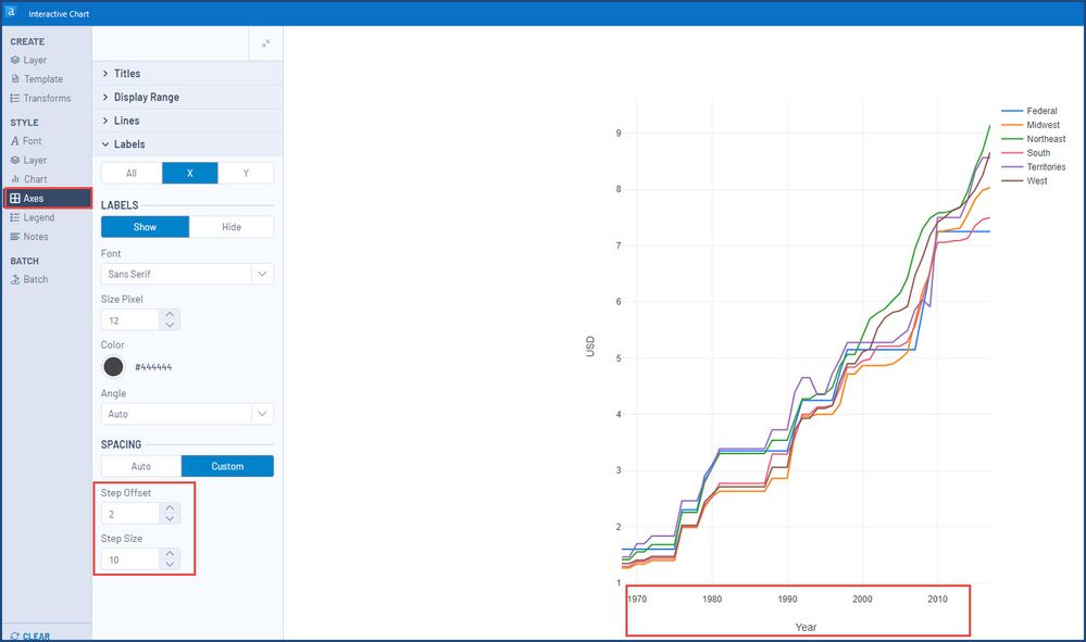
Since the series starts at 1968, there is a need to customize the Axes to start with 1970 by offsetting 2 then showing every 10th
15 - Aurora
02-05-2020
11:12 AM
- Mark as New
- Bookmark
- Subscribe
- Mute
- Subscribe to RSS Feed
- Permalink
- Notify Moderator
jacob_kahn
12 - Quasar
02-05-2020
12:58 PM
- Mark as New
- Bookmark
- Subscribe
- Mute
- Subscribe to RSS Feed
- Permalink
- Notify Moderator
dkoenawan004
7 - Meteor
02-05-2020
04:52 PM
- Mark as New
- Bookmark
- Subscribe
- Mute
- Subscribe to RSS Feed
- Permalink
- Notify Moderator
ErikaLoz
7 - Meteor
02-06-2020
02:37 AM
- Mark as New
- Bookmark
- Subscribe
- Mute
- Subscribe to RSS Feed
- Permalink
- Notify Moderator
jacrae
7 - Meteor
02-06-2020
12:08 PM
- Mark as New
- Bookmark
- Subscribe
- Mute
- Subscribe to RSS Feed
- Permalink
- Notify Moderator
abrouwer
8 - Asteroid
02-06-2020
01:02 PM
- Mark as New
- Bookmark
- Subscribe
- Mute
- Subscribe to RSS Feed
- Permalink
- Notify Moderator
ChristinaFPE
7 - Meteor
02-07-2020
10:48 AM
- Mark as New
- Bookmark
- Subscribe
- Mute
- Subscribe to RSS Feed
- Permalink
- Notify Moderator
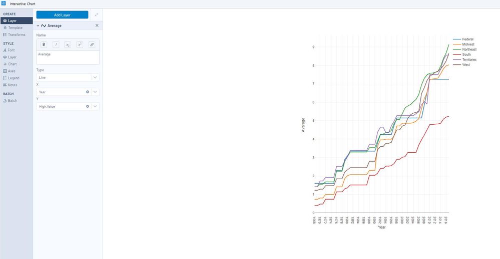
That was a great overview of charts. It took me a little while to figure out how to split the data by Region. I actually didn't think it was possible so I added 6 layers for each region, but as I was doing this I stumbled across the other settings in the Interactive Charts tool which allows the splitting with a click of the mouse!
huynv96
9 - Comet
02-08-2020
07:17 AM
- Mark as New
- Bookmark
- Subscribe
- Mute
- Subscribe to RSS Feed
- Permalink
- Notify Moderator
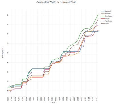
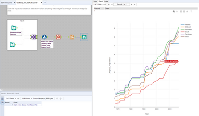
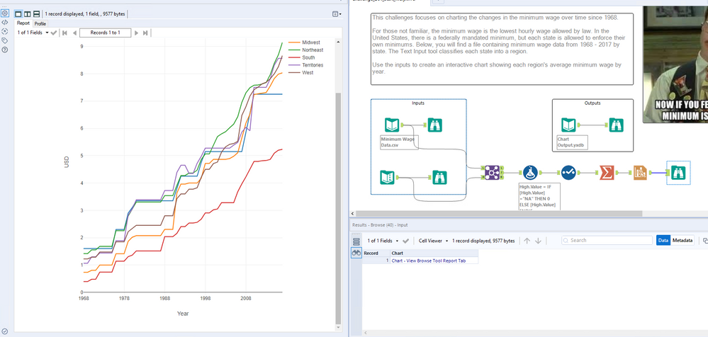
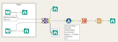
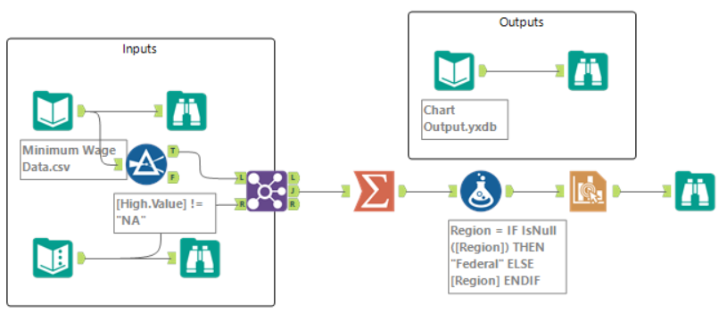
My solution
Labels
-
Advanced
275 -
Apps
24 -
Basic
128 -
Calgary
1 -
Core
112 -
Data Analysis
171 -
Data Cleansing
4 -
Data Investigation
7 -
Data Parsing
9 -
Data Preparation
195 -
Developer
35 -
Difficult
71 -
Expert
14 -
Foundation
13 -
Interface
39 -
Intermediate
237 -
Join
206 -
Macros
53 -
Parse
138 -
Predictive
20 -
Predictive Analysis
12 -
Preparation
271 -
Reporting
53 -
Reporting and Visualization
17 -
Spatial
60 -
Spatial Analysis
49 -
Time Series
1 -
Transform
214
- « Previous
- Next »

