In the 2020.2 release, we added the Topic Modeling tool to Designer as a part of the Alteryx Intelligence Suite (AIS). It is a powerful tool but requires some background knowledge to use it to its full potential. In this series, I provide a gentle introduction to topic modeling and the new topic modeling tool in Alteryx. Missed the first two in the series? Catch up with Part 1 | What is LDA? and Part 2 | How to Configure the Tool.
Now that we know the algorithm driving the tool and how to configure it, let's dive into the fun part...
Interpreting the Visualization
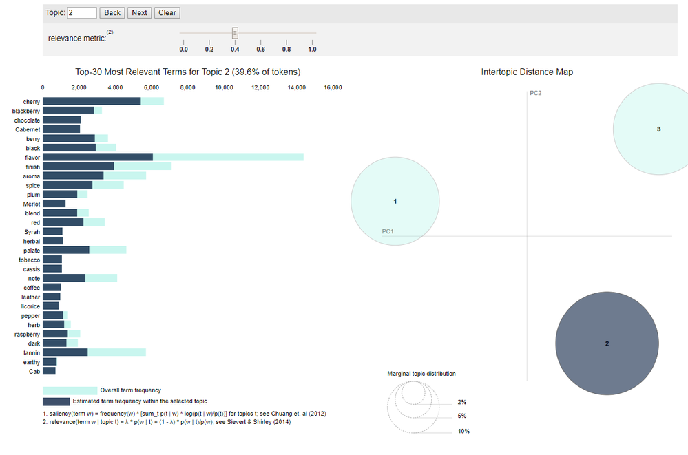
If you choose Interactive Chart in the Output Options section, the “R” (Report) anchor returns an interactive visualization of the topic model. The interactive visualization is a modified version of LDAvis, a visualization developed by Carson Sievert and Kenneth E. Shirley. The visualization has two major components, the bar chart on the left and the intertopic distance map on the right.

The intertopic distance map is a visualization of the topics in a two-dimensional space . The area of these topic circles is proportional to the amount of words that belong to each topic across the dictionary. The circles are plotted using a multidimensional scaling algorithm (converts a bunch of dimension, more than we can conceive with our human brains, to a reasonable number of dimensions, like two) based on the words they comprise, so topics that are closer together have more words in common.
The bar chart by default shows the 30 most salient terms. The bars indicate the total frequency of the term across the entire corpus. Salient is a specific metric, defined at the bottom of the visualization, that can be thought of as a metric used to identify most informative or useful words for identifying topics in the entire collection of texts. Higher saliency values indicate that a word is more useful for identifying a specific topic.
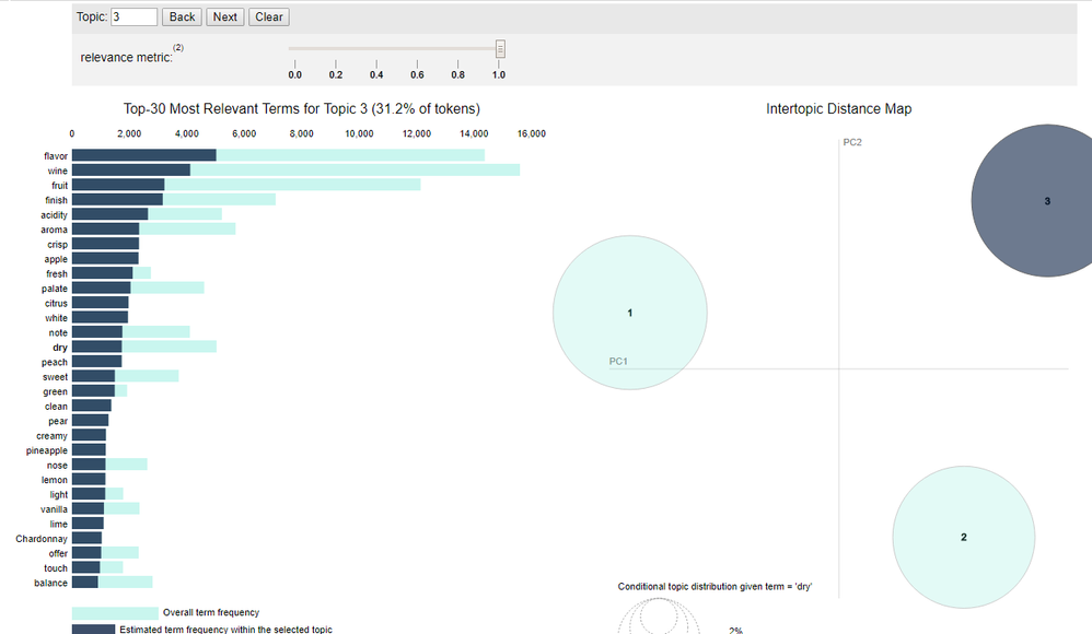
When you select a topic in the intertopic distance map, or specify a topic in the top panel, the bar chart changes to display the most salient words included in that specific topic. A second darker bar is also displayed over the term’s total frequency that shows the topic-specific frequency of words that belong to the selected topic. If the dark bar entirely eclipses the light bar, that term nearly exclusively belongs to the selected topic.
When you select a word in the bar chart, the topics and probabilities by topic of that word are displayed in the intertopic distance map, so you can see which other topics a term might be shared with.

You can adjust the words displayed in the bar chart for a topic by adjusting the λ (lambda) slider. Adjusting lambda to values close to 0 highlights potentially rare but more exclusive terms for the selected topic. Larger lambda values (closer to 1) highlight more frequently occurring terms in the document that might not be exclusive to the topic. The authors of this visualization found in a user study that a λ value close to 0.6 was optimal for interpreting the topics, although they expected this value to change based on the data and individual topics.
You can learn more about the visualization here.
Interpreting the Word-Relevance Summary
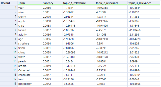
The Word-Relevance Summary is effectively the data-stream version of the visualization. It returns two metrics: relevance and saliency.
The intent of salience is to help identify which words are the most informative words for identifying topics in all the documents. Higher saliency values indicate that a word is more useful for identifying a specific topic. Saliency is always a positive value, and it does not have a maximum. A value of 0 indicates that a given word effectively belongs equally to all topics. Saliency is designed to look at words on a corpus-scale, as opposed to an individual topic levels.
You can read more about saliency here.

Relevance is a metric used for ranking terms within topics. It helps identify the most relevant words within a given topic. It reflects the level at which a word belongs to a certain topic at the exclusion of other topics. Relevance uses a parameter called lambda (which you can adjust using the slider in the visualization) to weight the probability of a term within a topic relative to its lift. The authors of this visualization found that the optimal value for lambda for topic interpretation is 0.6, which is the value used to calculate relevance in the data output. You can read more about relevance here.
Neither metric is normalized to any specific scale. Saliency can be any positive number, and relevance can be any number. These metrics are relative values you can use to identify the most helpful terms for describing and understanding a given topic. The higher the saliency value, the more helpful the term is for distinguishing the topic. The higher the relevancy metric is for a given topic, the more exclusive that term is to the given topic.
Get into the weeds with another walk-through on LDA with code example that gives additional context about interpretation; and learn more about evaluation methods for topic models.
Now it's time to get modeling!
