How to overlay dots and lines when the x-axis does not match exactly
- Subscribe to RSS Feed
- Mark Topic as New
- Mark Topic as Read
- Float this Topic for Current User
- Bookmark
- Subscribe
- Mute
- Printer Friendly Page
- Mark as New
- Bookmark
- Subscribe
- Mute
- Subscribe to RSS Feed
- Permalink
- Notify Moderator
Hi community,
i have a table of data, a simplified example below. I would have 4 lines from 4 different columns, then dots from the last column. The x-axis for the dots and lines does not overlay 100%. Which would cause discountinuous lines in my graph.
I wonder if there is a way to show continuous lines when the dot need to appear.
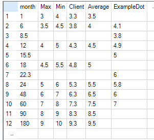
many thanks
 
- Labels:
- Reporting
- Mark as New
- Bookmark
- Subscribe
- Mute
- Subscribe to RSS Feed
- Permalink
- Notify Moderator
I am confused by the expected output - can you clarify?
- Mark as New
- Bookmark
- Subscribe
- Mute
- Subscribe to RSS Feed
- Permalink
- Notify Moderator
Hi @christinaliu ,
It seems the line chart is cut where the data is null.
To make it continuous, you may want to impute a value so that the line looks straight.
I made a sample workflow.
(Please note it works only when the missing data does not appear side-by-side.)
I hope this helps.
Workflow
Multi-Row Formula Expression
IF IsNull([Value])
THEN [Row-1:Value] + ([Row+1:Value] - [Row-1:Value]) / ([Row+1:month] - [Row-1:month]) * ([month] - [Row-1:month])
ELSE [Value]
ENDIF
Output