The Alteryx Community is a finalist in three 2026 CMX Awards! Help us win Customer Support Community, Most Engaged Community, and User Group Program of the Year - vote now! (it only takes about 2 minutes) before January 9.
ACT NOW: The Alteryx team will be retiring support for Community account recovery and Community email-change requests Early 2026. Make sure to check your account preferences in my.alteryx.com to make sure you have filled out your security questions.
Learn more here
Search
Close
Start Free Trial
Turn on suggestions
Auto-suggest helps you quickly narrow down your search results by suggesting possible matches as you type.
Showing results for
Weekly Challenges
Solve the challenge, share your solution and summit the ranks of our Community!Also available in | Français | Português | Español | 日本語
IDEAS WANTED
Want to get involved? We're always looking for ideas and content for Weekly Challenges.
SUBMIT YOUR IDEA- Community
- :
- Community
- :
- Learn
- :
- Academy
- :
- Challenges & Quests
- :
- Weekly Challenges
- :
- Re: Challenge #76: Strava Export Parse and Report
Challenge #76: Strava Export Parse and Report
Options
- Subscribe to RSS Feed
- Mark Topic as New
- Mark Topic as Read
- Float this Topic for Current User
- Bookmark
- Subscribe
- Mute
- Printer Friendly Page
pasccout
8 - Asteroid
10-29-2018
11:14 AM
- Mark as New
- Bookmark
- Subscribe
- Mute
- Subscribe to RSS Feed
- Permalink
- Notify Moderator
jssandom
8 - Asteroid
11-15-2018
05:49 AM
- Mark as New
- Bookmark
- Subscribe
- Mute
- Subscribe to RSS Feed
- Permalink
- Notify Moderator
Inactive User
Not applicable
11-15-2018
07:58 AM
- Mark as New
- Bookmark
- Subscribe
- Mute
- Subscribe to RSS Feed
- Permalink
- Notify Moderator
justynam
8 - Asteroid
11-23-2018
07:01 AM
- Mark as New
- Bookmark
- Subscribe
- Mute
- Subscribe to RSS Feed
- Permalink
- Notify Moderator
kelly_gilbert
13 - Pulsar
11-25-2018
07:03 PM
- Mark as New
- Bookmark
- Subscribe
- Mute
- Subscribe to RSS Feed
- Permalink
- Notify Moderator
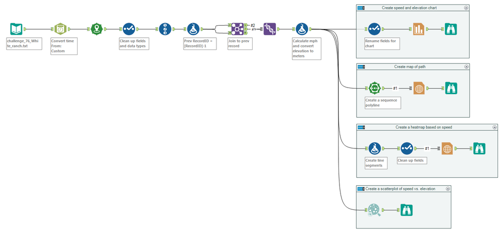
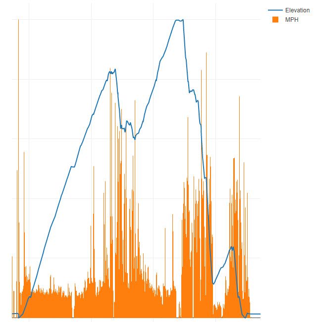
This was a good way to learn more about chart and map outputs!
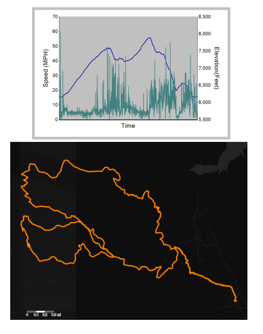
Recreated charts:
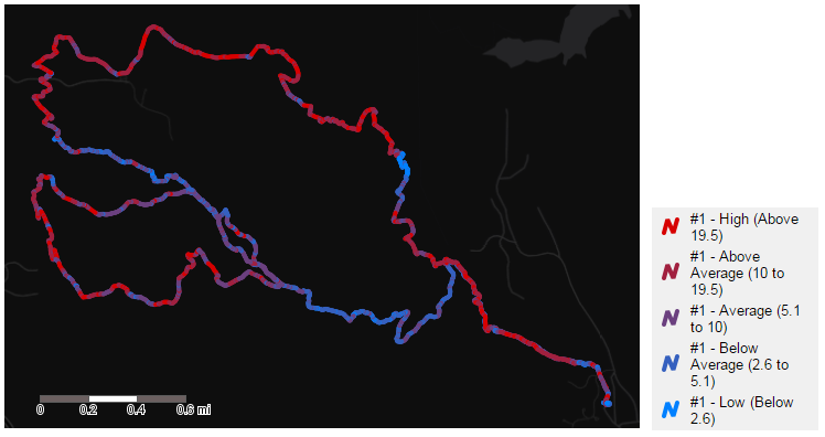
I also wanted to try to figure out how to do a heatmap based on speed:
JoshuaGostick
12 - Quasar
12-10-2018
03:43 AM
- Mark as New
- Bookmark
- Subscribe
- Mute
- Subscribe to RSS Feed
- Permalink
- Notify Moderator
My solution (minus the dual axis because I wasn't able to figure out how to add them in the Insight tool).
OldDogNewTricks
10 - Fireball
12-17-2018
10:38 AM
- Mark as New
- Bookmark
- Subscribe
- Mute
- Subscribe to RSS Feed
- Permalink
- Notify Moderator
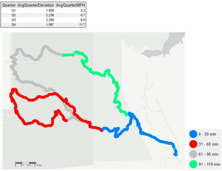
The approach that I took was to separate the data into 4 equal blocks of time (quarters) and see how the quarters compare to each other on the map.
As part of this challenge I learned a few things about the reporting tools in Alteryx.
- The new interactive charting tool does not have any options for dual axis (eventhough the tool that it replaced did)
- There is no ability to color points in the map tool by a data field
- I would have rather used Tableau (sorry guys)
I was able to create a dual axis chart by normalizing the data and showing the on the same chart, but that doesn't work very well with the labeling.
Tom_Luthi
8 - Asteroid
01-03-2019
06:11 AM
- Mark as New
- Bookmark
- Subscribe
- Mute
- Subscribe to RSS Feed
- Permalink
- Notify Moderator
elliemason
8 - Asteroid
01-03-2019
07:00 AM
- Mark as New
- Bookmark
- Subscribe
- Mute
- Subscribe to RSS Feed
- Permalink
- Notify Moderator
DavidThorpe
Alteryx Alumni (Retired)
01-18-2019
02:00 AM
- Mark as New
- Bookmark
- Subscribe
- Mute
- Subscribe to RSS Feed
- Permalink
- Notify Moderator
Labels
-
Advanced
302 -
Apps
27 -
Basic
158 -
Calgary
1 -
Core
157 -
Data Analysis
185 -
Data Cleansing
5 -
Data Investigation
7 -
Data Parsing
14 -
Data Preparation
238 -
Developer
36 -
Difficult
87 -
Expert
16 -
Foundation
13 -
Interface
39 -
Intermediate
268 -
Join
211 -
Macros
62 -
Parse
141 -
Predictive
20 -
Predictive Analysis
14 -
Preparation
272 -
Reporting
55 -
Reporting and Visualization
16 -
Spatial
60 -
Spatial Analysis
52 -
Time Series
1 -
Transform
227
- « Previous
- Next »
