Weekly Challenges
Solve the challenge, share your solution and summit the ranks of our Community!Also available in | Français | Português | Español | 日本語
IDEAS WANTED
Want to get involved? We're always looking for ideas and content for Weekly Challenges.
SUBMIT YOUR IDEA- Community
- :
- Community
- :
- Learn
- :
- Academy
- :
- Challenges & Quests
- :
- Weekly Challenges
- :
- Re: Challenge #104: Love's not the only thing in t...
Challenge #104: Love's not the only thing in the air!
- Subscribe to RSS Feed
- Mark Topic as New
- Mark Topic as Read
- Float this Topic for Current User
- Bookmark
- Subscribe
- Mute
- Printer Friendly Page
- Mark as New
- Bookmark
- Subscribe
- Mute
- Subscribe to RSS Feed
- Permalink
- Notify Moderator
- Mark as New
- Bookmark
- Subscribe
- Mute
- Subscribe to RSS Feed
- Permalink
- Notify Moderator
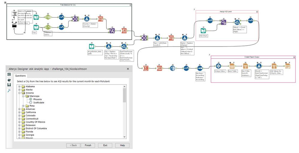
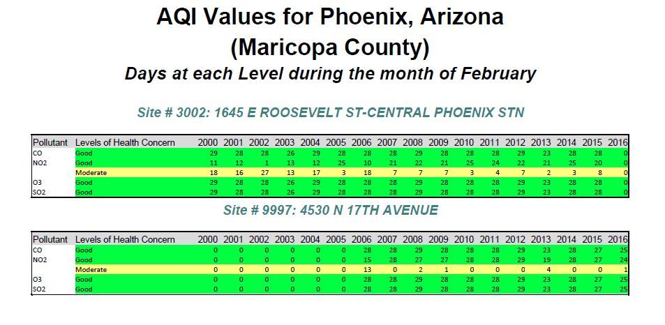
Fun challenge! I chose to make it a little more dynamic by building a tree that can be used to choose your city (I attached the workflow I used to build the tree as well). Noticed after testing for a few different cities that I needed to group by Site # since there are some cities that contained more than one Site (which was creating unusually high AQI values for the month by summarizing them together across sites). So I split out the output report into a separate grid per Site (based on city selected in the tree). Used Phoenix, Arizona as my sample city selection, largely because it's been 20 degrees here this week, so you know, wishful thinking. Plus the air quality looks pretty good!
Cheers,
NJ
- Mark as New
- Bookmark
- Subscribe
- Mute
- Subscribe to RSS Feed
- Permalink
- Notify Moderator
- Mark as New
- Bookmark
- Subscribe
- Mute
- Subscribe to RSS Feed
- Permalink
- Notify Moderator
- Mark as New
- Bookmark
- Subscribe
- Mute
- Subscribe to RSS Feed
- Permalink
- Notify Moderator
- Mark as New
- Bookmark
- Subscribe
- Mute
- Subscribe to RSS Feed
- Permalink
- Notify Moderator
- Mark as New
- Bookmark
- Subscribe
- Mute
- Subscribe to RSS Feed
- Permalink
- Notify Moderator
- Mark as New
- Bookmark
- Subscribe
- Mute
- Subscribe to RSS Feed
- Permalink
- Notify Moderator
- Mark as New
- Bookmark
- Subscribe
- Mute
- Subscribe to RSS Feed
- Permalink
- Notify Moderator
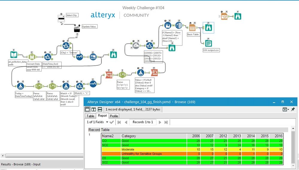
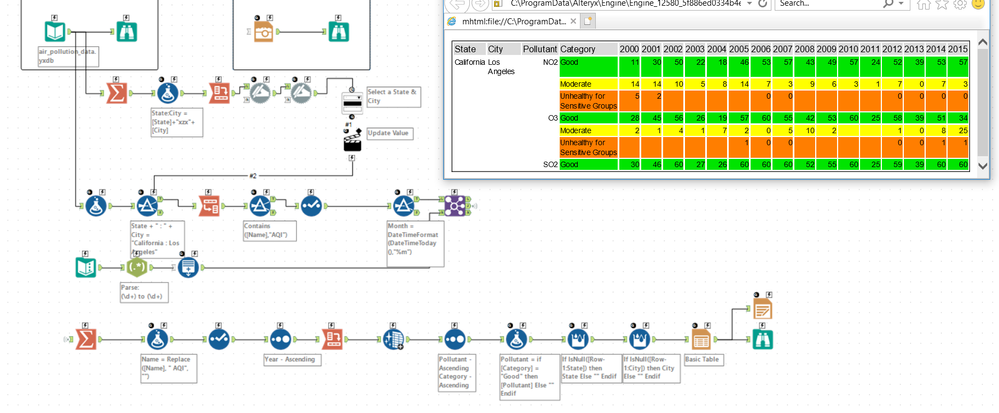
Started along the same path as @patrick_digan, grabbing the table from the EPA website. But ultimately decided to copy the results into a text table. Used a dynamic replace tool instead of a nested IF to assign the category. Transpose, summarize, crosstab, and report!
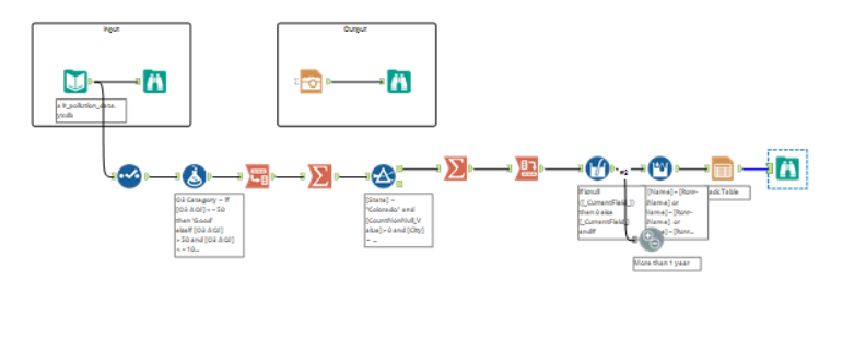
Created an app that allows the user to choose which city they'd like to see, and outputs the result. Tried the tree tool for the first time. Creating the table was a great exercise with using the Tile tool.
I'd love to make this dynamic and have the data pulled directly from the web, for the most current data. Any suggestions @ChristineB?
- Mark as New
- Bookmark
- Subscribe
- Mute
- Subscribe to RSS Feed
- Permalink
- Notify Moderator
I decided that it wasn't for me to determine which city to choose, so I made it into an app :)
Part time Tableau, Part Time Alteryx. Full Time Awesome

-
Advanced
299 -
Apps
27 -
Basic
156 -
Calgary
1 -
Core
155 -
Data Analysis
186 -
Data Cleansing
6 -
Data Investigation
7 -
Data Parsing
15 -
Data Preparation
234 -
Developer
35 -
Difficult
85 -
Expert
16 -
Foundation
13 -
Interface
39 -
Intermediate
266 -
Join
211 -
Macros
61 -
Parse
141 -
Predictive
20 -
Predictive Analysis
14 -
Preparation
272 -
Reporting
55 -
Reporting and Visualization
17 -
Spatial
60 -
Spatial Analysis
53 -
Time Series
1 -
Transform
225
- « Previous
- Next »
