Past Analytics Excellence Awards
- Community
- :
- Public Archive
- :
- Past Community Events
- :
- Past Analytics Excellence Awards: Top Ideas
- Mark all as New
- Mark all as Read
- Float this item to the top
- Subscribe to RSS Feed
Author: Rana Dalbah, Director - Workforce Intelligence & Processes
Company: BAE Systems
Awards Category: Most Unexpected Insight - Best Use Case for Alteryx in Human Resources
Working in Human Resources, people do not expect us to be technology savvy, let alone become technology leaders and host a "Technology Day" to show HR and other functions the type of technology that we are leveraging and how it has allowed us, as a team, to become more efficient and scalable.
Within the Workforce Intelligence team, a team responsible for HR metrics and analytics, we have been able to leverage Alteryx in a way that has allowed us to become more scalable and not "live in the data", spending the majority of our time formatting, cleansing, and re-indexing. For example, Alteryx replaced both Microsoft T-SQL and coding in R for our HR Dashboard, which allowed us to decrease the pre-processing time of our HR Dashboard from 8-16 hours per month to less than 10 minutes per month, which does not account for the elimination of human intervention and error.
With the time savings due to Alteryx, it has allowed us to create custom metrics in the dashboard at a faster rate to meet customer demands. In addition, it has also given us the opportunity to pursue other aspects of Alteryx forecast modeling, statistical analysis, predictive analytics, etc. The fact that we are able to turn an HR Dashboard around from one week to two days has been a game changer.
The HR dashboard is considered to have relevant data that is constantly being used for our Quarterly Business Reviews and has attracted the attention of our CEO and the Senior Leadership. Another use that we have found for Alteryx is to create a workflow for our Affirmative Action data processing. Our Affirmative Action process has lacked consistency over the years and has changed hands countless times, with no one person owning it for more than a year. After seeing the capabilities for our HR Dashboard, we decided to leverage Alteryx to create a workflow for our Affirmative Action processing that took 40 hours of work down to 7 minutes with an additional hour that allows for source data recognition
recognition and correction. We not only have been able to cut down a two or three month process to a few minutes, but we also now have a documented workflow that lists all the rules and exceptions for our process and would only need to be tweaked slightly as requirements change.
For our first foray into predictive analytics, we ran a flight risk model on a certain critical population. Before Alteryx, the team used SPSS and R for the statistical analysis and created a Microsoft Access database to combine and process at least 30 data files. The team was able to run the process, with predictive measures, in about 6 months. After the purchase of Alteryx, the workflow was later created and refined in Alteryx, and we were able to run a small flight risks analysis on another subset of our population that took about a month with better visualizations than what R had to offer. By reducing the data wrangling time, we are able to create models in a more timely fashion and the results are still relevant.
The biggest benefit of these time-savings is that it has freed up our analytics personnel to focus less on “data chores” and more on developing deeper analytics and making analytics more relevant to our executive leadership and our organization as a whole. We’ve already become more proactive and more strategic now that we aren’t focusing our time on the data prep. The combination of Alteryx with Tableau is transformative for our HR, Compensation, EEO-1, and Affirmative Action analytics. Now that we are no longer spending countless hours prepping data, we’re assisting other areas, including Benefits, Ethics, Safety and Health, Facilities, and even our Production Engineering teams with ad-hoc analytics processing.
Describe the problem you needed to solve
A few years ago, HR metrics was a somewhat foreign concept for our Senior Leadership. We could barely get consensus on the definition of headcount and attrition. But in order for HR to bring to the table what Finance and Business Development do: metrics, data, measurements, etc. we needed to find a way to start displaying relevant HR metrics that can steer Senior Leadership in the right direction when making decisions for the workforce. So, even though we launched with an HR Dashboard in January of 2014, it was simple and met minimum requirements, but it was a start. We used Adobe, Apache code and SharePoint, along with data in excel files, to create simple metrics and visuals. In April 2015, we launched the HR Dashboard using Tableau with the help of a third party that used Microsoft SQL server to read the data and visualize it based on our requirements. However, this was not the best solution for us because we were not able to make dynamic changes to the dashboard in a fast timeframe. The dashboard was being released about two weeks after fiscal month end, which is an eternity in terms of relevance to our Senior Leadership.
Once we had the talent in-house, we were able to leverage our technological expertise in Tableau and then, with the introduction of Alteryx, create our workflows that cut down a 2 week process into a few days - including data validation and dashboard distribution to the HR Business Partners and Senior Leadership. But why stop there? We viewed Alteryx as a way to help refine existing manual processes: marrying multiple excel files using vlookups, pivot tables, etc. that were not necessarily documented by the users and cut back on processing time. If we can build it once and spend minimal time maintaining the workflow, why not build it? This way, all one has to do in the future is append or replace a file and hit the start button, and the output is created. Easy peasy! That is when we decided we can leverage this tool for our compliance team and build out the Affirmative Action process, described above, along with the EE0-1 and Vets processing.
What took months and multiple resources now takes minutes and only one resource.
Describe the working solution
The majority of the data we are using comes from our HCM (Human Capital Management Database) in excel based files. In addition to the HCM files, we are also using files from our applicant tracking system (ATS), IMPACT Awards data, Benefit provider, 401K, Safety and Health data, and pension providers.
Anything that does not come out of our HCM system are coming from a third party vendor. These files are used specifically for our HR dashboard, Affirmative Action Plan workflow, Safety & Health Dashboard, and our benefits dashboard.
In addition to dashboards, we have been able to leverage the mentioned files along with survey data and macro-economic factors for our flight risk model. We have also leveraged Google map data to calculate the commute time from an employee's home zip code to their work location zip code. This was a more accurate measurement of time spent on the road to and from work when compared to distance.
The ultimate outputs vary: an HR dashboard that tracks metrics such as demographics, headcount, attrition, employee churn/movement, rewards and exit surveys is published as a Tableau workbook. The Flight Risk analysis that allows us to determine what factors most contribute to certain populations leaving the company; a compensation dashboard that provided executives a quick way to do merit and Incentive Compensation planning includes base pay, pay ratios, etc. is also published as a Tableau Workbook.
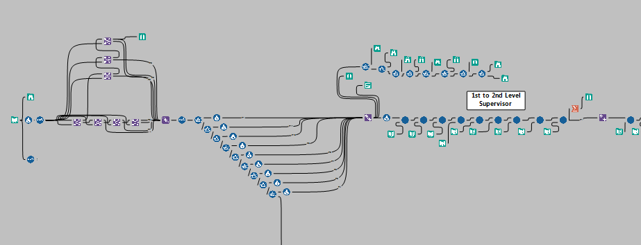
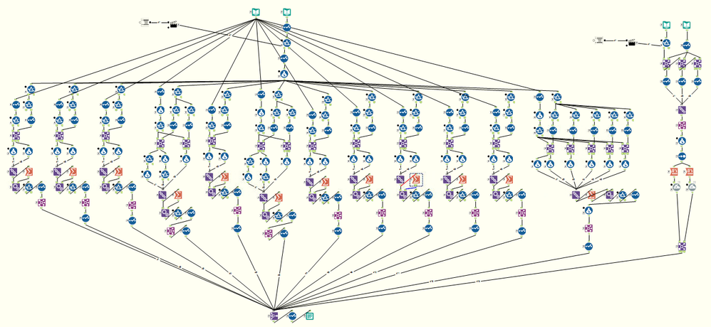
This workflow has as its input our employee roster file, which includes the employee’s work location and supervisor identifiers and work locations going up to their fourth level supervisor. For the first step of processing, we used stacked-joins to establish employee’s supervisor hierarchies up to the 8th level supervisor. We then needed to assign initial “starting location” for an employee based on the location type. That meant “rolling up” the employee’s location until we hit an actual company, not client, site. We did this because Affirmative Action reporting requires using actual company sites. The roll-up was accomplished using nested filters, which is easier to see, understand, modify, and track than a large ELSEIF function (important for team sharing).
Once the initial location rollup was completed, we then needed to rollup employees until every employee was at a site with at least 40 employees. While simply rolling all employees up at once would be quick, it would also result in fewer locations and many employees being rolled up too far from their current site which would undermine the validity and effectiveness of our Affirmative Action plan. Instead, we used a slow-rolling aggregate sort technique, where lone employees are rolled up into groups of two, then groups of two are rolled up into larger groups, and so on until sites are determined with a minimum of 40 employees (or whatever number is input). The goal is to aggregate employees effectively, while minimizing the “distance” of the employee from their initial site. This sorting was accomplished using custom-built macros with a group size control input that can be quickly changed by anyone using the workflow.
The end result was the roster of employees with the original data, with new fields identifying their roll-up location, and what level of roll-up from their initial location was needed. A small offshoot of “error” population (usually due to missing or incorrect data) is put into a separate file for later iterative correction.
Previously, this process was done through trial and error via Access, and Excel. That process, was not only much slower and more painstaking, but it also tended to result in larger “distances” of employees from initial sites then was necessary. As a result, our new process is quicker, less error-prone, and arguably more defensible than its predecessor.
One of the Macros used in AAP:
Describe the benefits you have achieved
Alteryx has enabled our relatively small analytics shop (3 people) to build a powerful, flexible and scalable analytics infrastructure without working through our IT support. We are independent and thus can reply to the user's custom requests in a timely fashion. We are seen as agile and responsive - creating forecasting workflows in a few days to preview to our CEO and CHRO instead of creating Power Point slides to preview for them a concept. This way, we can show them what we expect it to look like and how it will work and any feedback they give us, we can work at the same time to meet their requirements. The possibilities of Alteryx, in our eyes, are endless and for a minimal investment, we are constantly "wowing" our customers with the service and products we are providing them. In the end, we have been successful in showing that HR can leverage the latest technologies to become more responsive to business needs without the need for IT or developer involvement.
-
2016 Entries
-
Human Resources
-
Most Unexpected Insight
-
Wildcard
Author: Shelley Browning, Data Analyst
Company: Intermountain Healthcare
Awards Category: Most Time Saved
Describe the problem you needed to solve
Intermountain Healthcare is a not-for-profit health system based in Salt Lake City, Utah, with 22 hospitals, a broad range of clinics and services, about 1,400 employed primary care and secondary care physicians at more than 185 clinics in the Intermountain Medical Group, and health insurance plans from SelectHealth. The entire system has over 30,000 employees. This project was proposed and completed by members of the Enterprise HR Employee Analytics team who provide analytic services to the various entities within the organization.
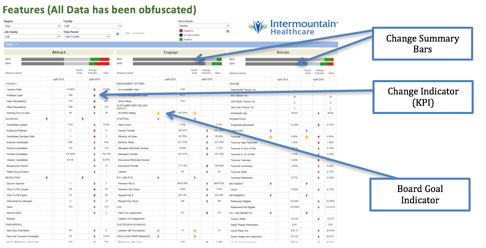
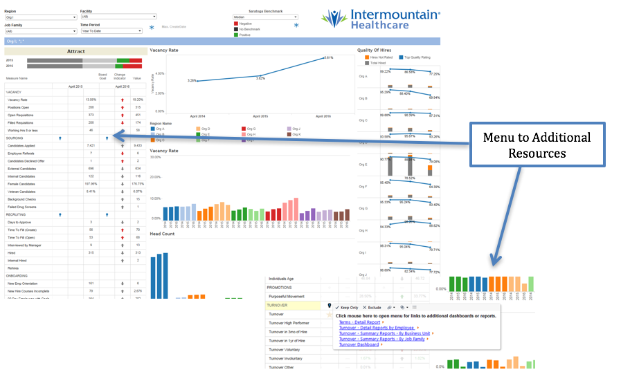
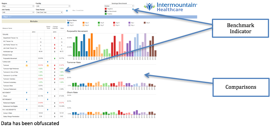
The initial goal was to create a data product utilizing data visualization software. The Workforce Optimization Dashboard and Scorecard is to be used throughout the organization by employees with direct reports. The dashboard provides a view of over 100 human resource metrics on activities related to attracting, engaging, and retaining employees at all levels of the organization. Some of the features in the dashboard include: drilldown to various levels of the organization, key performance indicators (KPI) to show change, options for various time periods, benchmark comparison with third party data, and links to additional resources such as detail reports. Prior to completion of this project, the data was available to limited users in at least 14 different reports and dashboards making it difficult and time consuming to get a complete view of workforce metrics.
During initial design and prototyping it was discovered that in order to meet the design requirements and maintain performance within the final visualization it would be necessary for all the data to be in a single data set. The data for human resources is stored in 17 different tables in an Oracle data warehouse. The benchmark data is provided by a third party. At the time of development the visualization software did not support UNION or UNION ALL in the custom SQL function. During development the iterative process of writing SQL, creating an extract file, and creating and modifying calculations in the visualization was very laborious. Much iteration was necessary to determine the correct format of data for the visualization.
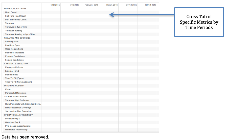
Other challenges occurred, such as when it was discovered that the visualization software does not support dynamic field formatting. The data values are reported in formats of percent, currency, decimal and numeric all within the same data column. While the dashboard was in final review it was determined that a summary of the KPI indicators would be another useful visualization on the dashboard. The KPI indicators, red and green arrows, were using table calculations. It is not possible to create additional calculations based on the results of table calculations in the visualization software. The business users also requested another cross tabular view of the same data showing multiple time periods.
Describe the working solution
Alteryx was instrumental in the designing and development of the visualization for the workforce dashboard. Without Alteryx the time to complete this project would have easily doubled. By using Alteryx, a single analyst was able to iterate through design and development of both the data set and the dashboard.
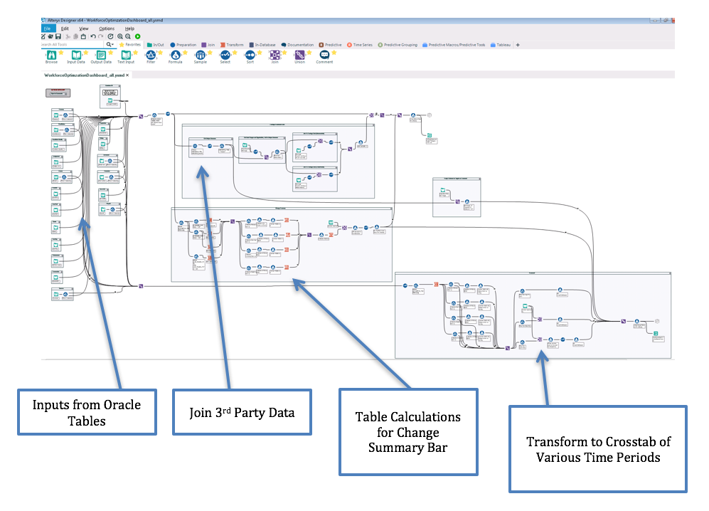
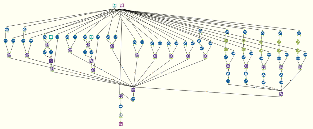
The final dashboard includes both tabular and graphic visualizations all displayed from the same data set. The Alteryx workflow uses 19 individual Input Data tools to retrieve data from the 17 tables in Oracle and unions this data into the single data set. Excel spreadsheets are the source for joining the third party benchmark data to the existing data. The extract is output from Alteryx directly to a Tableau Server. By utilizing a single set of data, filtering and rendering in visualization are very performant on 11 million rows of data. (Development included testing data sets of over 100 million rows with acceptable but slower performance. The project was scaled back until such a time as Alteryx Server is available for use.)
Describe the benefits you have achieved
The initial reason for using Alteryx was the ability to perform a UNION ALL on the 19 input queries. By selecting the option to cache queries, output directly to tde files, and work iteratively to determine the best format for the data in order to meet design requirements and provide for the best performance for filtering and rendering in the visualization, months of development time was saved. The 19 data inputs contain over 7000 lines of SQL code combined. Storing this code in Alteryx provides for improved reproducibility and documentation. During the later stages of the project it was fairly straight forward to use the various tools in Alteryx to transform the data to support the additional request for a cross tab view and also to recreate the table calculations to mimic the calculations the visualization. Without Alteryx it would have taken a significant amount of time to recreate these calculations in SQL and re-write the initial input queries.
Our customers are now able to view their Workforce Optimization metrics in a single location. They can now visualize a scenario in which their premium pay has been increasing the last few pay periods and see that this may be attributed to higher turnover rates with longer times to fill for open positions, all within a single visualization. With just a few clicks our leaders can compare their workforce optimization metrics with other hospitals in our organization or against national benchmarks. Reporting this combination of metrics had not been attempted prior to this time and would not have been possible at this cost without the use of Alteryx.
Costs saving are estimated at $25,000 to-date with additional savings expected in future development and enhancements.
-
2016 Entries
-
Healthcare
-
Human Resources
-
Most Time Saved
Author: Michael Barone, Data Scientist
Company: Paychex Inc
Awards Category: Best Use of Predictive
Describe the problem you needed to solve
Each month, we run two-dozen predictive models on our client base (600,000 clients). These models include various up-sell, cross-sell, retention, and credit risk models. For each model, we generally group clients into various buckets that identify how likely they are to buy a product/leave us/default on payment, etc. Getting these results into the hands of the end-users who will then make decisions is an arduous task, as there are many different end-users, and each end-user can have specific criteria they are focused on (clients in a certain zone, clients with a certain number of employees, clients in a certain industry, etc.).
Describe the working solution
I have a prototype app deployed via Alteryx Server that allows the end-user to “self-service” their modeling and client criteria needs. This is not in Production as of yet, but potentially provides great accessibility to the end-user without the need of a “go-between” (my department) to filter and distribute massive client lists.
Step 1: ETL
- I have an app that runs every month after our main company data sources have been refreshed:
This results in several YXDBs that are used in the models. Not all YXDBs are used in all models. This creates a central repository for all YXDBs, from which each specific model can pull in what is needed.
- We also make use of Calgary databases as well, for our really large data sets (billions of records).
Once all the YXDBs and CYDBs are created, we then run our models. Here is just one of our 24 models:
- Our Data Scientists like to write raw R-code, so the R tool used before the final Output Tool at the bottom contains their code:
The individual model scores are stored in CYDB format, to make the app run fast (since the end-user will be querying against millions and millions of records). Client information is also stored in this format, for this same reason.
Step 2: App
- Since the end-user will be making selections from a tree, we have to create the codes for the various trees and their branches. I want them to be able to pick through two trees – one for the model(s) they want, and one for the client attributes they want. For this app, they must choose a model, or no results will be returned. They DO NOT have to choose client attributes. If no attribute is chosen, then the entire client base will be returned. This presents a challenge in key-building, since normally an app that utilizes trees only returns values for keys that are selected. The solution is to attach keys to each client record for each attribute. My module to build the keys in such a way as I described is here (and there will be 12 different attributes from which the user can choose):
- Here is what the client database looks like once the keys are created and appended:
- The model keys do not have to be as complex a build as client keys, because the user is notified that if they don’t make a model selection, then no data will be returned:
- Once the key tables are properly made, we design the app. For the model selection, there is only one key (since there is only one variable, namely, the model). This is on the far right hand side. This makes use of the very powerful and fast Calgary join (joining the key from the pick-list to the key in the model table). For the client table, since there are 12 attributes/keys, we need 12 Calgary joins. Again, this is why we put the database into Calgary format. At the very end, we simply join the clients returned to the model selected:
Step 3: Gallery
- Using our private server behind our own firewall, we set up a Gallery and Studio for our apps:
- The app can now be run, and the results can be downloaded by the end-user to CSV (I even put a link to an “at-a-glance” guide to all our models):
- The user can select the model(s) they want, and the scores they want:
And then they can select the various client criteria:
Once done running (takes anywhere between 10 – 30 seconds), they can download their results to CSV:
Describe the benefits you have achieved
Not having to send out two dozen lists to the end-users, and the end users not having to wait for me to send them (can get them on their own). More efficient and streamlined giving them a self-service tool.
-
2016 Entries
-
Best Use of Predictive Analytics
-
Business Services
-
Human Resources
-
2016 Entries
37 -
2017 Entries
16 -
Automotive
2 -
Banking and Financial Services
2 -
Best Business ROI
4 -
Best Use of Alteryx Server
6 -
Best Use of Predictive Analytics
2 -
Best Use of Spatial Analytics
4 -
Best Value Driven
8 -
Best ‘Alteryx for Good’ Story
6 -
Business Intelligence
16 -
Business Services
2 -
Consulting
5 -
Consumer Goods & Services
1 -
Education
1 -
Energy & Utilities
1 -
Entertainment & Publishing
3 -
finance
1 -
From Zero to Hero
8 -
Government
1 -
Healthcare
2 -
Hospitality & Tourism
1 -
Human Resources
3 -
Insurance
3 -
IT
4 -
Manufacturing
1 -
Marketing
3 -
Marketing Service Provider
2 -
Media
3 -
Most Time Saved
12 -
Most Unexpected Insight
3 -
Non-Profit
2 -
Operations
4 -
Other
6 -
Retail
2 -
Sales
3 -
Transportation & Logistics
1 -
Wildcard
10
- « Previous
- Next »
- LeahK on: Excellence Awards 2017: Renilton Soares de Oliveir...
-
andrewdatakim on: Excellence Awards 2017: Bill Lyons - Multiple Awar...
- LeahK on: Excellence Awards 2017: Michael Carrico - Best Val...
- LeahK on: Excellence Awards 2017: Tim Chandler & Amy Jorde -...
- LeahK on: Excellence Awards 2017: John Matyasovsky Jr - From...
- robby on: Excellence Awards 2017: Allen Long - Best Value Dr...
- LeahK on: Excellence Awards 2017: Joseph Majewski - Best Use...
- LeahK on: Excellence Awards 2017: Jason Claunch - Best Use o...
- MosaicSP_Asher on: Excellence Awards 2017: Pamela Rooney - Best Value...
- lagueux_kerry on: Excellence Awards 2017: Ryan Bruskiewicz - Best Us...
