 If you have been keeping up with the Alteryx Engine Works blog, you know by now that we have been making a big push for our product to include the predictive element. This includes many types of analysis, one of the most important being A/B testing in the form of one analytic app. This app utilizes three Alteryx predictive macros that were built specifically for A/B testing: AB Trend, AB Controls, and finally AB Analysis.
In predictive analytics, A/B Testing plays an important role in determining the effectiveness of modifying with how you present or deliver a product or service. In a nutshell, A/B Testing is the testing of two variants, A and B. These two variants are very similar, with one variant being updated and changed throughout the test period while the other remains constant. The changed variant is referred to as the Treatment while the unchanged variant is the Control.
To follow along, please check out the just released AB Test Analysis App on the Alteryx Public Gallery.
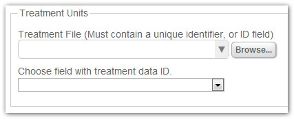 The analytic app itself contains multiple options for the user, beginning with a tab for Treatments. Treatments are units that receive a change in their offerings. A treatment unit is often a store location, a customer, or even the pages served on a website. These units are monitored both before and during a test in order to judge the effect of the treatment program. For treatment data to be properly analyzed, it must contain an ID field (such as a store number), which will be used to match to the Controls data in the next step.
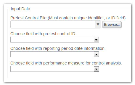
The next tab is where you can specify your control data. Control data are units that are similar on data dimensions prior to the beginning of the test. Dimensions are the trend and seasonality fields that are created based off of the specified unit performance measures (customer traffic, revenue, etc), as stated above. Proper data format for the control units are essential. In this app there needs to be an identifier, a date field with the reporting date information, and finally a numeric field with performance measure information.
Once this information has been specified in the app, determine your date values by choosing the frequency of the period your data has been captured (daily, quarterly, etc), and the number of periods required to calculate the trend. As stated in the app, the number of periods required to calculate the trend is determined by the number of periods prior to the date of the test, plus one year. For example, weekly data with two periods selected will mean that there needs to be at least 54 records in your data stream. Next, there are two data measures (created based off of the performance measure) that will be used to match treatment units to control units. This step tries to identify pairs of treatment and control units (stores, customers, etc.) that have similar attributes. Finally, select the number of control units you would like to match to each treatment unit.
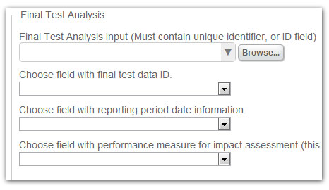 The final test data tab is your last stop for file input. Here, you will specify the data source for all of your post-test data. This test data contains performance measure and ID data from both your treatment and control units for both pre-test and in-test time periods. This final analysis helps you determine the effectiveness of the changes you made in treatment units. This analysis is based on the differences in performance measures between the treatment units and control units before and during the testing period. The tab needs only a few specifics in order to analyze the data, beginning with noting the identifier field, followed by the date field with date information (similar to the Controls file), and finally the numeric field with your performance measure to be analyzed.

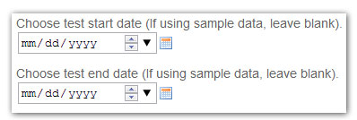
The next tab notes the dates of your test. If you are not using sample data and these fields are not specified properly, you will receive errors when running your analysis.
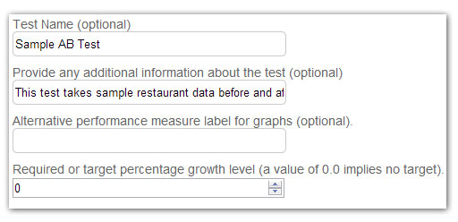
For customization, we have added two tabs, ‘Report Options’ and ‘Graphics Options’. These tabs focus on giving the user several options to make their reports more user-friendly and easier to understand. Under Report Options, you are given the ability to specify a new test name, description, alternative performance measure name (e.g. “Sales Revenue – Q2” rather than “q2salesdata”), and finally the target percentage growth level. Under ‘Graphics Options’, you are given the option to specify the resolution for your graphs (higher ‘x’ means higher resolution), how large you would like your graphs (Plot Size), and the base point size for your text.


The output for each analysis is broken into two files. The first of the two is the Controls Analysis file. This analysis displays and explains the relationship created between each treatment unit and its assigned control units. The report contains a description of the process, plus a plot of the locations of the treatment units in relation to their assigned controls. This plot relationship is based off of trend and seasonality, which if you remember are created based off of your performance measure analysis. The final bit of information is a table with each control unit, their assigned treatment unit, and the distance to that treatment unit.
The second of the 2 files is the AB Test Analysis file. This file breaks down your entire analysis and details out each section. The user is first given the summary of the test, in both written and tabular form. Next, a dot plot displaying the percentage change in your performance measure is given, followed by a violin plot that provides a visual of the distribution of the performance measure used in the test for both the treatment units and control units. Next, the report displays a box and whisker plot of the percentage change, followed by a bar plot, and then a line plot. The final graph is a dynamite plot displaying the percentage change in your performance measure. Last, but certainly not least is Welch’s Two Sample t-test of your performance measure. This table shows the t-statistic, degrees of freedom, and p-value of the control vs. treatment in your test.
Ultimately, there is quite a lot of information being displayed in multiple ways in our output. The idea is that our users will be given a sample of many of the most popular visuals that Alteryx is capable of which will allow them to draw their own conclusions or tailor their output to a specific need. If you would like to see an example of the output, there are two links to the bottom of this post titled AB Test Analysis.pdf and AB Controls Analysis.pdf. The app itself is presented in a way that helps most users understand what AB testing is, and how they can utilize it for their own benefit. The AB Test Analysis app has generated quite a bit of buzz since its inception, and we are very excited to see it grow!

 The analytic app itself contains multiple options for the user, beginning with a tab for Treatments. Treatments are units that receive a change in their offerings. A treatment unit is often a store location, a customer, or even the pages served on a website. These units are monitored both before and during a test in order to judge the effect of the treatment program. For treatment data to be properly analyzed, it must contain an ID field (such as a store number), which will be used to match to the Controls data in the next step.
 The final test data tab is your last stop for file input. Here, you will specify the data source for all of your post-test data. This test data contains performance measure and ID data from both your treatment and control units for both pre-test and in-test time periods. This final analysis helps you determine the effectiveness of the changes you made in treatment units. This analysis is based on the differences in performance measures between the treatment units and control units before and during the testing period. The tab needs only a few specifics in order to analyze the data, beginning with noting the identifier field, followed by the date field with date information (similar to the Controls file), and finally the numeric field with your performance measure to be analyzed.