Alteryx Designer Desktop Discussions
Find answers, ask questions, and share expertise about Alteryx Designer Desktop and Intelligence Suite.- Community
- :
- Community
- :
- Participate
- :
- Discussions
- :
- Designer Desktop
- :
- Re: Table column heading - rule based highlighting...
Table column heading - rule based highlighting?
- Subscribe to RSS Feed
- Mark Topic as New
- Mark Topic as Read
- Float this Topic for Current User
- Bookmark
- Subscribe
- Mute
- Printer Friendly Page
- Mark as New
- Bookmark
- Subscribe
- Mute
- Subscribe to RSS Feed
- Permalink
- Notify Moderator
Hi all,
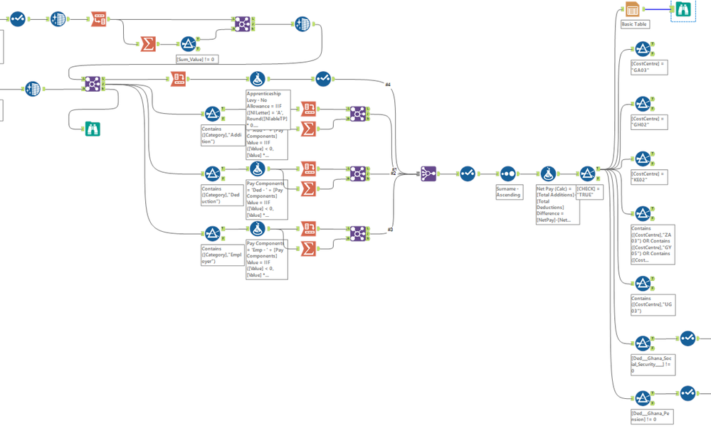
Over the last few days I've been building a monster workflow to help with some monthly payroll reporting tasks. It's nearly finished, but I cannot for the life in me work out how to add the final cherry on top - contextual highlighting for the column headings based on their name.
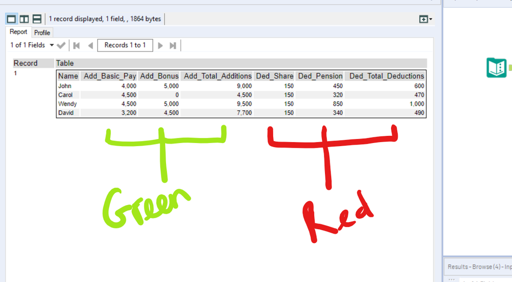
See attached dummy data and picture below.
Essentially what I'm trying to do with the Table tool is:
- if column heading contains the string 'Add', then highlight that heading in a particular colour;
- if column heading contains the string 'Ded', then highlight that heading in another colour.
There will be a different number of additions and deductions each month, and each month the pay component after the 'Add/Ded' prefix is likely to change each month. I need to be able to highlight the additions headings in a different colour to the deductions headings as the table I'll be producing is huge and would be impossible to navigate without the different coloured headings.
Because the number of pay components in each category will change each month, I figured that I wouldn't be able to use a positional argument, and that I'd have to use a prefix with a 'contains' argument.
Full disclaimer, I'm still pretty much brand new to Alteryx - if you can think of a better, less goofy way to do this, I'm all ears - pls halp!
Any help would be much appreciated!
Thanks,
James.
Solved! Go to Solution.
- Labels:
-
Reporting
- Mark as New
- Bookmark
- Subscribe
- Mute
- Subscribe to RSS Feed
- Permalink
- Notify Moderator
Hello @Inactive User
After looking into this I wasnt able to find a way to automate the process, however, you can set the font colors within the table column tool.
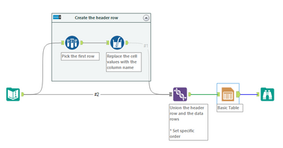
Within each column, you can set up a Column Rule. One option here would be to shift your data so that your first row contains the column header, not the 1st row of data. Doing this could allow you to build a formula to highlight the correct column with the correct color.
I would also recommend you submit this as a product enhancement idea so that if anyone else wants to see this as an OOTB option, we can get some movement on it!
I hope this helps!
TrevorS
- Mark as New
- Bookmark
- Subscribe
- Mute
- Subscribe to RSS Feed
- Permalink
- Notify Moderator
First of all, great job on getting this far when you're brand new to Alteryx. I don't think I even attempted reporting tools until I was about a year in! 🙂
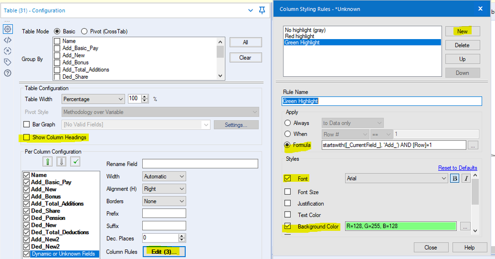
I was intrigued by this problem and experimented with it yesterday. While you can't conditionally format the table headers, you can conditionally format the body rows of a table. If we add a new row to the top of the table (that contains the field names), then we can use a column rule to apply the colors. Basically, we're using that new row as headers and hiding the actual table headers.
That gives us what we want, I think:
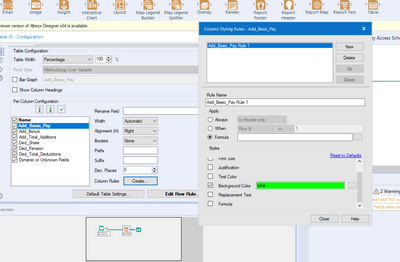
In the table tool, we need to hide the "real" column headings and set up three rules:
- One for the name column (default/gray)
- One for Add columns (green)
- One for Ded columns (red)
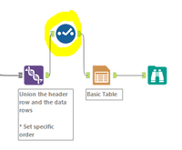
Note, since you have to set up the column rules individually for each column, you can make it easier on yourself by temporarily adding a Select tool before the table:
- Add a Select tool before the Table tool
- In your Select tool, deselect all of the fields (this will give you an error - that's OK).
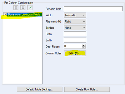
- Now, in your Table tool, you'll only have one column, "Dynamic or Unknown Fields." Click on that, and then set up your three rules
- Now, any new columns that show up will adopt those rules.
- Remove the Select tool from your workflow, then reconnect the Join and Table tools.
- Mark as New
- Bookmark
- Subscribe
- Mute
- Subscribe to RSS Feed
- Permalink
- Notify Moderator
Oops, sorry, @TrevorS - I think we're suggesting the same thing. I wrote my post last night and didn't hit post!
- Mark as New
- Bookmark
- Subscribe
- Mute
- Subscribe to RSS Feed
- Permalink
- Notify Moderator
@TrevorS @kelly_gilbert thank you so much, you've just made my Saturday night - that's worked perfectly!
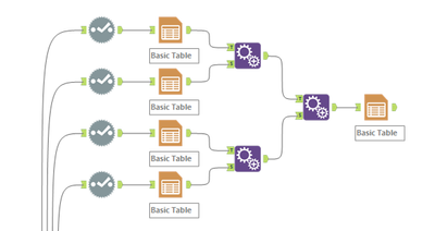
I was ready to give up this afternoon after trying and (...failing miserably) to append 4 tables together (each of which had the headers coloured using the 'default table settings).
@kelly_gilbert thanks for the 'temporary select trick' - I'll definitely be making use of that one again! I'd been wondering what the 'Dynamic or Unknown Fields' checkbox actually did; I guess that kind of explains it.
Nice introduction to the concept of the '_CurrentField_' variable as well - instead of having to specify the variable name, you can almost treat it like a for loop. I'd totally never have thought to add the 'AND [Row] = 1' on the end either to specify the row. Is there a resource on here that you'd recommend the really learn the formula syntax in Alteryx?
Thanks again so much for your help!
James.
- Mark as New
- Bookmark
- Subscribe
- Mute
- Subscribe to RSS Feed
- Permalink
- Notify Moderator
@Inactive User
Please mark @kelly_gilbert's post as the solution. It's and excellent approach to a very tricky problem.
- Mark as New
- Bookmark
- Subscribe
- Mute
- Subscribe to RSS Feed
- Permalink
- Notify Moderator
Hmmm, I've now ended up with a slightly different problem - the table is only able to output numbers as string when I use the render tool.
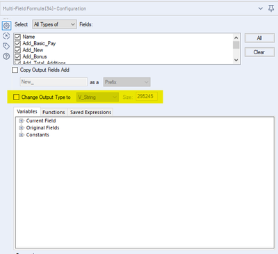
If I uncheck the box 'Change Output Type to' any type of string, or if I add a select tool downstream to change the non header variables back to a number type variable then, I get a 'string variable switched type' error from the table tool when I try to run the workflow.
I think it's potentially got something to do with the [_CurrentField_] variable, as when you change it to [_CurrentFieldName_], as suggested here it gets rid of the error message and the workflow runs, but then it outputs blank headers, albeit with the correct conditional colour formatting.
I'm afraid my Alteryx knowledge isn't good enough to work out what is going on here, how does the [_CurrentField_] variable differ from the [Name] variable for example?
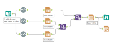
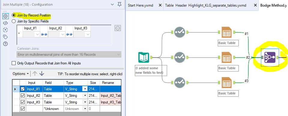
I re-tried the bodge method above of appending multiple mini-tables together (see attached workflow) and it seems to be working okay. The issue with this method is that I've got like 7 different 'Add', 'Ded' categories, and like 16 different reports to build, so the table creating and appending would quickly get out of hand on the designer workflow. It would be much neater to use your method above if it's possible!
Here's a small snippet from the test file we've been working with.
I can't take credit for this unfortunately, this was @wwatson's idea in a duplicate thread, here (for some reason this thread randomly disappeared when I created it, so I ended up creating another).
Any help would be much appreciated!
- Mark as New
- Bookmark
- Subscribe
- Mute
- Subscribe to RSS Feed
- Permalink
- Notify Moderator
Ah - by inserting the field names as a new row in the data, we've essentially forced all of the field types to strings. Each field now has a string in row 1 (the column name) and numbers in all of the other rows, so a string is the only data type that can accommodate everything in the column.
As you saw, when you change the field type in the Multi-Field tool, it outputs nulls instead of the column names, because the [_CurrentFieldName_] is a string. If the field types are numeric, then they can't accommodate a string. That's why I had the Change Output Type To box checked originally.
I wouldn't consider vertically appending tables a bodge method - I think that's a totally reasonable way to accomplish this, although it may require a bit more setup initially. The other benefit of that method is that it will force all of the columns of each type (Add, Ded, etc.) together in adjacent columns, which is probably the best way to go, anyway.
As far as making the "fake headers" method work, I'll keep thinking on it, but I may be out of ideas (other than editing the PCXML table output).
My original idea for this was to vertically append the tables (create one table for the headers, and then a separate table for the data, then stack the headers on top). However, I ran into some odd behavior when I tried adding new columns in the middle of the data. I tried adding two new columns here:
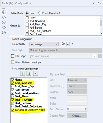
However, the output of the "header" table places the new columns at the end of the table, while it applies the color rules in the incoming order of the columns. The two new fields are placed at the end, but the colors reflect the incoming order of the fields (4 Add fields, followed by 4 Ded fields).
Since we have Dynamic or Unknown Fields ordered at the bottom in the Table tool, I expected the new fields to end up at the end (right side) of the table. However, I definitely didn't expect the color rules to be applied in a different order than the columns! Also, if I select the Table tool and look at its configuration, the new fields are listed in the incoming order (which is different than their order coming out of the Table tool).
The other interesting thing is that if I re-run the workflow after clicking on the Table tool (after making it active in the configuration window), then the colors align with the column order:
(I'm using 2019.2 BTW)
I'll keep thinking about other potential solutions (trying to avoid custom PCXML, though!) However, I think the vertically appended tables are a fine solution. I would potentially use a Join Multiple tool, though, to join all of the sections rather than multiple Append Field tools.
- Mark as New
- Bookmark
- Subscribe
- Mute
- Subscribe to RSS Feed
- Permalink
- Notify Moderator
Also, @Inactive User, I just wanted to say thank you for always attaching workflows with sample data, as well as a description/screen shots of what you've tried already. It makes it a lot easier to help (or try to, at least!)
- Mark as New
- Bookmark
- Subscribe
- Mute
- Subscribe to RSS Feed
- Permalink
- Notify Moderator
@kelly_gilbert You definitely had a better way to describe it than I did! I was learning as I went on this one, so thanks for the more in-depth reply!
-
Academy
6 -
ADAPT
2 -
Adobe
204 -
Advent of Code
3 -
Alias Manager
78 -
Alteryx Copilot
25 -
Alteryx Designer
7 -
Alteryx Editions
94 -
Alteryx Practice
20 -
Amazon S3
149 -
AMP Engine
252 -
Announcement
1 -
API
1,208 -
App Builder
116 -
Apps
1,360 -
Assets | Wealth Management
1 -
Basic Creator
14 -
Batch Macro
1,558 -
Behavior Analysis
246 -
Best Practices
2,693 -
Bug
719 -
Bugs & Issues
1 -
Calgary
67 -
CASS
53 -
Chained App
268 -
Common Use Cases
3,823 -
Community
26 -
Computer Vision
85 -
Connectors
1,426 -
Conversation Starter
3 -
COVID-19
1 -
Custom Formula Function
1 -
Custom Tools
1,936 -
Data
1 -
Data Challenge
10 -
Data Investigation
3,486 -
Data Science
3 -
Database Connection
2,220 -
Datasets
5,221 -
Date Time
3,227 -
Demographic Analysis
186 -
Designer Cloud
740 -
Developer
4,368 -
Developer Tools
3,528 -
Documentation
526 -
Download
1,037 -
Dynamic Processing
2,937 -
Email
927 -
Engine
145 -
Enterprise (Edition)
1 -
Error Message
2,256 -
Events
198 -
Expression
1,868 -
Financial Services
1 -
Full Creator
2 -
Fun
2 -
Fuzzy Match
711 -
Gallery
666 -
GenAI Tools
3 -
General
2 -
Google Analytics
155 -
Help
4,705 -
In Database
966 -
Input
4,291 -
Installation
360 -
Interface Tools
1,900 -
Iterative Macro
1,094 -
Join
1,957 -
Licensing
252 -
Location Optimizer
60 -
Machine Learning
259 -
Macros
2,862 -
Marketo
12 -
Marketplace
23 -
MongoDB
82 -
Off-Topic
5 -
Optimization
750 -
Output
5,252 -
Parse
2,327 -
Power BI
228 -
Predictive Analysis
936 -
Preparation
5,167 -
Prescriptive Analytics
205 -
Professional (Edition)
4 -
Publish
257 -
Python
855 -
Qlik
39 -
Question
1 -
Questions
2 -
R Tool
476 -
Regex
2,339 -
Reporting
2,431 -
Resource
1 -
Run Command
575 -
Salesforce
277 -
Scheduler
411 -
Search Feedback
3 -
Server
629 -
Settings
933 -
Setup & Configuration
3 -
Sharepoint
626 -
Spatial Analysis
599 -
Starter (Edition)
1 -
Tableau
512 -
Tax & Audit
1 -
Text Mining
468 -
Thursday Thought
4 -
Time Series
431 -
Tips and Tricks
4,187 -
Topic of Interest
1,126 -
Transformation
3,726 -
Twitter
23 -
Udacity
84 -
Updates
1 -
Viewer
3 -
Workflow
9,974
- « Previous
- Next »
