Word clouds: They sound so light, fluffy and fun. They’re a popular way of visualizing the frequency of terms in text data. But data commentators have long criticized these handy graphics, as in “Word Clouds Are Lame”, “Word Clouds: We Can’t Make Them Go Away, So Let’s Improve Them,” and the rather aggressively titled “Word clouds considered harmful.” Ouch.
What’s these people’s problem with word clouds? They can indeed have issues when they aren’t used wisely, but there are ways to make them better. Let’s take a look at the critiques of word clouds and see how we can navigate around their potential pitfalls, especially when you’re using Designer and the Word Cloud Tool in the Text Mining palette of the Alteryx Intelligence Suite.

Image via GIPHY
Mostly Cloudy? Critiques of Word Clouds
What are some of the common critiques of word clouds? Here’s a tl;dr of the articles linked above:
- Word clouds often share information that is self-apparent or obvious. A word cloud of product reviews would likely display the product names in large type because those names show up often — but that’s not a useful insight for the viewer. And, if they’re not removed, stop words (frequently occurring words like “the,” “a” or “an” in English) can also clutter up a word cloud, making it hard to see important words.
- Word clouds often show single words in isolation, leaving out valuable context and a surrounding narrative. They reduce complex text data to a bare minimum — maybe too bare. The viewer has to figure out the significance of how the words are displayed, and they may come to the wrong conclusions.
- Type size doesn’t clearly indicate words’ actual frequency; larger type means a word occurs more frequently, but making more nuanced comparisons or rankings is difficult.
These authors make some good points. We’ve probably all created first attempts at word clouds that included useless words or that didn’t suggest a story for the data.
So how can we address these shortcomings of word clouds, given that they can sometimes be a nice method for summarizing text data in a visually engaging way?

Image via GIPHY
A Storm of Stop Words
There are strategies you can use to address each of these concerns for your word clouds. Let’s take a look at some of them. I’m going to use a dataset I previously used to demonstrate sentiment analysis; it contains reviews of clothing items.
First, we can deal with the issue of self-apparent and stop words fairly easily. In Designer, be sure to set up a Text Pre-processing Tool before your Word Cloud Tool. Then, in the Word Cloud Tool, be sure to select the text field with _processed after the original field name; I’ve forgotten to do this many times! In the pre-processing step, you can remove digits, punctuation, and stop words.
The default stop words are from spaCy, the Python NLP package underlying this tool. However, you can add your own stop words to remove some of those painfully obvious terms that don’t help viewers gain meaning from the word cloud.
Below, I’ve removed “top” and “shirt” from the word cloud because this word cloud is going to represent only the “tops” category of clothing reviews. Seeing “top” and “shirt” prominently in the word cloud won’t help us understand what people are saying about them.
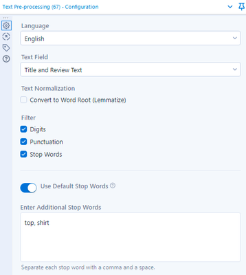
Obviously, you should use caution in omitting additional words beyond the default stop words so you don’t inadvertently misrepresent your data, but I would provide context for the viewer to be sure they know this word cloud is limited to reviews of tops.

Image via GIPHY
What Does That Cloud Look Like to You?
After we make sure only useful, relevant words are included in the word cloud, how can we make sure viewers extract the meaningful story that we hope to share in the visualization? Take a look at the word cloud below, which represents all the text of negative clothing reviews containing the word “fabric.” What are the key takeaways here, or even some interesting observations to follow up? It’s hard to tell.
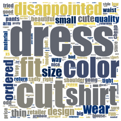
Depending on the topic(s) of your word cloud and the story you’re wanting to share, it could make more sense to have more than one word cloud. For example, if my goal is to share the main customer responses around the different clothing categories (e.g., tops, dresses, pants), it might make more sense to divide my dataset and the review text into those categories first, then make the word clouds. Alternatively, I could divide the comments by theme (e.g., fabric, sizing) and/or by sentiment analysis scores (i.e., positive or negative reviews).
With smaller groupings of related words, the viewer can focus on the key takeaways in each of those themes instead of having to study all the words and figure out an overarching message. As one research study says, “It is better to organize those words into zones of meaning, and display those zones in visually distinct groups, via spatial or color grouping.”

Word clouds for negative reviews mentioning fabric, grouped by clothing type
(from left to right: dresses, tops, and jackets)
If we break down the text of negative reviews by clothing type, as shown above, we now immediately see differences that might be compelling. When customers mention fabric in negative reviews, customers are also commenting on size XS dresses; there’s something “odd” about some tops; and color is especially notable for jackets.
Unfortunately, most of this kind of grouping has to happen manually — or semi-manually, at least. In Designer, you might use Formula and/or Filter tools to set criteria for “themes” that determine which text items are fed into each word cloud. You can also select different color schemes for your different themes in the Word Cloud Tool so the images are visually distinct.
You could also use topic modeling to help identify key themes, then use the topic modeling scores to divide up your text data. If you want to read more about topic modeling, here’s the start of our tutorial series, a SFW demo of using it, and a maybe-NSFW demo as well!

Image via GIPHY
When Clouds Obscure: Frequency and Ranking
Word clouds can be made more useful, but sometimes you might want a different option. For example, a word cloud might fail you when it’s important for the viewer to be able to understand in more detail the relative frequency and/or ranking of different words in your text data. A bar plot showing key words might be a better choice.
For example, maybe you want to dive into the opinions of your customers ages 18-34, especially their positive reviews of your tops, so you can see which characteristics they really like. The bar chart below shows one way to see a ranking of the most common words they used (with a few obvious stop words — shirt, top, love, and great — added to the default list). Size and fit appear to be popular criteria that happy customers discuss; it’s also easy to see in this format that size and fit were mentioned more often than “comfortable.”
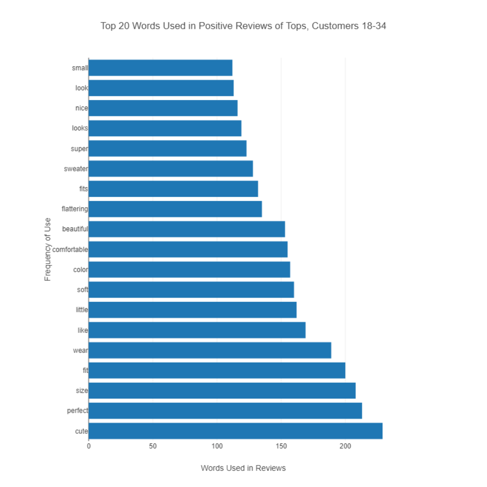
Creating a bar chart like this from your text takes a few more steps, as you can see in the attached workflow. The Text to Columns Tool set on “split to rows” makes it possible to convert the text reviews to individual lines; with a Summarize Tool and the Interactive Chart Tool, the bar chart comes together pretty quickly.
This article also shows a cool example of a heat map used for visualizing text (check out item 2).
Weather Watch: Proceed with Caution
While some folks may not appreciate word clouds, it’s certainly possible to use them wisely. As with any data visualization, the goal is to communicate information effectively to your viewer, so with that as top priority, your skies should be clear!
Are you still feeling cloudy about word clouds? Post your question below! Which other tools or data science concepts would you like to see addressed here on the blog? Let me know with a comment below, and subscribe to the blog to get future articles.
Recommended Resources
- Read about some word cloud alternatives for visualizing text data.
- This article, mentioned above, has a research-based critique of word clouds and thoughtful suggestions for them.
- This tutorial shows how to use Python to build word clouds, a method you could build into a workflow with a Python Tool.
- For more on data visualization of all kinds, check out our Data Science Mixer podcast episodes with data viz author and expert Alberto Cairo; we have a short episode from our Virtual Global Inspire conference and a full-length episode for your enjoyment!
Blog teaser photo by NOAA on Unsplash