Tool Mastery
Explore a diverse compilation of articles that take an in-depth look at Designer tools.- Community
- :
- Community
- :
- Learn
- :
- Academy
- :
- Tool Mastery
- :
- Tool Mastery | Charting
Tool Mastery | Charting
- Subscribe to RSS Feed
- Mark as New
- Mark as Read
- Bookmark
- Subscribe
- Printer Friendly Page
- Notify Moderator
03-13-2017 04:26 PM - edited 07-23-2021 11:54 AM

Note: The Charting Tool has been deprecated and replaced by the Interactive Chart Tool.
This article is part of the Tool Mastery Series, a compilation of Knowledge Base contributions to introduce diverse working examples for Designer Tools. Here we’ll delve into uses of the Charting Tool on our way to mastering the Alteryx Designer:
As long as you know where to look, data has all the answers. Sometimes, though, those answers aren’t clear as day. More often than not, they need to be communicated in an effective format - a format that can let the data talk and highlight the important motifs for you. Another favorite of the Reporting Tool Category, the Charting Tool can do just that by adding expressive visuals to any report or presentation. Offering an exhaustive list of charts to choose from (area, stacked area, column, stacked column, bar, stacked bar, line, tornado, pareto, box and whisker, scatter, bubble, polar, radar, pie), the Charting Tool will give you the ability to add descriptive visuals, with legends and even watermarks, to your reporting workflows that will help you find the answers in your data.
How many charts do you need? More
Use the Charting Tool for:
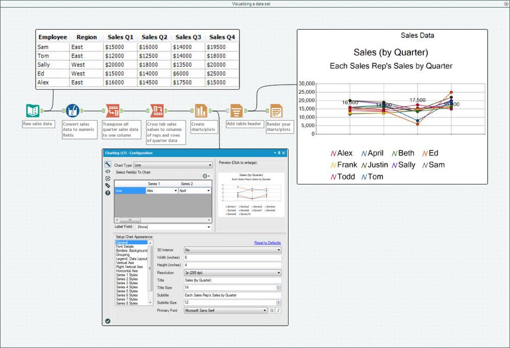
- Visualizing a data set (attached in Charting.yxmd)
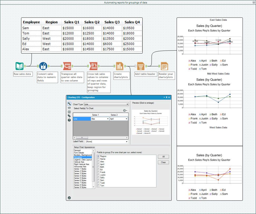
- Automating reports for groupings of data (attached in the Charting.yxmd)
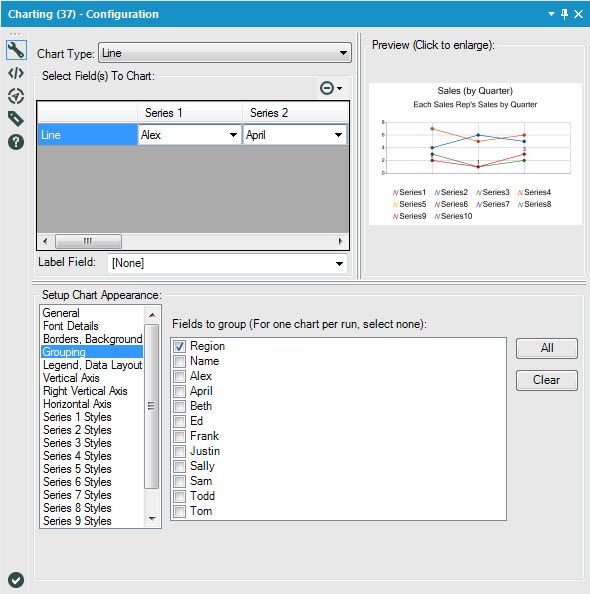
In this use case we simply took the same data from the first example and applied the Charting Tool’s “Grouping” feature to separate the reports by Region:
You can create the same output reports, one to a pdf file, by using the Output Mode “Choose a Specific Output File” in the Render Tool and grouping on the same field:
Like a charm, you have all your reports automated to output to each grouping in your data!
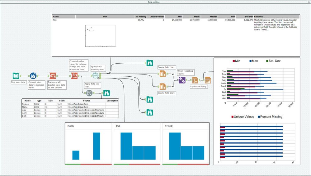
- Data profiling (attached in the Charting.yxmd)
Similar to the data profiling features added in v11.0 of the Designer, you can use a combination of tools native to previous versions (like the Field Info or Field Summary Tools), along with the Charting Tool, to visualize metadata in your data sets:
Data profiling in v11.0
By now, you should have expert-level proficiency with the Charting Tool! If you can think of a use case we left out, feel free to use the comments section below! Consider yourself a Tool Master already? Let us know at community@alteryx.com if you’d like your creative tool uses to be featured in the Tool Mastery Series.
Stay tuned with our latest posts every #ToolTuesdayby following @alteryxon Twitter! If you want to master all the Designer tools, consider subscribingfor email notifications.
- Mark as Read
- Mark as New
- Bookmark
- Permalink
- Notify Moderator
We would like to create a chart to email out, hence using the charting in tool in Alteryx. We want a line chart with 2 lines. We would like to use 2 vertical axis, and 1 horizontal (date). We would like one of the vertical axis to be a secondary axis. We want 1 line to plot against the left hand axis and the other line to plot against the right hand axis. This is standard functionality in Tableau but I can't see how to do this in Alteryx. Any ideas?
- Mark as Read
- Mark as New
- Bookmark
- Permalink
- Notify Moderator
A new Alteryx user - I'm trying to plot output data from an 'In-Db connection' using the Charting tool but it does not seem to work. Extracting data with 'Data Stream Out' tool, line shows its connecting to the Charting tool. But I don't get any fields to pick from the Configuration panel 'Select Fields to Chart' in the left. Trying to generate a Column chart, all I see is default 'Column' in the fields to pick and in the preview it just shows default Record1, Record2, Record3 and no actual data. What am I missing?
- Mark as Read
- Mark as New
- Bookmark
- Permalink
- Notify Moderator
@M_G What is your field type? I'm just taking a stab in the dark, but if you put a select tool before your charting tool, I think you'll only see numeric (double, float, int) data show up in the charting tool as an available field to graph.
- Mark as Read
- Mark as New
- Bookmark
- Permalink
- Notify Moderator

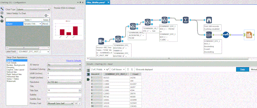
There are only two fields in the data output. First one is a Code (string) and the other one is Count (numeric). I'm not using any select tool explicitly. I'm tapping into a large table through 'IN-DB Connection' filtering through a series of Filter In-Db as I've not figured out yet to put together a sophisticated filter. Then getting count with a Summary tool and getting output with 'Data Stream out' then plugging in the Charting tool. I've tried to attach an image of my workflow, not sure how it's going to show in the actual post.
Again, appreciate your feedback.
M_G
- Mark as Read
- Mark as New
- Bookmark
- Permalink
- Notify Moderator
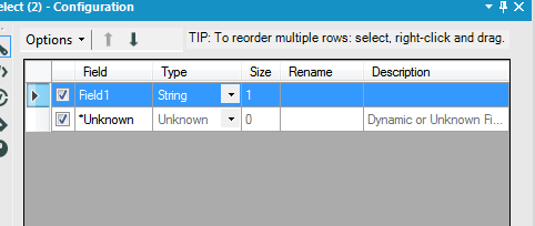
@M_G Can you add a select tool between your data out and chart tool and screenshot the configuration? Like this:
- Mark as Read
- Mark as New
- Bookmark
- Permalink
- Notify Moderator
@M_G Has the workflow been run since you added the Chart tool? You may just need to run the workflow so it pushes the metadata from the In-DB tools into the Chart tool and then you can configure the Chart tool.
- Mark as Read
- Mark as New
- Bookmark
- Permalink
- Notify Moderator
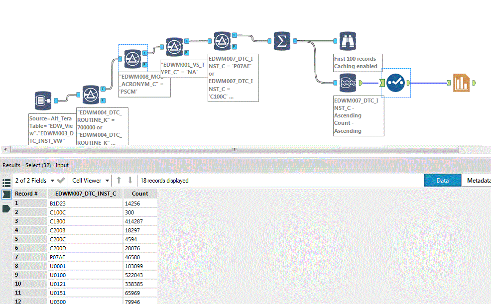
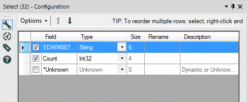
@patrick_digan Added 'Select' tool as suggested. Showing Config panel for the 'Select' tool.
Select tool is showing data in the bottom window, but Charting tool still does not show the available fields.
- Mark as Read
- Mark as New
- Bookmark
- Permalink
- Notify Moderator
Complete workflow with new 'Select' tool, showing data at the bottom, but still no fields available in Charting Tool Configuration.
- Mark as Read
- Mark as New
- Bookmark
- Permalink
- Notify Moderator
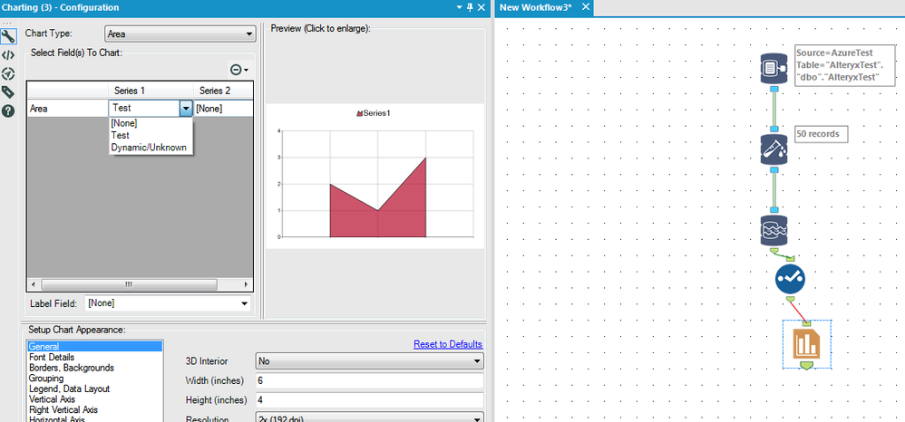
@M_G I must be missing something obvious. I quickly setup an IN-DB test and it's working as expected on my end. I set it up and then ran it and it now gives me tho option for series 1 to have my field "Test". All you pictures indicate that you should be having the same thing on your end, so I can't think of what could be wrong.
- Mark as Read
- Mark as New
- Bookmark
- Permalink
- Notify Moderator
Hi @patrick_digan,
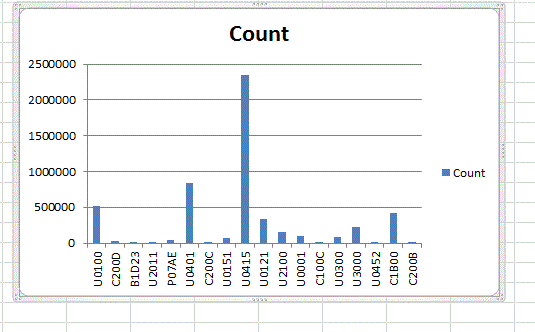
Yes, It sounds silly but I see the same default 3 records (Record1, Record2, Record3) in the Preview pane as you see in your sample. What I'm struggling with is how to show all (18 records in my case) records on the chart? This is the same data plotted in Excel, How do I get the charting tool to show the same in Alteryx.
- Mark as Read
- Mark as New
- Bookmark
- Permalink
- Notify Moderator
@M_G The preview pane is pretty hit or miss for me. If you put a browse after your chart tool, that will show you the actual chart then.
Your picture from yesterday shows that your label field is coming through, so I'm puzzled why your count field wouldn't as well.
- Mark as Read
- Mark as New
- Bookmark
- Permalink
- Notify Moderator
@patrick_digan Never mind the previous post. Yes, the Charting Tool was working all along, I just had to put yet another Browse tool after the Chart to see the results. Those little things that Experts like yourself take for granted don't come natural to beginners, I guess!
Once again, Thanks for your feedback and patience.
- Mark as Read
- Mark as New
- Bookmark
- Permalink
- Notify Moderator
@M_G Glad you were able to figure it out! I've been in your shoes plenty of times :)
- Mark as Read
- Mark as New
- Bookmark
- Permalink
- Notify Moderator
Is there an easy way to display a chart from the charting tool directly in the workflow canvas without first saving it to file?
- Mark as Read
- Mark as New
- Bookmark
- Permalink
- Notify Moderator
Can someone show how to do this on the new Interactive Charts tool? I can not figure it out. I have done the lines and they come out as records (so individual charts). I need to have all the lines on one Chart using interactive.
It would be great to show this example using the interactive chart tool.
Thanks
-
2018.3
1 -
2023.1
1 -
API
2 -
Apps
7 -
AWS
1 -
Configuration
4 -
Connector
4 -
Container
1 -
Data Investigation
11 -
Database Connection
2 -
Date Time
4 -
Designer
2 -
Desktop Automation
1 -
Developer
8 -
Documentation
3 -
Dynamic Processing
10 -
Error
4 -
Expression
6 -
FTP
1 -
Fuzzy Match
1 -
In-DB
1 -
Input
6 -
Interface
7 -
Join
7 -
Licensing
2 -
Macros
7 -
Output
2 -
Parse
3 -
Predictive
16 -
Preparation
16 -
Prescriptive
1 -
Python
1 -
R
2 -
Regex
1 -
Reporting
12 -
Run Command
1 -
Spatial
6 -
Tips + Tricks
1 -
Tool Mastery
99 -
Transformation
6 -
Visualytics
1
- « Previous
- Next »
